11-19-2014, 03:47 PM
|
#981
|
|
Powerplay Quarterback
Join Date: Apr 2014
Location: Calgary, AB
|
Quote:
Originally Posted by Jimmy Stang

Ladies and gentlemen : the next Calgary Flames home jersey!!!
A little part of my cynical self could see it happening. That would be very upsetting.
|
Can't count it out, I swear I saw the current jerseys at Winners years ago. Just atrocioussssss
|

|

|
|
11-19-2014, 04:03 PM
|
#982
|
|
Farm Team Player
Join Date: Oct 2014
Exp: 
|
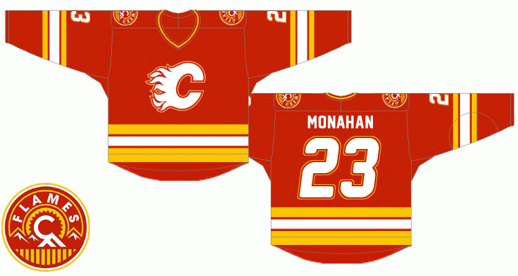
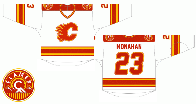
I still think these are wicked.
Just move the Flame/Calgary Tower logo to one of the shoulders and it'd be perfect.
|
|
|
|
|
The Following 5 Users Say Thank You to DrDangles92 For This Useful Post:
|
|
|
11-20-2014, 08:29 AM
|
#983
|
|
First Line Centre
Join Date: Aug 2003
Location: Toronto, ON
|
The "mini-tee and a diaper" effect of those remove them from consideration in my books
|
|
|
|
|
The Following 2 Users Say Thank You to Flames89 For This Useful Post:
|
|
|
11-20-2014, 11:05 AM
|
#984
|
|
Farm Team Player
Join Date: Oct 2014
Exp:
|
Our current digs are one of the worst in the league.
I still like the Flames in black and red, it reminds me of '04.
But our shoulder patches and current striping is hideous.
Last edited by DrDangles92; 11-20-2014 at 11:07 AM.
|
|
|
|
|
The Following User Says Thank You to DrDangles92 For This Useful Post:
|
|
|
11-20-2014, 11:09 AM
|
#985
|
|
Farm Team Player
Join Date: Oct 2014
Exp:
|
|
|
|
|
|
11-20-2014, 11:10 AM
|
#986
|
|
Farm Team Player
Join Date: Oct 2014
Exp:
|

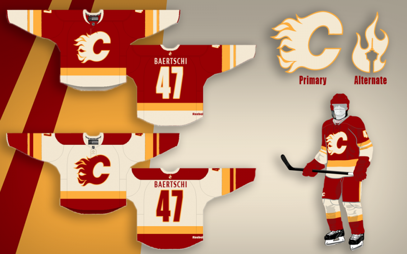
These mock 3rds are slick, too.
|
|
|
|
|
The Following User Says Thank You to DrDangles92 For This Useful Post:
|
|
|
11-22-2014, 09:11 PM
|
#987
|
|
Franchise Player
Join Date: Nov 2003
Location: Calgary, AB
|
I'd actually really like to see the black C on our current 3rd jersey's. I bet that would look quite sharp instead of the scripted Calgary and little 'C'. Photoshop wizards..?
|
|
|
|
|
11-22-2014, 09:59 PM
|
#988
|
|
First Line Centre
Join Date: Aug 2003
Location: Toronto, ON
|
Too much pedestal memories on that 3rd
|
|
|
|
|
The Following 2 Users Say Thank You to Flames89 For This Useful Post:
|
|
|
11-22-2014, 11:00 PM
|
#989
|
|
Farm Team Player
Join Date: Apr 2006
Exp:
|
Oh please, please bring back the 04-07 jerseys. It's the only jersey the Flames need.
Just replace the sneezing horsey shoulder patch with the current third jersey patch or whatever
__________________
Ole Yeller
Last edited by S. Yelle; 11-22-2014 at 11:03 PM.
|
|
|
|
|
11-23-2014, 01:14 AM
|
#990
|
|
Franchise Player
Join Date: Jul 2005
Location: 555 Saddledome Rise SE
|
I wonder what's wrong with me. I love the thirds. It's a great shade of red.
|
|
|
|
|
11-23-2014, 01:20 AM
|
#991
|
|
Backup Goalie
Join Date: Jan 2014
Exp:
|
Double post
|
|
|
|
|
11-23-2014, 01:20 AM
|
#992
|
|
Backup Goalie
Join Date: Jan 2014
Exp:
|
Quote:
Originally Posted by Frequitude
I wonder what's wrong with me. I love the thirds. It's a great shade of red.
|
I believe all the flames jerseys are the same shade of red iirc.
|
|
|
|
|
11-23-2014, 01:21 AM
|
#993
|
|
Franchise Player
|
Quote:
Originally Posted by Headshot
I believe all the jerseys are the same shade of red iirc.
|
They are. It blew my mind when I found out, but the retro third, the current home and the current third are all the exact same shade of red.
__________________
Quote:
Originally Posted by CroFlames
Before you call me a pessimist or a downer, the Flames made me this way. Blame them.
|
|
|
|
|
|
11-23-2014, 01:24 AM
|
#994
|
|
Backup Goalie
Join Date: Jan 2014
Exp:
|
Quote:
Originally Posted by codynw
They are. It blew my mind when I found out, but the retro third, the current home and the current third are all the exact same shade of red.
|
Blew my mind as well. Amazing how touch up colors such as black or white/yellow can change the perception of red, eh?
|
|
|
|
|
11-23-2014, 03:22 AM
|
#995
|
|
damn onions
|
Can't wait for another shades of red discussion on this site but looks like it's about to "fire" up.
(double puns intended).
|
|
|
|
|
11-23-2014, 07:13 AM
|
#996
|
|
First Line Centre
|
Quote:
Originally Posted by playmaker
I tried to photoshop my previously posted retro concept (the one enclosed in spoiler tags below) into images of real jerseys, hope you like it.
Although I did my best to find and combine various jersey images, the fact is that I'm not a professional graphic designer so please note that color shades and some details such as stitching may not necessarily correspond to an actual Reebok jersey.
Anyways, I'm hoping that these two will give a better impression of what the real thing would look like. In comparison to the previous iteration there are two minor changes - sleeve numbers are not outlined (in order to achieve a sharper look) and the flaming C is larger than before.
here we go ...
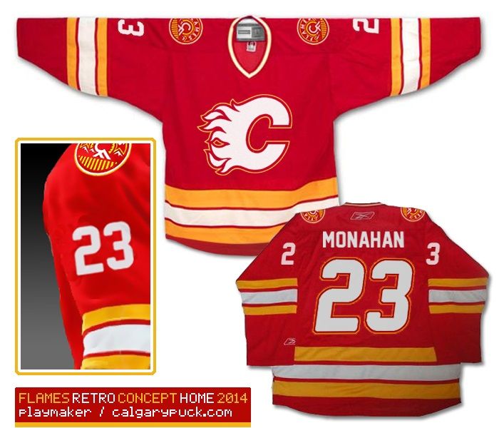
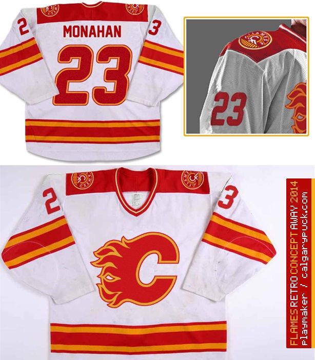
Last but not least, as the third jersey I'd choose our home uniforms from 2004:
 |
Bump.
Ken King: these please. Now.
|
|
|
|
|
The Following User Says Thank You to FlameZilla For This Useful Post:
|
|
|
11-23-2014, 07:35 AM
|
#997
|
|
Franchise Player
|
Quote:
Originally Posted by S. Yelle
Oh please, please bring back the 04-07 jerseys. It's the only jersey the Flames need.
|
Nooooooooooooo.
|
|
|
|
|
11-23-2014, 07:56 AM
|
#998
|
|
Franchise Player
Join Date: Oct 2006
Location: Calgary
|
Quote:
Originally Posted by DrDangles92
I still think these are wicked.
Just move the Flame/Calgary Tower logo to one of the shoulders and it'd be perfect.
|
Does anyone know where you could get the light one of this custom made, I know BC-Chris can do it, but I don't want him to get in any trouble.
Just an awesome jersey.
__________________
Fireside Chat - The #1 Flames Fan Podcast - FiresideChat.ca
|

|
|
|
11-23-2014, 08:08 AM
|
#999
|
|
First Line Centre
|
Quote:
Originally Posted by Caged Great
Does anyone know where you could get the light one of this custom made, I know BC-Chris can do it, but I don't want him to get in any trouble.
Just an awesome jersey.
|
The light one from this set and BC-Chris's retro-inspired red jersey are what I want to see. Easily the nicest designs I've seen for the Flames.
Where are they going to fit the Scotiabank logo though? [/green] 
|
|
|
|
|
11-23-2014, 09:20 AM
|
#1000
|
|
Franchise Player
Join Date: Nov 2009
Location: Kelowna, BC
|
Quote:
Originally Posted by Tyler
I'd actually really like to see the black C on our current 3rd jersey's. I bet that would look quite sharp instead of the scripted Calgary and little 'C'. Photoshop wizards..?
|
i'm just waiting for rbk to make the totally blank thirds available and then i plan on doing this - and i will post pics
__________________
"...and there goes Finger up the middle on Luongo!" - Jim Hughson, Av's vs. 'Nucks
|
|
|
|
|
The Following 2 Users Say Thank You to bc-chris For This Useful Post:
|
|
 Posting Rules
|
You may not post new threads
You may not post replies
You may not post attachments
You may not edit your posts
HTML code is Off
|
|
|
All times are GMT -6. The time now is 08:06 PM.
|
|