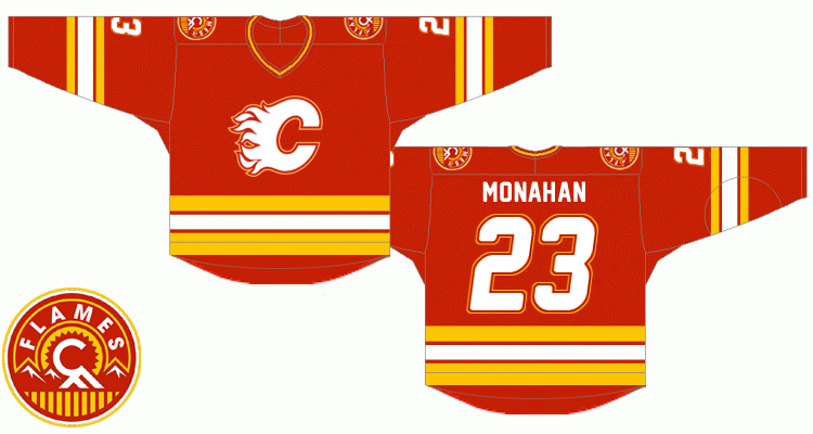
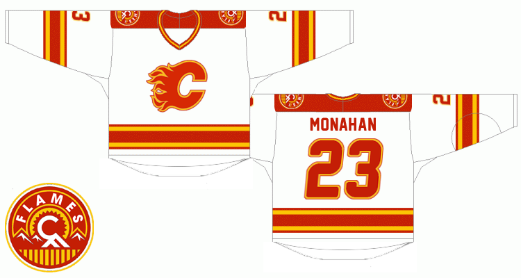
I tried to photoshop my previously posted retro concept (the one enclosed in spoiler tags below) into images of real jerseys, hope you like it.
Spoiler!
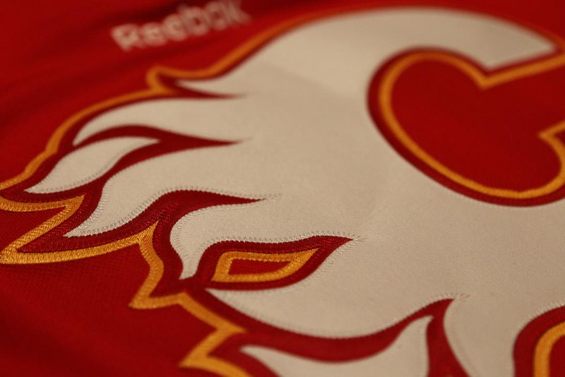
Although I did my best to find and combine various jersey images, the fact is that I'm not a professional graphic designer so please note that color shades and some details such as stitching may not necessarily correspond to an actual Reebok jersey.
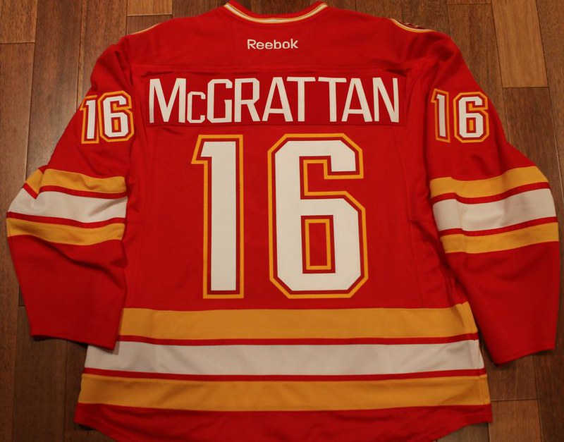
Anyways, I'm hoping that these two will give a better impression of what the real thing would look like. In comparison to the previous iteration there are two minor changes - sleeve numbers are not outlined (in order to achieve a sharper look) and the flaming C is larger than before.
here we go ...
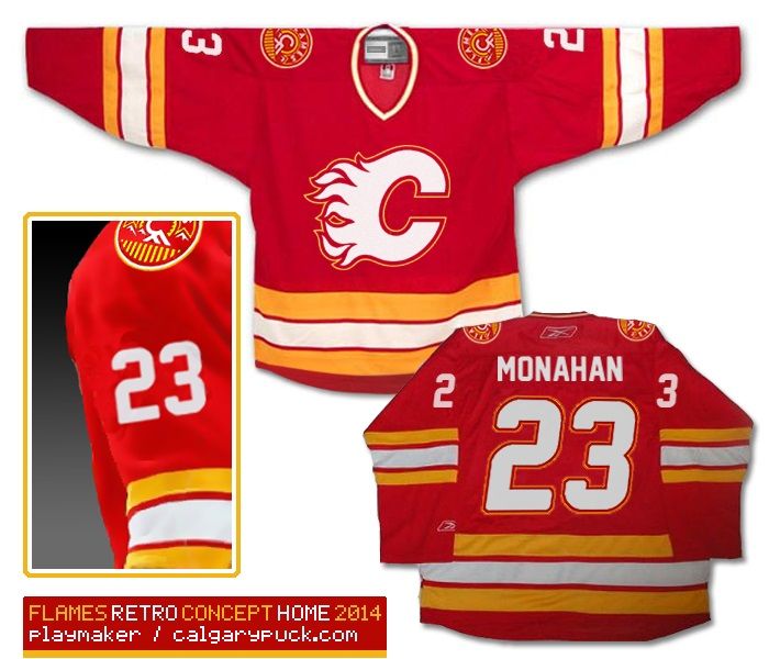
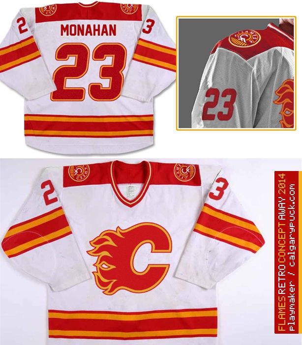
Last but not least, as the third jersey I'd choose our home uniforms from 2004:
The Following 28 Users Say Thank You to playmaker For This Useful Post:
Can you ship one of these to Ken King? Anonymously, probably, so you don't get accused of running a counterfeit jersey operation. But just a subtle little "see, Ken, it doesn't need black for the sake of black, or flags or piping or any of that fuss."
I would be tempted to change the font on the name bar to be more legible from distances, but everything else is great. A slight refresh on a classic design.
The Following 2 Users Say Thank You to Jimmy Stang For This Useful Post:
I tried to photoshop my previously posted retro concept (the one enclosed in spoiler tags below) into images of real jerseys, hope you like it.
Spoiler!
Although I did my best to find and combine various jersey images, the fact is that I'm not a professional graphic designer so please note that color shades and some details such as stitching may not necessarily correspond to an actual Reebok jersey.
Anyways, I'm hoping that these two will give a better impression of what the real thing would look like. In comparison to the previous iteration there are two minor changes - sleeve numbers are not outlined (in order to achieve a sharper look) and the flaming C is larger than before.
here we go ...
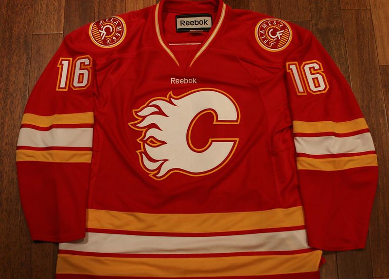
Last but not least, as the third jersey I'd choose our home uniforms from 2004:
Quote:
Originally Posted by bc-chris
i thought i posted this in here back in september, but i must have forgotten
this is what i wore to the young stars tourney in penticton....
Can you ship one of these to Ken King? Anonymously, probably, so you don't get accused of running a counterfeit jersey operation. But just a subtle little "see, Ken, it doesn't need black for the sake of black, or flags or piping or any of that fuss."
I would be tempted to change the font on the name bar to be more legible from distances, but everything else is great. A slight refresh on a classic design.
i wouldn't have to ship it to kk anonymously, i can make anything i want - as long as i'm not selling the stuff (i can't profit off of their trademarks). i've had this conversation before with a licensed manufacturer for the nhl - i think he was choked that the stuff i make for myself is nicer than the licensed stuff he makes - ha! ha!
the font i used is the current flames 3rd font - i like it - it's something a little different from the normal fonts you see on jerseys. i just wish they would do something about the 5 - it just doesn't work for me
__________________ "...and there goes Finger up the middle on Luongo!" - Jim Hughson, Av's vs. 'Nucks
The Following User Says Thank You to bc-chris For This Useful Post:
i wouldn't have to ship it to kk anonymously, i can make anything i want - as long as i'm not selling the stuff (i can't profit off of their trademarks). i've had this conversation before with a licensed manufacturer for the nhl - i think he was choked that the stuff i make for myself is nicer than the licensed stuff he makes - ha! ha!
the font i used is the current flames 3rd font - i like it - it's something a little different from the normal fonts you see on jerseys. i just wish they would do something about the 5 - it just doesn't work for me
You mean the 'oh no don't have any fives, lets just flip the two'. It really bothers me to.
The Following 4 Users Say Thank You to Robbob For This Useful Post:
The fact that this isn't already our primary home jersey is a travesty. In all honesty how would we go about petitioning the Flames organization in a serious way?
You can't sell them, but it sure would be a coincidence if one showed up in my mailbox and, out of the blue, a couple of C-notes ended up being anonymously dropped in yours.... Imagine the odds.
The Following User Says Thank You to JBR For This Useful Post:
I would buy that as a new jersey immediately. That is wonderfully done, it looks so much like the past but with the future in mind, its just perfect.
The problem is every sports team will have their own way to do things and actually sourcing a design from "the crowd" may be outside of their comfort zone due to the implications.
Edit: I love the 03/04 jerseys, but have hated the jerseys with the vertical side stripes thoroughly, introduced a few years later. I haven't bought one as a result. Time for change.
More importantly, its probably that Reebok or CCM or whoever has a deal with the NHL where the designs must be owned by a certain entity, and they probably think that its too much (1) hassle for rights (2) admittance of incompetence, to use a jersey designed by an unpaid fan.
Honestly, I don't even mind the use of black in the jerseys. Just take the current jerseys, get rid of the flags in favour of the new shoulder patch, and ditch the piping.
Obviously the retros are ideal, but a cleaned up version of the current set would be okay too.
__________________
Quote:
Originally Posted by CroFlames
Before you call me a pessimist or a downer, the Flames made me this way. Blame them.
The Following User Says Thank You to codynw For This Useful Post:
Damn... I think one of these should show up at some type of management with a note asking for a 3rds design contest.
It would be freaking amazing to see actual sweater mock ups of the jerseys on display.
IIRC, there were about 3-4 solid contenders for designs in the thread(s)?
Someone find a Flames player or management, have them lose a bet and be "required" to wear a commissioned mock up BC Chris' sweater for a week. It might get the right exposure to get a 3rds in.
No need to rain on my parade... I know I'm half dreaming.
Simply outstanding design bc-chris, well done! Combining the retro design with the new shoulder patches and font of the 3rds looks fantastic. Wish those were our primaries, I'd buy a couple of those in a heartbeat.