 09-26-2023, 10:55 AM
|
#241
|
|
Resident Videologist
Join Date: Mar 2002
Location: Calgary
|
They both look like Walmart specialty jerseys.
I like them more than the maroon ones we wore vs Montreal in our first outdoor game though.
|

|

|
|
The Following 3 Users Say Thank You to AC For This Useful Post:
|
|
|
09-26-2023, 10:55 AM
|
#242
|
|
Franchise Player
Join Date: Aug 2007
Location: Calgary
|
I see a clown face on the Oilers jersey when you get a blank one...
Spoiler for size
__________________

|
|
|
|
|
The Following 5 Users Say Thank You to Nammer403 For This Useful Post:
|
|
|
09-26-2023, 11:01 AM
|
#243
|
|
Celebrated Square Root Day
|
Quote:
Originally Posted by AC

They both look like Walmart specialty jerseys.
I like them more than the maroon ones we wore vs Montreal in our first outdoor game though.
|
Super boring jerseys, yep. The striping and colours on the Flames one is bland enough, but more importantly the Flaming C is already a logo, and they put it inside another logo, basically. It makes the little Flaming C look goofy.
Xzibit would be proud.
|
|
|
|
|
09-26-2023, 11:04 AM
|
#244
|
|
Franchise Player
Join Date: Apr 2004
Location: I don't belong here
|
Quote:
Originally Posted by sleepingmoose
My god the Edmonton uniforms are terrible. Ugh.
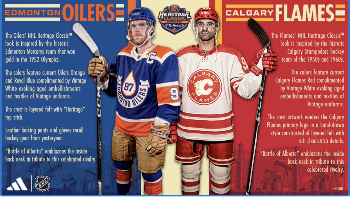 |
Based on this, I'm not sure how the Flames jersey looks. It could be good... It could be bad... but beside that Oilers abomination it looks not too bad!
|
|
|
|
|
09-26-2023, 11:09 AM
|
#245
|
|
Franchise Player
Join Date: Apr 2022
Location: California
|
|
|
|
|
|
09-26-2023, 11:09 AM
|
#246
|
|
Lifetime Suspension
|
Man McDavid is aging like crazy.
|
|
|
|
|
09-26-2023, 11:09 AM
|
#247
|
|
All I can get
|
The Calgary jersey striping is typical of the period they are evoking. Something team managers would order of of the Eatons catalogue. You had a variety of colours, all with that striping.
The Calgary Flames word mark looks like it was drawn with a Leroy lettering kit.
Also, pants were canvas then.
Last edited by Reggie Dunlop; 09-26-2023 at 11:20 AM.
|
|
|
|
|
09-26-2023, 11:11 AM
|
#248
|
|
Franchise Player
|
Yeah, that totally looks like Adidas had surplus Red Wing jerseys and just put the Flames crest on it.
|
|
|
|
|
09-26-2023, 11:11 AM
|
#249
|
|
Franchise Player
Join Date: Nov 2009
Location: In the studio
|
Quote:
Originally Posted by Paulie Walnuts
Man McDavid is aging like crazy.
|
Hes enging lol
|
|
|
|
|
The Following 2 Users Say Thank You to Heavy Jack For This Useful Post:
|
|
|
09-26-2023, 11:18 AM
|
#250
|
|
Owner
Join Date: Dec 2001
Location: Calgary
|
I like it for what it's trying to accomplish.
The Heritage game has always had a look back at old local unis and this one got it right in my opinion. (So this looks basic or like a Canadian Tire jersey is expected)
It doesn't replace or supplant their existing look, which is on point, but for the role this jersey is trying to fill, I think they nailed it.
|
|
|
|
|
The Following 5 Users Say Thank You to Bingo For This Useful Post:
|
|
|
09-26-2023, 11:23 AM
|
#251
|
|
Franchise Player
Join Date: Feb 2007
Location: Calgary, AB
|

Quote:
Originally Posted by AC
They both look like Walmart specialty jerseys.
I like them more than the maroon ones we wore vs Montreal in our first outdoor game though.
|
Quote:
Originally Posted by jayswin
Super boring jerseys, yep. The striping and colours on the Flames one is bland enough, but more importantly the Flaming C is already a logo, and they put it inside another logo, basically. It makes the little Flaming C look goofy.
Xzibit would be proud.
|
Disagree on both these takes to be honest.
The Flames jersey looks really nice and actually looks like a really traditional hockey jersey in terms of the colors and striping pattern. Don't think it looks wal-mart quality at all (when I think of Walmart quality generally it's ugly busy striping and weird colors).
All Oilers jerseys look Wal-Mart quality - so no change there.
And I don't think the Flaming C within the circle makes it seem goofy. The Penguins, Blackhawks, Blues etc have all done it. Actually something not uncommon for the era of the 40/50s they are trying to represent here.
Think Adidas and the Flames did a good job here with what they were trying to achieve which was a Flames version of the old Stampeders hockey team jerseys.
|
|
|
|
|
The Following User Says Thank You to SuperMatt18 For This Useful Post:
|
|
|
09-26-2023, 11:25 AM
|
#252
|
|
Franchise Player
|
These are Heritage Classic jersey's. Please refer to them appropriately as Woolco quality if that's how you feel.
|
|
|
|
|
The Following 21 Users Say Thank You to Cleveland Steam Whistle For This Useful Post:
|
BACKCHECK!!!,
bdubbs,
Bubba17,
Captain Hair,
Flamesguy_SJ,
GreenHardHat,
Icon,
Jay Random,
jayswin,
Mightyfire89,
MissTeeks,
Press Level,
Puppet Guy,
Reggie Dunlop,
SuperMatt18,
SutterBrother,
Textcritic,
TheScorpion,
topfiverecords,
Yeah_Baby,
You Need a Thneed
|
|
09-26-2023, 12:06 PM
|
#253
|
|
All I can get
|
"EDmOnTOn OILERS"
|
|
|
|
|
The Following User Says Thank You to Reggie Dunlop For This Useful Post:
|
|
|
09-26-2023, 12:19 PM
|
#254
|
|
Franchise Player
Join Date: Oct 2021
Location: Richmond upon Thames, London
|
Quote:
Originally Posted by sleepingmoose
My god the Edmonton uniforms are terrible. Ugh.
|
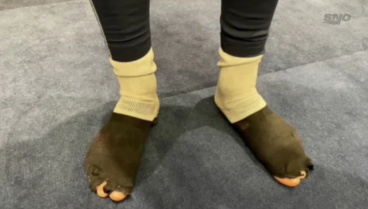
Good thing Connor wore the brown pants.
|

|
|
|
The Following 4 Users Say Thank You to TrentCrimmIndependent For This Useful Post:
|
|
|
09-26-2023, 12:27 PM
|
#255
|
|
All I can get
|
Thin gold piping on the red stripes would've looked sharp, but all-in-all, that's a decent looking Calgary set. The crest is a bit practise jersey-esque, but as others have pointed out, its consistent with the era.
|
|
|
|
|
09-26-2023, 12:27 PM
|
#256
|
|
Scoring Winger
Join Date: Feb 2008
Location: Burmis Tree
|
As it said, inspired by the Calgary Stampeders HC of the 50's and 60's... Similar but slightly different. I do not mind it at all.
Oilers could have done something with the 52 Olympics or the Maple Leaf in the logo to really make it worthy, the oil drop does not support the bannering.
|
|
|
|
|
09-26-2023, 12:29 PM
|
#257
|
|
Franchise Player
Join Date: Feb 2010
Location: Park Hyatt Tokyo
|
Quote:
Originally Posted by TrentCrimmIndependent
Good thing Connor wore the brown pants.
|
He already has the matching socks.
|
|
|
|
|
The Following 4 Users Say Thank You to topfiverecords For This Useful Post:
|
|
|
09-26-2023, 12:45 PM
|
#258
|
|
Franchise Player
Join Date: Jul 2009
Location: Calgary
|
Quote:
Originally Posted by TheIronMaiden
Gotta say though, without the yellow, they really look like Redwings jerseys.
|
I think there's enough yellow on the crest.
|
|
|
|
|
09-26-2023, 01:05 PM
|
#259
|
|
First Line Centre
Join Date: Oct 2002
Location: Turner Valley
|
Awful. Oiler's jerseys are better than ours. I'm pretty much a lock to buy every Flames jersey on pre-sale as soon as they are announced, and this is the first I won't be buying.
|
|
|
|
|
09-26-2023, 01:05 PM
|
#260
|
|
Franchise Player
Join Date: Aug 2004
Location: Conquering the world one 7-11 at a time
|
I actually really like the Flames jersey. It's period appropriate for the look they're going for and I dig the simplicity of it. The little embellishments in the flames on the logo are pretty cool too.
The oilers one on the other hand.... if a dog puked on a dead raccoon then ate it and crapped the whole thing out in a steaming mess of diarrhea, it would look better than that God awful jersey.
__________________
"There will be a short outage tonight sometime between 11:00PM and 1:00AM as network upgrades are performed. Please do not panic and overthrow society. Thank you."
|
|
|
|
 Posting Rules
|
You may not post new threads
You may not post replies
You may not post attachments
You may not edit your posts
HTML code is Off
|
|
|
All times are GMT -6. The time now is 05:42 PM.
|
|


