|
View Poll Results: Are you happy Blasty is back?
|
|
Yes
|
   
|
275 |
72.56% |
|
No
|
  
|
104 |
27.44% |
 11-16-2020, 10:57 AM
|
#821
|
|
Franchise Player
Join Date: Feb 2006
Location: Calgary, AB
|
Red pants, helmet, and gloves with this could be an interesting look.
__________________
Turn up the good, turn down the suck!
|

|

|
|
11-16-2020, 10:57 AM
|
#822
|
|
Franchise Player
Join Date: Mar 2005
Location: Van City - Main St.
|
Gotta say Montreal is my favorite. Thry nailed the "reverse" part of reverse retro.
I guess we just went with remixed retro.
|

|
|
|
11-16-2020, 11:00 AM
|
#823
|
|
Franchise Player
Join Date: Jul 2002
Location: ---
|
Quote:
Originally Posted by Winsor_Pilates

Gotta say Montreal is my favorite. Thry nailed the "reverse" part of reverse retro.
I guess we just went with remixed retro.
|
We took a jersey from the darkest timeline of our teams existent. Removed one panel of striping and showboat it around like its some great desgin feat. Im really lost what the point of this big reveal was?
|
|
|
|
|
11-16-2020, 11:00 AM
|
#824
|
|
Franchise Player
Join Date: Nov 2009
Location: Section 203
|
Quote:
Originally Posted by tvp2003
Clarke Wilm actually (Wilm's name is on the cuff of the glove).
|
Thank you. I guessed Gelinas because of the A on the jersey. I'm guessing that is Photoshopped in.
__________________
My thanks equals mod team endorsement of your post.
Quote:
Originally Posted by Bingo
Jesus this site these days
|
Quote:
Originally Posted by Barnet Flame
He just seemed like a very nice person. I loved Squiggy.
|
Quote:
Originally Posted by dissentowner
I should probably stop posting at this point
|
|
|
|
|
|
11-16-2020, 11:05 AM
|
#825
|
|
Powerplay Quarterback
Join Date: Dec 2009
Location: Tokyo, Japan
|
Quote:
Originally Posted by bax
Flames knocked this one out of the park. Absolutely beautiful.
We went from having one of the worst jersey sets in the league to one of the best in one season.
I like the black out appearance these jerseys give off. Minimal striping and will look very sharp on the ice.
|
My initial reaction was that they didn't do a great job on the stripes (not enough white on the front to balance with the white C's and the white numbers). But, I think these will look great as a full uniform set. Hopefully the pant shells complement the jersey well. Also interested to see if there is anything new with the helmets and what the socks look like. On TV, they could look very black and white and it might have a really cool effect.
|
|
|
|
|
11-16-2020, 11:05 AM
|
#826
|
Participant  |
Quote:
Originally Posted by Flaming Homer
We took a jersey from the darkest timeline of our teams existent. Removed one panel of striping and showboat it around like its some great desgin feat. Im really lost what the point of this big reveal was?
|
Big reveal? Every team got a reverse retro, and they're all being promoted the exact same way, and were teased and released the exact same way.
It's not like the Flames are showboating like it's a design feat. All the promotion is the exact same way across the board.
|
|
|
|
|
The Following 3 Users Say Thank You to PepsiFree For This Useful Post:
|
|
|
11-16-2020, 11:06 AM
|
#827
|
|
#1 Goaltender
Join Date: Nov 2005
Location: the middle
|
Quote:
Originally Posted by getbak
- Front views of horses in illustrations generally don't look as good as a side view or at least a 3/4 view. If you do an image search for "horse logo", hardly any of the examples have the horse's head looking straight ahead.
|
This is because horse's eyes look dumb from the front with the way they bulge out the side. They aren't tucked in and facing forward like they do with tonal horse. It's also why you don't typically get many good views staring straight onto a horse, because horses turn their heads to see you better.
It's not a horse logo, it's a cartoon horse, a small but important difference. Cartoon's as logos are for minor leagues.
|
|
|
|
|
The Following 2 Users Say Thank You to Roughneck For This Useful Post:
|
|
|
11-16-2020, 11:06 AM
|
#828
|
|
First round-bust
Join Date: Feb 2015
Location: speculating about AHL players
|
The Flames will be wearing black pants, gloves, and helmets with this jersey.
__________________
Host of the FlamesNation Warmies and Afterburner shows.
2026 World Junior Pool Champion
|
|
|
|
|
The Following 3 Users Say Thank You to TheScorpion For This Useful Post:
|
|
|
11-16-2020, 11:07 AM
|
#829
|
|
Franchise Player
Join Date: Jul 2005
Location: SW Ontario
|
I like my original Blasty better but I will still buy one of these. What is better than a Blasty jersey? Two of them!
|
|
|
|
|
The Following User Says Thank You to dissentowner For This Useful Post:
|
|
|
11-16-2020, 11:07 AM
|
#830
|
|
Franchise Player
Join Date: Oct 2001
Location: sector 7G
|
Snot horse sucks. And I must be in the minority as I hate the Habs in blue.
|
|
|
|
|
11-16-2020, 11:09 AM
|
#831
|
|
Franchise Player
|
The black blasty was already a reverse retro, that was ahead of it's time.
|
|
|
|
|
11-16-2020, 11:10 AM
|
#832
|
|
Franchise Player
|
Quote:
Originally Posted by FlamesFanFromBC
They've done nothing compelling from the original blasty jersey... I have an old blasty and don't see any reason to get this new one.
Also I've seen fan renders that are much more interesting.
|
My original fits like a garbage bag so there's one good reason to buy a new one.
__________________
Quote:
Originally Posted by CroFlames
Before you call me a pessimist or a downer, the Flames made me this way. Blame them.
|
|
|
|
|
|
The Following User Says Thank You to codynw For This Useful Post:
|
|
|
11-16-2020, 11:12 AM
|
#833
|
|
Franchise Player
|
Capitals, Blues, Kings, Ducks, Stars, Habs, and Canucks all executed this concept really well.
__________________
All you have to decide is what to do with the time that is given to you.
Rowan Roy W-M - February 15, 2024
|
|
|
|
|
11-16-2020, 11:17 AM
|
#834
|
|
Franchise Player
Join Date: Jun 2011
Location: Calgary
|
Val Bure approves!
I want a Bennett Blasty Jersey.
|
|
|
|
|
11-16-2020, 11:18 AM
|
#835
|
|
First Line Centre
Join Date: Oct 2002
Location: Turner Valley
|
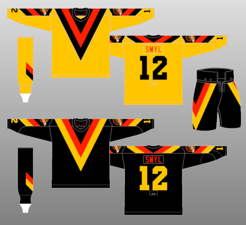
Knowing the Flames, they will ruin this by having "V" style socks circa the 1978 Canucks:
|
|
|
|
|
11-16-2020, 11:24 AM
|
#836
|
|
#1 Goaltender
|
Darn right I'm buying one of these.
We have the best primary sets in the league now with the retros and I think this is the perfect time to bring the old horse head jersey back for a few games a year.
|
|
|
|
|
11-16-2020, 11:24 AM
|
#837
|
|
Franchise Player
Join Date: Jul 2009
Location: Calgary
|
Quote:
Originally Posted by Ashasx
The Kings and the Wild especially look great. Minnesota should really go with this colour scheme full time.
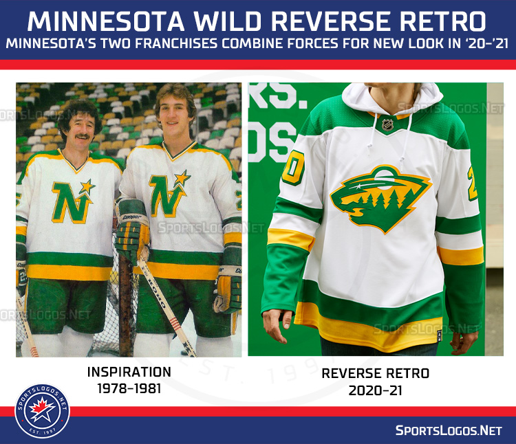 |
the Wild jersey is amazing.
|
|
|
|
|
11-16-2020, 11:25 AM
|
#838
|
|
Powerplay Quarterback
Join Date: Mar 2014
Location: MTL
|
Quote:
Originally Posted by habernac
Snot horse sucks. And I must be in the minority as I hate the Habs in blue.
|
Agreed, the Habs in Blue looks horrible
|
|
|
|
|
The Following User Says Thank You to Funkhouser For This Useful Post:
|
|
|
11-16-2020, 11:26 AM
|
#839
|
|
Franchise Player
Join Date: Jul 2009
Location: Calgary
|
I think the Flames get a passing grade, but it's just... fine. Definitely were ways to improve on the design and just feels like this was the boring, easy option.
|
|
|
|
|
The Following User Says Thank You to Icon For This Useful Post:
|
|
|
11-16-2020, 11:30 AM
|
#840
|
|
First Line Centre
Join Date: Oct 2002
Location: Turner Valley
|
Quote:
Originally Posted by the-rasta-masta
Knowing the Flames, they will ruin this by having "V" style socks circa the 1978 Canucks:
|
Actually its kind of funny looking at those Canucks V jerseys. You could literally do a GIF of the V lowering itself down to the waist and the arm bands extending, then with Flames logos appearing. LOL Inspiration from the one of the ugliest NHL jerseys of all times...
|
|
|
|
 Posting Rules
|
You may not post new threads
You may not post replies
You may not post attachments
You may not edit your posts
HTML code is Off
|
|
|
All times are GMT -6. The time now is 10:17 AM.
|
|


