|
View Poll Results: Are you happy Blasty is back?
|
|
Yes
|
   
|
275 |
72.56% |
|
No
|
  
|
104 |
27.44% |
 11-16-2020, 10:08 AM
|
#781
|
|
Franchise Player
Join Date: Mar 2015
Location: Pickle Jar Lake
|
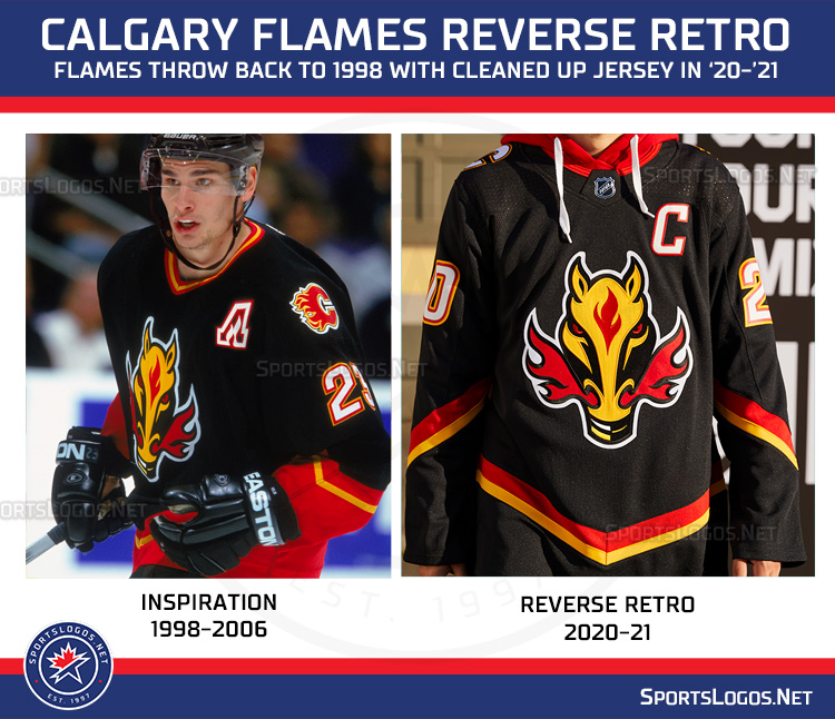
Meh. It's blasty on a black jersey. Nothing special here.
|

|

|
|
11-16-2020, 10:09 AM
|
#782
|
|
Franchise Player
Join Date: Mar 2006
Location: Shanghai
|
Quote:
Originally Posted by bc-chris

i've never understood why the 'N' in TOROnTO is lower case 
and yea - that front logo looks massive! |
You're right. That is so weird. It's not like that on their other logos It looks so out of place.
__________________
"If stupidity got us into this mess, then why can't it get us out?"
|
|
|
|
|
11-16-2020, 10:10 AM
|
#783
|
|
Franchise Player
Join Date: Feb 2007
Location: Calgary, AB
|
Quote:
Originally Posted by AC
If they were going to take the original and slightly change the stripes, then adding white was the way to go IMO. I think all 3 of these are better:

I also made the captain's C match the numbers with the yellow. |
Don't love the middle, but the left and the right are improvements for sure.
Flames need to hire AC to be part of the design team in the future.
|
|
|
|
|
The Following 3 Users Say Thank You to SuperMatt18 For This Useful Post:
|
|
|
11-16-2020, 10:11 AM
|
#784
|
|
Franchise Player
|
Quote:
Originally Posted by Fuzz
Meh. It's blasty on a black jersey. Nothing special here.
|
I don't care how retro it is, that horse head looks dumb.
__________________
Quote:
Originally Posted by MisterJoji
Johnny eats garbage and isnt 100% committed.
|
|
|
|
|
|
The Following 11 Users Say Thank You to nik- For This Useful Post:
|
Buff,
burn_this_city,
Canada 02,
Fuzz,
Hoop27,
Johnny Makarov,
JohnnyB,
Rhettzky,
rustycana,
vennegoor of hesselink,
You Need a Thneed
|
|
11-16-2020, 10:12 AM
|
#785
|
|
#1 Goaltender
Join Date: Aug 2007
Location: Halifax
|
Looking forward to seeing the full setup with all the gear. Red pants, helmet and gloves would be interesting to see but I'd imagine it'll be a fully black set
|
|
|
|
|
11-16-2020, 10:12 AM
|
#786
|
|
First round-bust
Join Date: Feb 2015
Location: speculating about AHL players
|
Quote:
Originally Posted by nik-
I don't care how retro it is, that horse head looks dumb.
|
He has feelings, you know
__________________
Host of the FlamesNation Warmies and Afterburner shows.
2026 World Junior Pool Champion
|

|
|
|
The Following 5 Users Say Thank You to TheScorpion For This Useful Post:
|
|
|
11-16-2020, 10:12 AM
|
#787
|
|
Franchise Player
|
Quote:
Originally Posted by AC
If they were going to take the original and slightly change the stripes, then adding white was the way to go IMO. I think all 3 of these are better:
I also made the captain's C match the numbers with the yellow. |
Quote:
Originally Posted by SuperMatt18
Don't love the middle, but the left and the right are improvements for sure.
Flames need to hire AC to be part of the design team in the future.
|
Why aren't you (AC) part of the design team?
|
|
|
|
|
11-16-2020, 10:12 AM
|
#788
|
|
Backup Goalie
Join Date: Aug 2004
Exp: 
|
Quebec and Hartford will be selling like hot cakes
|
|
|
|
|
11-16-2020, 10:13 AM
|
#789
|
|
Franchise Player
Join Date: Mar 2004
Location: Calgary
|
It is both hilarious and sad that a hockey fan forum (with obviously some very talented members) can come up with better designs in 1 hr, than the entire design team and executive group who approved some of these jerseys did over months.
__________________
REDVAN!
|
|
|
|
|
11-16-2020, 10:13 AM
|
#790
|
|
Lifetime Suspension
Join Date: Jul 2003
Location: Calgary, Alberta
|
Quote:
Originally Posted by Ashasx
The Kings and the Wild especially look great. Minnesota should really go with this colour scheme full time.
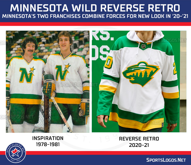 |
They should go to these full time.
|
|
|
|
|
The Following 2 Users Say Thank You to the_only_turek_fan For This Useful Post:
|
|
|
11-16-2020, 10:13 AM
|
#791
|
|
Franchise Player
Join Date: Jan 2018
Location: Alberta
|
Quote:
Originally Posted by JohnnyB
That logo definitely deserves some more use.
|

|
|
|
|
|
The Following User Says Thank You to Monahammer For This Useful Post:
|
|
|
11-16-2020, 10:14 AM
|
#792
|
|
Franchise Player
Join Date: Mar 2005
Location: Van City - Main St.
|
No go.
Striping is bad and logo looks too large. The original is better.
|
|
|
|
|
11-16-2020, 10:14 AM
|
#793
|
|
Franchise Player
Join Date: Feb 2007
Location: Calgary, AB
|
Quote:
Originally Posted by nik-
I don't care how retro it is, that horse head looks dumb.
|
Why? I honestly never understood the hate for the logo.
It was awesome as a shoulder patch, and is a good alternate logo.
A fire breathing horse is a great logo for the Calgary Flames in this city, and the execution of the logo is pretty good.
|
|
|
|
|
11-16-2020, 10:15 AM
|
#794
|
|
Franchise Player
Join Date: Mar 2006
Location: Shanghai
|
Quote:
Originally Posted by Monahammer
|
Better as a shoulder patch, but I'd still take it over the horse head as the main crest.
__________________
"If stupidity got us into this mess, then why can't it get us out?"
|
|
|
|
|
11-16-2020, 10:16 AM
|
#795
|
|
Franchise Player
|
Blasty is beautiful. Blasty is best.
|
|
|
|
|
11-16-2020, 10:17 AM
|
#796
|
|
#1 Goaltender
Join Date: Feb 2012
Location: Calgary
|
I think our own posters had much better versions, but this isn't something I was interested in anyway (I will be picking up a retro red).
Most of the league's are just awful though. I guess the Flames meh is perhaps a win.
__________________
From HFBoard oiler fan, in analyzing MacT's management:
O.K. there has been a lot of talk on whether or not MacTavish has actually done a good job for us, most fans on this board are very basic in their analysis and I feel would change their opinion entirely if the team was successful.
|
|
|
|
|
11-16-2020, 10:22 AM
|
#797
|
|
I believe in the Jays.
|
Love love love a lot of these (not blasty, blasty sucks). But I think the Kings, Aves, 'Canes, Wild, and Vegas look super slick. Ducks and 'Yotes look hideously silly (I actually like the Aztec-esq logo for Arizona... I just hate the rest of it).
Last edited by Parallex; 11-16-2020 at 10:27 AM.
|
|
|
|
|
11-16-2020, 10:23 AM
|
#798
|
|
Franchise Player
Join Date: Nov 2009
Location: Section 203
|
Quote:
Originally Posted by SuperMatt18
|
Is that Monahan's head on Gelinas's body? If so, that's a weird picture to use for the comparison.
__________________
My thanks equals mod team endorsement of your post.
Quote:
Originally Posted by Bingo
Jesus this site these days
|
Quote:
Originally Posted by Barnet Flame
He just seemed like a very nice person. I loved Squiggy.
|
Quote:
Originally Posted by dissentowner
I should probably stop posting at this point
|
|
|
|
|
|
The Following 2 Users Say Thank You to squiggs96 For This Useful Post:
|
|
|
11-16-2020, 10:30 AM
|
#799
|
|
#1 Goaltender
|
Flames knocked this one out of the park. Absolutely beautiful.
We went from having one of the worst jersey sets in the league to one of the best in one season.
I like the black out appearance these jerseys give off. Minimal striping and will look very sharp on the ice.
|
|
|
|
|
The Following 11 Users Say Thank You to bax For This Useful Post:
|
Braden,
CF84,
dissentowner,
Funkhouser,
Hockey_Ninja,
Jetfire,
JurassicTunga12,
MisterJoji,
PepsiFree,
TheIronMaiden,
VilleN
|
|
11-16-2020, 10:32 AM
|
#800
|
|
Backup Goalie
Join Date: Aug 2004
Exp:
|
Quote:
Originally Posted by TheScorpion
He has feelings, you know
|
The horse head was designed by a kid, an local artist.
|
|
|
|
 Posting Rules
|
You may not post new threads
You may not post replies
You may not post attachments
You may not edit your posts
HTML code is Off
|
|
|
All times are GMT -6. The time now is 10:27 AM.
|
|