|
View Poll Results: Are you happy Blasty is back?
|
|
Yes
|
   
|
275 |
72.56% |
|
No
|
  
|
104 |
27.44% |
 11-16-2020, 09:03 AM
|
#701
|
|
Pent-up
Join Date: Mar 2018
Location: Plutanamo Bay.
|
Quote:
Originally Posted by chummer

Are we getting a new Captain?
|
All the examples are #20 (2020) with the C.
|

|

|
|
The Following User Says Thank You to Scroopy Noopers For This Useful Post:
|
|
|
11-16-2020, 09:04 AM
|
#702
|
|
Celebrated Square Root Day
|
They blew it with the bottom, trying too hard to fit into the reverse retro theme, but the rest looks really nice. Glad they didn't reverse the horsehead colours as every mock up looked bad.
|
|
|
|
|
The Following 3 Users Say Thank You to jayswin For This Useful Post:
|
|
|
11-16-2020, 09:04 AM
|
#703
|
|
Resident Videologist
Join Date: Mar 2002
Location: Calgary
|
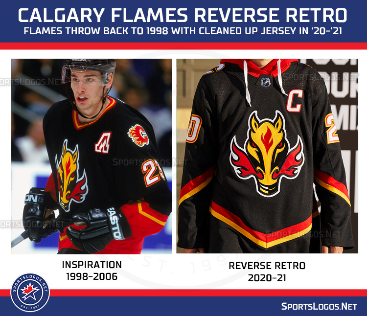
Hmm, I'm a little disappointed. By itself, the jersey is good... but by swapping the bottom red stripe for black, they just made it look like this jersey:

There's already been so many "Calgary Canucks" jokes...
It's sharp, but I wish they changed one of the red stripes to white instead.
|
|
|
|
|
The Following User Says Thank You to AC For This Useful Post:
|
|
|
11-16-2020, 09:05 AM
|
#704
|
|
Franchise Player
Join Date: Mar 2004
Location: Chilliwack, B.C
|
Quote:
Originally Posted by TheScorpion
|
Whats so reverse retro about that?
Sent from my SM-G930W8 using Tapatalk
|
|
|
|
|
The Following 8 Users Say Thank You to calgaryred For This Useful Post:
|
|
|
11-16-2020, 09:06 AM
|
#705
|
|
First round-bust
Join Date: Feb 2015
Location: speculating about AHL players
|
Quote:
Originally Posted by calgaryred
Whats so reverse retro about that?
Sent from my SM-G930W8 using Tapatalk
|
The "C" on the shoulders is now white instead of red, and the base of the jersey below the striping is now black instead of red.
__________________
2026 World Junior Pool Champion
|

|
|
|
11-16-2020, 09:06 AM
|
#706
|
|
Scoring Winger
Join Date: Apr 2014
Location: Red Deer
|
It’s glorious
__________________
It was in.
|
|
|
|
|
11-16-2020, 09:06 AM
|
#707
|
|
Franchise Player
Join Date: Apr 2004
Location: I don't belong here
|
Those are terrible! I hope this is a one year thing. The striping ruins the entire look and I just don't like that logo. 0/10 from me.
|
|
|
|
|
The Following 7 Users Say Thank You to Buff For This Useful Post:
|
|
|
11-16-2020, 09:07 AM
|
#708
|
|
Franchise Player
Join Date: Dec 2011
Location: Calgary
|
The black bottom is a downgrade but the white C on the shoulder is an upgrade. I dig it.
|
|
|
|
|
11-16-2020, 09:07 AM
|
#709
|
|
Franchise Player
Join Date: Feb 2006
Location: Calgary, AB
|
Something about the stripes makes me think of the Hitmen jersey of that era.
They really did the minimum to make this "reverse", but I'm okay with that.
__________________
Turn up the good, turn down the suck!
|
|
|
|
|
The Following User Says Thank You to getbak For This Useful Post:
|
|
|
11-16-2020, 09:08 AM
|
#710
|
|
Pent-up
Join Date: Mar 2018
Location: Plutanamo Bay.
|
Quote:
Originally Posted by AC
Hmm, I'm a little disappointed. By itself, the jersey is good... but by swapping the bottom red stripe for black, they just made it look like this jersey:
There's already been so many "Calgary Canucks" jokes...
It's sharp, but I wish they changed one of the red stripes to white instead. |
Interested to see what the kit looks like. Red pants and gloves?
|
|
|
|
|
11-16-2020, 09:08 AM
|
#711
|
|
Franchise Player
Join Date: Feb 2007
Location: Calgary, AB
|
I think it's okay.
A white version of the jersey, or even some of the black designs on here looked better.
I actually like the waste striping better than the original but think there should have been a white stripe too.
Also don't really get why the yellow stripe at the bottom looks gold instead of Flames yellow.
Edit: Looks like the gold look is maybe just lighting in the video this still looks right.
Last edited by SuperMatt18; 11-16-2020 at 09:14 AM.
|
|
|
|
|
The Following User Says Thank You to SuperMatt18 For This Useful Post:
|
|
|
11-16-2020, 09:08 AM
|
#712
|
|
Franchise Player
|
eh I think these miss the mark. not a fan.
|
|
|
|
|
11-16-2020, 09:09 AM
|
#713
|
|
Franchise Player
Join Date: Mar 2002
Location: Calgary
|
So, take my word back. Carolina and the Avs look dumb. Minnesota really only nailed it for the teams that moved by recolouring the current logo in old colours, if we are talking proper reversing.
Adding grey was for the teams that they didn’t know what to do with.
Flames just did retro and forgot the reverse part, outside of a red for black hemline color change from the original.
|
|
|
|
|
11-16-2020, 09:09 AM
|
#714
|
|
Some kinda newsbreaker!
Join Date: May 2004
Location: Learning Phaneufs skating style
|
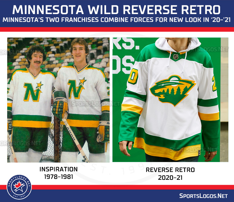
Here is a breakdown of the inspiration vs the reverse retro for each team:
https://news.sportslogos.net/2020/11...eams/hockey-2/
|
|
|
|
|
The Following User Says Thank You to sureLoss For This Useful Post:
|
|
|
11-16-2020, 09:10 AM
|
#715
|
|
Franchise Player
Join Date: Mar 2006
Location: Shanghai
|
What's with the hoods?
__________________
"If stupidity got us into this mess, then why can't it get us out?"
|
|
|
|
|
11-16-2020, 09:10 AM
|
#716
|
|
#1 Goaltender
|
Has anyone ever had an unctrollable, never-ending orgasm before?
Because that is the exact thing I am experiencing right now staring at that jersey.
BLASTY. IS. BACK.
|
|
|
|
|
11-16-2020, 09:11 AM
|
#717
|
|
Franchise Player
|
That's a bit of a miss. Some of the fan proposals in this thread are way way better
|
|
|
|
|
The Following 13 Users Say Thank You to btimbit For This Useful Post:
|
bdubbs,
Brad Marsh,
Buff,
calgaryred,
FlamesNation23,
Jarome,
JohnnyB,
KevanGuy,
MrMike,
Rhettzky,
Rubber Ducky,
socalwingfan,
Yamer
|
|
The Following 18 Users Say Thank You to Ashasx For This Useful Post:
|
Bill Bumface,
BsFaninCGY,
DaQwiz,
Erick Estrada,
Flamezzz,
Funkhouser,
Jetfire,
MrMike,
Mustache,
Plett25,
Puppet Guy,
rayne008,
Redliner,
Rubber Ducky,
Scroopy Noopers,
Textcritic,
Tkachukwagon,
Yamer
|
|
11-16-2020, 09:12 AM
|
#719
|
|
Franchise Player
Join Date: Aug 2004
Location: Conquering the world one 7-11 at a time
|
__________________
"There will be a short outage tonight sometime between 11:00PM and 1:00AM as network upgrades are performed. Please do not panic and overthrow society. Thank you."
|
|
|
|
|
11-16-2020, 09:13 AM
|
#720
|
|
First Line Centre
|
It’s better / cleaner looking than the original. The only miss for me is that the first outline around the white C on the shoulder should be red instead of black, matching the number font. Otherwise looks good!
|
|
|
|
|
The Following User Says Thank You to Zarley For This Useful Post:
|
|
 Posting Rules
|
You may not post new threads
You may not post replies
You may not post attachments
You may not edit your posts
HTML code is Off
|
|
|
All times are GMT -6. The time now is 09:57 PM.
|
|