Part III!
16. San Jose Sharks
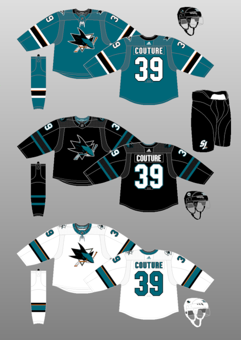
These uniforms are simple and largely effective. I wonder why the Sharks even bother with the cameo of orange in the arm and sock striping of their primary uniforms? I guess the colour makes a brief appearance in the logo, but it seems slightly misplaced amidst the otherwise relatively basic colour scheme. It used to be far worse (see their late 2000s uniforms), so this is an improvement. I will say I probably prefer the primary uniform design the Sharks wore in the late 1990s and early 2000s (AKA the one Owen Nolan sported on the cover of NHL 2001), but they aren't a massive step up from these.
As was the case with their old uniforms, the Sharks' best sweater is their black alternate. The minimalistic inclusion of teal in the uniform causes every little detail to pop. It's really sharp.
15. Minnesota Wild
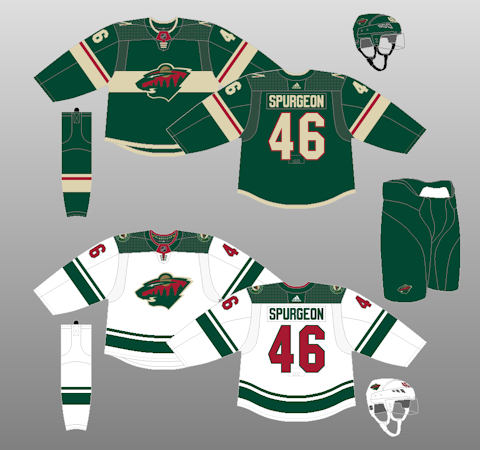
As usual, Minnesota finds itself smack-dab in the middle of the rankings. The Wild have a stupid name but an otherwise cool logo, and their white uniform boasts one of the only squared-off shoulder yokes in the league that actually doesn't bother me all that much. I like the increased emphasis placed on beige in their Adidas sweater, too, although I'm not sure if I'm a huge fan of the stripe going behind the logo. I might have tried out some waist striping instead, similar to the design on the road jersey (but with the same red line as in the arms of the green uniform -- I find that a strong element).
I always used to be partial to Minnesota's
old red sweaters and I would like to see a reworked, cleaner version of them made into an alternate at some point in the future. Failing that, I wonder if a beige uniform could ever be in the cards? Done right, it could be stunning... done wrong, it could be a laughingstock.
14. Detroit Red Wings
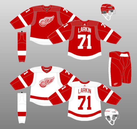
Blasphemous, I know.
Detroit hasn't changed their sweaters substantially since Yzerman arrived in 1983 and, honestly, they probably shouldn't, ever. There's nothing wrong with them. The logo is neat, the lettering on the back is cool (I like how it arches), and the striping, while basic, is classic and will never change.
That said... when I think of uniforms I love, I think of something with a bit of personality. I don't see a lot of that, here. I see something very basic with only two colours that hasn't changed in forever because, why should it? If it ain't broke... well, you don't want to see a Detroit "New York Fishticks" Red Wings jersey.
I just find it hard to get all that excited about Detroit's sweaters. It's the same as with Toronto. This ranks higher because I think the logo is better and I think this uniform has more unique quirks (the arched lettering, the opposite-side captaincy patches) that set it apart.
13. Boston Bruins
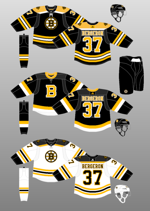
Boston has won a lot of games in this uniform, but I think it's one of the least effective designs they've ever worn from an aesthetic standpoint. I don't like the namebar font at all... I find it's too cluttered. There's too much going on. I prefer a nice and simple font that I can read easily and that looks clean and polished. Boston decided around a decade ago to add serifs and excessive accent colours to the lettering on their uniforms. Not only that, but they decided to add those same busy elements to their crest logo. It used to be a LOT worse (seriously,
check out the font on their Reebok black home jersey... yikes), but it's still not good.
That said... I have very high expectations for the Bruins because their uniforms from the Ray Bourque era are still some of my favourites ever worn in professional sports. I love black uniforms and I find yellow is the perfect accent colour to use with black. Pittsburgh's current uniforms combine these two colours to marvellous effect. They're clean, classic, and full of contrast. Boston's uniforms nail the colour scheme, but they're more cluttered than they need to be and, because of that, they lose a lot of their classic appeal.
I don't even want to talk about the alternate jersey. Good lord. It's awful. I hate the striping and the collar.
12. Columbus Blue Jackets
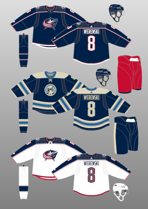
Aha, yes! See how effective a shoulder yoke can be when it continues down the arms? Ten points to Columbus' road sweater for creating a cohesive top section of the uniform. It looks great.
Look, I know this is kind of a weird pick, especially given that the Jackets' sweaters look super boring on paper and I've repeatedly expressed my distaste for boring uniforms, but I find these jerseys look phenomenal on the ice and are a huge upgrade over their Reebok Edge threads. The red pants are great and they allow the team to go perfectly subtle with the red on the jersey and the socks. And I'm a huge fan of the lettering.
Obviously, the real star here is the alternate uniform. The cream and powder blue work together so effectively while also allowing the navy to actually pop.
11. New York Rangers
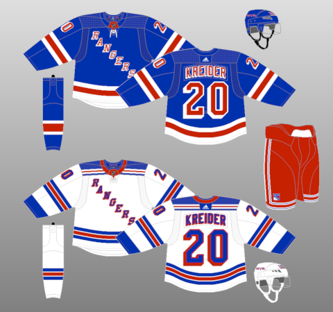
The Rangers are another team that haven't changed their look in a billion years. I really like these uniforms. The only real complaint I have about the home uniform is I would probably try to change the waist striping to match the template from the white jersey. But Once again, I love the red pants with both sweaters... they're surprisingly seamless and a perfect dose of New York flair.
Where Detroit's look is classic but lacks personality, the Rangers' uniforms are bursting at the seams with unique traits. The diagonal crest is obvious, but I also have a massive soft spot for the unique 3-D font and the striping on the pants. I haven't really made up my mind on how I feel about the shoulder yoke on the white jersey, but I do love how it incorporates a miniaturized version of the waist stripes. Great touch.
10. New York Islanders
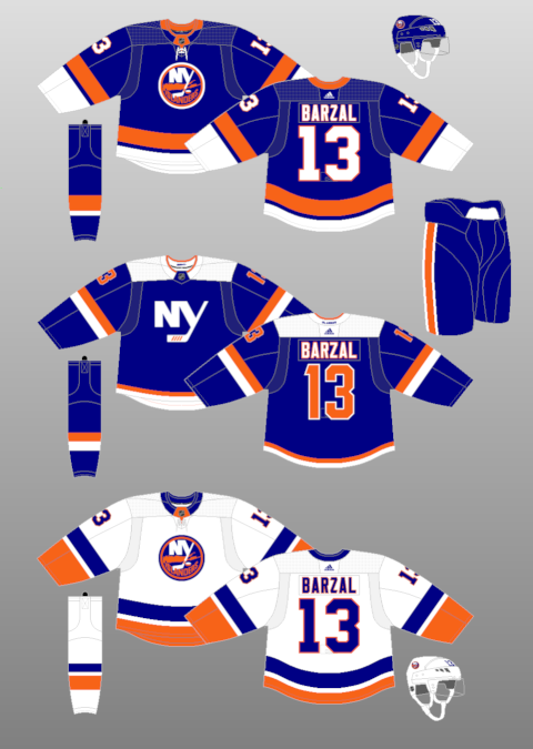
I adore it when blue and orange are paired together effectively. The Oilers used to do it well in their uniforms and it was the one part of that team that I was a fan of. But nobody will ever top the Islanders, with their iconic logo and massive waist striping. If there's one thing I would change about the home jersey, it might be the weirdly-shaped Adidas-brand collar, but otherwise, the colours play off each other so effectively and it looks so cohesive on the ice.
The alternate is decent, although I'm not sure if I'm sold on the wordmark. But the squared-off shoulder isn't awful and I actually dig the orange numbers. I also really love the arm striping, although the waist leaves a bit to be desired.
9. Montreal Canadiens
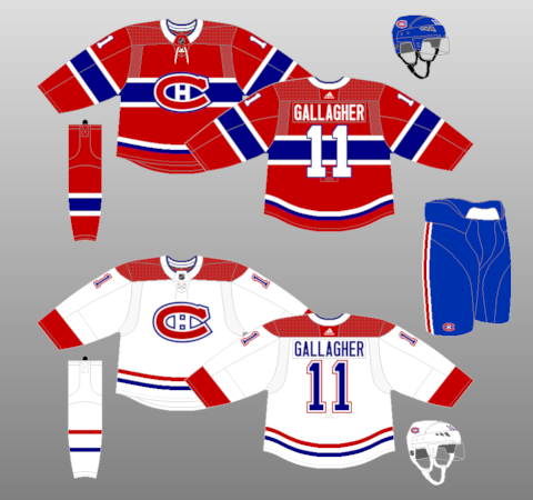
There would be literal riots in the streets if this design ever changed, and for good reason. The blue stripe on the home jersey isn't just iconic, it's a genuinely great piece of design and I really love how it looks. The toilet seat collar on the home uniform is an issue, and we'll talk more about that with a future entry, but otherwise, it's really hard to pick apart the
bleu, blanc, et rouge. Unlike the Leafs and Red Wings, this classic uniform certainly isn't boring.
That said... I would love to see a blue alternate jersey tried one day, probably with a white stripe behind the iconic CH logo and lots of red accents, too. Am I crazy? Or maybe something like this?
Eh, who knows.