Calgarypuck Forums - The Unofficial Calgary Flames Fan Community

Go Back   Calgarypuck Forums - The Unofficial Calgary Flames Fan Community > Main Forums > Fire on Ice: The Calgary Flames Forum
Register Forum Rules FAQ Community Calendar Today's Posts Search

Reply
 
Thread Tools Search this Thread
Old 07-25-2020, 09:39 PM   #61
timbit
Franchise Player
 
Join Date: Jun 2005
Exp:
Default

Quote:
Originally Posted by TheScorpion View Post
That's very kind of you to say.

Part III will be up this evening followed by the top eight tomorrow.
Waiting....
timbit is offline   Reply With Quote
Old 07-26-2020, 03:25 AM   #62
TheScorpion
First round-bust
 
TheScorpion's Avatar
 
Join Date: Feb 2015
Location: speculating about AHL players
Exp:
Default

Got called in to do a graveyard shift at work. Part III will have to wait, sorry guys.
__________________
Need a great deal on a new or pre-owned car? Come see me at Platinum Mitsubishi — 2720 Barlow Trail NE

TheScorpion is offline   Reply With Quote
Old 07-26-2020, 04:45 AM   #63
Poe969
Franchise Player
 
Poe969's Avatar
 
Join Date: Jun 2009
Location: Thunder Bay Ontario
Exp:
Default

Jerseys now a days suck in comparison to the older ones. So many retro jerseys are so popular because the new ones such. Look at thise kings jerseys, they are so "blah" and the current Flames ones such IMO, everyone wants retros. Bright, bold and not over designed.

Retro Flames, retro devils, retro ducks, north stars, nordiques, whalers...the list keeps going. So many old jerseys were just better, I can't think of a newer jersey that is really good.
__________________
Fan of the Flames, where being OK has become OK.
Poe969 is offline   Reply With Quote
The Following 4 Users Say Thank You to Poe969 For This Useful Post:
Old 07-26-2020, 06:16 AM   #64
Scroopy Noopers
Pent-up
 
Scroopy Noopers's Avatar
 
Join Date: Mar 2018
Location: Plutanamo Bay.
Exp:
Default

Quote:
Originally Posted by Poe969 View Post
Jerseys now a days suck in comparison to the older ones. So many retro jerseys are so popular because the new ones such. Look at thise kings jerseys, they are so "blah" and the current Flames ones such IMO, everyone wants retros. Bright, bold and not over designed.

Retro Flames, retro devils, retro ducks, north stars, nordiques, whalers...the list keeps going. So many old jerseys were just better, I can't think of a newer jersey that is really good.
Devils have to bring back the green. Those are great.

I don’t understand how the ducks fixed their logo issue, but abandoned the colours that made it great. We need more purple in the league, great colour and only one team uses it.
Scroopy Noopers is offline   Reply With Quote
Old 07-26-2020, 07:24 AM   #65
N-E-B
Franchise Player
 
N-E-B's Avatar
 
Join Date: Dec 2011
Location: Calgary
Exp:
Default

Couldn’t agree with you more on the Avs 3rd jersey. I don’t get the hype either. I think the white shoulders completely ruin the jersey and it has the ugly flags on it. It’s an absolute train wreck of a jersey.
N-E-B is offline   Reply With Quote
Old 07-26-2020, 07:44 AM   #66
White Out 403
Franchise Player
 
White Out 403's Avatar
 
Join Date: Jan 2013
Location: Cape Breton Island
Exp:
Default

Sens before leafs? Wow strong disagree. Leafs suck and their fans suck but they're top 10 jerseys for sure... And Ottawa probably belongs in the 20 to 25 range.

You haven't picked Tampa yet so if they're anywhere near top 10 your leafs pick is going to look like Toronto hate. Which I guess I get.
__________________
White Out 403 is offline   Reply With Quote
Old 07-26-2020, 08:04 AM   #67
Scroopy Noopers
Pent-up
 
Scroopy Noopers's Avatar
 
Join Date: Mar 2018
Location: Plutanamo Bay.
Exp:
Default

Quote:
Originally Posted by White Out 403 View Post
Sens before leafs? Wow strong disagree. Leafs suck and their fans suck but they're top 10 jerseys for sure... And Ottawa probably belongs in the 20 to 25 range.

You haven't picked Tampa yet so if they're anywhere near top 10 your leafs pick is going to look like Toronto hate. Which I guess I get.
Tampa is 31, first post.
Scroopy Noopers is offline   Reply With Quote
The Following User Says Thank You to Scroopy Noopers For This Useful Post:
Old 07-26-2020, 09:04 AM   #68
TOfan
#1 Goaltender
 
Join Date: Aug 2004
Exp:
Default

I'm baffled by the decisions made for the Flames jerseys. I definitely agree that their current home and aways are in the bottom 1/3 of the league. The decision to add the flags on the shoulder smacks of pandering to the fans, or maybe even politicians for arena funding, in an very thin way. Who are they trying to curry favour with? Or did they just want to say 'we love Alberta and Canada so much, we just needed to remind everyone'. Barf. Easily the most distasteful move the Flames have ever tried to pull off. Not only that, this always struck me as a very Canucks like thing to do to try and sell more jerseys.

retro's on th other hand are top 1/3. I believe these are going to be the home and aways moving forward and it's about time. They won the cup on those jerseys. They can get as cute as they want with their thirds, but let's just leave the retros alone, please? Exercise some authenticity?
TOfan is offline   Reply With Quote
The Following 4 Users Say Thank You to TOfan For This Useful Post:
Old 07-26-2020, 09:23 AM   #69
TheScorpion
First round-bust
 
TheScorpion's Avatar
 
Join Date: Feb 2015
Location: speculating about AHL players
Exp:
Default

I don't hate the Leafs at all... I have a soft spot for them and their logo is a lot better than Tampa's. But their jerseys are very very similar, and I don't like either design.
__________________
Need a great deal on a new or pre-owned car? Come see me at Platinum Mitsubishi — 2720 Barlow Trail NE

TheScorpion is offline   Reply With Quote
Old 07-26-2020, 07:50 PM   #70
timbit
Franchise Player
 
Join Date: Jun 2005
Exp:
Default

Quote:
Originally Posted by TheScorpion View Post
I don't hate the Leafs at all... I have a soft spot for them and their logo is a lot better than Tampa's. But their jerseys are very very similar, and I don't like either design.
Scorp, will you be coming up with more rankings tonight?
timbit is offline   Reply With Quote
Old 07-26-2020, 07:55 PM   #71
White Out 403
Franchise Player
 
White Out 403's Avatar
 
Join Date: Jan 2013
Location: Cape Breton Island
Exp:
Default

Quote:
Originally Posted by Scroopy Noopers View Post
Tampa is 31, first post.
Oh #### I suck
__________________
White Out 403 is offline   Reply With Quote
Old 07-26-2020, 08:04 PM   #72
Scroopy Noopers
Pent-up
 
Scroopy Noopers's Avatar
 
Join Date: Mar 2018
Location: Plutanamo Bay.
Exp:
Default

Quote:
Originally Posted by White Out 403 View Post
Oh #### I suck
No, Tampa sucks.

I’ll hold my opinion of you neutral until after the play in.
Scroopy Noopers is offline   Reply With Quote
Old 07-26-2020, 08:20 PM   #73
TheScorpion
First round-bust
 
TheScorpion's Avatar
 
Join Date: Feb 2015
Location: speculating about AHL players
Exp:
Default

Quote:
Originally Posted by timbit View Post
Scorp, will you be coming up with more rankings tonight?
Yes. About to begin writing them now. I have a day off tomorrow!
__________________
Need a great deal on a new or pre-owned car? Come see me at Platinum Mitsubishi — 2720 Barlow Trail NE

TheScorpion is offline   Reply With Quote
The Following 3 Users Say Thank You to TheScorpion For This Useful Post:
Old 07-26-2020, 10:34 PM   #74
TheScorpion
First round-bust
 
TheScorpion's Avatar
 
Join Date: Feb 2015
Location: speculating about AHL players
Exp:
Default

Part III!

16. San Jose Sharks
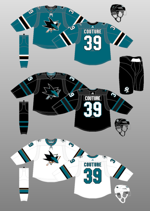


These uniforms are simple and largely effective. I wonder why the Sharks even bother with the cameo of orange in the arm and sock striping of their primary uniforms? I guess the colour makes a brief appearance in the logo, but it seems slightly misplaced amidst the otherwise relatively basic colour scheme. It used to be far worse (see their late 2000s uniforms), so this is an improvement. I will say I probably prefer the primary uniform design the Sharks wore in the late 1990s and early 2000s (AKA the one Owen Nolan sported on the cover of NHL 2001), but they aren't a massive step up from these.

As was the case with their old uniforms, the Sharks' best sweater is their black alternate. The minimalistic inclusion of teal in the uniform causes every little detail to pop. It's really sharp.

15. Minnesota Wild
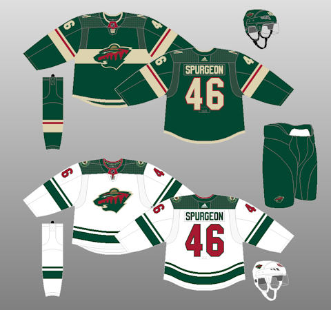


As usual, Minnesota finds itself smack-dab in the middle of the rankings. The Wild have a stupid name but an otherwise cool logo, and their white uniform boasts one of the only squared-off shoulder yokes in the league that actually doesn't bother me all that much. I like the increased emphasis placed on beige in their Adidas sweater, too, although I'm not sure if I'm a huge fan of the stripe going behind the logo. I might have tried out some waist striping instead, similar to the design on the road jersey (but with the same red line as in the arms of the green uniform -- I find that a strong element).

I always used to be partial to Minnesota's old red sweaters and I would like to see a reworked, cleaner version of them made into an alternate at some point in the future. Failing that, I wonder if a beige uniform could ever be in the cards? Done right, it could be stunning... done wrong, it could be a laughingstock.

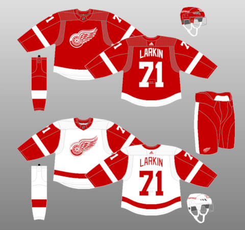
14. Detroit Red Wings


Blasphemous, I know.

Detroit hasn't changed their sweaters substantially since Yzerman arrived in 1983 and, honestly, they probably shouldn't, ever. There's nothing wrong with them. The logo is neat, the lettering on the back is cool (I like how it arches), and the striping, while basic, is classic and will never change.

That said... when I think of uniforms I love, I think of something with a bit of personality. I don't see a lot of that, here. I see something very basic with only two colours that hasn't changed in forever because, why should it? If it ain't broke... well, you don't want to see a Detroit "New York Fishticks" Red Wings jersey.

I just find it hard to get all that excited about Detroit's sweaters. It's the same as with Toronto. This ranks higher because I think the logo is better and I think this uniform has more unique quirks (the arched lettering, the opposite-side captaincy patches) that set it apart.

13. Boston Bruins
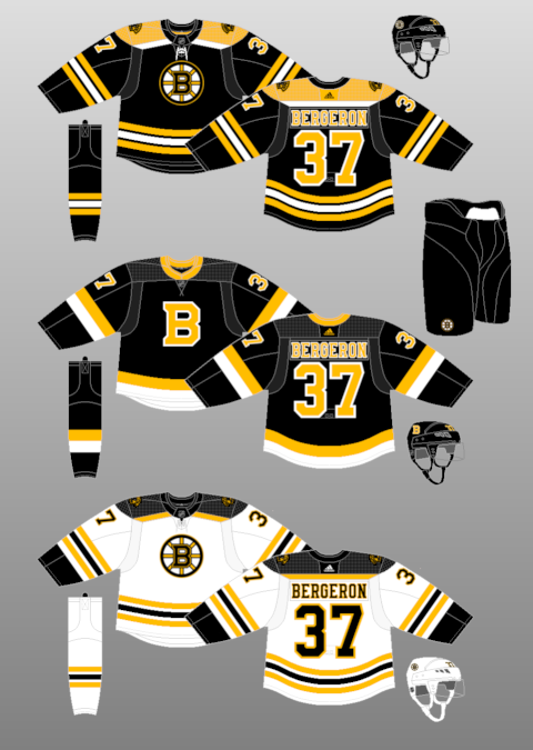


Boston has won a lot of games in this uniform, but I think it's one of the least effective designs they've ever worn from an aesthetic standpoint. I don't like the namebar font at all... I find it's too cluttered. There's too much going on. I prefer a nice and simple font that I can read easily and that looks clean and polished. Boston decided around a decade ago to add serifs and excessive accent colours to the lettering on their uniforms. Not only that, but they decided to add those same busy elements to their crest logo. It used to be a LOT worse (seriously, check out the font on their Reebok black home jersey... yikes), but it's still not good.

That said... I have very high expectations for the Bruins because their uniforms from the Ray Bourque era are still some of my favourites ever worn in professional sports. I love black uniforms and I find yellow is the perfect accent colour to use with black. Pittsburgh's current uniforms combine these two colours to marvellous effect. They're clean, classic, and full of contrast. Boston's uniforms nail the colour scheme, but they're more cluttered than they need to be and, because of that, they lose a lot of their classic appeal.

I don't even want to talk about the alternate jersey. Good lord. It's awful. I hate the striping and the collar.

12. Columbus Blue Jackets
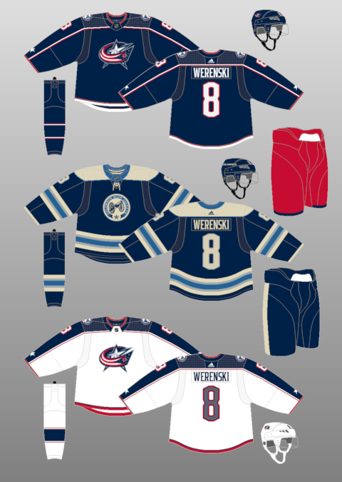


Aha, yes! See how effective a shoulder yoke can be when it continues down the arms? Ten points to Columbus' road sweater for creating a cohesive top section of the uniform. It looks great.

Look, I know this is kind of a weird pick, especially given that the Jackets' sweaters look super boring on paper and I've repeatedly expressed my distaste for boring uniforms, but I find these jerseys look phenomenal on the ice and are a huge upgrade over their Reebok Edge threads. The red pants are great and they allow the team to go perfectly subtle with the red on the jersey and the socks. And I'm a huge fan of the lettering.

Obviously, the real star here is the alternate uniform. The cream and powder blue work together so effectively while also allowing the navy to actually pop.

11. New York Rangers
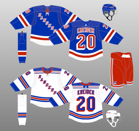


The Rangers are another team that haven't changed their look in a billion years. I really like these uniforms. The only real complaint I have about the home uniform is I would probably try to change the waist striping to match the template from the white jersey. But Once again, I love the red pants with both sweaters... they're surprisingly seamless and a perfect dose of New York flair.

Where Detroit's look is classic but lacks personality, the Rangers' uniforms are bursting at the seams with unique traits. The diagonal crest is obvious, but I also have a massive soft spot for the unique 3-D font and the striping on the pants. I haven't really made up my mind on how I feel about the shoulder yoke on the white jersey, but I do love how it incorporates a miniaturized version of the waist stripes. Great touch.

10. New York Islanders
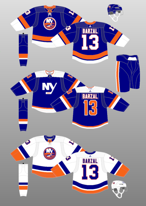


I adore it when blue and orange are paired together effectively. The Oilers used to do it well in their uniforms and it was the one part of that team that I was a fan of. But nobody will ever top the Islanders, with their iconic logo and massive waist striping. If there's one thing I would change about the home jersey, it might be the weirdly-shaped Adidas-brand collar, but otherwise, the colours play off each other so effectively and it looks so cohesive on the ice.

The alternate is decent, although I'm not sure if I'm sold on the wordmark. But the squared-off shoulder isn't awful and I actually dig the orange numbers. I also really love the arm striping, although the waist leaves a bit to be desired.

9. Montreal Canadiens
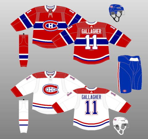


There would be literal riots in the streets if this design ever changed, and for good reason. The blue stripe on the home jersey isn't just iconic, it's a genuinely great piece of design and I really love how it looks. The toilet seat collar on the home uniform is an issue, and we'll talk more about that with a future entry, but otherwise, it's really hard to pick apart the bleu, blanc, et rouge. Unlike the Leafs and Red Wings, this classic uniform certainly isn't boring.

That said... I would love to see a blue alternate jersey tried one day, probably with a white stripe behind the iconic CH logo and lots of red accents, too. Am I crazy? Or maybe something like this?

Spoiler!


Eh, who knows.
__________________
Need a great deal on a new or pre-owned car? Come see me at Platinum Mitsubishi — 2720 Barlow Trail NE


Last edited by TheScorpion; 07-26-2020 at 10:46 PM.
TheScorpion is offline   Reply With Quote
The Following 2 Users Say Thank You to TheScorpion For This Useful Post:
Old 07-26-2020, 11:19 PM   #75
Gizmo
Backup Goalie
 
Gizmo's Avatar
 
Join Date: Jun 2006
Location: Ricci's Ugly
Exp:
Default

Love the work you've put into this, Scorpion. Don't agree with all of it (Sens jerseys not being in last spot takes priority, but it seems that they've taken this into their own hands.
2-D will look good on them again), but any thread you can fire up while getting this many people engaged is something to be proud of on this forum.
Gizmo is offline   Reply With Quote
The Following User Says Thank You to Gizmo For This Useful Post:
Old 07-26-2020, 11:39 PM   #76
Strange Brew
Franchise Player
 
Strange Brew's Avatar
 
Join Date: Sep 2011
Exp:
Default

Love the work here Scorp. There are some great uni’s in this tranche for sure. I have always liked the Islanders logo, but not the uniforms so much.

Seeing a lot of these makes you realize how many beautiful team logos and uniforms are based on rather generic team names which have stood the test of time. Makes me wish Seattle had gone with a classic name like the Emeralds. But that’s off topic I guess.
Strange Brew is offline   Reply With Quote
Old 07-26-2020, 11:50 PM   #77
btimbit
Franchise Player
 
btimbit's Avatar
 
Join Date: Sep 2012
Location: St. George's, Grenada
Exp:
Default

Fun reading so far, I personally have Boston in the top 10, but as long as you have St Louis and Chicago in the top 5, I'll forgive you
btimbit is offline   Reply With Quote
Old 07-27-2020, 01:02 AM   #78
FireGilbert
Franchise Player
 
FireGilbert's Avatar
 
Join Date: Sep 2013
Location: Brisbane
Exp:
Default

Whoa lots of curve balls this round. 4 original 6 teams plus the Wild, Sharks, and Isles who all have popular jerseys. Definitely interested in seeing your final rankings later and comparing with my own.
__________________
The masses of humanity have always had to surf.
FireGilbert is offline   Reply With Quote
Old 07-27-2020, 09:46 AM   #79
powderjunkie
Franchise Player
 
Join Date: Dec 2011
Exp:
Default

Quote:
Originally Posted by TheScorpion View Post

That said... I would love to see a blue alternate jersey tried one day, probably with a white stripe behind the iconic CH logo and lots of red accents, too. Am I crazy? Or maybe something like this?

Spoiler!


Eh, who knows.
Don't love the photo for the alternate, but I think you're on to something with your description. I think the logo needs to remain totally unchanged. But the more I think about it, any attempt is going to end up offensive.

Any attempt for blue should base around the top left:


Perhaps red pants & helmet with blue socks (white/red pipe)
powderjunkie is offline   Reply With Quote
Old 07-27-2020, 05:36 PM   #80
TheScorpion
First round-bust
 
TheScorpion's Avatar
 
Join Date: Feb 2015
Location: speculating about AHL players
Exp:
Default

8. Chicago Blackhawks


The toilet seat collar is no more, restoring the Blackhawks' jersey design to its past visual splendour. The striping and lettering on both jerseys is beautiful and I would like it to remain as it is for the foreseeable future.

But I have a couple main complaints. First of all, I don't know how I feel about the logo. The ethics of using a Native American as the mascot of a sports team have been close to the forefront of the news cycle about professional sports in recent weeks and months. I know many people have many different opinions about how offensive or insensitive the Blackhawks' primary crest is. It's certainly an iconic look, but with Cleveland's baseball team and Washington DC's football team ditching their long-standing logos in recent years, I'm curious about whether Chicago's will be subjected to the same degree of scrutiny. I think it looks less offensive than the former Washington and Cleveland logos, but that doesn't mean it's not offensive. I wonder how much the overall quality of the uniform would change if the shoulder logo was used in place of the current crest.

Secondly, I wish Chicago would bring back their old black uniform. I think it outstrips the quality of the red design by a decent amount. I love red and white striping on a black uniform.

I don't have much to say about the ethics debate surrounding the Blackhawks' logo. I'm not sure if it's offensive or not, and I really don't think it's my place to say whether it's acceptable. But as it stands, I think it is a well-designed uniform set.
__________________
Need a great deal on a new or pre-owned car? Come see me at Platinum Mitsubishi — 2720 Barlow Trail NE

TheScorpion is offline   Reply With Quote
Reply


Posting Rules
You may not post new threads
You may not post replies
You may not post attachments
You may not edit your posts

BB code is On
Smilies are On
[IMG] code is On
HTML code is Off

Forum Jump


All times are GMT -6. The time now is 02:11 AM.

Calgary Flames
2024-25


Powered by vBulletin® Version 3.8.4
Copyright ©2000 - 2025, Jelsoft Enterprises Ltd.
Copyright Calgarypuck 2021 | See Our Privacy Policy