06-01-2016, 12:55 PM
|
#1361
|
|
Powerplay Quarterback
|
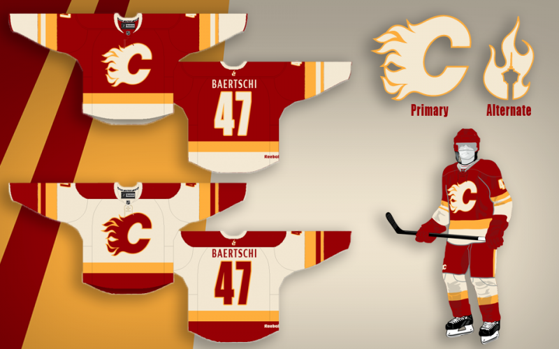
Was looking at the Adidas jerseys for the World Cup and thought I'd play around with the template and semi-predict what we might see for the Flames based on those designs. The thirds are based off of the NA young stars. Looking forward to saying goodbye to vertical panels and piping!
Note: Still need to work on making the gold/yellow not look so washed out and mustardy looking!

|

|

|
|
The Following 4 Users Say Thank You to Scary Eloranta For This Useful Post:
|
|
|
06-01-2016, 12:59 PM
|
#1362
|
|
First Line Centre
Join Date: Oct 2014
Location: Vancouver, B.C.
|
Quote:
Originally Posted by Scary Eloranta

Was looking at the Adidas jerseys for the World Cup and thought I'd play around with the template and semi-predict what we might see for the Flames based on those designs. The thirds are based off of the NA young stars. Looking forward to saying goodbye to vertical panels and piping!
Note: Still need to work on making the gold/yellow not look so washed out and mustardy looking!
|
Those are pretty sweet? Are we getting new Jerseys or something? New thirds anyways?
|
|
|
|
|
06-01-2016, 01:00 PM
|
#1363
|
|
Franchise Player
|
Quote:
Originally Posted by Scary Eloranta
Was looking at the Adidas jerseys for the World Cup and thought I'd play around with the template and semi-predict what we might see for the Flames based on those designs. The thirds are based off of the NA young stars. Looking forward to saying goodbye to vertical panels and piping!
Note: Still need to work on making the gold/yellow not look so washed out and mustardy looking!
|
I like these a lot.
|

|
|
|
06-01-2016, 01:37 PM
|
#1365
|
|
Lifetime Suspension
Join Date: Sep 2006
Location: home, calgary
|
Quote:
Originally Posted by Scary Eloranta
Thought I'd try full uni templates and show some bolder designs in the way of striping, etc. Thanks for all the feedback so far guys!
 |
Make these and take my money.
Thank you.
|
|
|
|
|
The Following 8 Users Say Thank You to cgy2london For This Useful Post:
|
|
|
06-01-2016, 01:42 PM
|
#1366
|
|
Franchise Player
Join Date: Jun 2009
Location: Thunder Bay Ontario
|
It looks like whoever made those concept jerseys is banking on Perron being on the team?
I like these last ones a lot too.
__________________
Fan of the Flames, where being OK has become OK.
|
|
|
|
|
06-02-2016, 04:46 PM
|
#1367
|
|
Franchise Player
Join Date: Aug 2004
Location: Conquering the world one 7-11 at a time
|
Quote:
Originally Posted by Scary Eloranta
|
These look like pyjamas. Not a shot at your design attempt, I just think the adidas jerseys look like something a 14 year old threw together in his basement with iron-on transfers.
__________________
"There will be a short outage tonight sometime between 11:00PM and 1:00AM as network upgrades are performed. Please do not panic and overthrow society. Thank you."
|
|
|
|
|
06-03-2016, 10:52 AM
|
#1368
|
|
Franchise Player
Join Date: Sep 2011
Location: The toilet of Alberta : Edmonton
|
Quote:
Originally Posted by Scary Eloranta
|
Love the 3rd because the diagonal striping on the arms and the bottom match. On the standards I think it needs to be the same. Either both diagonal, or both straight, not one of each. But generally, those are sick sick jerseys.
__________________
"Illusions Michael, tricks are something a wh*re does for money ....... or cocaine"
|
|
|
|
|
The Following User Says Thank You to MisterJoji For This Useful Post:
|
|
|
06-03-2016, 09:55 PM
|
#1369
|
|
Franchise Player
Join Date: Jul 2009
Location: Red Deer
|
This thread is the epitome of 'you can't please everyone'.
__________________
"It's a great day for hockey."
-'Badger' Bob Johnson (1931-1991)
"I see as much misery out of them moving to justify theirselves as them that set out to do harm."
-Dr. Amos "Doc" Cochran
|
|
|
|
|
The Following 3 Users Say Thank You to Yamer For This Useful Post:
|
|
|
06-03-2016, 10:39 PM
|
#1370
|
|
Franchise Player
Join Date: Sep 2015
Location: Paradise
|
Quote:
Originally Posted by Scary Eloranta
Thought I'd try full uni templates and show some bolder designs in the way of striping, etc. Thanks for all the feedback so far guys!
|
These are Uber cool. I would pick up a home and a third I think.
Nice work!
Last edited by Samonadreau; 06-03-2016 at 10:41 PM.
|
|
|
|
|
The Following User Says Thank You to Samonadreau For This Useful Post:
|
|
|
06-04-2016, 09:17 PM
|
#1371
|
|
Franchise Player
Join Date: Jul 2005
Location: SW Ontario
|

Quote:
Originally Posted by sun
Dunno about that. If they brought back the retros, they would have a pretty big win on their hands as 70% of this board considers them the best in franchise history. The other 30% are probably stuck in the early 2000s Town of Dissen where everything is black and eyeliner'd. If you're making 70% of your most rabid fanbase very, very happy, I think that would about as big of a slam dunk as any brand could ever hope for. This is a subset of your fanbase that is so obsessed with your product that they sign up to a message board to talk about it with other nerds and rack up tens of thousands of posts debating which #6D isn't getting enough ice time. A section of your fanbase that buys Flames branded crockpots. Who have avatars of their children wearing Flames gear the INSTANT they are out of the womb. Who buy David Jones, Todd Bertuzzi, and TJ Galiardi jerseys (seriously, all one guy). Who dress up like the short-lived mascot of the FARM TEAM. Give the people what they want, goddammit!
If this thread paints a pretty good picture of anything, it's a picture of design-by-committee being No Good. Especially if the committee has little to no design experience. I'm not referring to those whipping up concepts - I find them interesting too. But when everyone pitches in their own idea, you end up with the current abysmal thirds. Scary Eloranta, can you add some speed holes? I think they'd really jazz things up a bit and really make it pop!
|
You mean give you what you want right? You can whine about retro's all you want but it isn't happening. And black is an official team colour so suck it up and get used to it.
|
|
|
|
|
06-04-2016, 10:33 PM
|
#1372
|
|
#1 Goaltender
Join Date: Aug 2011
Location: Not cheering for losses
|
Quote:
Originally Posted by dissentowner
You mean give you what you want right? You can whine about retro's all you want but it isn't happening. And black is an official team colour so suck it up and get used to it.
|
Yeah, me and 70% of the posters on this board want them, crumb bum. My post from three months ago was referencing a poll on this board where the retros were the overwhelming favourite.
I'm used to black being an official colour, it's been that way due to an unfortunate, near sighted marketing ploy in the mid 90s to appeal to people who thought black was Pretty Hardcore. The Flames joined the myriad of teams with similar colours, weakening the brand and the general aesthetics of the kit. Unfortunately, black has been a part of the jerseys for longer than it hasn't and people stuck in the 90s totally dig it. That doesn't mean it was a dumb, ugly, incorrect, goofy looking, lame-o choice, made by the same team that made the flaming snot jersey, the pedestal jersey, and the little-bit-of-everything jersey with the cowboy shoulders.
|
|
|
|
|
The Following 2 Users Say Thank You to sun For This Useful Post:
|
|
|
06-04-2016, 10:41 PM
|
#1373
|
|
Lifetime Suspension
|
Quote:
Originally Posted by Scary Eloranta
Thought I'd try full uni templates and show some bolder designs in the way of striping, etc. Thanks for all the feedback so far guys!
|
I think these are the best home/away concept jerseys ive seen yet. Well done!
|
|
|
|
|
The Following User Says Thank You to Chonger For This Useful Post:
|
|
|
06-06-2016, 01:12 AM
|
#1374
|
|
Scoring Winger
|
Quote:
Originally Posted by Split98
|
Bumped so my two favorite mock ups (Scary's as the other) can be viewed at the same time.
|
|
|
|
|
The Following 4 Users Say Thank You to morgin For This Useful Post:
|
|
|
06-06-2016, 11:46 AM
|
#1375
|
|
Franchise Player
|
It's funny how soccer clubs change their jerseys annually, but it takes hockey clubs a decade to do so. Real Madrid doesn't earn those bazillions by selling the same shirt year after year.
The Flames have what, 4 sets in the past 36 years?
|
|
|
|
|
The Following 21 Users Say Thank You to Scary Eloranta For This Useful Post:
|
Bingo,
Coach,
codynw,
Domoic,
Drak,
drewtastic,
Fire,
Flames_F.T.W,
Funkhouser,
gilligans_off,
Icon,
JonDuke,
Kidder,
Lonestar,
M*A*S*H 4077,
MisterJoji,
SnipeShow,
TBone290,
tknez16,
underGRADFlame,
Wolfman
|
|
06-06-2016, 09:48 PM
|
#1377
|
|
damn onions
|
Quote:
Originally Posted by CroFlames
It's funny how soccer clubs change their jerseys annually, but it takes hockey clubs a decade to do so. Real Madrid doesn't earn those bazillions by selling the same shirt year after year.
The Flames have what, 4 sets in the past 36 years?
|
Actually, some of the best uniforms are the ones that don't change.
Montreal, Chicago, Detroit, Boston, New York Rangers, New Jersey Devils, hell even Toronto's... noticing a theme? All classic jerseys that haven't had to change or if they've had it's been slight. Some of those teams have changed their uniforms, but not really in a long time in a material way.
Look at the Flames, if they'd just left the damn thing alone they'd have the nicest uniforms in the NHL. The large majority on this site want the retro's. The Oilers look best in their originals. A lot of the original jersey's are often the best. Ottawa's, San Jose's, Dallas', Pittsburgh's, Philadelphia's... on and on.
|
|
|
|
|
The Following User Says Thank You to Mr.Coffee For This Useful Post:
|
|
|
06-06-2016, 09:48 PM
|
#1378
|
|
Powerplay Quarterback
Join Date: Mar 2014
Location: MTL
|
Quote:
Originally Posted by Scary Eloranta
If the Flames insist on keeping black as team color maybe they can tone it back at least and make it more of an accent? Maybe something like this?
 |
Dude, please get a job wih the Flames...somehow
(if only Ken King knew that he should read this thread)
|
|
|
|
|
The Following User Says Thank You to Funkhouser For This Useful Post:
|
|
|
06-06-2016, 09:51 PM
|
#1379
|
|
damn onions
|
I know what you're saying about trying to incorporate black, but drop the black on those and improve them 100 fold. Also add an outline of gold to the collar and number outlines.
|
|
|
|
|
06-06-2016, 10:01 PM
|
#1380
|
|
#1 Goaltender
|
Quote:
Originally Posted by Scary Eloranta
If the Flames insist on keeping black as team color maybe they can tone it back at least and make it more of an accent? Maybe something like this?
|
The issue is bigger than the jersey though. It's the black gloves, pants, and helmets.
The team looks so much better in red
|
|
|
|
 Posting Rules
|
You may not post new threads
You may not post replies
You may not post attachments
You may not edit your posts
HTML code is Off
|
|
|
All times are GMT -6. The time now is 09:32 PM.
|
|