 02-03-2016, 11:07 AM
|
#1181
|
|
Lifetime Suspension
|
This last concept looks fabulous!
|

|

|
|
02-03-2016, 11:07 AM
|
#1182
|
|
Lifetime Suspension
Join Date: Jul 2003
Location: Calgary, Alberta
|

Quote:
Originally Posted by Dr. Pepper

With TO's logo redesign coming out last night, I decided to see where this thread was at - some interesting posts lately.
Like some of you, I would very much like to return to the classic look of the Flames, but not exactly the 80's jersey's per se - they look a little too much like pajama's to me - especially the red/red/red/red combo with helmet/jersey/pants/socks - hell even the gloves were red - too much like a giant blood clot. Also - I think the majority of us don't like the current piping and usage of flags on the shoulders. Also - although I don't like the current over-use of black, I think it's a good contrast or outlining color with our classic red/yellow/white colors. Also - while not a huge fan of our new 3rd jersey - the new alternate round logo is pretty great. So I went over to icethetics to see what was new and found these which, while I have a few quibbles with, would look pretty great I think:


What do you all think? |
I hate the jersey lettering.
|
|
|
|
|
02-03-2016, 11:09 AM
|
#1183
|
|
Franchise Player
|
The away jersey needs to have the number/letters and logo the same colour. It looks weird the way it is.
Otherwise they're not bad. The font on the back could be better.
|
|
|
|
|
The Following User Says Thank You to codynw For This Useful Post:
|
|
|
02-03-2016, 11:15 AM
|
#1184
|
|
Lifetime Suspension
Join Date: Jul 2003
Location: Calgary, Alberta
|
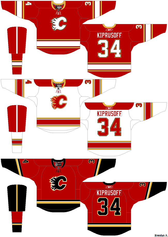
This is the best concept, IMO. It has a slight black trim but maintains the traditional red gloves, helmet, and pants.
|
|
|
|
|
The Following 2 Users Say Thank You to the_only_turek_fan For This Useful Post:
|
|
|
02-03-2016, 12:00 PM
|
#1185
|
Participant  |
Quote:
Originally Posted by the_only_turek_fan
This is the best concept, IMO. It has a slight black trim but maintains the traditional red gloves, helmet, and pants.
|
I hate the lettering.
Want to make your jersey look immediately dated and "retro"? Go with clunky varsity lettering. Versions of it work but that version is ugly.
Dr.Pepper's concept is fantastic. I agree that the lettering is also not ideal though, something similar to the 3rds or the all-stars.
As Mastodon said though, I think the color way (or at least the 3rd) could do with a heavy injection of cream.
|
|
|
|
|
The Following User Says Thank You to PepsiFree For This Useful Post:
|
|
|
02-03-2016, 12:08 PM
|
#1186
|
|
Franchise Player
Join Date: Sep 2011
Location: The toilet of Alberta : Edmonton
|
Jersey Ideas - Ken King please read
I'm married to the black C. The home reds with the white C just looks terrible in my eyes. The red C on the home reds that turek_fan made looks substantially better than the white.
__________________
"Illusions Michael, tricks are something a wh*re does for money ....... or cocaine"
|
|
|
|
|
02-03-2016, 12:12 PM
|
#1187
|
|
Franchise Player
Join Date: Jun 2009
Location: Thunder Bay Ontario
|
See, I'm of the exact opposite thinking. I really don't like the black C. I much prefer the red or white C and think the black on the jerseys is just too boring. The black logo just seems like it's burnt out...
__________________
Fan of the Flames, where being OK has become OK.
|
|
|
|
|
The Following 3 Users Say Thank You to Poe969 For This Useful Post:
|
|
|
02-03-2016, 12:15 PM
|
#1188
|
|
Franchise Player
Join Date: Dec 2011
Location: Calgary
|
I don't hate the black C but I would much prefer the white one. I think they should lose the black all together.
|
|
|
|
|
The Following 3 Users Say Thank You to N-E-B For This Useful Post:
|
|
|
02-03-2016, 12:36 PM
|
#1189
|
|
That Crazy Guy at the Bus Stop
Join Date: Jun 2010
Location: Springfield Penitentiary
|
I think pretty much all of these in the last few pages are better than our current home jerseys.
Except the popular one with tan in it that has been popping up for the last few years (feels like years). I've never liked that one. No offense to the person who designed it. It isn't ugly. I just think the off white/tan color is best left to the heritage jerseys.
|
|
|
|
|
02-03-2016, 03:21 PM
|
#1190
|
|
Lifetime Suspension
Join Date: Jul 2003
Location: Calgary, Alberta
|
|
|
|
|
|
The Following 9 Users Say Thank You to the_only_turek_fan For This Useful Post:
|
|
|
02-03-2016, 03:36 PM
|
#1191
|
|
Crash and Bang Winger
Join Date: May 2009
Location: Calgary
|
Hey Turek I saw those at icethetics too - seems pretty cool but I just don't think it's real possibility - right?
__________________
The Doctor is in
|
|
|
|
|
02-03-2016, 03:37 PM
|
#1192
|
|
Franchise Player
Join Date: Feb 2006
Location: Calgary, AB
|
They put the wrong logo on that Senators jersey.
__________________
Turn up the good, turn down the suck!
Last edited by getbak; 02-04-2016 at 07:19 PM.
|
|
|
|
|
The Following 14 Users Say Thank You to getbak For This Useful Post:
|
christoph186,
Dion,
Funkhouser,
Igottago,
Iveman,
Mattman,
MrMastodonFarm,
Mustache,
Nammer403,
redflamesfan08,
saskflames69,
Stringer Bell,
ToraToraTora,
vennegoor of hesselink
|
|
02-03-2016, 03:48 PM
|
#1193
|
|
Franchise Player
Join Date: Aug 2007
Location: Vancouver
|
Obviously just a Senator's jersey, but damn, that gold C actually looks great.
__________________

|
|
|
|
|
The Following User Says Thank You to Coach For This Useful Post:
|
|
|
02-03-2016, 03:54 PM
|
#1194
|
|
Lifetime Suspension
|
I'm hoping there will be a redesign for the Addidas rebrand the season after next. And that Ken King has nothing to do with it.
|
|
|
|
|
02-03-2016, 04:23 PM
|
#1195
|
|
Franchise Player
Join Date: Oct 2003
Location: Vancouver
|
The Flames are desperately in need of new jerseys. Get the home/away set right, and then plaster that scheme over all the branding related to the team. Do away with black C's and do away with the horrific third jersey. I actually feel like the team needs to instill some pride in how it presents itself again. New jerseys are essential.
__________________
A few weeks after crashing head-first into the boards (denting his helmet and being unable to move for a little while) following a hit from behind by Bob Errey, the Calgary Flames player explains:
"I was like Christ, lying on my back, with my arms outstretched, crucified"
-- Frank Musil - Early January 1994
|
|
|
|
|
02-03-2016, 04:50 PM
|
#1196
|
|
Franchise Player
Join Date: Oct 2006
Location: Calgary
|
Quote:
Originally Posted by Dr. Pepper
With TO's logo redesign coming out last night, I decided to see where this thread was at - some interesting posts lately.
Like some of you, I would very much like to return to the classic look of the Flames, but not exactly the 80's jersey's per se - they look a little too much like pajama's to me - especially the red/red/red/red combo with helmet/jersey/pants/socks - hell even the gloves were red - too much like a giant blood clot. Also - I think the majority of us don't like the current piping and usage of flags on the shoulders. Also - although I don't like the current over-use of black, I think it's a good contrast or outlining color with our classic red/yellow/white colors. Also - while not a huge fan of our new 3rd jersey - the new alternate round logo is pretty great. So I went over to icethetics to see what was new and found these which, while I have a few quibbles with, would look pretty great I think:
What do you all think? |
The only good thing about the current set of Flames jerseys is they have properly framed the bottom of the jersey. The lack of the stripe at the bottom makes the jersey look weird on the ice (watch Dallas play as their set has a similar set up as this mock)
If the jersey cut was the same as the ones prior to RBK, this would be fine. However, unless the bottom part of both jerseys matches the pants, this will look weird.
Also, on the top of the red jersey, perhaps make the shoulders black in the same area that the white one is red.
__________________
Fireside Chat - The #1 Flames Fan Podcast - FiresideChat.ca
|
|
|
|
|
02-03-2016, 05:30 PM
|
#1197
|
|
Franchise Player
Join Date: Jun 2006
Location: Calgary, Alberta
|
This thread has been going strong for over three years, and yet the Flames still won't change the primary jerseys.
When the hell is it going to get done? There's a crapton of money to be made from doing this. I would say it's fair to assume that a large portion of the consumer base would be down for new jerseys, and purchasing them. (As long as they're an obvious improvement over the current set)
|
|
|
|
|
02-04-2016, 12:10 PM
|
#1198
|
|
Lifetime Suspension
Join Date: Sep 2006
Location: home, calgary
|
New jerseys please!
My hope would be to use our 80's early 90's vintage threads as the regular home and away jerseys. Do whatever you want with the a third jersey, tons of good options provided in this thread, our current kit is so bad I would be happy with any update.
|
|
|
|
|
02-04-2016, 12:13 PM
|
#1199
|
|
Franchise Player
Join Date: Aug 2007
Location: Ontario
|
Quote:
Originally Posted by Joborule
This thread has been going strong for over three years, and yet the Flames still won't change the primary jerseys.
When the hell is it going to get done? There's a crapton of money to be made from doing this. I would say it's fair to assume that a large portion of the consumer base would be down for new jerseys, and purchasing them. (As long as they're an obvious improvement over the current set)
|
An answer I got from Ken was that our current third was in production. It seems like the process is very long and drawn out.
Once that 3rd was approved and rolled out, I'm sure rumblings around the offices were already started over a change in jersey manufacturer. I'm sure they knew about it well before it leaked to us.
Speculation, of course. But I'll bet they are waiting for the league-wide jersey shift to unveil a new jersey. I'd be shocked if the current threads continue into the new era.
|
|
|
|
|
02-04-2016, 05:51 PM
|
#1200
|
|
Franchise Player
|
Quote:
Originally Posted by Split98
An answer I got from Ken was that our current third was in production. It seems like the process is very long and drawn out.
Once that 3rd was approved and rolled out, I'm sure rumblings around the offices were already started over a change in jersey manufacturer. I'm sure they knew about it well before it leaked to us.
Speculation, of course. But I'll bet they are waiting for the league-wide jersey shift to unveil a new jersey. I'd be shocked if the current threads continue into the new era.
|
To add, I know Shanahan mentioned in a scrum yesterday about the new Leafs' logo is that the NHL and Reebok have an incredibly long process in changing logos and jerseys so I highly doubt it's the Flames' fault.
|
|
|
|
 Posting Rules
|
You may not post new threads
You may not post replies
You may not post attachments
You may not edit your posts
HTML code is Off
|
|
|
All times are GMT -6. The time now is 08:02 PM.
|
|


