|
View Poll Results: Hiow do you like the leaked jersey?
|
|
Like
|
   
|
185 |
24.03% |
|
Dislike
|
  
|
585 |
75.97% |
 10-06-2013, 02:01 PM
|
#221
|
|
aka Spike
Join Date: Sep 2004
Location: The Darkest Corners of My Mind
|
|

|

|
|
The Following User Says Thank You to CMPunk For This Useful Post:
|
|
|
10-06-2013, 02:06 PM
|
#222
|
|
First Line Centre
Join Date: May 2009
Location: Back in YYC....7 Years Later
|
Doesn't seem so bad now, does it?
|
|
|
|
|
The Following 13 Users Say Thank You to FlamesFanStrandedInEDM For This Useful Post:
|
Brad Marsh,
chalms04,
davidus_49,
Erick Estrada,
Flash Walken,
Hockey_Ninja,
jayswin,
kipperfan,
LeftWing,
Lego Man,
Peanut,
Stillman16,
undercoverbrother
|
|
10-06-2013, 02:08 PM
|
#223
|
|
First Line Centre
Join Date: May 2009
Location: Back in YYC....7 Years Later
|
They look like those cheap "Mighty Mac" youth jerseys you would of bought at Walmart or Zellers...
And also, the "leaked face" looks a lot like Kotalik....worse things to be unleaked?
|
|
|
|
|
10-06-2013, 02:10 PM
|
#224
|
|
Franchise Player
Join Date: Oct 2001
Location: Vancouver
|
I hate word marks. I don't mind the colour scheme though.
__________________
"A pessimist thinks things can't get any worse. An optimist knows they can."
|
|
|
|
|
10-06-2013, 02:11 PM
|
#225
|
|
Lifetime Suspension
|
These look like a jersey you'd buy at Wal-Mart for $7.98.
|
|
|
|
|
The Following User Says Thank You to puckluck2 For This Useful Post:
|
|
|
10-06-2013, 02:12 PM
|
#226
|
|
Lifetime Suspension
Join Date: Sep 2005
Location: The Void between Darkness and Light
|
Canuck fan friend: "Why would you change from the White C third jerseys? That's an all-time classic jersey."
*sigh*
|
|
|
|
|
The Following 3 Users Say Thank You to Flash Walken For This Useful Post:
|
|
|
10-06-2013, 02:17 PM
|
#227
|
|
Powerplay Quarterback
|
Quote:
Originally Posted by N-E-B

You people are impossible to please.
1. It's red, not yellow or black.
2. The shoulder patches are new and not flags
3. The striping is simple and clean
You all complained about it and now you got it. Quit complaining. It's fine jersey for a 3rd.
|
Agree completely. What a bunch of drama queens. You'd think everyone is being forced to buy one. I don't love the wordmark but really like the new shoulder patch, the yokes, and striping.
And as many have mentioned this is a rendering in a video game, let's see the real thing on the ice with the full kit.
__________________
"If the oceans was whiskey and I was a duck, I'd swim to the bottom and never come up, but the oceans ain't whiskey, and I ain't no duck, so I'll play the Jack of Diamonds and toast to my luck..."
|
|
|
|
|
The Following User Says Thank You to Jables16 For This Useful Post:
|
|
|
10-06-2013, 02:27 PM
|
#228
|
|
Franchise Player
Join Date: Feb 2006
Location: Calgary
|
I don't like them, but I'm not going to get too worked up about it. I vote with my dollars, so I won't be buying this jersey. I guess I'll be waiting on the next iteration of the alternate jersey (and there will be another one, since the Flames are in the business of making money), and then decide whether I'll be spending my money to support that one.
|
|
|
|
|
10-06-2013, 02:29 PM
|
#229
|
|
Franchise Player
Join Date: Mar 2012
Location: Sylvan Lake
|
I liked the outdoor ones, I think they should have kept them as a 3rd jersey.
This ones ####ing suck.
__________________
Captain James P. DeCOSTE, CD, 18 Sep 1993
Corporal Jean-Marc H. BECHARD, 6 Aug 1993
|
|
|
|
|
10-06-2013, 02:36 PM
|
#230
|
|
Lifetime Suspension
|
Quote:
Originally Posted by Mr.Coffee
disagree. I don't think people are impossible to please at all. Quite the opposite. You do a little research, check out what's in style, and then redesign the uniform to match that. If you read that other jersey thread, and you look at the comments in this thread, the majority of opinion is more or less straightforward IMO.
Because the Flames just do whatever they want, they end up with atrocities like this. And more importantly to the Flames, they'll end up selling less than they would have had they done the opposite.
|
What's in style? You mean like the generally well-liked Minnesota wordmark jersey? Or the clean lines and minimal piping that has been celebrated?
Interesting, two things which the Flames have,
|
|
|
|
|
10-06-2013, 02:47 PM
|
#231
|
|
Franchise Player
|
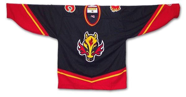
The proportions are way off.
The word "Calgary" utilizes awful script and the flaming C logo is way too small compared to the lettering. It looks like they just stuck the flaming C somewhere on the front of the jersey after they got the rest of the stuff on.
The flaming C logo even looks smaller than the "A" for assist.
And there is too much black. They need more yellow somewhere.
|
|
|
|
|
10-06-2013, 03:15 PM
|
#232
|
|
Franchise Player
Join Date: Feb 2010
Location: Park Hyatt Tokyo
|
|
|
|
|
|
The Following 10 Users Say Thank You to topfiverecords For This Useful Post:
|
|
|
10-06-2013, 03:17 PM
|
#233
|
|
Lifetime Suspension
|
Quote:
Originally Posted by playmaker
|
Seeing them like this it doesn't look too bad, I see what they were going for- and updated '04 jersey. It's too bad about the shoulders though. I wonder if that was a Reebok decision.
|
|
|
|
|
10-06-2013, 03:22 PM
|
#234
|
Join Date: Dec 2010
Location: Cleveland, OH (Grew up in Calgary)
|
Quote:
Originally Posted by Rejean31
For gawds sake, can we just quit trying to re-invent the wheel and go back to these!!!

 |
Those white jerseys are so pretty they make me wanna cry.
__________________
Just trying to do my best
|
|
|
|
|
10-06-2013, 03:31 PM
|
#235
|
|
Franchise Player
Join Date: Oct 2001
Location: Behind Nikkor Glass
|
Has EA or the Flames brass responded to the leaked jersey?
|
|
|
|
|
10-06-2013, 03:33 PM
|
#236
|
|
Franchise Player
Join Date: Oct 2001
Location: Behind Nikkor Glass
|
fyp.
Quote:
Originally Posted by Hockey_Ninja
Joey Mullen is so pretty, he makes me wanna cry.
|
|
|
|
|
|
The Following User Says Thank You to Regulator75 For This Useful Post:
|
|
|
10-06-2013, 03:45 PM
|
#237
|
|
Franchise Player
Join Date: Mar 2002
Location: Calgary
|
Quote:
Originally Posted by Rejean31
For gawds sake, can we just quit trying to re-invent the wheel and go back to these!!!
|
So you want a 3rd and 4th jersey?
Not sure how people are not grasping that this is a third jersey being released, a jersey that should have a different design, and has really nothing to do with the primary set.
Yes, the primary set should and will likely get redone in the next few years to hopefully/probably be more towards that retro look, but that has nothing to do with the creation or the design of a third jersey.
The retiring of the retro as a third makes that possibility of the retros being full time, down the road, a lot more realistic now, actually.
|
|
|
|
|
The Following 2 Users Say Thank You to browna For This Useful Post:
|
|
|
10-06-2013, 03:47 PM
|
#238
|
|
Franchise Player
Join Date: Feb 2006
Location: Calgary, AB
|

Quote:
Originally Posted by Mr.Coffee
Stuff like popping on this website, doing fan surveys, focus groups, looking around the league to see what sells best, doing market research.
|
Just because you weren't consulted doesn't mean they didn't do all those things.
As has already been mentioned in this thread, design by committee almost never results in the best design. You get the Ed Stelmach of designs, something no one really loves, but also something no one really hates. If you ask 20 people for their opinions, you're more likely to get a bunch of conflicting choices than you are to get one solid consensus.
What are the biggest complaints about the current jerseys? The flags; the vertical stripes on the torso; and the piping. All of those are gone from the new design.
As for best selling, I believe the Wild's green jersey (with "Minnesota" written in a stylized script) and the Sabres' anniversary jersey (with "Buffalo" written in a stylized script) both were well-received by their fans and sold very well.
It's not hard to imagine how this design came together...
1. Red must be the primary colour. Since the red jerseys were re-introduced in 2003, black has been the prominent secondary colour on the Flames red jersey and white and yellow have been compliments. This design should maintain that mix because it has been the identity the Flames have built around for a decade.
2. A return to tradition horizontal stripes on the jersey. Fans like the black-white-yellow-black stripe pattern introduced with the 2003 design. This jersey should maintain those stripes.
3. A new alternate logo for a shoulder patch, but not used as the primary logo on the jersey. Using the standard flaming C as the primary logo will not differentiate this design from the primary jersey enough, so something else needs to be used on the front of the jersey. If both the primary and secondary logos are ruled out, that leaves a word mark as the only other option. The Sabres and Wild have used stylized word marks on jerseys that have been well-received.
Take those three criteria to Reebok, and it's not hard to see how they got to this design.
__________________
Turn up the good, turn down the suck!
|

|
|
|
10-06-2013, 04:16 PM
|
#239
|
|
First Line Centre
Join Date: Oct 2008
Location: Cambodia
|
Quote:
Originally Posted by getbak
Take those three criteria to Reebok, and it's not hard to see how they got to this design.
|
And then, when the jersey was finished, they tacked a tiny Flaming C on the front as an afterthought?
There are a lot of things that I don't like about these, but I could see how most of them might have seemed like good ideas to someone. I just can't imagine how anyone thought they looked better with that Flaming C than without it.
|
|
|
|
|
10-06-2013, 04:20 PM
|
#240
|
|
Lifetime Suspension
Join Date: Oct 2012
Location: Halifax
|
People are whining way too much, it really isn't that bad. Good design, bad logo.
|
|
|
|
|
The Following User Says Thank You to $ven27 For This Useful Post:
|
|
 Posting Rules
|
You may not post new threads
You may not post replies
You may not post attachments
You may not edit your posts
HTML code is Off
|
|
|
All times are GMT -6. The time now is 09:48 PM.
|
|


