05-24-2013, 01:18 PM
			
			
		 | 
		
			 
			#41
			
		 | 
	
 
	| 
			
			 RealtorŪ 


				Join Date: Feb 2009 
				Location: Calgary 


	 | 


			I seem to be the only one who loves the simplicity of the black jersey with dallas written across it. 
Teams try to do too much with jerseys when keeping them simple looks real classy IMO.


	 | 


	 | 


	 | 


			| 
				
					The Following 5 Users Say Thank You to Travis Munroe For This Useful Post:


			 | 
			 | 


			05-24-2013, 01:24 PM
			
			
		 | 
		
			 
			#42
			
		 | 
	
 
	| 
			
			 Franchise Player 


				Join Date: Sep 2002 
				Location: I'm right behind you 


	 | 


	Quote: 


					Originally Posted by  TurdFerguson
					 
				 
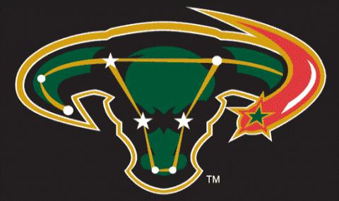
				Was kind of hoping they would bring back the Ovary logo 
 
Tags for size
  
			
		 | 


Referred to as the Mooterus.


				__________________ 
				Don't fear me. Trust me. 


	 | 


	 | 


	 | 


			| 
				
					The Following 2 Users Say Thank You to Reaper For This Useful Post:


			 | 
			 | 


			05-24-2013, 01:26 PM
			
			
		 | 
		
			 
			#43
			
		 | 
	
 
	| 
			
			 Franchise Player 


				Join Date: Sep 2002 
				Location: I'm right behind you 


	 | 


	Quote: 


					Originally Posted by  troutman
					 
				 
				I would have liked it if they took the name Lone Stars (like North Stars). 
			
		 | 


Kind of an oxymoron though, eh?


				__________________ 
				Don't fear me. Trust me. 


	 | 


	 | 


	 | 


			05-24-2013, 01:54 PM
			
			
		 | 
		
			 
			#44
			
		 | 
	
 
	| 
			
			 First Line Centre 


				Join Date: Nov 2009 
				Location: TEXAS!! 


	 | 


			Ugh.


				__________________ 
				I am a lunatic whose world revolves around hockey and Oilers hate.


	 | 


	 | 


	 | 


			05-24-2013, 02:12 PM
			
			
		 | 
		
			 
			#45
			
		 | 
	
 
	| 
			
			 Lives In Fear Of Labelling 


	 | 


	Quote: 


					Originally Posted by  Reaper
					 
				 
				Kind of an oxymoron though, eh? 
			
		 | 


Like the Lone Rangers


	 | 


	 | 


	 | 


			| 
				
					The Following 2 Users Say Thank You to underGRADFlame For This Useful Post:


			 | 
			 | 


			05-24-2013, 02:16 PM
			
			
		 | 
		
			 
			#46
			
		 | 
	
 
	| 
			
			 Unfrozen Caveman Lawyer 


				Join Date: Oct 2002 
				Location: Crowsnest Pass 


	 | 


	Quote: 


					Originally Posted by  Reaper
					 
				 
				Kind of an oxymoron though, eh? 
			
		 | 


There is only one North Star too.


	 | 


	 | 


	 | 


			| 
				
					The Following User Says Thank You to troutman For This Useful Post:


			 | 
			 | 


			05-24-2013, 02:23 PM
			
			
		 | 
		
			 
			#47
			
		 | 
	
 
	| 
			
			 Franchise Player 


	 | 


	Quote: 


					Originally Posted by  Reaper
					 
				 
				Referred to as the Mooterus. 
			
		 | 


Best (mockery) name ever   


	 | 


	 | 


	 | 


			05-24-2013, 03:14 PM
			
			
		 | 
		
			 
			#48
			
		 | 
	
 
	| 
			
			 Lifetime Suspension 


				Join Date: Dec 2011 
				Location: CGY 
				
				Exp:     


	 | 


			Dallas sports teams have been known for their simple logo's (see Dallas Cowboys), and to be honest, I agree with other posters on here who like the simple design of their current logo.  
  
I would have been a bigger fan of this design if there was not a big "D" in the middle of the logo. Just a star surrounded by the circle saying 'Dallas Stars'


	 | 


	 | 


	 | 


			| 
				
					The Following User Says Thank You to HartAttack For This Useful Post:


			 | 
			 | 


			05-24-2013, 04:11 PM
			
			
		 | 
		
			 
			#49
			
		 | 
	
 
	| 
			
			 Powerplay Quarterback 


	 | 


	Quote: 


					Originally Posted by  Realtor 1
					 
				 
				I seem to be the only one who loves the simplicity of the black jersey with dallas written across it. 
Teams try to do too much with jerseys when keeping them simple looks real classy IMO. 
			
		 | 


I actually didn't mind that black jersey.  Didn't they do it because the Mavericks did it?
 
Also, the D looks like its got spikes coming out of it.


				__________________ 
				 
CPHL Dallas Stars


						Last edited by t0rrent98; 05-24-2013 at 04:14 PM.


	 | 


	 | 


	 | 


			05-24-2013, 04:17 PM
			
			
		 | 
		
			 
			#50
			
		 | 
	
 
	| 
			
			 Franchise Player 


	 | 


			Not sure if it was mentioned above, but the rumor is that the "D" logo is the primary, and the circular logo is the shoulder patch.


	 | 


	 | 


	 | 


			05-24-2013, 04:30 PM
			
			
		 | 
		
			 
			#51
			
		 | 
	
 
	| 
			
			 Franchise Player 


	 | 


			They definitely needed new jerseys but I thought their logo was pretty cool.  Should've kept it imo.  They won the cup with the logo, so I think it should stay as it has history.


	 | 


	 | 


	 | 


			| 
				
					The Following User Says Thank You to Geeoff For This Useful Post:


			 | 
			 | 


			05-24-2013, 05:20 PM
			
			
		 | 
		
			 
			#52
			
		 | 
	
 
	| 
			
			 Franchise Player 


				Join Date: May 2004 
				Location: Helsinki, Finland 


	 | 


			Seems like so far it's just one on HFBoards reporting these, so I'd hold a while before accepting them as real. 
 
As for comments; bland, uninspired, looks unprofessional. They way the D sits on top of the star just hurts my eyes. Silver makes it too generic and makes the logo basicly just black and white with a dash of green, which is boring. Green and gold was/is a nice color combination, they should stick with it.


	 | 


	 | 


	 | 


			05-24-2013, 06:29 PM
			
			
		 | 
		
			 
			#53
			
		 | 
	
 
	| 
			
			 Scoring Winger 


	 | 


			I like it!  It is simple, but affective.  I still think this is the best though: 


	 | 


	 | 


	 | 


			05-24-2013, 06:32 PM
			
			
		 | 
		
			 
			#54
			
		 | 
	
 
	| 
			
			 Scoring Winger 


	 | 


			I like it!  It is simple, but affective.  I still think this is the best though: 
    
 
Maybe if they modernized this logo, but I think it is a nice logo and a far cry better than the terrible non-logo they have now.  Also, it will be nice to see what it looks like on the new uniforms.  I like the Raiders' uniforms, so it should look good on them although it seems odd that the template would be released before the NHL Stars is unveiled.


	 | 


	 | 


	 | 


			| 
				
					The Following 2 Users Say Thank You to Playfair For This Useful Post:


			 | 
			 | 


			05-24-2013, 06:41 PM
			
			
		 | 
		
			 
			#55
			
		 | 
	
 
	| 
			
			 Franchise Player 


				Join Date: Oct 2001 
				Location: NYYC 


	 | 


	Quote: 


					Originally Posted by  Burninator


First thing that popped into my head.  
			
		 | 


Funny, I had this one pop into my head, but thats probably because it was my go-to beer for may years.
  
The Skoda one is great though.


	 | 


	 | 


	 | 


			| 
				
					The Following User Says Thank You to Table 5 For This Useful Post:


			 | 
			 | 


			| 
				
					The Following User Says Thank You to t0rrent98 For This Useful Post:


			 | 
			 | 


			05-24-2013, 07:01 PM
			
			
		 | 
		
			 
			#57
			
		 | 
	
 
	| 
			
			 First Line Centre 


				Join Date: Sep 2012 
				Location: Calgary AB 


	 | 


			Pretty bad when your team store has a better logo than the team on the ice.


				__________________ 
				
	Quote: 


					Originally Posted by  puckluck2
					 
				 
				Well, deal with it. I wasn't cheering for Canada either way. Nothing worse than arrogant Canadian fans. They'd be lucky to finish 4th. Quote me on that. They have a bad team and that is why I won't be cheering for them. 
			
		 | 


	 | 


	 | 


	 | 


			05-24-2013, 07:53 PM
			
			
		 | 
		
			 
			#58
			
		 | 
	
 
	| 
			
			 In the Sin Bin 


	 | 


	Quote: 


					Originally Posted by  troutman
					 
				 
				Big Improvement to the worst uniforms in the NHL. 
			
		 | 


Agreed, but until the Anaheim Ducks change their uniforms, your statement applies to anything else.
 
As to this logo, It looks like it wanted to be a Texas Ranger badge and inform the viewer where the team is from and be "edgy" and "modern", but missed the mark in every respect.


	 | 


	 | 


	 | 


			05-24-2013, 08:41 PM
			
			
		 | 
		
			 
			#59
			
		 | 
	
 
	| 
			
			 damn onions 


	 | 


	Quote: 


					Originally Posted by  Geeoff
					 
				 
				They definitely needed new jerseys but I thought their logo was pretty cool.  Should've kept it imo.  They won the cup with the logo, so I think it should stay as it has history. 
			
		 | 


This is how I felt too, just get a new set of uniforms with the old Dallas logo. Dallas is starting to get a history, why switch? I dunno, but I don't like what seems like the dropping of the gold either. 
 
I guess I say this while reserving final judgement until we see the real final deal.


	 | 


	 | 


	 | 


			05-24-2013, 09:29 PM
			
			
		 | 
		
			 
			#60
			
		 | 
	
 
	| 
			
			 Lifetime Suspension 


	 | 


			I guess they wanted the D.


	 | 


	 | 


	 | 


			| 
				
					The Following 3 Users Say Thank You to TurnedTheCorner For This Useful Post:


			 | 
			 | 


		Posting Rules
	 | 


		You may not post new threads 
		You may not post replies 
		You may not post attachments 
		You may not edit your posts 


		HTML code is Off 
		 
		
	  | 
 
 
	 | 
	
		
	 | 
 
 
All times are GMT -6. The time now is 07:16 PM. 


 | 


     |