 05-24-2013, 10:00 AM
|
#21
|
|
Franchise Player
Join Date: Mar 2002
Location: Auckland, NZ
|
I don't think you need the D in the star. Should have just left the star unaltered; would have sent a more bold message about their identity.
|

|

|
|
05-24-2013, 10:00 AM
|
#22
|
|
Franchise Player
Join Date: Jun 2011
Location: Austria, NOT Australia
|
I kind of like it. Good choice of colours too, mint-green and silver looks neat.
|
|
|
|
|
The Following 2 Users Say Thank You to devo22 For This Useful Post:
|
|
|
05-24-2013, 10:03 AM
|
#23
|
|
Unfrozen Caveman Lawyer
Join Date: Oct 2002
Location: Crowsnest Pass
|
I would have liked it if they took the name Lone Stars (like North Stars).
|
|
|
|
|
The Following User Says Thank You to troutman For This Useful Post:
|
|
|
05-24-2013, 10:10 AM
|
#24
|
|
Powerplay Quarterback
|
They want the D
|
|
|
|
|
The Following User Says Thank You to jeffman For This Useful Post:
|
|
|
05-24-2013, 10:16 AM
|
#25
|
|
Franchise Player
|
Quote:
Originally Posted by getbak

They haven't had the Stars logo on the front of their jerseys for a few years now, just the awful "DALLAS" word mark with the number below.
|
Holy crap. You're right. I know they did that for their home jerseys a while back but when did they change their aways?
Shows you how much I pay attention.
__________________

|
|
|
|
|
05-24-2013, 10:17 AM
|
#26
|
|
Powerplay Quarterback
|
Get rid of the D and I like it.
__________________
 CPHL Dallas Stars
|
|
|
|
|
05-24-2013, 10:22 AM
|
#27
|
|
First Line Centre
Join Date: Sep 2012
Location: Calgary AB
|
wtf was wrong with the one they had now? god i hate this trend in sports that teams seem to have this insane desire to keep re-inventing the wheel. how do these teams expect to make their logos timeless if they keep changing them? this new logo is terrible compared to the old one. just terrible.
__________________
Quote:
Originally Posted by puckluck2
Well, deal with it. I wasn't cheering for Canada either way. Nothing worse than arrogant Canadian fans. They'd be lucky to finish 4th. Quote me on that. They have a bad team and that is why I won't be cheering for them.
|
|
|
|
|
|
05-24-2013, 10:32 AM
|
#28
|
|
Franchise Player
Join Date: Jun 2011
Location: STH since 2002
|
The color scheme is good i like that. The circular logo is allright but it would be much cleaner looking if they removed the D on the silver star and just filled in the star a solid silver.
On the shoulder patch I would have liked it just how it is shown again without the overlapping D.
__________________

Last edited by Stay Golden; 05-24-2013 at 10:35 AM.
|
|
|
|
|
05-24-2013, 10:45 AM
|
#29
|
|
Not Jim Playfair
Join Date: Oct 2001
Location: Philadelphia, Pennsylvania
|
Never should have gotten rid of those sweaters that had the big star outline.
__________________
CORNELL
National Champions: 1967, 1970
CALGARY
Stanley Cup Champions: 1989
|
|
|
|
|
The Following 3 Users Say Thank You to calgARI For This Useful Post:
|
|
|
05-24-2013, 10:59 AM
|
#30
|
|
First Line Centre
Join Date: Oct 2009
Location: Calgary
|
The plain silver star is already a logo for a certain other pro sports team in town. I think they use the D to be just slighlty different. I am curious to see the whole uniform set-up and how they use the new colors. Dropping the yellow/gold is a big departure.
|
|
|
|
|
05-24-2013, 11:00 AM
|
#31
|
 Posted the 6 millionth post! |
Quote:
Originally Posted by RM14
The plain silver star is already a logo for a certain other pro sports team in town. I think they use the D to be just slighlty different. I am curious to see the whole uniform set-up and how they use the new colors. Dropping the yellow/gold is a big departure.
|
That would be cool if it was a sports franchise that spanned multiple sports. Kind of like CSKA or Dynamo Moscow.
|
|
|
|
|
The Following User Says Thank You to Ozy_Flame For This Useful Post:
|
|
|
05-24-2013, 11:10 AM
|
#32
|
|
Powerplay Quarterback
|
Fugly!
|
|
|
|
|
05-24-2013, 11:13 AM
|
#33
|
|
Scoring Winger
|
Reminds me too much of Starbucks. My favorite one of theirs is the one from 1999.
|
|
|
|
|
05-24-2013, 11:33 AM
|
#34
|
|
Franchise Player
|
Anything is better then this jersey they used to use.

Quite possibly the laziest jersey design in the history of sport.
|
|
|
|
|
The Following User Says Thank You to Huntingwhale For This Useful Post:
|
|
|
05-24-2013, 11:44 AM
|
#35
|
|
#1 Goaltender
|
Hopefully with their new logo they won't have number on the front of their jersey anymore either. Personally I like it, but it's not as good as the star logo much it's miles ahead of the 'Dallas' wordmark
|
|
|
|
|
05-24-2013, 11:44 AM
|
#36
|
|
Franchise Player
Join Date: Nov 2008
Location: the dark side of Sesame Street
|
Quote:
Originally Posted by Huntingwhale
Anything is better then this jersey they used to use.
Quite possibly the laziest jersey design in the history of sport. |
I agree. There's a difference between "understated" and "not even trying", and this is the latter.
__________________
"If Javex is your muse
then dive in buddy"
- Surferguy
|
|
|
|
|
05-24-2013, 11:55 AM
|
#37
|
|
Powerplay Quarterback
|
Two things I hate a lot about new jerseys in the NHL: using predominantly black, and using word marks. That Dallas jersey fails both. Just go back to green and yellow from the North Stars and lose the black. It'd look way better.
|
|
|
|
|
05-24-2013, 11:58 AM
|
#38
|
|
Franchise Player
|
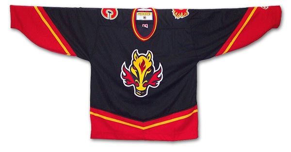
Quote:
Originally Posted by sureLoss
|

First thing that popped into my head.
|
|
|
|
|
The Following 17 Users Say Thank You to Burninator For This Useful Post:
|
Alberta_Beef,
BurningYears,
corporatejay,
davidus_49,
evman150,
FurnaceFace,
GreenHardHat,
Magnum PEI,
MRCboicgy,
OffsideSpecialist,
Phaneufenstein,
Regulator75,
Resolute 14,
Stay Golden,
Stealth22,
Table 5,
TopChed
|
|
05-24-2013, 12:09 PM
|
#39
|
|
One of the Nine
Join Date: Jul 2007
Location: Space Sector 2814
|
Troll by!!!
__________________
"In brightest day, in blackest night / No evil shall escape my sight / Let those who worship evil's might / Beware my power, Green Lantern's light!"
|
|
|
|
|
05-24-2013, 12:17 PM
|
#40
|
|
Franchise Player
Join Date: Jan 2012
Location: Ontario
|
Marketing always rules which I guess is why teams continue to reinvent the wheel, but there is a reason the Original 6 teams are often at the top of lists of best logos. They've been around for a long time and their teams don't feel the need to switch them up every 3-4 years to drive jersey sales.
A lesson the other 24 teams could learn. The amount of change is ridiculous.
|
|
|
|
 Posting Rules
|
You may not post new threads
You may not post replies
You may not post attachments
You may not edit your posts
HTML code is Off
|
|
|
All times are GMT -6. The time now is 09:49 AM.
|
|


