01-29-2013, 10:29 AM
|
#421
|
|
Franchise Player
Join Date: Feb 2007
Location: Calgary, AB
|
Quote:
Originally Posted by Dr. Pepper

Surfing around tonight, found this - pretty nice:
 |
Quote:
Originally Posted by Zarley
|
The Alternate from the first image and the Home/Away from the second image would be the best jerseys the Flames could ever have.
Three timeless jerseys that take from the Flames most successful seasons (80's and 03-04).
|

|

|
|
The Following 3 Users Say Thank You to SuperMatt18 For This Useful Post:
|
|
|
01-29-2013, 10:31 AM
|
#422
|
|
Franchise Player
|
Quote:
Originally Posted by Flames89
Well done Zarley. Now we just need Ken King and the flames to realize we are as good a focus group as they can get.
|
Maybe if we change the thread title to "Ken King please create a CP focus group"
|
|
|
|
|
The Following 3 Users Say Thank You to DownhillGoat For This Useful Post:
|
|
|
01-29-2013, 11:00 AM
|
#423
|
|
Franchise Player
Join Date: Jun 2006
Location: Calgary, Alberta
|
Quote:
Originally Posted by Zarley
Thanks for the positive feedback.
To be quite honest, I'm happy with my design for the home and road, but still not sure about the third jersey. If anyone has some good ideas for a third, let me know and maybe I'll take another stab at it.
|
The issue I have with the third concept is that the black at the top feels mismatched and unnecessary. Not sure about the stripes either. Would need to see that with the arms down to get a perspective on how it would look on the ice. But I think if you removed the black and kept that part red, it may look better.
Quote:
Originally Posted by SuperMatt18
The Alternate from the first image and the Home/Away from the second image would be the best jerseys the Flames could ever have.
Three timeless jerseys that take from the Flames most successful seasons (80's and 03-04).
|
That actually would be a good combo. I prefer the whole set of the first though. The 04 design in retro colours just looks slick.
|
|
|
|
|
The Following User Says Thank You to hkstylez For This Useful Post:
|
|
|
01-29-2013, 01:20 PM
|
#425
|
|
Crash and Bang Winger
Join Date: May 2009
Location: Calgary
|

As much as I like the classic Flames uniforms of the 80's, when I was watching the game the other night against the Oilers I just couldn't help thinking that they either looked like pajamas or like lumberjack longjohns with stripes. I do like them, but I just think that although they are classic, they aren't worth so much as to compare them to other uniformly heralded classic jerseys like Montreal, Chicago, etc. I think we need a 'new' classic. I know this does bring up risks however, like with Phoenix when they went the polar opposite direction from their terrible jerseys to the super-boring ones they have now, when I think they were going for that 'new classic' look - but in my opinion missed the mark. That's why my vote is for the redesign above that uses the '04 pattern with updated striping - or something like it - reminiscent and classic looking but new. On any Red Helmet/Red Jersey/Red Pants/Red Socks combo - somehow we need to break up all the red. Some will disagree - just a thought.
|
|
|
|
|
01-29-2013, 10:43 PM
|
#426
|
|
Backup Goalie
Join Date: Mar 2010
Location: Seattle
Exp: 
|
Quote:
Originally Posted by hkstylez
This is just wrong.. haha.
|
I designed it, what don't you like?
It's a third jersey concept, not trying to replace the reds, whites or retros.
Very simple colour edit on our current red and whites.
|
|
|
|
|
The Following User Says Thank You to tomo For This Useful Post:
|
|
|
01-29-2013, 10:49 PM
|
#427
|
|
Lifetime Suspension
Join Date: Oct 2012
Location: Halifax
|
Quote:
Originally Posted by tomo
I designed it, what don't you like?
It's a third jersey concept, not trying to replace the reds, whites or retros.
Very simple colour edit on our current red and whites.
|
Not to take anything anyway from your design, but it's extremely similar to the NHL Black Ice Jerseys.
http://shop.nhl.com/family/index.jsp...oryId=12175252
|
|
|
|
|
01-29-2013, 10:56 PM
|
#428
|
|
Backup Goalie
Join Date: Mar 2010
Location: Seattle
Exp:
|
Quote:
Originally Posted by $ven27
|
I hadn't seen the black ice jerseys before and I made a version that was really really similar. After posting on CP and some other jersey concept sites I took the feedback I received and updated it with the more readable logo, numbers, name, etc..
The idea is that it's not black like those old ugly horsehead 3rds.
It's a mix of charcoal with black trim, to go along with the red,white,yellow which gives it that burning ember feeling.
If you guys want to vote for it, here is the link. feel free to comment as well
http://www.icethetics.info/concepts/...r-calgary.html
Last edited by tomo; 01-29-2013 at 10:58 PM.
Reason: added link
|
|
|
|
|
01-29-2013, 11:37 PM
|
#429
|
|
Crash and Bang Winger
Join Date: May 2009
Location: Calgary
|
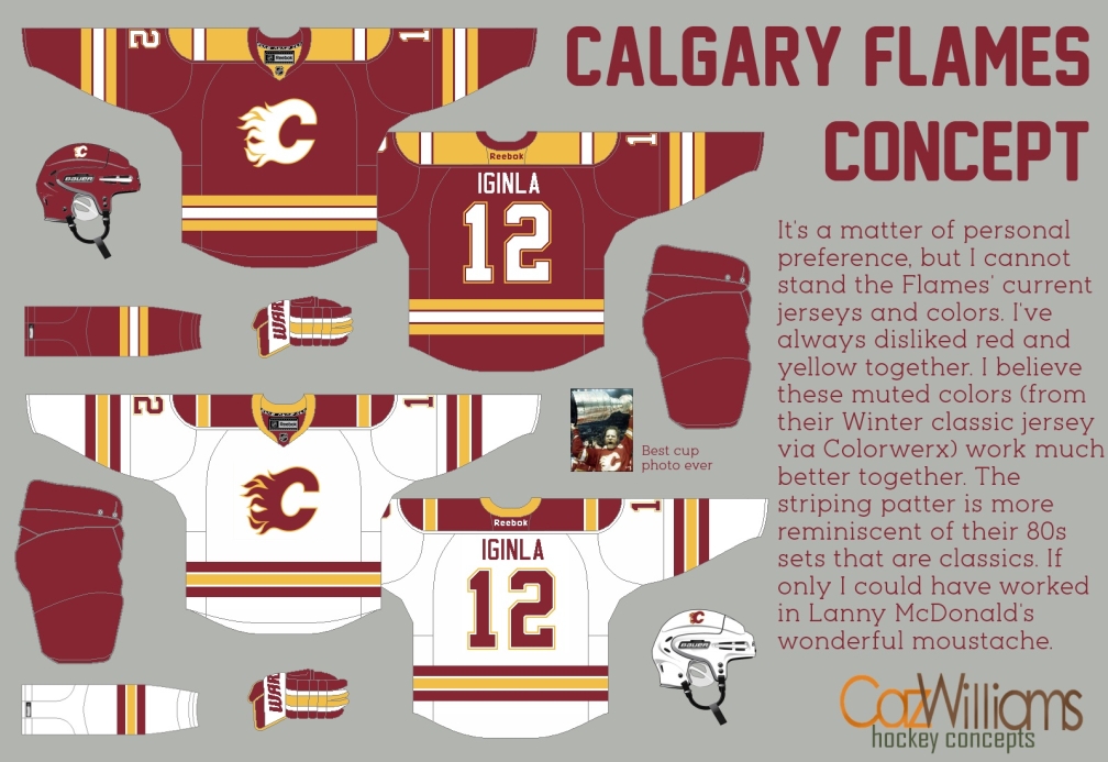
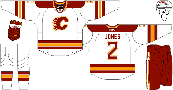
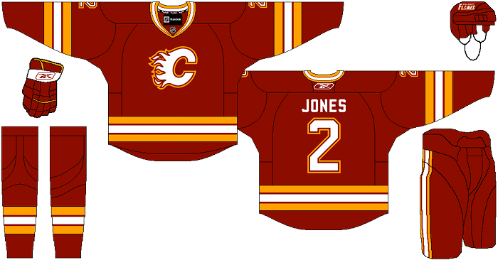
What do people think of these?
|
|
|
|
|
The Following 5 Users Say Thank You to Dr. Pepper For This Useful Post:
|
|
|
01-30-2013, 12:13 AM
|
#430
|
|
Franchise Player
Join Date: Oct 2006
Location: Calgary
|
Since when did we become the Boston Bruins?
|
|
|
|
|
01-30-2013, 12:39 AM
|
#431
|
|
First Line Centre
|
Those Heritage Classic colours were fine for one game, and one game only: the 2011 Heritage Classic. Please never again.
|
|
|
|
|
The Following 3 Users Say Thank You to Zarley For This Useful Post:
|
|
|
01-30-2013, 08:33 AM
|
#432
|
|
Franchise Player
Join Date: Jun 2006
Location: Calgary, Alberta
|
Quote:
Originally Posted by Zarley
Those Heritage Classic colours were fine for one game, and one game only: the 2011 Heritage Classic. Please never again.
|
The colours wasn't the issue.
It was the stripe, on stripe, on stripe.
|
|
|
|
|
01-30-2013, 08:53 AM
|
#433
|
|
Scoring Winger
Join Date: Mar 2004
Location: Movin' Dirt
|
I wish they would get rid of black altogether. Not because I don't like it but more because of superstition.
In my own craziness things started to go downhill when black was added as a stripe in the early ninety's and suddenly we couldn't keep our star players, after years of deep teams and deep playoff runs.
I associate our darkest years with that stupid horse head logo and mostly black uniforms. Things suddenly started to get better when they reintroduced red as the primary color. Even making the cup final in 03/04.
I know I'm nutty and that's mostly coincidental but many superstitions were built from coincidences, like Daryl Sutters L.A. Drives last year.
__________________
"25 strong"+Thousands in the stands at the 'Dome & millions elswhere
-be counted.
I Believe in the Red!!!
|
|
|
|
|
The Following User Says Thank You to BigBCalgary For This Useful Post:
|
|
|
01-30-2013, 10:30 PM
|
#434
|
|
damn onions
|

Quote:
Originally Posted by Zarley
I'm a long time lurker, I usually just read CP to get Flames news and roster updates but reading this thread inspired me to register and post. I love the Flames' original 1980-94 look, it was (and still is) one of the best uniforms in the league. The current home and road jerseys are a mess: ugly vertical and horizontal stripes, useless armpit piping, and out-of-place flag patches. I was messing around in Photoshop and came up with with my ideal Flames set; based on the classic flames sweaters but with a few minor tweaks:
Home: The main difference is that the red is one shade darker. I loved watching the Flames school the Oil last night in their vintage threads, but they are a little bit bright on TV. The red should be slightly darker - the same shade the Habs use. Also the hem and pants stripes now match the arm stripes, and the alternate captain letter is no longer a generic 'A.'
Road: This one has a few more changes from the '80's white sweater. I added gold trim to the red shoulders, the hem and arm stripes are now the same pattern as on the red jersey, and I included a lace-up collar because I felt like it.
Alternate: I've never been a fan of black being included in the Flames' colour scheme, but I could live with it on a third jersey. I also have a soft spot for the 1990s 'pedestal' uniforms. Most fans associate that look with the futility of the Young Guns era, but those were the jerseys they wore when I first became a Flames fan and I think they would've been great sweaters if only they didn't include that stupid pedestal detail. I realize that many fans still love the black C jerseys from 2003-04 so my design for the third is a bit of a mashup between those two styles.
Also, no shoulder patches because it's damn near impossible to come up with an alternate logo anywhere near as awesome as the Flaming C, and that space is reserved for Stanley Cup Finals patches only. 
 |
these are by far the best I've ever seen. Even that 3rd is perfect in my mind, perfect blend of past and present and looks sharp, really well done. I'd buy em all.
|
|
|
|
|
The Following 8 Users Say Thank You to Mr.Coffee For This Useful Post:
|
|
|
01-31-2013, 02:05 PM
|
#435
|
|
Backup Goalie
Join Date: Apr 2004
Location: 403
Exp:
|
Quote:
Originally Posted by Mr.Coffee
these are by far the best I've ever seen. Even that 3rd is perfect in my mind, perfect blend of past and present and looks sharp, really well done. I'd buy em all.
|
agreed
|
|
|
|
|
01-31-2013, 02:37 PM
|
#437
|
|
Franchise Player
Join Date: Jul 2009
Location: Calgary
|
Zarley's are by far the best ones I've seen in here.
The "charcoal" ones have potential to work, but they'd need a bit more accent color to work I think; and not just piping.... can't put my finger on how to make it work but they just seem too lacklustre.
|
|
|
|
|
The Following User Says Thank You to Icon For This Useful Post:
|
|
|
01-31-2013, 02:46 PM
|
#438
|
|
Franchise Player
Join Date: Jun 2011
Location: STH since 2002
|
So long as the home Jersey remains primarily red. I wouldn't mind a yellow or gold C with a Black border.
Maybe the Calgary Tower for the shoulder patch since it is one of the more prominent longstanding land marks tied to Calgary.
__________________

|
|
|
|
|
02-04-2013, 02:12 AM
|
#439
|
|
Franchise Player
Join Date: Mar 2002
Location: Calgary
|
From a thread at Sportslogos.net
Toss in a graphite as an alternate, and call it a decade.
|
|
|
|
|
The Following 5 Users Say Thank You to browna For This Useful Post:
|
|
|
02-04-2013, 08:31 AM
|
#440
|
|
Franchise Player
Join Date: Dec 2005
Location: back in the 403
|
They NEED to bring back those retro whites. They're dick-explodingly good.
|
|
|
|
|
The Following 3 Users Say Thank You to Sainters7 For This Useful Post:
|
|
 Posting Rules
|
You may not post new threads
You may not post replies
You may not post attachments
You may not edit your posts
HTML code is Off
|
|
|
All times are GMT -6. The time now is 02:28 AM.
|
|