#101
#1 Goaltender
Not the most original idea but very good looking, top 10 in the league.
#102
Franchise Player
Join Date: Sep 2013
Location: Brisbane
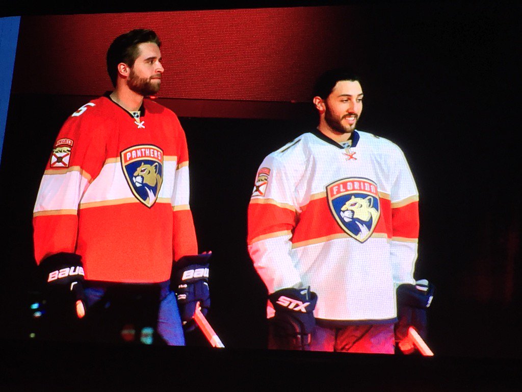
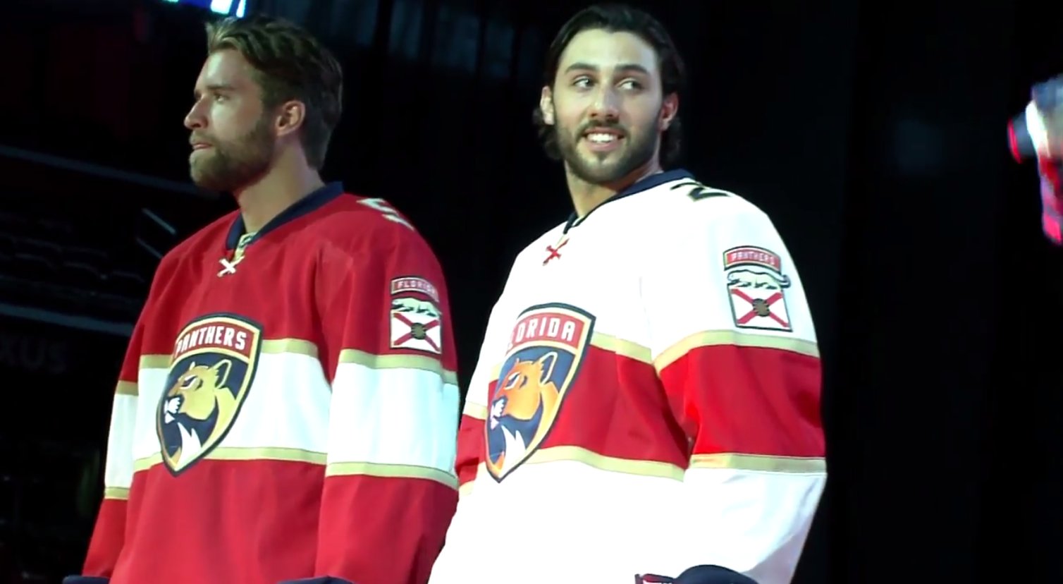
Nice jerseys that look both retro and contemporary. I also like they have gone baseball style having Florida on the away jerseys and Panthers on the home jerseys. Having the name of the city on a home jersey is one of the things that bugs me about the Flames' 3rd jerseys.
#103
First Line Centre
Join Date: Mar 2013
Location: YYC
I'm getting too much of an Arsenal soccer jersey feel of it to be honest.
Nice jerseys but I feel like I've seen it before.
__________________
The Following User Says Thank You to Mattman For This Useful Post:
#104
Franchise Player
Quote:
Originally Posted by
Mattman
I'm getting too much of an Arsenal soccer jersey feel of it to be honest.
Nice jerseys but I feel like I've seen it before.
I don't follow soccer and I thought this was a UAE jersey.
Kill me if the NHL ads get to this level where the companies are the focal point of the jersey...
#105
Participant
Quote:
Originally Posted by
activeStick
I don't follow soccer and I thought this was a UAE jersey.
I wouldn't worry about having to be killed.
Ads on soccer jerseys started as the focal point, right in the middle. They replaced... empty space.
It's not like they've become bigger or more obtrusive over time, they've basically been the same size in the same place since the very first one.
#106
damn onions
Not a fan and I don't understand why they did this, it's not an upgrade to their existing uniforms. Their old logo was better, this cat seems tamer.
#107
First Line Centre
Join Date: Dec 2013
Location: Montréal, QC
I think they look awesome. Well done Panthers.
The Following 2 Users Say Thank You to Party Elephant For This Useful Post:
#108
First Line Centre
Join Date: Dec 2013
Location: Montréal, QC
Quote:
Originally Posted by
Mattman
I'm getting too much of an Arsenal soccer jersey feel of it to be honest.
Nice jerseys but I feel like I've seen it before.
What exactly is the similarity here? That they're both red?
#109
First Line Centre
Join Date: Aug 2009
Location: Sector 7G
Quote:
Originally Posted by
sureLoss
New jersey:
__________________The Oilers are like a buffet with one tray of off-brand mac-and-cheese and the rest of it is weird Jell-O
#110
Franchise Player
Quote:
Originally Posted by
Party Elephant
What exactly is the similarity here? That they're both red?
I'd guess red and the shape of the tiny Arsenal logo
#111
First Line Centre
Join Date: Aug 2003
Location: Toronto, ON
I am a fan, maybe slightly boring, but everything ties together well and looks good
#112
Franchise Player
Join Date: Jun 2009
Location: Thunder Bay Ontario
I prefer these to some of the others in the league. To be honest, I like their logo more than a black flaming C.
__________________
#113
Franchise Player
Quote:
Originally Posted by
BurningYears
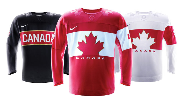
more like the Habs an in the article that Cali Panthers Fan posted they specifically stated the Habs and other original 6 teams were used for inspiration. I would specifically mention top row, 4th from the left in the image below.
Last edited by Alberta_Beef; 06-03-2016 at 08:11 AM .
#114
First Line Centre
Join Date: Oct 2014
Location: Vancouver, B.C.
Pretty boring jerseys.
#115
That Crazy Guy at the Bus Stop
Join Date: Jun 2010
Location: Springfield Penitentiary
i think this video accurately describes how CP feels about jerseys. 1:13 and on specifically. VIDEO
The Following 5 Users Say Thank You to Cecil Terwilliger For This Useful Post:
#116
Franchise Player
I like these, and especially love the unique idea of players 'earning' tabs for the shoulder patches similar to rank on a uniform. That is a cool idea. I also like the idea of the name on the jersey actually changing depending on if the team is at home (Panthers) or on the road (Florida).
#117
Franchise Player
I think they are great. They look the Ottawa 3rds which are the best jersey in the NHL (next to the Flames retro)
#118
Crash and Bang Winger
Join Date: Jan 2015
Location: Southern Sweden
Those are pretty great. Colossal improvement. Only thing is I don't get why the numbers are on the shoulders. I may get used to it.
#119
Franchise Player
Quote:
Originally Posted by
Mr.Coffee
Not a fan and I don't understand why they did this, it's not an upgrade to their existing uniforms. Their old logo was better, this cat seems tamer.
Yes, but this cat seems more wise though at the same time.
The Following 2 Users Say Thank You to Cleveland Steam Whistle For This Useful Post:
#120
Unfrozen Caveman Lawyer
Join Date: Oct 2002
Location: Crowsnest Pass
I like these, but they are coming across more red than orange? Maybe my screen.
You may not post new threads
You may not post replies
You may not post attachments
You may not edit your posts
HTML code is Off
All times are GMT -6. The time now is 11:47 AM .