01-30-2016, 10:42 AM
|
#1121
|
|
Franchise Player
Join Date: Dec 2005
Location: back in the 403
|
Quote:
Originally Posted by Bingo

at the risk of pulling an old scab off, I don't know why the Flames don't just do what the Oilers have done and bring back the full 1980s package.
|
Yeah, whenever we play them, it really bugs me that their unis are nicer than ours. Traditionally we always had the better ones. Our retros blow theirs out of the water.
|

|

|
|
01-30-2016, 10:45 AM
|
#1122
|
|
Franchise Player
Join Date: Nov 2003
Location: Calgary, AB
|
those Stockton jerseys are straight outta 2006. Blech.
Retros for life
|
|
|
|
|
01-30-2016, 01:36 PM
|
#1123
|
|
First Line Centre
Join Date: Dec 2013
Location: Calgary, Canada
|
With the way the league revenues are probably plunging or at the very best, stagnant, I suspect we are going to see several teams look at new jersey options in order to encourage the fan bases to upgrade merchandise. I read an article on how the Leafs are looking at doing that so I suspect they aren't going to be the only ones.
|
|
|
|
|
01-30-2016, 03:23 PM
|
#1124
|
|
#1 Goaltender
Join Date: Aug 2011
Location: Not cheering for losses
|
Retros look better on the ice. They're beautiful. Flawless.
Current ones look better off the ice. Or rather, people look better wearing them. Black lessens the harshness of the orangey-ness of the traditional colours. Fans look better wearing jerseys with some black in them, and fans are the ones paying $150 for them, so...
I don't think we'll be going back to the retros anytime soon, to my endless disappointment. The currents are okay, but they could be perfect. The abominable thirds take us even further into blah NJ Devils territory.
Watched the KC Chiefs game a week or so ago and they looked so damn sharp. Those are our colours, dammit! It's so easy. Lose the black and the Flames have a totally unique look instead of something similar to the Hurricanes, Devils, Sens, and whoever else.
|
|
|
|
|
The Following User Says Thank You to sun For This Useful Post:
|
|
|
01-30-2016, 03:36 PM
|
#1125
|
|
Retired
Join Date: May 2004
Location: Pacific Ocean
|
I just got my retro Bennett jersey and gawd I wish they would switch back to those jerseys full time. They are so damn awesome
|
|
|
|
|
01-30-2016, 03:49 PM
|
#1126
|
|
First round-bust
Join Date: Feb 2015
Location: speculating about AHL players
|
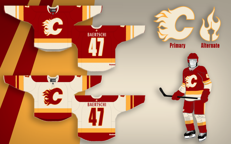
Just threw this together:

Not sure what to do about the away jersey, but for this one, I:
- took the alternate jersey's template - smoothed out the shoulder yoke
- added the basic, black c - thought the retro white c would look out of place
- changed the font (considered the home/away one, but that's been in use for 20 years already)
Hope you like it.
__________________
2026 World Junior Pool Champion
Need a deal on a new or pre-owned car? Come see me at Platinum Mitsubishi DM me to chat!
|
|
|
|
|
The Following 2 Users Say Thank You to TheScorpion For This Useful Post:
|
|
|
01-30-2016, 04:06 PM
|
#1127
|
|
First round-bust
Join Date: Feb 2015
Location: speculating about AHL players
|
Quote:
Originally Posted by bc-chris
|
BTW - just wanted to revive this post, which is my favourite post on the internet ever.
__________________
2026 World Junior Pool Champion
Need a deal on a new or pre-owned car? Come see me at Platinum Mitsubishi DM me to chat!
Last edited by TheScorpion; 01-30-2016 at 04:17 PM.
|
|
|
|
|
The Following 6 Users Say Thank You to TheScorpion For This Useful Post:
|
|
|
01-30-2016, 04:12 PM
|
#1128
|
|
Franchise Player
|
Quote:
Originally Posted by Split98
So I think I'm finally pretty happy with the concept. After playing around with the nameplate font, I found that I really did just love the clean (though Coyote's-esque) simple sans font. I also still never dug adding the extra band to the waist and included here is the neck-placement alternate logo that would be a great place if Reebok does end up allowing their branding relocation. I also retained the tie-ups, but decided on a jersey coloured thread to blend while keeping the (IMO) great look of a tie-up. Blends, avoids the clutter that bothered some people and adds that classic tie-up touch.
Thanks a lot for the positive response guys, this was definitely something I've had a ton of fun working on. |

|
|
|
|
|
The Following 4 Users Say Thank You to Ashasx For This Useful Post:
|
|
|
01-30-2016, 04:29 PM
|
#1129
|
|
First round-bust
Join Date: Feb 2015
Location: speculating about AHL players
|
I mean, seriously. bc-chris, have you emailed the Flames yet? Because you totally should.
__________________
2026 World Junior Pool Champion
Need a deal on a new or pre-owned car? Come see me at Platinum Mitsubishi DM me to chat!
|
|
|
|
|
The Following 2 Users Say Thank You to TheScorpion For This Useful Post:
|
|
|
01-30-2016, 06:26 PM
|
#1130
|
|
Franchise Player
Join Date: Sep 2002
Location: I'm right behind you
|
Quote:
Originally Posted by browna
Oilers never had black as a trim color so it was easier to go back, and they use the same pants and gloves, for example, for all 3 sets.
|
No they don't use the same gloves and pants for all three. They have plain dark blue gloves and pants with the orange jersey.
__________________
Don't fear me. Trust me.
|
|
|
|
|
01-30-2016, 10:14 PM
|
#1131
|
|
Scoring Winger
Join Date: Dec 2015
Location: Calgary via Palm Desert
|
Quote:
Originally Posted by socalwingfan
I just got my retro Bennett jersey and gawd I wish they would switch back to those jerseys full time. They are so damn awesome
|
Got a pic to share?
|
|
|
|
|
01-30-2016, 10:21 PM
|
#1132
|
|
Scoring Winger
Join Date: Dec 2015
Location: Calgary via Palm Desert
|
I really like the white flaming "C". Black is ok. I've "grow to like it". But I still prefer the white Flaming C on Red. Even the pedestal jerseys look ok because of the White C on the front. Our current 3rd the "Calgary" writing one I didn't care for at all but over time I have come to not mind it I guess. The jersey BC Chris did is amazing too
|
|
|
|
|
The Following 2 Users Say Thank You to TheOnlyBilko For This Useful Post:
|
|
|
01-30-2016, 10:24 PM
|
#1133
|
|
Scoring Winger
Join Date: Dec 2015
Location: Calgary via Palm Desert
|
I thought I would add that when the Flames moved to Calgary way back when, my brother designed a logo that was seriously considered for our logo. My brothers logo design was even on the news several times and Ed Whalen said he loved it. One day I will get a picture of it and post it here
|
|
|
|
|
The Following 2 Users Say Thank You to TheOnlyBilko For This Useful Post:
|
|
|
01-31-2016, 11:16 AM
|
#1134
|
|
Franchise Player
|
Quote:
Originally Posted by TheScorpion
Just threw this together:
Not sure what to do about the away jersey, but for this one, I:
- took the alternate jersey's template - smoothed out the shoulder yoke
- added the basic, black c - thought the retro white c would look out of place
- changed the font (considered the home/away one, but that's been in use for 20 years already)
Hope you like it. |
I love almost everything about this. Just keep the 3rs jersey numbers and letters, and that's our next jersey. I actually think this is what they're planning.
Our current numbers look tackey and dated. The 3rds are still a little kooky, but they're subtle and they have grown on me.
I can't wait for us to be rid of piping. That will be a glorious day
__________________
All you have to decide is what to do with the time that is given to you.
Rowan Roy W-M - February 15, 2024
|
|
|
|
|
01-31-2016, 11:22 AM
|
#1135
|
|
Franchise Player
Join Date: Jun 2009
Location: Thunder Bay Ontario
|
Am I the only one who is really starting to get sick of the black C?
__________________
Fan of the Flames, where being OK has become OK.
|
|
|
|
|
The Following 4 Users Say Thank You to Poe969 For This Useful Post:
|
|
|
01-31-2016, 11:23 AM
|
#1136
|
|
Franchise Player
Join Date: Oct 2006
Location: San Fernando Valley
|
I don't understand why the Flames are keeping with the current 3rd jersey that nobody likes. You never see anyone wearing them at Flames games or anywhere else in the city and I can't imagine they have been a sales success.
|
|
|
|
|
01-31-2016, 11:25 AM
|
#1137
|
|
Franchise Player
Join Date: Oct 2006
Location: San Fernando Valley
|
Quote:
Originally Posted by Poe969
Am I the only one who is really starting to get sick of the black C?
|
With a red jersey you don't have a lot of choices when it comes to the C as it's either black, white (retro) or yellow (hasn't been done because it would look terrible). You can only do so much with the team's colour palette. I would like to see another black jersey myself or I suppose they could go with yellow but I that would he hard to pull off.
|
|
|
|
|
01-31-2016, 11:27 AM
|
#1138
|
|
Franchise Player
Join Date: Jun 2009
Location: Thunder Bay Ontario
|
Maybe it's just me but I really like the thirds. Probably more than the normal ones.
__________________
Fan of the Flames, where being OK has become OK.
|
|
|
|
|
01-31-2016, 01:39 PM
|
#1139
|
|
damn onions
|
Yeah the Flames seriously need an overhaul. And did like 5 years ago. The flags on the shoulders are just hideous. The piping... not great.
I've purposely withheld buying a jersey because I am sure one day they'll release a new one that won't be so fugly and then I'll be happy to buy it.
|
|
|
|
|
01-31-2016, 01:57 PM
|
#1140
|
|
First Line Centre
|
The current set are the only Flames sweaters I don't own. The design is truly terrible - among the worst in the league. I can't believe we are still stuck with them nine seasons later.
|
|
|
|
|
The Following User Says Thank You to Zarley For This Useful Post:
|
|
 Posting Rules
|
You may not post new threads
You may not post replies
You may not post attachments
You may not edit your posts
HTML code is Off
|
|
|
All times are GMT -6. The time now is 05:23 AM.
|
|