 01-18-2014, 12:50 AM
|
#861
|
|
Backup Goalie
Join Date: Sep 2013
Exp: 
|
Quote:
Originally Posted by Reign of Fire

Flags show lack of imagination and need to go
|
imagination
is what got us into this
butt-ugly thirds mess
Last edited by haiku; 01-18-2014 at 12:53 AM.
|

|

|
|
The Following 7 Users Say Thank You to haiku For This Useful Post:
|
|
|
01-18-2014, 03:40 AM
|
#862
|
|
First Line Centre
Join Date: Oct 2008
Location: Cambodia
|
Quote:
Originally Posted by btimbit
Been rumours for a while that they'll keep the current thirds as thirds and bring back the retro thirds as the new regulars. I'd support that 100%
|
Retro homes, retro aways and the current thirds? I'd support that 66.66%.
|
|
|
|
|
01-18-2014, 09:20 AM
|
#863
|
|
Lifetime Suspension
Join Date: Oct 2012
Location: Halifax
|
Quote:
Originally Posted by btimbit
Been rumours for a while that they'll keep the current thirds as thirds and bring back the retro thirds as the new regulars. I'd support that 100%
|
Source???
|
|
|
|
|
01-19-2014, 01:02 AM
|
#864
|
|
Celebrated Square Root Day
|
Quote:
Originally Posted by btimbit
Been rumours for a while that they'll keep the current thirds as thirds and bring back the retro thirds as the new regulars. I'd support that 100%
|
Are you just referring to Calgarypuck, though? Because to me that seems like the typical Calgarypuck rumour, where the idea gest tossed around here, and then later everyone just goes "it's been a rumour for awhile".
I've never seen any source on that anywhere, other than people discussing it here and then more people referring to the earlier calgarypuck discussion as "rumours".
|
|
|
|
|
02-07-2014, 10:33 AM
|
#866
|
|
Franchise Player
Join Date: Apr 2004
Location: I don't belong here
|
I took a look at all the concepts submitted to that contest. I'm glad this is just something that website is doing and nothing official from the Calgary Flames. Each and every concept submitted for that contest makes me absolutely love our current alternative jersey, which I don't hate, but I don't like.
|
|
|
|
|
02-07-2014, 10:50 AM
|
#867
|
|
First Line Centre
Join Date: Oct 2005
Location: Calgary
|
I thought that list was very predictable, most of it was gonna be garbage and it is. And there's a couple that are good, and a couple that are obvious (like taking our current third, adding the C and making a white version)
|
|
|
|
|
The Following 2 Users Say Thank You to TjRhythmic For This Useful Post:
|
|
|
02-07-2014, 12:23 PM
|
#869
|
|
Self-Retirement
|
Wow they are terrible. Hot garbage must be the prize.
|
|
|
|
|
02-07-2014, 12:34 PM
|
#870
|
|
First Line Centre
|
I prefer my concept to all of those.
|
|
|
|
|
02-07-2014, 01:15 PM
|
#871
|
|
Franchise Player
Join Date: Nov 2009
Location: Kelowna, BC
|
i don't mind these - just make the red shoulders white on the white jersey

__________________
"...and there goes Finger up the middle on Luongo!" - Jim Hughson, Av's vs. 'Nucks
|
|
|
|
|
02-07-2014, 01:18 PM
|
#872
|
|
Franchise Player
Join Date: Jun 2006
Location: Calgary, Alberta
|
I prefer the red shoulders on the white jersey. That's ideally what I would think new primaries would look like, or close to it.
EDIT: Don't like the white outline on the away C. Should be red and yellow only.
|
|
|
|
|
02-07-2014, 01:19 PM
|
#873
|
|
Franchise Player
|
Quote:
Originally Posted by $ven27
Source???
|
Quote:
Originally Posted by flameswin
Are you just referring to Calgarypuck, though? Because to me that seems like the typical Calgarypuck rumour, where the idea gest tossed around here, and then later everyone just goes "it's been a rumour for awhile".
I've never seen any source on that anywhere, other than people discussing it here and then more people referring to the earlier calgarypuck discussion as "rumours".
|
No source, that's why I said rumours. If there was a source it wouldn't be just a rumour. Don't think I've ever read it on CP though
|
|
|
|
|
05-11-2014, 02:43 PM
|
#874
|
|
Scoring Winger
Join Date: Jul 2011
Location: at home
|

Though I'm in favor of keeping a small amount of black on our jerseys (previously posted Bastian Schmulling's concept is my favorite) recently I've been playing with retro ideas for slight modifications if the Flames decide to go full retro. Here is a concept I created:
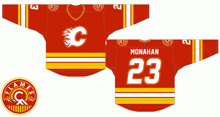
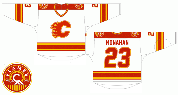
Notable changes:
* the red flaming C should be outlined the same way as it is on our current road jersey, yet using red instead of black. In order to unify the outlined look of the logo on both jerseys, the white flaming C would be quite a challenge to adapt but the red and yellow outline combo turned out to be good looking. Same for the numbers.
* Lettering - the goal was so that slighly italic and double outline numbers match the logo. As for the typeface itself, I've used the freeware 'New Athletic M54' font which IMHO combines the best of both worlds - sans-serif style from the original retro font and gently rounded corners from the new one.
* Squared off yokes are a bit contrversial but I found them perfectly fitting for Stars and Wild simplistic designs. It's one of those nice little modern touches I'd include, like them a lot.
* As for the shoulder patch, I was quite surprised when I photoshopped out the black because to me it looks sharper without it on both home and road uniforms
any thoughts ?
|
|
|
|
|
The Following 28 Users Say Thank You to playmaker For This Useful Post:
|
AC,
Burke Salad,
chalms04,
Cole436,
corporatejay,
DuckSauce,
Freeway,
Gallick,
getbak,
GoFlamesGo1989,
jayswin,
Jimmy Stang,
Joborule,
JoelOtto29,
Mattman,
Mazrim,
Mightyfire89,
MrMastodonFarm,
Nathan89,
Party Elephant,
rabenson000,
Roof-Daddy,
saskflames69,
Split98,
the_only_turek_fan,
TjRhythmic,
Vinny01,
Yamer
|
|
05-11-2014, 02:53 PM
|
#875
|
|
Powerplay Quarterback
|
playmaker, those look fantastic! though one thought, maybe its just me but i'd add a bit of white to the collar of the red jersey not sure how that would look though.
|
|
|
|
|
05-11-2014, 03:05 PM
|
#876
|
|
Lifetime Suspension
Join Date: Jul 2003
Location: Calgary, Alberta
|
Quote:
Originally Posted by playmaker
Though I'm in favor of keeping a small amount of black on our jerseys (previously posted Bastian Schmulling's concept is my favorite) recently I've been playing with retro ideas for slight modifications if the Flames decide to go full retro. Here is a concept I created:
Notable changes:
* the red flaming C should be outlined the same way as it is on our current road jersey, yet using red instead of black. In order to unify the outlined look of the logo on both jerseys, the white flaming C would be quite a challenge to adapt but the red and yellow outline combo turned out to be good looking. Same for the numbers.
* Lettering - the goal was so that slighly italic and double outline numbers match the logo. As for the typeface itself, I've used the freeware 'New Athletic M54' font which IMHO combines the best of both worlds - sans-serif style from the original retro font and gently rounded corners from the new one.
* Squared off yokes are a bit contrversial but I found them perfectly fitting for Stars and Wild simplistic designs. It's one of those nice little modern touches I'd include, like them a lot.
* As for the shoulder patch, I was quite surprised when I photoshopped out the black because to me it looks sharper without it on both home and road uniforms
any thoughts ? |
This may be the best concept ever come up with. I love the retro red, and the shoulder patch makes it more modern.
Very well done.
|
|
|
|
|
05-11-2014, 03:09 PM
|
#877
|
|
Franchise Player
|
Quote:
Originally Posted by playmaker
Though I'm in favor of keeping a small amount of black on our jerseys (previously posted Bastian Schmulling's concept is my favorite) recently I've been playing with retro ideas for slight modifications if the Flames decide to go full retro. Here is a concept I created:
Notable changes:
* the red flaming C should be outlined the same way as it is on our current road jersey, yet using red instead of black. In order to unify the outlined look of the logo on both jerseys, the white flaming C would be quite a challenge to adapt but the red and yellow outline combo turned out to be good looking. Same for the numbers.
* Lettering - the goal was so that slighly italic and double outline numbers match the logo. As for the typeface itself, I've used the freeware 'New Athletic M54' font which IMHO combines the best of both worlds - sans-serif style from the original retro font and gently rounded corners from the new one.
* Squared off yokes are a bit contrversial but I found them perfectly fitting for Stars and Wild simplistic designs. It's one of those nice little modern touches I'd include, like them a lot.
* As for the shoulder patch, I was quite surprised when I photoshopped out the black because to me it looks sharper without it on both home and road uniforms
any thoughts ? |
Beautiful. I'd love for these to be our mainstays as home/away jerseys.
Then have thirds where black is the primary color scheme, and some sort of alternate logo (no word marks).
Last edited by Roof-Daddy; 05-11-2014 at 03:31 PM.
|
|
|
|
|
05-11-2014, 03:21 PM
|
#878
|
|
Franchise Player
Join Date: Aug 2007
Location: Vancouver
|
Really like the design. Not a fan of the comic sans numbers, but other than that I like it.
__________________

|
|
|
|
|
05-11-2014, 03:23 PM
|
#879
|
|
Franchise Player
Join Date: Sep 2003
Location: Calgary
|
That's GORGEOUS.
|
|
|
|
|
05-11-2014, 03:28 PM
|
#880
|
|
Lifetime Suspension
|
Yeah, wow.
Lost in all the ugly that is the current 3rd's are what a home run the Flames hit with that shoulder patch. Love that you've kept them and altered the colour scheme to match.
Slight criticisms...
-Prefer a bigger logo that the Flames went with instead of the classic smaller one
-Don't like the cartoon font on the number
|
|
|
|
 Posting Rules
|
You may not post new threads
You may not post replies
You may not post attachments
You may not edit your posts
HTML code is Off
|
|
|
All times are GMT -6. The time now is 07:23 AM.
|
|


