 10-25-2013, 12:04 PM
|
#841
|
|
Franchise Player
|
Quote:
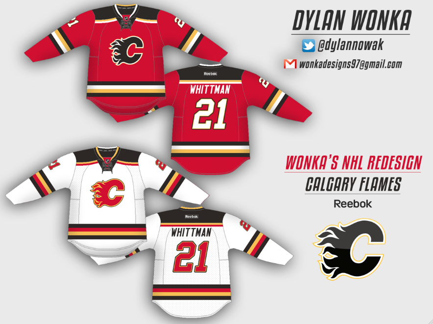
Originally Posted by BigBCalgary

I still prefer these....thanks Zarley.
 |
These. 1000x these.
|

|

|
|
The Following User Says Thank You to ComixZone For This Useful Post:
|
|
|
10-25-2013, 12:35 PM
|
#842
|
|
Franchise Player
Join Date: Nov 2009
Location: Kelowna, BC
|
Quote:
Originally Posted by flameswin
Red looks slick, the white is a major Calgary jersey foul, as it is very similar to the Canuck's colour scheme from the 90's. Not cool man, not cool.
 |
my first thought with that flames white was remove 'c' and throw on the german's hockey logo - you'd have a great jersey for the german olympic hockey team

__________________
"...and there goes Finger up the middle on Luongo!" - Jim Hughson, Av's vs. 'Nucks
|
|
|
|
|
10-25-2013, 01:04 PM
|
#843
|
|
Powerplay Quarterback
|
Quote:
Originally Posted by Kolbe31
I thought this was a nice concept. Could be finished off by adding our fancy new shoudler patches.
 |
Flip the red and black on the striping and shoulders on the white jersey and you have a win. And add the new shoulder patch.
|
|
|
|
|
11-21-2013, 01:34 AM
|
#844
|
|
Crash and Bang Winger
Join Date: May 2009
Location: Calgary
|
 New concept
I hadn't seen this one before - it's.......interesting.... Needs at least the flaming C on the shoulder - but overall based on the new secondary patch with the angles and arm stripes - I'd actually have preferred this 10x more than the 3rd jersey they went with...

__________________
The Doctor is in
|
|
|
|
|
The Following 3 Users Say Thank You to Dr. Pepper For This Useful Post:
|
|
|
11-21-2013, 02:27 AM
|
#845
|
|
Franchise Player
|
'04 Jersey, but replace the horse head with the flags or the new shoulder patch.
|
|
|
|
|
11-21-2013, 08:36 AM
|
#846
|
|
Franchise Player
Join Date: Nov 2003
Location: Calgary, AB
|
Sorry, but there is just something wrong with the flaming C not being on the front of our jersey that bothers me
|
|
|
|
|
11-21-2013, 09:34 AM
|
#847
|
|
Lifetime Suspension
|
Yeah, no Flaming C? Pass.
Plus that looks an awwwwful lot like the NYI third. And I use the word "awwwwful" very purposefully.
|
|
|
|
|
11-29-2013, 12:16 AM
|
#848
|
|
Crash and Bang Winger
Join Date: May 2009
Location: Calgary
|
 Another concept
Any takers?

__________________
The Doctor is in
|
|
|
|
|
11-29-2013, 12:31 AM
|
#849
|
|
Franchise Player
Join Date: Nov 2009
Location: Kelowna, BC
|
first impression of the black jerseys is that it reminds me of this....

....so no thanks
__________________
"...and there goes Finger up the middle on Luongo!" - Jim Hughson, Av's vs. 'Nucks
|
|
|
|
|
11-29-2013, 07:53 AM
|
#850
|
|
Self-Retirement
|
Can we let this thread die?
|
|
|
|
|
The Following 2 Users Say Thank You to normtwofinger For This Useful Post:
|
|
|
11-29-2013, 08:13 AM
|
#851
|
|
Uncle Chester
|
Not if Dr. Pepper can help it.
|
|
|
|
|
11-29-2013, 08:18 AM
|
#852
|
|
Franchise Player
Join Date: Oct 2006
Location: San Fernando Valley
|
Quote:
Originally Posted by Dr. Pepper
Any takers?
|
You are close but all you really have to do is take the Flames 80's jersey and change all the red to black and it's done. Black, yellow, and red is just too much IMO.
|
|
|
|
|
01-16-2014, 08:49 PM
|
#853
|
|
Lifetime Suspension
|
nm wrong thread
Last edited by Magnum PEI; 01-16-2014 at 08:52 PM.
|
|
|
|
|
The Following User Says Thank You to Bend it like Bourgeois For This Useful Post:
|
|
|
01-16-2014, 10:53 PM
|
#855
|
|
First Line Centre
Join Date: Oct 2009
Location: Reppin' the C in BC
|
Quote:
Originally Posted by btimbit
'04 Jersey, but replace the horse head with the flags or the new shoulder patch.
|
Flags show lack of imagination and need to go
__________________
"There are no asterisks in this life, only scoreboards." - Ari Gold
12 13 14 2 34
|

|
|
|
01-17-2014, 08:21 AM
|
#856
|
|
Not the 1 millionth post winnar
Join Date: Aug 2004
Location: Los Angeles
|
Why wear a bag if you aren't wearing a jersey? Nobody knows which team you're embarrassed by.
I mean WE know. But nobody else will.
__________________
"Isles give up 3 picks for 5.5 mil of cap space.
Oilers give up a pick and a player to take on 5.5 mil."
-Bax
|
|
|
|
|
01-17-2014, 08:41 AM
|
#857
|
|
Lifetime Suspension
Join Date: Oct 2012
Location: Halifax
|
Yes...they sadly will.
|
|
|
|
|
01-18-2014, 12:05 AM
|
#858
|
|
Franchise Player
Join Date: Jun 2006
Location: Calgary, Alberta
|

The more I think of it, the more I feel that the black C needs to be retired and the white C need to become the secondary one once again, along with removing the black outline on any of the logos. Red and Gold, and by default, white are Flames colours, and that should be the case once again.
On the thirds, my gripe with it is the black shoulders. In general, the black colour may clash on it too much, which is why it may not be welled received by the vocal group. In any concept made, the black colour clashes too much for my liking. The black has only looked good on the 04 jerseys, and that might because of the black pants since it jelled the whole uniform together.
The retro alternative reaffirmed that the Flames look their best when they're using their three original colours. I really hope that Flames executives follow the trend of what other sports teams across the continent have been doing, and either going back to their true colours, or removing black from their colour palette. I don't care if they're in their retros or they make a new design, but the black trend has faded away, and it's time Flames go back to their roots of red, gold, and white being the colours on their uniforms once again.

Last edited by Joborule; 01-18-2014 at 12:38 AM.
|
|
|
|
|
The Following 7 Users Say Thank You to Joborule For This Useful Post:
|
|
|
01-18-2014, 12:30 AM
|
#859
|
|
Franchise Player
|
Been rumours for a while that they'll keep the current thirds as thirds and bring back the retro thirds as the new regulars. I'd support that 100%
|
|
|
|
|
01-18-2014, 12:43 AM
|
#860
|
|
Franchise Player
|
The retro red jerseys or the red that you see with on the picture above with Hudler, those are the only two "HOT" Flames red. Leave the Flaming C logo the way it is, either white or red with embossed yellow on the outside.
When you're drunk at the Saddledome, you won't be able to read that word from the front of the jersey with a small logo. The new jersey is so dang amateurish in its design that it makes them look even more like a minor league team. Leave the Flaming C alone as it is and stop spelling things out!
|
|
|
|
|
The Following User Says Thank You to CSharp For This Useful Post:
|
|
 Posting Rules
|
You may not post new threads
You may not post replies
You may not post attachments
You may not edit your posts
HTML code is Off
|
|
|
All times are GMT -6. The time now is 02:50 PM.
|
|


