Calgarypuck Forums - The Unofficial Calgary Flames Fan Community

Go Back   Calgarypuck Forums - The Unofficial Calgary Flames Fan Community > Main Forums > Fire on Ice: The Calgary Flames Forum
Register Forum Rules FAQ Community Calendar Today's Posts Search

View Poll Results: Are you happy Blasty is back?
Yes 275 72.56%
No 104 27.44%
Voters: 379. You may not vote on this poll

Reply
 
Thread Tools Search this Thread
Old 11-16-2020, 09:33 AM   #801
Ashasx
Franchise Player
 
Ashasx's Avatar
 
Join Date: Jan 2011
Exp:
Default

I just don't think there is any way to make this logo look good. We have some great ideas in this thread but even nobody here could make this jersey look right with this logo.

Hoping this is just a one and done situation never to be used again, but I know many here don't mind it.
Ashasx is offline   Reply With Quote
The Following 3 Users Say Thank You to Ashasx For This Useful Post:
Old 11-16-2020, 09:34 AM   #802
Buff
Franchise Player
 
Buff's Avatar
 
Join Date: Apr 2004
Location: I don't belong here
Exp:
Default

Using this site, I looked at all of the jerseys: https://news.sportslogos.net/2020/11...eams/hockey-2/


Here are my thoughts on all the reverse retro jerseys of all the teams:

Anaheim: Sharp jersey - terrible logo
Arizona: I love the purple but the trim colors really takes away from the entire jersey
Boston: Sharp and bright. I think I like it. Might need something extra though?
Buffalo: Something is off with the logo but it's close. The colour scheme and striping works, but a huge miss on putting "Buffalo" in the strip on the front.
Calgary: The Flaming C on the shoulder looks good. The rest is terrible. I hate it.
Carolina: Nice! I like.
Chicago: Boring. Much improved upon the jersey that inspired it though, but boring.
Colorado: Very clean. I'm not overly sold on the maroon but this one will grow on me.
Columbus: Neither a hit or miss. Reminds me of Lethbridge Hurricanes jerseys from a few years ago.
Dallas: Too white. Not enough contrast.
Detroit: Practice jersey?
Edmonton: That is terrible.
Florida: Not too bad. I'm not a fan of that shade of blue, but I never have been.
Los Angeles: Pretty good. From the pic I've seen I can't tell if the logo is white or silver.
Minnesota: I like them. It is weird to see their logo in those colours but I do like them
Montreal: Very nice.
Nashville: Nice for a yellow jersey.
New Jersey: Well, that's different for that franchise. Just in time for Christmas season! They can only wear those in December.
New York Islanders: I could randomly tune into their games and not know that they were wearing their Reverse Retros. Not a fail, but nothing different.
New York Rangers: Too much blue, but clean.
Ottawa: Red alert! It could grow on me, but the logo could have been re-worked to change the large red portion to black.
Philadelphia: Meh.
Pittsburgh: I don't like the diagonal city name concept.
San Jose: Doesn't work. That much grey is just not nice on this jersey.
St.Louis: Yuck! They took a bad jersey and made it worse.
Tampa Bay: Same as the Islanders, it looks very normal.
Toronto: Who let the designers use MS Paint?
Vancouver: It's okay.
Las Vegas: No thanks.
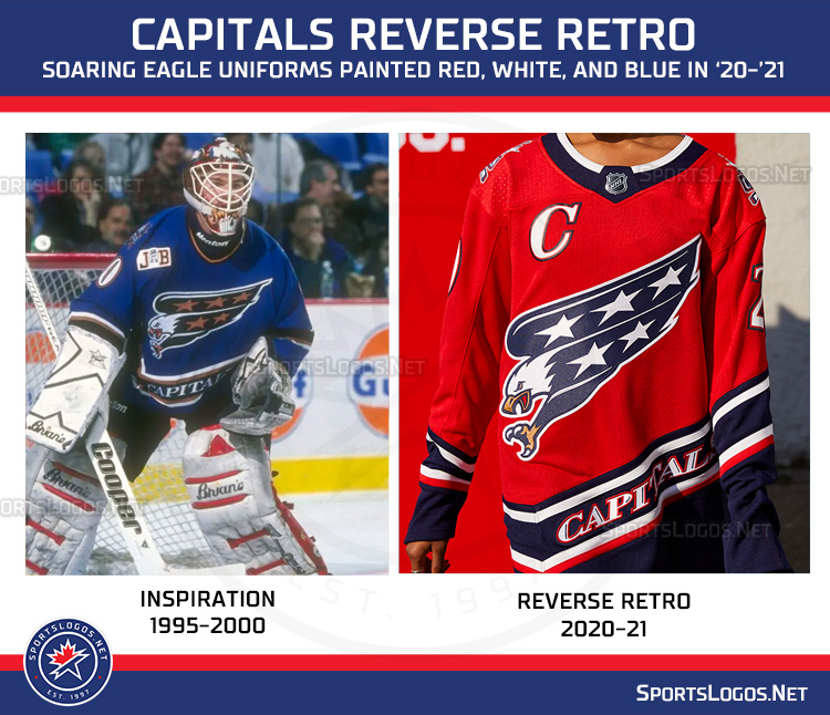
Capitals: I like them.
Winnipeg: Nope!
Buff is online now   Reply With Quote
The Following 2 Users Say Thank You to Buff For This Useful Post:
Old 11-16-2020, 09:35 AM   #803
TheIronMaiden
Franchise Player
 
TheIronMaiden's Avatar
 
Join Date: May 2016
Location: ATCO Field, Section 201
Exp:
Default

Quote:
Originally Posted by bax View Post
Flames knocked this one out of the park. Absolutely beautiful.

We went from having one of the worst jersey sets in the league to one of the best in one season.

I like the “black out” appearance these jerseys give off. Minimal striping and will look very sharp on the ice.
I agree, after suffering through a decade of busy jerseys in is nice to have one so clean and simple.
TheIronMaiden is offline   Reply With Quote
Old 11-16-2020, 09:37 AM   #804
SuperMatt18
Franchise Player
 
SuperMatt18's Avatar
 
Join Date: Feb 2007
Location: Calgary, AB
Exp:
Default

Quote:
Originally Posted by Ashasx View Post
I just don't think there is any way to make this logo look good. We have some great ideas in this thread but even nobody here could make this jersey look right with this logo.

Hoping this is just a one and done situation never to be used again, but I know many here don't mind it.
I think lots of the jerseys in here looked right. In both retro and black colorways.

Even this jersey looks pretty good.

The biggest issue is with the name/numbers IMO. That has nothing to do with the logo.
SuperMatt18 is offline   Reply With Quote
Old 11-16-2020, 09:37 AM   #805
Cecil Terwilliger
That Crazy Guy at the Bus Stop
 
Cecil Terwilliger's Avatar
 
Join Date: Jun 2010
Location: Springfield Penitentiary
Exp:
Default

Jesus christ buffalo, you kept the wordmark? Stupid, stupid, stupid.
Cecil Terwilliger is offline   Reply With Quote
The Following 6 Users Say Thank You to Cecil Terwilliger For This Useful Post:
Old 11-16-2020, 09:41 AM   #806
Cecil Terwilliger
That Crazy Guy at the Bus Stop
 
Cecil Terwilliger's Avatar
 
Join Date: Jun 2010
Location: Springfield Penitentiary
Exp:
Default

Winners - Almost everyone. I'm impressed with how good most of these look.

Losers: Buffalo for that stupid wordmark, Winnipeg just ugh, Toronto good god that's bad.

Meh: Detroit, Dallas, maybe Flames? I can't decide. Canucks, Anaheim.


I was mad about the Avs but if they're going white then I don't actually hate the mix of old and new colours.

Very rare that I'm overall quite positive about jerseys for any sport. It's just something most sports fail miserably at. So IMO this is a massive win for the NHL to have this many good looking jerseys.
Cecil Terwilliger is offline   Reply With Quote
Old 11-16-2020, 09:41 AM   #807
_Q_
#1 Goaltender
 
_Q_'s Avatar
 
Join Date: Jan 2009
Location: Calgary
Exp:
Default

It has the flaming snot horse - which I always hated. The colours and striping pattern looks more like a Canucks retro jersey. Yet, it's still miles ahead of the current third jersey/last year's primary.

I don't love it, but I don't hate it as passionately as I hated the blue flag abomination we wore for 13 seasons.
_Q_ is offline   Reply With Quote
Old 11-16-2020, 09:42 AM   #808
goodyear
Scoring Winger
 
goodyear's Avatar
 
Join Date: Nov 2006
Location: Calgary, AB
Exp:
Default

The Blasty jersey was a little bit underwhelming given its retro but not reverse.

These "true" reverse retros were pretty good:

Ducks, Bruins, Sabres, Canes, Wild, Devils and Predators

Capitals had the best one.


goodyear is offline   Reply With Quote
The Following User Says Thank You to goodyear For This Useful Post:
Old 11-16-2020, 09:43 AM   #809
flylock shox
1 millionth post winnar!
 
flylock shox's Avatar
 
Join Date: Mar 2006
Location: Now world wide!
Exp:
Default

This project makes clear why a lot of these jerseys were retired in the first place.


Winners for me:
- Minnesota
- Montreal
- Ottawa
- Winnipeg (only because the jersey will look good as worn by fans as a fashion piece, not necessarily because they'll look good on the ice)
- LA
- New Jersey
- Chicago
flylock shox is offline   Reply With Quote
The Following User Says Thank You to flylock shox For This Useful Post:
Old 11-16-2020, 09:44 AM   #810
FlamesFanFromBC
First Line Centre
 
FlamesFanFromBC's Avatar
 
Join Date: Oct 2001
Location: BC
Exp:
Default

They've done nothing compelling from the original blasty jersey... I have an old blasty and don't see any reason to get this new one.

Also I've seen fan renders that are much more interesting.
__________________
FlamesFanFromBC is offline   Reply With Quote
Old 11-16-2020, 09:45 AM   #811
tvp2003
Franchise Player
 
tvp2003's Avatar
 
Join Date: Mar 2006
Exp:
Default

I prefer the version with the white stripe along the bottom, but for a two-game novelty jersey I'm not too concerned.

So what is actually reversed on this? Just the coloring on the shoulder logo and the switch from red to black below the striping? Kudos I guess to Popowich and the creative team to only make a few small changes (in keeping with the "reverse" concept) but otherwise bringing back Blasty as we know and love (?) him.

Quote:
Originally Posted by squiggs96 View Post
Is that Monahan's head on Gelinas's body? If so, that's a weird picture to use for the comparison.
Clarke Wilm actually (Wilm's name is on the cuff of the glove).
tvp2003 is offline   Reply With Quote
The Following User Says Thank You to tvp2003 For This Useful Post:
Old 11-16-2020, 09:46 AM   #812
PepsiFree
Participant
Participant
 
PepsiFree's Avatar
 
Join Date: Jul 2015
Exp:
Default

The jersey looks sick. Nothing about it really screams "reverse" to me (there are maybe 5 other jerseys released that I would say are a pretty big stretch to fit into the reverse motif) and having seen the re-colouring attempts at the logo, I'm glad they kept it the same.

AC's versions definitely look a little better to me, but I like this and I'll happily buy it.
PepsiFree is offline   Reply With Quote
The Following User Says Thank You to PepsiFree For This Useful Post:
Old 11-16-2020, 09:48 AM   #813
Kipper_3434
First Line Centre
 
Join Date: Jun 2013
Exp:
Default

Really like the jersey but not a fan of the font or mismatched outlines around logo(s), C, and names. Not enough to dislike the jersey but bad enough that my likelihood of buying one went from about 1% to 0%. Blasty looks good and the stripes pop nicely, enjoy the 04 style chevron shape.
Kipper_3434 is offline   Reply With Quote
Old 11-16-2020, 09:51 AM   #814
CroFlames
Franchise Player
 
CroFlames's Avatar
 
Join Date: Feb 2015
Exp:
Default

Besides Minnesota who are the clear winners here, Habs, Caps and Avs all tied for 2nd. Flames I think are 3rd.

Lots of good ones including Rangers, Kings, Panthers.

LoL at Leafs; the worst one by a mile.
CroFlames is offline   Reply With Quote
Old 11-16-2020, 09:51 AM   #815
getbak
Franchise Player
 
getbak's Avatar
 
Join Date: Feb 2006
Location: Calgary, AB
Exp:
Default

Quote:
Originally Posted by SuperMatt18 View Post
Why? I honestly never understood the hate for the logo.

It was awesome as a shoulder patch, and is a good alternate logo.

A fire breathing horse is a great logo for the Calgary Flames in this city, and the execution of the logo is pretty good.
Here are my issues with it...
  • It's yellow.
  • It doesn't have a mane, which makes it look bald.
  • Front views of horses in illustrations generally don't look as good as a side view or at least a 3/4 view. If you do an image search for "horse logo", hardly any of the examples have the horse's head looking straight ahead.
  • The flames coming out of the nose look weird.

A side view of a charging or rearing horse would have looked better, IMO. That also would have allowed them to incorporate flames into the mane and tail. My guess is they didn't want to do that because it would be too similar to the Stamps or the Denver Broncos who had updated their logo only a year earlier.
__________________
Turn up the good, turn down the suck!
getbak is online now   Reply With Quote
Old 11-16-2020, 09:53 AM   #816
TheScorpion
First round-bust
 
TheScorpion's Avatar
 
Join Date: Feb 2015
Location: speculating about AHL players
Exp:
Default

But what's wrong with yellow? It's one of the Flames' colours.
__________________
Need a great deal on a new or pre-owned car? Come see me at Platinum Mitsubishi — 2720 Barlow Trail NE

TheScorpion is offline   Reply With Quote
Old 11-16-2020, 09:54 AM   #817
Patek23
Franchise Player
 
Patek23's Avatar
 
Join Date: Jul 2002
Location: ---
Exp:
Default

Well its as ugly as it was the first time. But I guess this is what some people wanted? Going to guess alot of late 80s and early 90s kids. Cuz this jersey gives me terrible flashbacks to terrible memories.

Edit- it looks super weird with the black under the bottom striping. Why not keep that red just like the original. The black there gives it a practice jersey vibe.
Patek23 is offline   Reply With Quote
The Following 3 Users Say Thank You to Patek23 For This Useful Post:
Old 11-16-2020, 09:55 AM   #818
getbak
Franchise Player
 
getbak's Avatar
 
Join Date: Feb 2006
Location: Calgary, AB
Exp:
Default

Quote:
Originally Posted by TheScorpion View Post
But what's wrong with yellow? It's one of the Flames' colours.
It's an accent colour.
__________________
Turn up the good, turn down the suck!
getbak is online now   Reply With Quote
The Following User Says Thank You to getbak For This Useful Post:
Old 11-16-2020, 09:56 AM   #819
GreenLantern2814
Franchise Player
 
GreenLantern2814's Avatar
 
Join Date: Mar 2011
Exp:
Default

Even for us, this is lame.
__________________
”All you have to decide is what to do with the time that is given to you.”

Rowan Roy W-M - February 15, 2024
GreenLantern2814 is offline   Reply With Quote
The Following 3 Users Say Thank You to GreenLantern2814 For This Useful Post:
Old 11-16-2020, 09:56 AM   #820
Scroopy Noopers
Pent-up
 
Scroopy Noopers's Avatar
 
Join Date: Mar 2018
Location: Plutanamo Bay.
Exp:
Default

Quote:
Originally Posted by Flaming Homer View Post
Well its as ugly as it was the first time. But I guess this is what some people wanted? Going to guess alot of late 80s and early 90s kids. Cuz this jersey gives me terrible flashbacks to terrible memories.

Edit- it looks super weird with the black under the bottom striping. Why not keep that red just like the original. The black there gives it a practice jersey vibe.
I’m assuming the pants are Red, and not black like the originals.
Scroopy Noopers is online now   Reply With Quote
Reply


Posting Rules
You may not post new threads
You may not post replies
You may not post attachments
You may not edit your posts

BB code is On
Smilies are On
[IMG] code is On
HTML code is Off

Forum Jump


All times are GMT -6. The time now is 02:45 PM.

Calgary Flames
2024-25


Powered by vBulletin® Version 3.8.4
Copyright ©2000 - 2025, Jelsoft Enterprises Ltd.
Copyright Calgarypuck 2021 | See Our Privacy Policy