|
View Poll Results: Are you happy Blasty is back?
|
|
Yes
|
   
|
275 |
72.56% |
|
No
|
  
|
104 |
27.44% |
 11-16-2020, 09:13 AM
|
#721
|
|
Franchise Player
Join Date: Mar 2006
Location: Shanghai
|
Quote:
Originally Posted by AustinL_NHL

Has anyone ever had an unctrollable, never-ending orgasm before?
Because that is the exact thing I am experiencing right now staring at that jersey.
BLASTY. IS. BACK.
|
There's one more connotation blasty could do without.
__________________
"If stupidity got us into this mess, then why can't it get us out?"
|

|

|
|
11-16-2020, 09:14 AM
|
#722
|
|
#1 Goaltender
Join Date: Aug 2007
Location: Halifax
|
Screw my savings. I need me that blasty!
|
|
|
|
|
The Following User Says Thank You to foofighter15 For This Useful Post:
|
|
|
11-16-2020, 09:14 AM
|
#723
|
|
Franchise Player
Join Date: Apr 2008
Location: CGY
|
Little bit of a letdown but still nice.
Funny I heard the afternoon fill in guys talking on the FAN last week and the take was you either love or hate blasty.
Put me in the meh camp. Definitely do not love or hate the jersey
|
|
|
|
|
11-16-2020, 09:16 AM
|
#724
|
|
Some kinda newsbreaker!
Join Date: May 2004
Location: Learning Phaneufs skating style
|
|
|
|
|
|
The Following User Says Thank You to sureLoss For This Useful Post:
|
|
|
11-16-2020, 09:16 AM
|
#725
|
|
Franchise Player
Join Date: Feb 2007
Location: Calgary, AB
|
Quote:
Originally Posted by Zarley
Its better / cleaner looking than the original. The only miss for me is that the first outline around the white C on the shoulder should be red instead of black, matching the number font. Otherwise looks good!
|
This bugs me too.
The lettering is white with red outline.
The numbering is white with red and yellow outline.
The shoulder patches are white with yellow outline.
No good reason for those three things to now be aligned to the same outline so it looks consistent. It what I like least about the jersey.
|
|
|
|
|
The Following 2 Users Say Thank You to SuperMatt18 For This Useful Post:
|
|
|
11-16-2020, 09:19 AM
|
#726
|
|
Jordan!
Join Date: Jul 2009
Location: Chandler, AZ
|
Wish it was white on the bottom..
Buying purple yotes jersey obviously but on the fence now with the blasty. It's too similar to the original
|
|
|
|
|
The Following 2 Users Say Thank You to Jordan! For This Useful Post:
|
|
|
11-16-2020, 09:20 AM
|
#727
|
|
Pent-up
Join Date: Mar 2018
Location: Plutanamo Bay.
|
Quote:
Originally Posted by Ashasx
The Kings and the Wild especially look great. Minnesota should really go with this colour scheme full time.
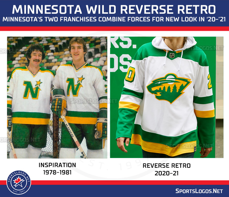 |
Easily the best two. Nailed it.
|
|
|
|
|
The Following 2 Users Say Thank You to Scroopy Noopers For This Useful Post:
|
|
|
11-16-2020, 09:20 AM
|
#728
|
|
Resident Videologist
Join Date: Mar 2002
Location: Calgary
|
Quote:
Originally Posted by SuperMatt18
This bugs me too.
The lettering is white with red outline.
The numbering is white with red and yellow outline.
The shoulder patches are white with yellow outline.
No good reason for those three things to now be aligned to the same outline so it looks consistent. It what I like least about the jersey.
|
Yeah I agree. The sewed on elements have 4 different transitions to the black of the jersey, which makes it look busier.
White/red for the letters and captaincy.
White/red/yellow for the numbers.
White/black/yellow for the shoulder logos.
Black/white for the main logo.
|
|
|
|
|
11-16-2020, 09:21 AM
|
#729
|
|
Franchise Player
Join Date: Nov 2008
Location: the dark side of Sesame Street
|
Quote:
Originally Posted by Ashasx
The Kings and the Wild especially look great. Minnesota should really go with this colour scheme full time.
|
Buffalo, Montreal and Washington are pretty sharp, too.
__________________
"If Javex is your muse
then dive in buddy"
- Surferguy
|
|
|
|
|
The Following 2 Users Say Thank You to Puppet Guy For This Useful Post:
|
|
|
11-16-2020, 09:22 AM
|
#730
|
|
Franchise Player
Join Date: Dec 2011
Location: Calgary
|
Quote:
Originally Posted by sureLoss
|
This trend of white gloves and white pants needs to die.
|
|
|
|
|
The Following 6 Users Say Thank You to N-E-B For This Useful Post:
|
|
|
11-16-2020, 09:23 AM
|
#731
|
|
Franchise Player
Join Date: Mar 2002
Location: Calgary
|
Quote:
Originally Posted by SuperMatt18
I think it's okay.
A white version of the jersey, or even some of the black designs on here looked better.
I actually like the waste striping better than the original but think there should have been a white stripe too.
Also don't really get why the yellow stripe at the bottom looks gold instead of Flames yellow.
Edit: Looks like the gold look is maybe just lighting in the video this still looks right.
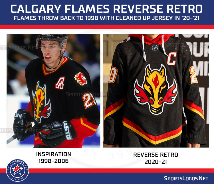 |
Definitely has the Hitmen vibe.

Weird how Sportslogos shows Monahan wearing theinspiration jersey.
|
|
|
|
|
11-16-2020, 09:24 AM
|
#732
|
|
Powerplay Quarterback
Join Date: Mar 2014
Location: MTL
|
I like it!
Simple, clean, unique
In my opinion the best are:
Wild
Sens
Flames
Bruins
Kings
Hawks
NYR
|

|
|
|
11-16-2020, 09:24 AM
|
#733
|
Join Date: Dec 2010
Location: Cleveland, OH (Grew up in Calgary)
|
I for one am pleased that Blasty is back and cant wait to get this jersey.
__________________
Just trying to do my best
|
|
|
|
|
The Following User Says Thank You to Hockey_Ninja For This Useful Post:
|
|
|
11-16-2020, 09:25 AM
|
#734
|
|
Scoring Winger
Join Date: Jul 2008
Location: New York, NY
|
Not doing a flaming "A" here was a huge miss by the organization...
|
|
|
|
|
The Following 5 Users Say Thank You to Domoic For This Useful Post:
|
|
|
11-16-2020, 09:25 AM
|
#735
|
|
All I can get
|
It could've been worse.
__________________
Edmonton is No Good.
|
|
|
|
|
The Following User Says Thank You to Reggie Dunlop For This Useful Post:
|
|
|
11-16-2020, 09:28 AM
|
#736
|
|
Franchise Player
Join Date: Feb 2006
Location: Calgary, AB
|
I don't hate the Canucks green-blue gradient.
I don't like the logo choice the Leafs made...
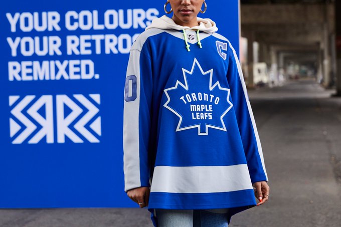
It looks very oversized and doesn't match with the logo on the 1970 version of their jersey.
__________________
Turn up the good, turn down the suck!
|
|
|
|
|
The Following 3 Users Say Thank You to getbak For This Useful Post:
|
|
|
11-16-2020, 09:29 AM
|
#737
|
|
Franchise Player
Join Date: Oct 2006
Location: San Fernando Valley
|
That Wild jersey is amazing.
|
|
|
|
|
The Following 3 Users Say Thank You to Erick Estrada For This Useful Post:
|
|
|
11-16-2020, 09:29 AM
|
#738
|
|
Crash and Bang Winger
|
Should look really good with black pants! Curious to see what the socks will look like
|
|
|
|
|
11-16-2020, 09:30 AM
|
#739
|
|
Franchise Player
|
Quote:
Originally Posted by browna
Weird how Sportslogos shows Monahan wearing theinspiration jersey.
|
That is weird. When would he have ever worn it?
|
|
|
|
|
11-16-2020, 09:31 AM
|
#740
|
|
Franchise Player
Join Date: Dec 2005
Location: Moscow
|
I'll just have to hope that the Flames don't wear this jersey very often.
__________________
"Life of Russian hockey veterans is very hard," said Soviet hockey star Sergei Makarov. "Most of them don't have enough to eat these days. These old players are Russian legends."
|
|
|
|
|
The Following 2 Users Say Thank You to Makarov For This Useful Post:
|
|
 Posting Rules
|
You may not post new threads
You may not post replies
You may not post attachments
You may not edit your posts
HTML code is Off
|
|
|
All times are GMT -6. The time now is 08:51 PM.
|
|


