 08-24-2013, 07:32 PM
|
#641
|
|
First Line Centre
Join Date: Oct 2011
Location: The Armpit of BC: Trail
|
Quote:
Originally Posted by GreenLantern2814

|
Thanks. Ill send an email later when my phone isn't dying.
I love the CP braintrust.
__________________
Disregard any and all THANKS I give. I'm a dirty, dirty thanks-whore.
|

|

|
|
08-24-2013, 07:35 PM
|
#642
|
|
Resident Videologist
Join Date: Mar 2002
Location: Calgary
|
I think there's a risk of pissing KK off if he gets email bombed like this.
Why not simply link him to this thread to show how much support those jersey designs have?
|
|
|
|
|
The Following User Says Thank You to AC For This Useful Post:
|
|
|
08-24-2013, 07:59 PM
|
#643
|
|
Franchise Player
|
Quote:
Originally Posted by AC
I think there's a risk of pissing KK off if he gets email bombed like this.
Why not simply link him to this thread to show how much support those jersey designs have?
|
What's he going to do, shut down the site? People seem to really dig the creme, and most people who have supported it have said they'd buy it in a heartbeat. Which they don't say about most of the designs in this thread.
Tell the president to give us awesome new sweaters and give us something cool to watch our last place team in.
__________________
All you have to decide is what to do with the time that is given to you.
Rowan Roy W-M - February 15, 2024
|
|
|
|
|
08-24-2013, 08:43 PM
|
#644
|
|
Backup Goalie
Join Date: Sep 2012
Exp: 
|
Dear Mr. Ken King,
Please consider the following concept for a future Calgary Flames Jersey possibility.
It has received overwhelming support by an avid Flames following. In a sense, a new uniform for a new era in flames hockey.
"Image"
Please do not feel compelled to reply. I trust you are occupied by far more important matters.
Kind regards,
Dedicated Flames Fan
|
|
|
|
|
08-24-2013, 08:48 PM
|
#645
|
|
Franchise Player
Join Date: Nov 2006
Location: Salmon with Arms
|
Quote:
Originally Posted by Beer-gut Murray
Dear Mr. Ken King,
Please consider the following concept for a future Calgary Flames Jersey possibility.
It has received overwhelming support by an avid Flames following. In a sense, a new uniform for a new era in flames hockey.
"Image"
Please do not feel compelled to reply. I trust you are occupied by far more important matters.
Kind regards,
Dedicated Flames Fan
|
To ensure he opens the email have the subject read "Penis enlargement pills-effectively guarantee"
|
|
|
|
|
The Following 2 Users Say Thank You to Street Pharmacist For This Useful Post:
|
|
|
08-24-2013, 08:50 PM
|
#646
|
|
Franchise Player
Join Date: Feb 2004
Location: Brisbane, Australia
|
I too really like the creme jerseys and would probably buy a home and an away if they were to actually become our new uni's. Would also really like to see a mock up third jersey using the same theme but with the alternate logo on the front.
__________________
"Man, so long as he remains free, has no more constant and agonizing anxiety than to find, as quickly as possible, someone to worship."
Fyodor Dostoevsky - The Brothers Karamazov
|
|
|
|
|
08-24-2013, 09:40 PM
|
#647
|
|
Lifetime Suspension
Join Date: Sep 2007
Location: blow me
|
I hate to be "that guy", but I hope Ken King (or whoever makes the decision) doesn't take a few emails as scripture for what all Flames fans like.
I agree that are some great designs here, and I like a lot of them, but I personally can't get past the white 'C' on the red jersey.
I would love to see them keep a black 'C' with white and yellow edging.
Again...sorry to be such a downer.
|
|
|
|
|
The Following 2 Users Say Thank You to RedMileDJ For This Useful Post:
|
|
|
08-24-2013, 09:41 PM
|
#648
|
|
Lifetime Suspension
Join Date: Sep 2007
Location: blow me
|
Quote:
Originally Posted by AC

I still prefer this set that was posted in the other thread.
I don't think we should introduce creme as a primary colour for the team. |
I love the Brodie jersey here.
|
|
|
|
|
The Following User Says Thank You to RedMileDJ For This Useful Post:
|
|
|
08-26-2013, 12:17 AM
|
#649
|
|
Franchise Player
Join Date: Jan 2010
Location: Kelowna
|
Quote:
Originally Posted by Pierre "Monster" McGuire
These are phenomenally beautiful! I'd buy one in an instant.
|
Wow...those are awesome!
|
|
|
|
|
08-26-2013, 12:27 AM
|
#650
|
|
Lifetime Suspension
|
Quote:
Originally Posted by Red-Mile-DJ
I hate to be "that guy", but I hope Ken King (or whoever makes the decision) doesn't take a few emails as scripture for what all Flames fans like.
I agree that are some great designs here, and I like a lot of them, but I personally can't get past the white 'C' on the red jersey.
I would love to see them keep a black 'C' with white and yellow edging.
Again...sorry to be such a downer.
|
I second that. The retro style is cool, but I think the black C really has more to it.
|
|
|
|
|
08-26-2013, 12:31 AM
|
#651
|
|
Draft Pick
Join Date: Mar 2012
Location: Calgary
|
Quote:
Originally Posted by dissentowner
I might be alone on this but I wish the retro jerseys would go back to 1989. Seriously, the were good back then but they are stale and dated now. The 04 Jerseys were by far the best we ever had.
|
Nar I'm with you on that one. Looks like a mens league jersey lol!
|
|
|
|
|
The Following User Says Thank You to mattcoco35 For This Useful Post:
|
|
|
08-26-2013, 02:17 AM
|
#652
|
|
Franchise Player
|
Quote:
Originally Posted by Split98
So I think I'm finally pretty happy with the concept. After playing around with the nameplate font, I found that I really did just love the clean (though Coyote's-esque) simple sans font. I also still never dug adding the extra band to the waist and included here is the neck-placement alternate logo that would be a great place if Reebok does end up allowing their branding relocation. I also retained the tie-ups, but decided on a jersey coloured thread to blend while keeping the (IMO) great look of a tie-up. Blends, avoids the clutter that bothered some people and adds that classic tie-up touch.
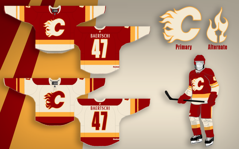
Thanks a lot for the positive response guys, this was definitely something I've had a ton of fun working on. |
I feel as though this picture needs to be on every page.
|
|
|
|
|
The Following 3 Users Say Thank You to Ashasx For This Useful Post:
|
|
|
08-26-2013, 03:20 AM
|
#653
|
|
A Fiddler Crab
Join Date: Jan 2007
Location: Chicago
|
Aren't there fairly serious issues around intellectual property that are raised by threads/blogs/email jihads of this nature?
If the Flames were to release a cream jersey now that even bore a passing resemblance to this design, wouldn't it expose them to a potential lawsuit? I imagine that the intention of most posters here is to show what they like, but what if you're a professional designer, or what if you were hoping to become one, or break into the big-leagues of design?
Having a major sports team select you as the designer for their jerseys would be a huge feather in your cap and would represent a substantial amount of money. Would anyone really blame someone who had made a gorgeous design only to see their team use it - or something very close - and not compensate or credit them?
So, as much as these threads are fun and the designs are great, I think that the more a design shows up on a thread like this the less likely it is to ever come close to reality.
|
|
|
|
|
08-26-2013, 03:33 AM
|
#654
|
|
Franchise Player
Join Date: Aug 2003
Location: Calgary, Alberta, Canada
|

Quote:
Originally Posted by driveway
Aren't there fairly serious issues around intellectual property that are raised by threads/blogs/email jihads of this nature?
If the Flames were to release a cream jersey now that even bore a passing resemblance to this design, wouldn't it expose them to a potential lawsuit? I imagine that the intention of most posters here is to show what they like, but what if you're a professional designer, or what if you were hoping to become one, or break into the big-leagues of design?
Having a major sports team select you as the designer for their jerseys would be a huge feather in your cap and would represent a substantial amount of money. Would anyone really blame someone who had made a gorgeous design only to see their team use it - or something very close - and not compensate or credit them?
So, as much as these threads are fun and the designs are great, I think that the more a design shows up on a thread like this the less likely it is to ever come close to reality.
|
It's really not that difficult. Just find the person who made it (in this case Split98), and compensate them for designing the jersey.
__________________

Huge thanks to Dion for the signature!
|
|
|
|
|
08-26-2013, 03:56 AM
|
#655
|
|
A Fiddler Crab
Join Date: Jan 2007
Location: Chicago
|
Quote:
Originally Posted by Nehkara
It's really not that difficult. Just find the person who made it (in this case Split98), and compensate them for designing the jersey.
|
Okay, but in this case, Split98 has posted the design on the internet, solicited advice, and changed the design based on that advice. This means that every single person who commented on the design (at the very least), could have a legitimate claim to compensation for participating in the design of the jersey. Not to mention all the commenters at Icethetics, in addition to the guys who run the icethetics blog itself, Bingo here at CP, and any other places the jersey has been posted.
All it takes is one of those people deciding to be a dink about things and it becomes a legal nightmare for the team.
|
|
|
|
|
The Following User Says Thank You to driveway For This Useful Post:
|
|
|
08-26-2013, 09:44 AM
|
#656
|
|
Franchise Player
|
Quote:
Originally Posted by driveway
Okay, but in this case, Split98 has posted the design on the internet, solicited advice, and changed the design based on that advice. This means that every single person who commented on the design (at the very least), could have a legitimate claim to compensation for participating in the design of the jersey. Not to mention all the commenters at Icethetics, in addition to the guys who run the icethetics blog itself, Bingo here at CP, and any other places the jersey has been posted.
All it takes is one of those people deciding to be a dink about things and it becomes a legal nightmare for the team.
|
Not that I think you're wrong, but this is the sort of thinking that makes society worse.
__________________
All you have to decide is what to do with the time that is given to you.
Rowan Roy W-M - February 15, 2024
|
|
|
|
|
08-26-2013, 10:12 AM
|
#657
|
|
Franchise Player
Join Date: Sep 2011
Location: The toilet of Alberta : Edmonton
|
Quote:
Originally Posted by GreenLantern2814
Not that I think you're wrong, but this is the sort of thinking that makes society worse.
|
No doubt. Since Split probably got most or all of the tweaking suggestions from here, who on CP is going to be THAT guy? I'd like to think none us are a dickhead of that proportion.
__________________
"Illusions Michael, tricks are something a wh*re does for money ....... or cocaine"
|
|
|
|
|
08-26-2013, 10:14 AM
|
#658
|
|
#1 Goaltender
|
Quote:
Originally Posted by MisterJoji
No doubt. Since Split probably got most or all of the tweaking suggestions from here, who on CP is going to be THAT guy? I'd like to think none us are a dickhead of that proportion.
|
Would that actually hold up in a court though? Because you voiced your opinion online under an alias you deserve some sort of compensation? Me thinks not. Also, yeah I hope no one on here is that greedy to even attempt such a things.
|
|
|
|
|
08-26-2013, 10:18 AM
|
#659
|
|
Lifetime Suspension
Join Date: Sep 2007
Location: blow me
|
IMO, if you want to keep your idea as yours, then don't put it on the internet.
I'm glad it was shared with all of us.
|
|
|
|
|
08-26-2013, 10:23 AM
|
#660
|
|
Franchise Player
Join Date: Feb 2007
Location: Calgary, AB
|
Quote:
Originally Posted by Split98
So I think I'm finally pretty happy with the concept. After playing around with the nameplate font, I found that I really did just love the clean (though Coyote's-esque) simple sans font. I also still never dug adding the extra band to the waist and included here is the neck-placement alternate logo that would be a great place if Reebok does end up allowing their branding relocation. I also retained the tie-ups, but decided on a jersey coloured thread to blend while keeping the (IMO) great look of a tie-up. Blends, avoids the clutter that bothered some people and adds that classic tie-up touch.
Thanks a lot for the positive response guys, this was definitely something I've had a ton of fun working on. |
These are great.
One thing I would like though is a smaller Flaming C.
The logo was much smaller on the 80's/90's jerseys and think that the Flaming C is too big on the current jerseys.
|
|
|
|
 Posting Rules
|
You may not post new threads
You may not post replies
You may not post attachments
You may not edit your posts
HTML code is Off
|
|
|
All times are GMT -6. The time now is 06:19 AM.
|
|


