|
View Poll Results: Best Flames Jersey
|
|
Originals (last year's retros)
|
   
|
212 |
77.09% |
|
Angled Podium Jersey
|
  
|
4 |
1.45% |
|
Black Horse Head
|
  
|
3 |
1.09% |
|
2004 Cup Run Jerseys
|
  
|
46 |
16.73% |
|
Current Set
|
  
|
8 |
2.91% |
|
Cowboy Alternates
|
  
|
2 |
0.73% |
 03-08-2014, 10:58 AM
|
#41
|
|
Franchise Player
Join Date: Aug 2004
Location: Conquering the world one 7-11 at a time
|
Love the retros and I always will, but they shouldn't be our primary jersey. I'm fine with the team wearing them 8 times a year or whatever but they should be kept and celebrated as a part of Flames history, not re-instated so we can try and live in the glory days of our past like the lunkheads up north.
__________________
"There will be a short outage tonight sometime between 11:00PM and 1:00AM as network upgrades are performed. Please do not panic and overthrow society. Thank you."
|

|

|
|
The Following User Says Thank You to Redliner For This Useful Post:
|
|
|
03-08-2014, 11:00 AM
|
#42
|
|
Uncle Chester
|
Quote:
Originally Posted by dissentowner

The retros are outdated and they do not represent all of the Flames colours as there is no black. They are bland and boring which was great back in the 80's but look dated and blah now. The 2004 jerseys were the perfect design, bring those back and leave the retros for retro night. The people that want to dwell in jersey past can whine all they want but it won't matter because the team recognizes that you can't stay glued to the past. The retros will never be the full time jerseys again, I guarantee it.
|
I know you like the black on the jersey but black is not a Flames colour. It shouldn't be there.
|
|
|
|
|
03-08-2014, 11:00 AM
|
#43
|
|
Lifetime Suspension
Join Date: Jul 2003
Location: Calgary, Alberta
|
Quote:
Originally Posted by playmaker
Leave the retro thirds to special events only and change our current uniforms to something like Bastian Schmulling concept below
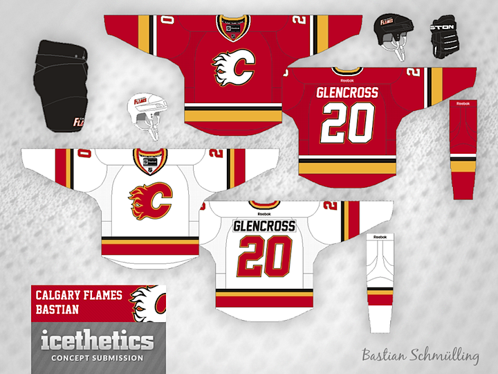
The only thing I'd add to them is a subtle outline around yokes (red on white jerseys and yellow on red jerseys) with the new shoulder patch inside. Hopefuly they will ged rid of black flaming C soon and bring the legendary white flaming C back.
White on red provides much better contrast and makes jerseys look sharper. |
Make the 'C' black on the red jersey and that would be a nice simple design.
Not to sound anti-Canadian or anti-Albertan, but the Flags look so dumb. The little blue patch on a red jersey has to be the worst design in the NHL.
But....if, I had my way, I would go back to the retros for the road and at home.
|
|
|
|
|
03-08-2014, 11:01 AM
|
#44
|
|
First Line Centre
Join Date: Nov 2009
Location: TEXAS!!
|
Just giving some love to the current home jersey.
Easily one of my all time favorites. I bought mine within a day or two of them coming out, and I'm not one of the "buy everything Flames-related" people.
Also, the flags are the best thing on any jersey in the NHL.
__________________
I am a lunatic whose world revolves around hockey and Oilers hate.
|
|
|
|
|
03-08-2014, 11:05 AM
|
#45
|
|
First Line Centre
Join Date: Aug 2004
Location: Calgary in Heart, Ottawa in Body
|
Quote:
Originally Posted by N-E-B
I agree. I enjoyed them a lot more this year seeing them once than seeing them 10 times last year. Edmonton's ruined their 80's jerseys, why do the same here?
|
This.
I love the retros, but I like seeing them once and a while as a Third Jersey and for special occasions. Seeing them on the team every game would lose the nostalgia. The Oilers look like they're really trying to live in the past glory by wearing the blue/orange every game.
I like that there are distinct jersey eras for our teams history.
Retros - Glory Years.
Pedistals - Young Guns/Fluery Years
2004 Run - Iginla/Kipper
Create a new simple and classic set of threads for the Monohan Years and let them define a new era for that Jersey.
|
|
|
|
|
03-08-2014, 11:09 AM
|
#46
|
|
Lifetime Suspension
Join Date: Oct 2012
Location: Halifax
|
I hate when teams change their jerseys all the time (Vancouver). Just go with the Retros, touch them up a little and don't change them ever again.
|
|
|
|
|
03-08-2014, 11:27 AM
|
#47
|
|
Franchise Player
Join Date: Oct 2003
Location: Vancouver
|
No question the retros ARE the Calgary Flames. How great was it to see the Stanley Cup winners come out in the proper Flames jerseys, and then see the kids go out wearing the same threads. The Flames just look like a way better team in those jerseys. The organization needs to do the right thing here and make the Flames look like the Flames again. The pride in the organization will start to be restored with that simple change, from the players to the fans.
Also, the Flames would've won the cup in 2004 if they had the retro jerseys on!
__________________
A few weeks after crashing head-first into the boards (denting his helmet and being unable to move for a little while) following a hit from behind by Bob Errey, the Calgary Flames player explains:
"I was like Christ, lying on my back, with my arms outstretched, crucified"
-- Frank Musil - Early January 1994
|
|
|
|
|
The Following 2 Users Say Thank You to Igottago For This Useful Post:
|
|
|
03-08-2014, 11:45 AM
|
#48
|
|
First Line Centre
Join Date: Jul 2010
Location: Calgary
|
Quote:
Originally Posted by dissentowner
The retros are outdated and they do not represent all of the Flames colours as there is no black. They are bland and boring which was great back in the 80's but look dated and blah now. The 2004 jerseys were the perfect design, bring those back and leave the retros for retro night. The people that want to dwell in jersey past can whine all they want but it won't matter because the team recognizes that you can't stay glued to the past. The retros will never be the full time jerseys again, I guarantee it.
|
I need to pile on. You say don't dwell in jersey past and then proceed to say we should bring back the 2004 jersey? LOL c'mon man.
Retros FTW.
__________________
|
|
|
|
|
03-08-2014, 11:50 AM
|
#49
|
|
Franchise Player
|
Quote:
Originally Posted by playmaker
Leave the retro thirds to special events only and change our current uniforms to something like Bastian Schmulling concept below
The only thing I'd add to them is a subtle outline around yokes (red on white jerseys and yellow on red jerseys) with the new shoulder patch inside. Hopefuly they will ged rid of black flaming C soon and bring the legendary white flaming C back.
White on red provides much better contrast and makes jerseys look sharper. |
These seem nice. As someone else said, I'd experiment with a black C on the red, but I like the white as well.
|
|
|
|
|
03-08-2014, 12:06 PM
|
#50
|
|
Unfrozen Caveman Lawyer
Join Date: Oct 2002
Location: Crowsnest Pass
|
Black was a shameless attempt by most sports franchises to try and sell ball caps to hip-hop
Mall rats.
|
|
|
|
|
The Following 3 Users Say Thank You to troutman For This Useful Post:
|
|
|
03-08-2014, 12:08 PM
|
#51
|
|
Franchise Player
|
Quote:
Originally Posted by troutman
Black was a shameless attempt by most sports franchises to try and sell ball caps to hip-hop
Mall rats.
|
I have no idea what it was an attempt at, but regardless, it looked / looks sharp.
|
|
|
|
|
03-08-2014, 12:40 PM
|
#52
|
|
Franchise Player
Join Date: Jul 2009
Location: Red Deer
|
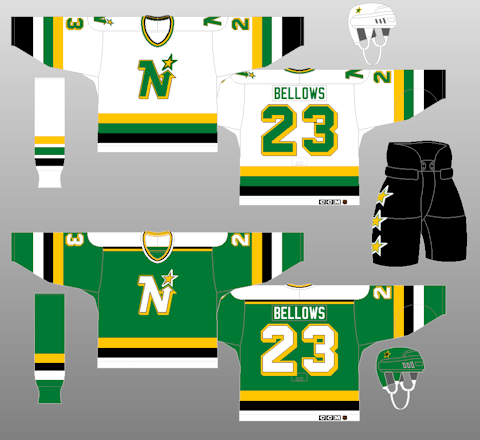
Black as an accent does well (see the North Stars jerseys as a prime example).
__________________
"It's a great day for hockey."
-'Badger' Bob Johnson (1931-1991)
"I see as much misery out of them moving to justify theirselves as them that set out to do harm."
-Dr. Amos "Doc" Cochran
|
|
|
|
|
The Following 2 Users Say Thank You to Yamer For This Useful Post:
|
|
|
03-08-2014, 01:05 PM
|
#53
|
|
Franchise Player
Join Date: May 2004
Location: Helsinki, Finland
|
The 2004 jersey is nice too, but not as good as the retros.
But the retro white is the ultimate for me, I want that back more than anything.
|
|
|
|
|
03-08-2014, 01:08 PM
|
#54
|
|
damn onions
|
the Flames need new uniforms because the existing set is hideous (all of them).
Whatever they do I don't give a damn but for the love of Christ just get a set that doesn't make one want to claw their eyes out.
Same goes for Stampeders actually. Losing black seems like a logical step for better aesthetics.
|
|
|
|
|
The Following User Says Thank You to Mr.Coffee For This Useful Post:
|
|
|
03-08-2014, 01:22 PM
|
#55
|
|
Franchise Player
|
Related question: if/when the Cowboy alternate jersey gets mothballed, how long until it comes back as the cool "so bad it's good" design (similar to the Pedestal jerseys nowadays)? Especially if Monahan ends up reaching his full potential (i.e. with this being his rookie year)?
|
|
|
|
|
03-08-2014, 03:04 PM
|
#56
|
|
Franchise Player
Join Date: Jul 2005
Location: SW Ontario
|
Quote:
Originally Posted by undercoverbrother
ban this man
|
Yup, ban somebody for having a differing opinion. I believe I have said this before, are you a mod? No? Then shut your hole! Freakin trolls on this board....
|
|
|
|
|
03-08-2014, 03:06 PM
|
#57
|
|
Franchise Player
Join Date: Jul 2005
Location: SW Ontario
|
Quote:
Originally Posted by icecube
|
No, I am not wrong, the retros are being discontinued, everything has pointed to it. They are not coming back as the regular jerseys.
|
|
|
|
|
03-08-2014, 03:08 PM
|
#58
|
|
Franchise Player
Join Date: Jul 2005
Location: SW Ontario
|
Quote:
Originally Posted by SportsJunky
I know you like the black on the jersey but black is not a Flames colour. It shouldn't be there.
|
Yes it is and has been longer than it was not.
|
|
|
|
|
03-08-2014, 03:08 PM
|
#59
|
|
Lifetime Suspension
|
Quote:
Originally Posted by Yamer
Black as an accent does well (see the North Stars jerseys as a prime example).
|
The previous uniforms, without the black, were better though.
|
|
|
|
|
The Following User Says Thank You to MrMastodonFarm For This Useful Post:
|
|
|
03-08-2014, 03:10 PM
|
#60
|
|
First Line Centre
Join Date: Jul 2013
Location: Calgary
|
The 90s are so hot right now, so I'm voting for the young guns!

|
|
|
|
|
The Following 2 Users Say Thank You to shogged For This Useful Post:
|
|
 Posting Rules
|
You may not post new threads
You may not post replies
You may not post attachments
You may not edit your posts
HTML code is Off
|
|
|
All times are GMT -6. The time now is 01:21 AM.
|
|