 02-12-2013, 03:44 PM
|
#481
|
|
Scoring Winger
Join Date: Jul 2011
Location: at home
|
Here are my jersey concepts, hope you'll like it. A few points to consider ...
* In my opinion, Flames have a great advantage (along with Red Wings, Flyers, Blues, etc.) of having fantastic logo that give the impression of shape and is easily recognisable even in small scales or from a long distance. Therefore there is no need to adorn jerseys with diagonal stripes or anything special
* The jerseys we had in 1995 - 2000 were actually pretty good except for those awkward diagonal stripes and shoulder decorations
* As for the black color I think it's fine as long as it does not dominate in the upper part and it's not used for the logo.
* Yellow stripes should be broader than on the current jerseys
So here we go:


|

|

|
|
02-12-2013, 04:07 PM
|
#482
|
|
Franchise Player
Join Date: Sep 2011
Location: The toilet of Alberta : Edmonton
|

Quote:
Originally Posted by playmaker

Here are my jersey concepts, hope you'll like it. A few points to consider ...
* In my opinion, Flames have a great advantage (along with Red Wings, Flyers, Blues, etc.) of having fantastic logo that give the impression of shape and is easily recognisable even in small scales or from a long distance. Therefore there is no need to adorn jerseys with diagonal stripes or anything special
* The jerseys we had in 1995 - 2000 were actually pretty good except for those awkward diagonal stripes and shoulder decorations
* As for the black color I think it's fine as long as it does not dominate in the upper part and it's not used for the logo.
* Yellow stripes should be broader than on the current jerseys
So here we go:
|
Not terrible except for the 7th grade bubble letter font. Also I don't hate the horse head shoulder patch, but quite a few have come up with excellent ideas for a new patch. Color scheme is okay except that it brings me back to "young guns era" which makes me shudder.
__________________
"Illusions Michael, tricks are something a wh*re does for money ....... or cocaine"
|
|
|
|
|
02-12-2013, 04:30 PM
|
#483
|
|
Franchise Player
Join Date: Oct 2006
Location: Calgary
|
Here's one that I just made up

It has a darker red than the current ones, slightly darker than the 04 ones as well. A slight tie in with the Heritage classic jerseys, but still different. The Crest is that off white that the HC jersey used. Keep the font the same.
|
|
|
|
|
02-12-2013, 04:34 PM
|
#484
|
|
Franchise Player
Join Date: Sep 2011
Location: The toilet of Alberta : Edmonton
|
I think you have to stick with the deep red they already use. That's a little too purple and the off white logo had the color of a pit stain. Enjoy all the different ideas though.
__________________
"Illusions Michael, tricks are something a wh*re does for money ....... or cocaine"
|
|
|
|
|
02-12-2013, 05:16 PM
|
#485
|
|
Franchise Player
Join Date: Oct 2006
Location: Calgary
|
That colour is off, It's supposed to be dark red not purpley. Adding more black to the current red, not changing it purple.
|
|
|
|
|
02-12-2013, 11:36 PM
|
#486
|
|
Scoring Winger
Join Date: Jul 2011
Location: at home
|
Quote:
Originally Posted by MisterJoji
Not terrible except for the 7th grade bubble letter font. Also I don't hate the horse head shoulder patch, but quite a few have come up with excellent ideas for a new patch. Color scheme is okay except that it brings me back to "young guns era" which makes me shudder.
|
Thanks for the review, I'll try to rework the lettering and patches. As for resembling the Domenichelli era, I think it's mostly the bottom of red jersey (and the amount of white) that does this. I don't think it's a big problem but perhaps the additional yellow stripe at the bottom would help. Updated version coming soon ...
|
|
|
|
|
02-13-2013, 12:11 AM
|
#487
|
|
Franchise Player
Join Date: Oct 2006
Location: Calgary
|

I retouched the colours and screwed with the C's colourization.
Last edited by Caged Great; 02-13-2013 at 12:49 AM.
|
|
|
|
|
02-13-2013, 12:17 AM
|
#488
|
|
First Line Centre
Join Date: Oct 2011
Location: The Armpit of BC: Trail
|
Those colours don't go. At all. The red needs to be pretty much the same as it is. The socks are simplistic and look awkward. The black C with a black border is just wrong. It just looks dark and depressing.
__________________
Disregard any and all THANKS I give. I'm a dirty, dirty thanks-whore.
|
|
|
|
|
02-13-2013, 12:30 AM
|
#489
|
|
Franchise Player
Join Date: Oct 2006
Location: Calgary
|
Quote:
Originally Posted by Trailer Fire
Those colours don't go. At all. The red needs to be pretty much the same as it is. The socks are simplistic and look awkward. The black C with a black border is just wrong. It just looks dark and depressing.
|
I was trying to go for the simplistic route for the jersey. The hard thing with the Flames is that it is really really easy to be tacky, like the current jerseys. Simple/classical in cases like that tend to work best. I agree the socks and logo suck, the logo takes too long to edit, and the socks don't really matter.
|
|
|
|
|
02-13-2013, 12:49 AM
|
#490
|
|
Franchise Player
Join Date: Oct 2006
Location: Calgary
|
I edited it again adding striping to the socks and a red outline in the C
|
|
|
|
|
02-13-2013, 04:14 AM
|
#491
|
|
Franchise Player
Join Date: Aug 2007
Location: Ontario
|
Quote:
Originally Posted by Trailer Fire
We talked about the Calgary Tower as a shoulder patch idea....

Bear in mind I'm horridly unartistic. I thought I'd give it a whirl though and see what you guys thought. |

?
Wouldn't mind seeing something like this on the sleeve. A la Blue Jackets.
|
|
|
|
|
The Following 9 Users Say Thank You to Split98 For This Useful Post:
|
|
|
02-13-2013, 02:50 PM
|
#492
|
|
First Line Centre
Join Date: Oct 2002
Location: Turner Valley
|
Quote:
Originally Posted by Split98
?
Wouldn't mind seeing something like this on the sleeve. A la Blue Jackets. |
Pretty cool and would be a nice shoulder patch for a 3rd jersey. I don't really want any shoulder patches on our home and away's.
|
|
|
|
|
02-13-2013, 02:52 PM
|
#493
|
|
Franchise Player
Join Date: Apr 2004
Location: I don't belong here
|
Quote:
Originally Posted by Split98
?
Wouldn't mind seeing something like this on the sleeve. A la Blue Jackets. |

|
|
|
|
|
02-13-2013, 03:12 PM
|
#494
|
|
Franchise Player
Join Date: Aug 2007
Location: Ontario
|
Quote:
Originally Posted by the-rasta-masta
Pretty cool and would be a nice shoulder patch for a 3rd jersey. I don't really want any shoulder patches on our home and away's.
|
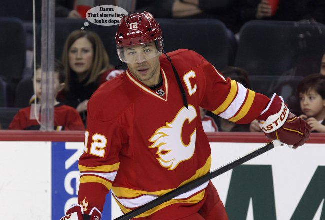
Agreed. And I kinda made it quick aside, but the more I think about it... the more I love the idea of this (or something similar) on the sleeve and clean shoulders:

Subtle touch without taking away from the overall cleanliness of the throwback jerseys I'd love to see return full-time.
Edit:
Not sure about you guys... but I dig the hell out of it:
Last edited by Split98; 02-13-2013 at 03:35 PM.
|
|
|
|
|
The Following 9 Users Say Thank You to Split98 For This Useful Post:
|
|
|
02-13-2013, 03:27 PM
|
#495
|
|
Franchise Player
Join Date: Aug 2007
Location: Ontario
|
I also still can't get over how perfectly Zarley nailed this. There are a few awesome designs in here, but man did he kill it.
|
|
|
|
|
The Following User Says Thank You to Split98 For This Useful Post:
|
|
|
02-13-2013, 04:03 PM
|
#496
|
|
#1 Goaltender
|
Quote:
Originally Posted by Split98
Agreed. And I kinda made it quick aside, but the more I think about it... the more I love the idea of this (or something similar) on the sleeve and clean shoulders:
Subtle touch without taking away from the overall cleanliness of the throwback jerseys I'd love to see return full-time.
Edit:
Not sure about you guys... but I dig the hell out of it:
|
That actually looks much better than I thought it would. I would love to see this happen, super unique.
|
|
|
|
|
The Following User Says Thank You to bax For This Useful Post:
|
|
|
02-13-2013, 04:06 PM
|
#497
|
|
Franchise Player
|
Quote:
Originally Posted by bax
That actually looks much better than I thought it would. I would love to see this happen, super unique.
|
Yeah I really like that, a subtle touch on a classic jersey.
|
|
|
|
|
02-13-2013, 04:19 PM
|
#498
|
|
Scoring Winger
Join Date: Feb 2012
Location: BH dungeon
|
How can they not make the vintage jerseys our regular home jerseys.
I personally think they are among the best in the league as is.
Make our away jersey a white vintage jersey, then go nuts on the alternate jersey.
|
|
|
|
|
The Following 3 Users Say Thank You to Wronskian For This Useful Post:
|
|
|
02-13-2013, 04:25 PM
|
#499
|
|
#1 Goaltender
Join Date: Jan 2009
Location: Calgary
|
Thanks for the effort guys, but I would say about 95% of the jerseys in here are absolutely atrocious.
Things we should never do:
- Make the red darker. That would mean we would be making our primary colour maroon. Maroon is a hideous colour that seems like it was invented in the 90s and has gladly died there.
- Add more colours. No Blue, no different tones of red... nothing new. A very stylish (maybe gay) friend of mine once told me, whenever possibly, reduce the number of colours you wear to 2, 3 at most. Anything more than that and you look tacky. So that brings me to my next point.
Things we need to get rid of:
-Black. Our jersey as it stands has 4 colours - red, white, gold, black. Way too many, hence why it looks super tacky.
-Shoulder patches. I'm not opposed to a simple shoulder patch, like the flaming tower above, but flags? That's super tacky.
-Weird piping/vertical striping. What the hell were they thinking?
Sorry to say, but as it stands, our current home and away set are probably the worst jerseys in the NHL and possibly some of the worst of all time. Yes and that includes the Canucks V jersey (Same colour palette), Flaming pedestal (again same colours), Mighty Ducks 3rd, etc. However, our retros might be some of the best jerseys in NHL history. We need to go back to those, or a slight (very slight) modification.
So Ken King, please go back to our retro jerseys. The team looks awesome wearing them.
|
|
|
|
|
The Following 5 Users Say Thank You to _Q_ For This Useful Post:
|
|
|
02-13-2013, 05:46 PM
|
#500
|
|
First Line Centre
|
Quote:
Originally Posted by _Q_
Thanks for the effort guys, but I would say about 95% of the jerseys in here are absolutely atrocious.
Things we should never do:
- Make the red darker. That would mean we would be making our primary colour maroon. Maroon is a hideous colour that seems like it was invented in the 90s and has gladly died there.
- Add more colours. No Blue, no different tones of red... nothing new. A very stylish (maybe gay) friend of mine once told me, whenever possibly, reduce the number of colours you wear to 2, 3 at most. Anything more than that and you look tacky. So that brings me to my next point.
Things we need to get rid of:
-Black. Our jersey as it stands has 4 colours - red, white, gold, black. Way too many, hence why it looks super tacky.
-Shoulder patches. I'm not opposed to a simple shoulder patch, like the flaming tower above, but flags? That's super tacky.
-Weird piping/vertical striping. What the hell were they thinking?
Sorry to say, but as it stands, our current home and away set are probably the worst jerseys in the NHL and possibly some of the worst of all time. Yes and that includes the Canucks V jersey (Same colour palette), Flaming pedestal (again same colours), Mighty Ducks 3rd, etc. However, our retros might be some of the best jerseys in NHL history. We need to go back to those, or a slight (very slight) modification.
So Ken King, please go back to our retro jerseys. The team looks awesome wearing them.
|

|
|
|
|
|
The Following 3 Users Say Thank You to timun For This Useful Post:
|
|
 Posting Rules
|
You may not post new threads
You may not post replies
You may not post attachments
You may not edit your posts
HTML code is Off
|
|
|
All times are GMT -6. The time now is 07:12 AM.
|
|


