|
View Poll Results: Best Flames Jersey
|
|
Originals (last year's retros)
|
   
|
212 |
77.09% |
|
Angled Podium Jersey
|
  
|
4 |
1.45% |
|
Black Horse Head
|
  
|
3 |
1.09% |
|
2004 Cup Run Jerseys
|
  
|
46 |
16.73% |
|
Current Set
|
  
|
8 |
2.91% |
|
Cowboy Alternates
|
  
|
2 |
0.73% |
 03-08-2014, 08:54 AM
|
#21
|
|
Owner
Join Date: Dec 2001
Location: Calgary
|
I'm dying to see the retro whites on the road ... haven't seen those jerseys in rotation since 1993, that's 21 years!
|

|

|
|
The Following 18 Users Say Thank You to Bingo For This Useful Post:
|
Alberta_Beef,
automaton 3,
DaQwiz,
Dion,
doctajones428,
Domoic,
Flames Fan in Exile,
Flames_18_22_12,
FlameZilla,
Flashpoint,
Itse,
Jacks,
jayswin,
Joborule,
Mightyfire89,
Saint Troy,
the_only_turek_fan,
vennegoor of hesselink
|
|
03-08-2014, 08:54 AM
|
#22
|
|
First Line Centre
|
Quote:
Originally Posted by dissentowner

You are joking right?
|
No, I don't share the same opinion as you. Imagine that!
|

|
|
|
03-08-2014, 08:56 AM
|
#23
|
|
Franchise Player
|

Quote:
Originally Posted by dissentowner
The retros are outdated and they do not represent all of the Flames colours as there is no black. They are bland and boring which was great back in the 80's but look dated and blah now. The 2004 jerseys were the perfect design, bring those back and leave the retros for retro night. The people that want to dwell in jersey past can whine all they want but it won't matter because the team recognizes that you can't stay glued to the past. The retros will never be the full time jerseys again, I guarantee it.
|
The original uniforms never had black in them. They added black in the young guns era, making an abomination of one of the best logos and uniforms in all of sports. I loved the fact that Calgary didn't have black in their uniforms. Black was being added to every uniform at the time and it was cliche. I love the fact that the original six teams haven't screwed with their uniforms much. When they do, the quickly realize their mistake and go back to tradition. Tradition in Calgary is the first jersey which is also the Stanley Cup jersey.
Restore tradition! Ditch the black and go back to the 1988-89 uniform forever!
|
|
|
|
|
The Following 12 Users Say Thank You to Lanny_McDonald For This Useful Post:
|
Dion,
doctajones428,
Domoic,
Flames Fan in Exile,
jayswin,
Mightyfire89,
RedHot25,
RedMan12,
Rejean31,
t0rrent98,
TjRhythmic,
topfiverecords
|
|
03-08-2014, 09:00 AM
|
#24
|
|
Unfrozen Caveman Lawyer
Join Date: Oct 2002
Location: Crowsnest Pass
|
Quote:
Originally Posted by dissentowner
The retros are outdated and they do not represent all of the Flames colours as there is no black. They are bland and boring which was great back in the 80's but look dated and blah now. The 2004 jerseys were the perfect design, bring those back and leave the retros for retro night. The people that want to dwell in jersey past can whine all they want but it won't matter because the team recognizes that you can't stay glued to the past. The retros will never be the full time jerseys again, I guarantee it.
|
You complain about the thread, then post your opinion?
|
|
|
|
|
The Following 3 Users Say Thank You to troutman For This Useful Post:
|
|
|
03-08-2014, 09:00 AM
|
#25
|
|
Crash and Bang Winger
Join Date: Aug 2005
Location: Vancouver, under cover Flames spy in knucklehead land
|
Quote:
Originally Posted by $ven27
So by this logic the islanders, Caps away jersey, Buffalos jersey and Edmonton's jersey are all outdated and boring? Talk about bland, black is about as bland as it gets. If you don't like them fine but every time the topic of retro jerseys comes up don't just crap all over them because you personally don't like them.
|
Add Montreal into that mix...
__________________

We are what we repeatedly do. Excellence, then, is not an act, but a habit -Aristotle
|
|
|
|
|
03-08-2014, 09:02 AM
|
#26
|
|
Powerplay Quarterback
|
I think these mustard/ketchup abominations should be kept in the closet. Very garish colours, very 80s look, very hard on the eyes. Don't like them at all.
|
|
|
|
|
03-08-2014, 09:03 AM
|
#27
|
|
Lifetime Suspension
|
I was originally of a mind similar to dissentowner. I foolishly threw out phrases like "But black is one of our colours!" and "They are 'retro' for a reason!" Yeah. I was that guy. I'm not proud that I was that guy, but I'm not afraid to admit it: I had a problem.
Over the course of the past 6 months however, I've begun my road to recovery. No longer do I cling to the designs of the new, no. I have put down those childish things, and realised that the 'retro' design is the one TRUE jersey design.
Don't blame dissentowner, for he does not know. He is not ready to put down childish things and accept the one true jersey, but in time, he will.
I mean, the long and short of it is: the retros f'n rock.
|
|
|
|
|
The Following 6 Users Say Thank You to strombad For This Useful Post:
|
|
|
03-08-2014, 09:13 AM
|
#28
|
|
Scoring Winger
Join Date: Jul 2011
Location: at home
|
Leave the retro thirds to special events only and change our current uniforms to something like Bastian Schmulling concept below
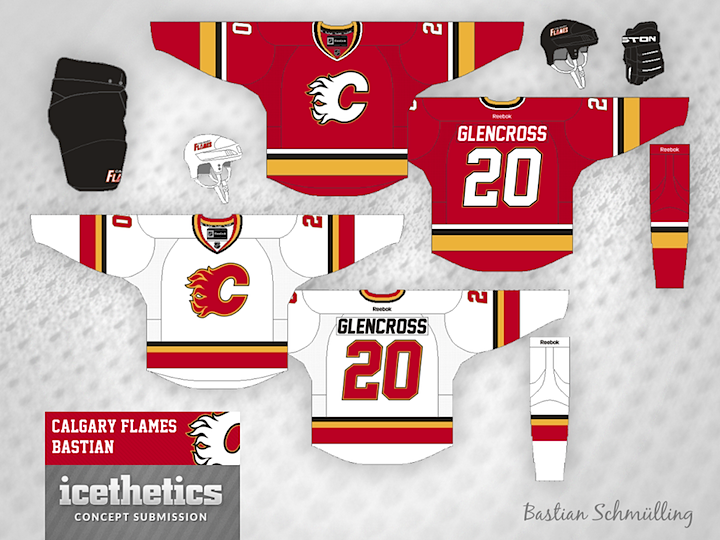
The only thing I'd add to them is a subtle outline around yokes (red on white jerseys and yellow on red jerseys) with the new shoulder patch inside. Hopefuly they will ged rid of black flaming C soon and bring the legendary white flaming C back.
White on red provides much better contrast and makes jerseys look sharper.
|
|
|
|
|
The Following 2 Users Say Thank You to playmaker For This Useful Post:
|
|
|
03-08-2014, 09:32 AM
|
#29
|
|
#1 Goaltender
Join Date: Jan 2009
Location: Calgary
|
My opinion on this is very well documented on this site (there's a reason why my avatar is in the retro colours). What's more telling however is the players opinions. I recall a few weeks ago McGrattan tweeted about wishing the team would go back to the retro colours full time. I remember Backlund and Conroy saying something similar in the past as well.
Ken King, please give the fans AND the players what they want. Ditch the black!
|
|
|
|
|
The Following User Says Thank You to _Q_ For This Useful Post:
|
|
|
03-08-2014, 09:45 AM
|
#30
|
|
Franchise Player
|
Tough call. I like the retro's but think they are a little dated. They need the smallest of tweaks. Maybe just a thinner yellow band would do it. That said I have no faith that ownership/management could get that done. We have seen the new 3rd jerseys and some of the concept ideas that were thrown their way. Yikes it was all bad. Same with regular jerseys over the decades. Not sure which firm they hire, but they might want to look elsewhere.
Basically I would vote for retro's because I don't have faith that they would design/pick a better jersey.
Also I am a bigger fan of the retro whites.
|
|
|
|
|
03-08-2014, 09:48 AM
|
#31
|
|
Franchise Player
Join Date: Jun 2006
Location: Calgary, Alberta
|
Go back to retros or make a modern day version of them. Red, yellow, and white should be the most prominent colours on the jersey. No, or very little black.
I don't understand why they keep going with things that don't work. The solution is right under their nose.
|
|
|
|
|
The Following 3 Users Say Thank You to Joborule For This Useful Post:
|
|
|
03-08-2014, 09:53 AM
|
#32
|
|
Franchise Player
Join Date: Mar 2012
Location: Sylvan Lake
|
Quote:
Originally Posted by dissentowner
the retros are outdated and they do not represent all of the flames colours as there is no black. They are bland and boring which was great back in the 80's but look dated and blah now. The 2004 jerseys were the perfect design, bring those back and leave the retros for retro night. The people that want to dwell in jersey past can whine all they want but it won't matter because the team recognizes that you can't stay glued to the past. The retros will never be the full time jerseys again, i guarantee it.
|
ban this man
__________________
Captain James P. DeCOSTE, CD, 18 Sep 1993
Corporal Jean-Marc H. BECHARD, 6 Aug 1993
|
|
|
|
|
The Following 3 Users Say Thank You to undercoverbrother For This Useful Post:
|
|
|
03-08-2014, 09:53 AM
|
#33
|
|
Lives In Fear Of Labelling
|
I'd be very happy with a slightly modified retro jersey (smaller striping) for home and away. Keep the 3rd's with the exception of removal of the word mark and just a black flaming C (as that is my only gripe with the 3rd).
To me that would be the perfect set for the flames.Then all we would need is a winning team on the ice 
|
|
|
|
|
The Following User Says Thank You to underGRADFlame For This Useful Post:
|
|
|
03-08-2014, 09:59 AM
|
#34
|
|
Franchise Player
Join Date: Oct 2001
Location: Vancouver
|
I wanted to say the angled podium jersey just to be a jerk, but I couldn't bring myself to even joke about it.
When the black flaming C jerseys first came in, I liked them a lot, but now I am back to preferring the retros.
__________________
"A pessimist thinks things can't get any worse. An optimist knows they can."
|
|
|
|
|
03-08-2014, 10:02 AM
|
#35
|
|
Franchise Player
|
Quote:
Originally Posted by FlamesAddiction
I wanted to say the angled podium jersey just to be a jerk, but I couldn't bring myself to even joke about it.
When the black flaming C jerseys first came in, I liked them a lot, but now I am back to preferring the retros.
|
Agreed. I liked them, but looking at them now it just doesn't speak to me the way the retros do. Our original jerseys (home and away) would be among the best in the NHL.
|
|
|
|
|
03-08-2014, 10:08 AM
|
#36
|
|
Franchise Player
Join Date: Mar 2007
Location: Calgary
|
So my hate is directed at the right one, which one is the angle podium and which one is the cowboys?
|
|
|
|
|
03-08-2014, 10:34 AM
|
#37
|
|
In the Sin Bin
Join Date: Dec 2006
Location: compton
|
Quote:
Originally Posted by dissentowner
The retros are outdated and they do not represent all of the Flames colours as there is no black. They are bland and boring which was great back in the 80's but look dated and blah now. The 2004 jerseys were the perfect design, bring those back and leave the retros for retro night. The people that want to dwell in jersey past can whine all they want but it won't matter because the team recognizes that you can't stay glued to the past. The retros will never be the full time jerseys again, I guarantee it.
|

|
|
|
|
|
03-08-2014, 10:39 AM
|
#38
|
|
First Line Centre
Join Date: Aug 2009
Location: Coquitlam, BC
|
Quote:
Originally Posted by burn_this_city
So my hate is directed at the right one, which one is the angle podium and which one is the cowboys?
|
Angled podium:

Cowboy:

|
|
|
|
|
The Following User Says Thank You to BloodFetish For This Useful Post:
|
|
|
03-08-2014, 10:42 AM
|
#39
|
|
First Line Centre
Join Date: Aug 2004
Location: YYC
|
Fans make a difference! Voted for Retro. Hope KK listens!
|
|
|
|
|
03-08-2014, 10:49 AM
|
#40
|
|
Franchise Player
Join Date: Dec 2011
Location: Calgary
|
Quote:
Originally Posted by dissentowner
The retros are outdated and they do not represent all of the Flames colours as there is no black. They are bland and boring which was great back in the 80's but look dated and blah now. The 2004 jerseys were the perfect design, bring those back and leave the retros for retro night. The people that want to dwell in jersey past can whine all they want but it won't matter because the team recognizes that you can't stay glued to the past. The retros will never be the full time jerseys again, I guarantee it.
|
I agree. I enjoyed them a lot more this year seeing them once than seeing them 10 times last year. Edmonton's ruined their 80's jerseys, why do the same here?
|
|
|
|
|
The Following User Says Thank You to N-E-B For This Useful Post:
|
|
 Posting Rules
|
You may not post new threads
You may not post replies
You may not post attachments
You may not edit your posts
HTML code is Off
|
|
|
All times are GMT -6. The time now is 08:39 AM.
|
|


