Boston also released a new primary logo, same sorta thing, and I think same one used during the 100 centennial year. Theyre releasing new jerseys this week apparently.
There's no way the previous mish mash of different shades of mismatched blues (basically black) and pipings are better than what was rolled out today.
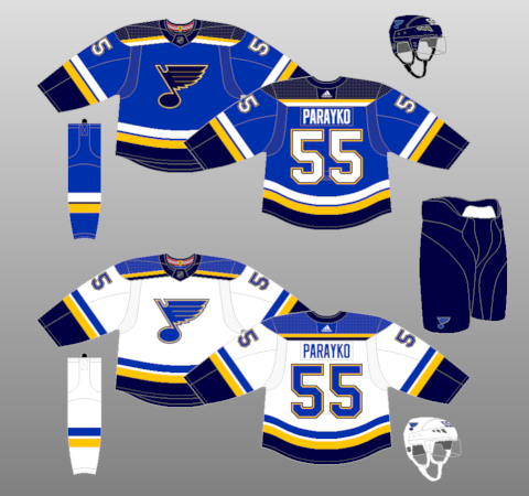
I always really liked the Blues jerseys they are now retiring. It was a big win when they went back to them from the Reebok atrocities. New ones look alright but they do seem close to the Sabres.
Also they're literally called the BLUES. Not the BLUE. Them wearing two shades of blue matches their name!
They won the Cup in those jerseys, they'll always be iconic.
__________________
Need a great deal on a new or pre-owned car? Come see me at Platinum Mitsubishi 2720 Barlow Trail NE
2026 World Junior Pool CHAMPION
This is a very meh update. I'm still waiting on a team to take the leap and revolutionize their uniform. Retro looks are so lazy to be doing. NHL should do a City Connect akin to MLB.
Not much to hate about that design. Great update for them. The piping and forearm stripping with excessive black/dark navy was very dated. The piping was originally put in place, when jerseys had that perforated material in the armpits and sides. It somehow managed to hang around as a design aesthetic. It's awful. We don't need to have the front panel of a jersey outlined.
Do any teams still keep the piping or were the Blues the last?
Am I missing something? Where is the piping on these jerseys?
__________________
Need a great deal on a new or pre-owned car? Come see me at Platinum Mitsubishi 2720 Barlow Trail NE
2026 World Junior Pool CHAMPION