 07-05-2024, 11:08 AM
|
#3981
|
|
Franchise Player
|

Quote:
Originally Posted by Table 5

Like every product or company, every city has a brand, whether it's formalized or not. Having said that, the most successful city brands are the ones where the messaging is simple, and consistent. Nashville works because it went all into the music, Vegas works because it went all into sin and entertainment. They have one simple brand message and don't muddle things up by trying to be everything. I'm sure there's lots of other things going on in those cities too, but they take their most valuable characteristic, and go all in.
I think this new logo is fairly mediocre, but then again I think the whole "Blue Sky City" thing is mediocre. Not because it's ugly or I dislike like the fonts (although I can't say I love them)....but because as a brand this package doesn't distinguish us in anyway way. Worse, it throws away the things that do...things that other tourism boards of other undistinguished mid-sized cities like Edmonton or Cincinnati would kill for. Western/Native heritage, the energy sector, and the Rockies....that's what we're known for and that's why people come here. The older logos and tagline may not have been award winners, but atleast they spoke to these defining characteristics.
I don't think a city brand is just for tourism, but when it comes to attracting visitors, you need to stand for something, or you stand for nothing. Nobody wants to hear about your city's diversity or how you're great at everything, because that just translates to a generic muddled up experience. People travel to places for specific experiences.
|
Our big blue skies are actually a fairly unique characteristic. We are probably the biggest city in 'Big Sky Country', which is essentially Montana+Wyoming, but no reason we can't lean into it, too. I don't hate the new idea, but I'm not crazy about the execution and don't think we should ever be changing the motto to begin with.
Quote:
Originally Posted by PepsiFree
^to Table 5
I agree. Like businesses, there are cities that have great brands and are just able to stick with them. For smaller/lesser established ones, thats where you run into never ending cycles of rebrands or direction refreshes. Everyone is just trying to gain some sort of competitive advantage. When one doesnt stick, on to the next.
I like the design because it does pull in that indigenous aspect of Calgary, and I like the slogan because it really appeals to that way of thinking that startups and younger entrepreneurs covet.
Overall though, its just nice. Its not cohesive, which is a problem, and doesnt stand out in a way that people can really say yeah, thats what its all about. Most cities arent unique, but when you think of cities, you usually think of cities that nailed the branding better than the ones who didnt.
Calgary has two options, imo.
- Embrace the western/indigenous heritage, like you said. Take the Stampede and make that your entire identity. Country music and the best country bars in Canada, rodeos, blah blah blah.
- Embrace the gateway aspect. Be the place that is one step away from the mountains, from Banff, from outdoor sport and all those tourism aspects. Lean into that mountain town away from the mountains idea.
The first option is what I wouldve pushed. You can still be progressive, fresh, and appeal to young people while embracing that Stampede city mentality year round. The longer Calgary tries to run away from or outthink what Calgary really is, the longer theyll come up with these things are fine but ultimately doomed to fail.
|
Heart of the New West was actually pretty good. The pivot to Energy was somewhat understandable but it looks incredibly foolish now that we have elected idiots who attack most forms of energy.
IMO for a motto to work you've got to stick with it for decades if not permanently. You can update the look/feel a bit from time to time, or even add a secondary tagline that you want to shift focus to for a while without abandoning the initial brand altogether ( Heart of the New West: Be a Part of the Energy; or a bit more clumsily The Blue Sky City: Heart of the New West)
But really the only way these enter the lexicon is when they are simple and unofficial. Sin City. Music City. The Big Apple. Windy City. Cowtown.
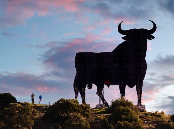
I understand not wanting to be Cowtown. But we should totally be Cowtown. Let's do the painted cows all around the city again. Maybe make them bulls this time or something.
Hell, we should have something like this at each of the 4 main entrances to the city:

Maybe a Buffalo to the west and Musk Oxen to the north and Cow to the east and Steer to the south.
It can even be done fairly cheaply:
|

|

|
|
The Following 3 Users Say Thank You to powderjunkie For This Useful Post:
|
|
|
07-05-2024, 11:17 AM
|
#3982
|
|
Franchise Player
|
Random aside, all of the animals I mentioned are part of the Bovidae family.
It turns out Cattle and Buffalo (and water buffalo and antelope) are all part of the Bovinae subfamily.
Musk ox are in the Caprinae subfamily with sheep and goats. TIL.
|
|
|
|
|
07-05-2024, 11:20 AM
|
#3983
|
|
Franchise Player
Join Date: Mar 2007
Location: Income Tax Central
|
We should have an open competition for all Elementary schools to design a new flag and slogan.
So far...I think Tillie Backlund would win it.
"Thank you Tigers!"
__________________
The Beatings Shall Continue Until Morale Improves!
This Post Has Been Distilled for the Eradication of Seemingly Incurable Sadness.
The World Ends when you're dead. Until then, you've got more punishment in store. - Flames Fans
If you thought this season would have a happy ending, you haven't been paying attention.
|

|
|
|
07-05-2024, 11:23 AM
|
#3984
|
|
Franchise Player
|
Quote:
Originally Posted by PepsiFree
I like the design because it does pull in that indigenous aspect of Calgary, and I like the slogan because it really appeals to that way of thinking that startups and younger entrepreneurs covet.
|
If you were presented with the logo and nothing was said to you would you have realized or made the connection with the indigenous element of beadwork?
|
|
|
|
|
07-05-2024, 11:35 AM
|
#3985
|
|
Franchise Player
Join Date: Oct 2001
Location: NYYC
|
Quote:
Originally Posted by powderjunkie
IMO for a motto to work you've got to stick with it for decades if not permanently. You can update the look/feel a bit from time to time, or even add a secondary tagline that you want to shift focus to for a while without abandoning the initial brand altogether (Heart of the New West: Be a Part of the Energy; or a bit more clumsily The Blue Sky City: Heart of the New West)
|
Yeah with a lot of branding it's about consistency and longevity. Even if your idea is strong, you gotta keep hammering home the same point over and over. Although some campaigns seem to get traction right away. Ie "What Happens Here, Stays Here" (or What Happens in Vegas, Stays in Vegas) was only created in the early 2000s...but it feels like it could've been around forever since it's so perfect.
Funnily enough, they changed it to "What Happens Here, Only Happens Here." in 2020...which to me feels much more watered down as it loses that little edge.
It's really hard to beat Vegas though...they have a really unique characteristic and they nailed the initial tagline. The only other tagline I can think of with that type of power/longevity is "I love NY". I once was a student of the designer who came up with that logo btw...what a genius that guy was.
|
|
|
|
|
The Following 2 Users Say Thank You to Table 5 For This Useful Post:
|
|
|
07-05-2024, 11:51 AM
|
#3986
|
Participant  |
Quote:
Originally Posted by calgarygeologist
If you were presented with the logo and nothing was said to you would you have realized or made the connection with the indigenous element of beadwork?
|
No, but beadwork really isnt something Im familiar with or a common point of reference for me. Thats why designers summarize their designs, so that people understand the references within them and inspiration behind them.
This is also not unique, either. There are people that still dont know the Minnesota Wild logo is a wild animals head (genuinely, there are people who just think its a landscape). The oval Toyota logo has the word Toyota laid within it. The Toblerone logo has a bear in it, calling back to the official animal of its hometown. The adidas logo is a mountain representing the climb athletes push through. The Cisco logo is the golden gate bridge.
Did you realize all of those without being told? Because I didnt (expect for the Wild logo, thats all Ive ever seen).
There are literally hundreds if not thousands of logos like that, where they represent something that isnt immediately obvious unless youre really looking for it. Its a hallmark of great logo design. Not saying this logo is great just because of it, but youd be hard pressed to find an award winning logo without elements that arent completely obvious without explanation.
|
|
|
|
|
07-05-2024, 12:01 PM
|
#3987
|
|
Franchise Player
|
Quote:
Originally Posted by Table 5
Yeah with a lot of branding it's about consistency and longevity. Even if your idea is strong, you gotta keep hammering home the same point over and over. Although some campaigns seem to get traction right away. Ie "What Happens Here, Stays Here" (or What Happens in Vegas, Stays in Vegas) was only created in the early 2000s...but it feels like it could've been around forever since it's so perfect.
Funnily enough, they changed it to "What Happens Here, Only Happens Here." in 2020...which to me feels much more watered down as it loses that little edge.
It's really hard to beat Vegas though...they have a really unique characteristic and they nailed the initial tagline. The only other tagline I can think of with that type of power/longevity is "I love NY". I once was a student of the designer who came up with that logo btw...what a genius that guy was.
|
I was curious what preceded that Vegas tagline...looks like it was The American Way to Play.
A couple awesome 80s ads in here:
https://www.travelpulse.com/news/ent...as-commercials
|
|
|
|
|
07-05-2024, 12:28 PM
|
#3988
|
|
Franchise Player
|
Quote:
Originally Posted by PepsiFree
No, but beadwork really isnt something Im familiar with or a common point of reference for me. Thats why designers summarize their designs, so that people understand the references within them and inspiration behind them.
This is also not unique, either. There are people that still dont know the Minnesota Wild logo is a wild animals head (genuinely, there are people who just think its a landscape). The oval Toyota logo has the word Toyota laid within it. The Toblerone logo has a bear in it, calling back to the official animal of its hometown. The adidas logo is a mountain representing the climb athletes push through. The Cisco logo is the golden gate bridge.
Did you realize all of those without being told? Because I didnt (expect for the Wild logo, thats all Ive ever seen).
There are literally hundreds if not thousands of logos like that, where they represent something that isnt immediately obvious unless youre really looking for it. Its a hallmark of great logo design. Not saying this logo is great just because of it, but youd be hard pressed to find an award winning logo without elements that arent completely obvious without explanation.
|
That is the beauty, appeal and smartness of a well crafted and designed logo when elements can be incorporated which aren't always apparent but tie into the brand or representation. The Wild with their nature elements inside the animal head or the FedEx arrow or the NBC Peacock etc. The Calgary dots/beads just doesn't do that in my opinion even after the reference to beadwork.
|
|
|
|
|
07-05-2024, 06:44 PM
|
#3990
|
|
Franchise Player
|
I wonder if it'll smell like Cowboys.
|
|
|
|
|
07-05-2024, 06:53 PM
|
#3991
|
|
Franchise Player
|
Quote:
Originally Posted by DownInFlames
|
I'm surprised they are dropping the Millennium name (maybe it is another rebranding strategy) but I have no issue with selling out to corporate sponsors. It was Shaw Millennium Park for the longest time so I don't care who is putting up some money which will hopefully stay with the park for improvements.
|
|
|
|
|
07-06-2024, 12:05 AM
|
#3992
|
|
Franchise Player
|
The slogan could be worse, it could be Winnipeg's - "Made From What's Real".
That's real alright, real bad.
|
|
|
|
|
07-06-2024, 01:24 AM
|
#3993
|
|
Franchise Player
|
Quote:
Originally Posted by D as in David
The slogan could be worse, it could be Winnipeg's - "Made From What's Real".
That's real alright, real bad.
|
I prefer their old one

|
|
|
|
|
The Following 2 Users Say Thank You to btimbit For This Useful Post:
|
|
|
07-06-2024, 01:59 AM
|
#3994
|
|
Franchise Player
Join Date: Feb 2006
Location: Calgary, AB
|
__________________
Turn up the good, turn down the suck!
|
|
|
|
|
The Following 4 Users Say Thank You to getbak For This Useful Post:
|
|
|
07-06-2024, 08:58 AM
|
#3995
|
|
Franchise Player
Join Date: Jul 2003
Location: Sector 7-G
|
Quote:
Originally Posted by DownInFlames
|
Interesting.... I was wondering where the Cowboys Tent would go considering it's right on top of the new Arena site. I thought they would have gone after something closer to the Casino though (like a surface parking lot in East Village). That and the Millennium Park site seems a little small for that tent.
If it helps fix up that park for 355 other days of the year I suppose that's the price to be paid. That and the moral compass of a generation of skateboarders who are about to witness some serious degeneration for 10 days of the year.
|
|
|
|
|
07-06-2024, 02:26 PM
|
#3996
|
|
Franchise Player
|
Quote:
Originally Posted by PepsiFree
No, but beadwork really isnt something Im familiar with or a common point of reference for me. Thats why designers summarize their designs, so that people understand the references within them and inspiration behind them.
This is also not unique, either. There are people that still dont know the Minnesota Wild logo is a wild animals head (genuinely, there are people who just think its a landscape). The oval Toyota logo has the word Toyota laid within it. The Toblerone logo has a bear in it, calling back to the official animal of its hometown. The adidas logo is a mountain representing the climb athletes push through. The Cisco logo is the golden gate bridge.
Did you realize all of those without being told? Because I didnt (expect for the Wild logo, thats all Ive ever seen).
There are literally hundreds if not thousands of logos like that, where they represent something that isnt immediately obvious unless youre really looking for it. Its a hallmark of great logo design. Not saying this logo is great just because of it, but youd be hard pressed to find an award winning logo without elements that arent completely obvious without explanation.
|
I've been through a branding process and was surprised how deeply they dug into the organizations history, mission, etc. and how they wove multiple subtle elements into the logo. Having said that, the logo should evoke something at first viewing - e.g. the Wild logo is obviously wilderness, Toblerone is a mountain with or without the bear, Adidas is racing stripes and motion even without recognizing the mountain. The beadwork isn't obvious in any way, so becomes a secondary feature, leaving the main graphic feature being a big C which isn't too imaginative for a city whose name starts with C. I think it might be a missed opportunity for something more unique and evocative.
I appreciate the narrative that goes with it and it all makes sense, but when's the last time anyone read a manual before they used a new app?
|
|
|
|
|
07-06-2024, 04:07 PM
|
#3997
|
|
Franchise Player
|

Quote:
Originally Posted by edslunch
I've been through a branding process and was surprised how deeply they dug into the organizations history, mission, etc. and how they wove multiple subtle elements into the logo. Having said that, the logo should evoke something at first viewing - e.g. the Wild logo is obviously wilderness, Toblerone is a mountain with or without the bear, Adidas is racing stripes and motion even without recognizing the mountain. The beadwork isn't obvious in any way, so becomes a secondary feature, leaving the main graphic feature being a big C which isn't too imaginative for a city whose name starts with C. I think it might be a missed opportunity for something more unique and evocative.
I appreciate the narrative that goes with it and it all makes sense, but when's the last time anyone read a manual before they used a new app?
|
It probably would have been beneficial if they made the "beads" a little bit smaller, just add another row/column or two, and made them yellow, red and blue and put in some sort of pattern that better resembled actual beadwork.
|
|
|
|
|
The Following 2 Users Say Thank You to calgarygeologist For This Useful Post:
|
|
|
07-08-2024, 04:57 PM
|
#3998
|
|
#1 Goaltender
|
Then people would be mad that it's catering too much to aboriginals ...
|
|
|
|
|
07-08-2024, 06:02 PM
|
#3999
|
Participant |
Thought this was worth a cruise through. Contextualizes the brand a little bit more and shows some different design treatments beyond the logo.
I actually like it a bit more than I originally did: https://www.blueskycity.ca/
|
|
|
|
|
The Following 4 Users Say Thank You to PepsiFree For This Useful Post:
|
|
|
07-08-2024, 10:49 PM
|
#4000
|
|
Franchise Player
|
Look up? And open my nostrils to the chem trails? No thanks.
|
|
|
|
|
The Following 2 Users Say Thank You to powderjunkie For This Useful Post:
|
|
 Posting Rules
|
You may not post new threads
You may not post replies
You may not post attachments
You may not edit your posts
HTML code is Off
|
|
|
All times are GMT -6. The time now is 01:46 PM.
|
|


