11-24-2021, 01:52 PM
|
#121
|
|
Franchise Player
Join Date: Mar 2007
Location: Income Tax Central
|
Quote:
Originally Posted by stazzy33

Split98, the king of jersey concepts, came up with this subtle change that makes the jersey 1000x better.
 |
Exactly what I said on the second page. The screwed up Maple Leaf ruins the whole thing.
That jersey looks great.
__________________
The Beatings Shall Continue Until Morale Improves!
This Post Has Been Distilled for the Eradication of Seemingly Incurable Sadness.
The World Ends when you're dead. Until then, you've got more punishment in store. - Flames Fans
If you thought this season would have a happy ending, you haven't been paying attention.
|

|

|
|
The Following 4 Users Say Thank You to Locke For This Useful Post:
|
|
|
11-24-2021, 02:54 PM
|
#122
|
|
Some kinda newsbreaker!
Join Date: May 2004
Location: Learning Phaneufs skating style
|
|
|
|
|
|
The Following User Says Thank You to sureLoss For This Useful Post:
|
|
|
11-24-2021, 02:57 PM
|
#123
|
|
Franchise Player
Join Date: Mar 2007
Location: Income Tax Central
|
Quote:
Originally Posted by sureLoss
|
I gotta say...that all-blue on the left is pretty sharp. I like it.
__________________
The Beatings Shall Continue Until Morale Improves!
This Post Has Been Distilled for the Eradication of Seemingly Incurable Sadness.
The World Ends when you're dead. Until then, you've got more punishment in store. - Flames Fans
If you thought this season would have a happy ending, you haven't been paying attention.
|
|
|
|
|
11-24-2021, 03:19 PM
|
#124
|
|
Franchise Player
Join Date: Mar 2004
Location: Chilliwack, B.C
|
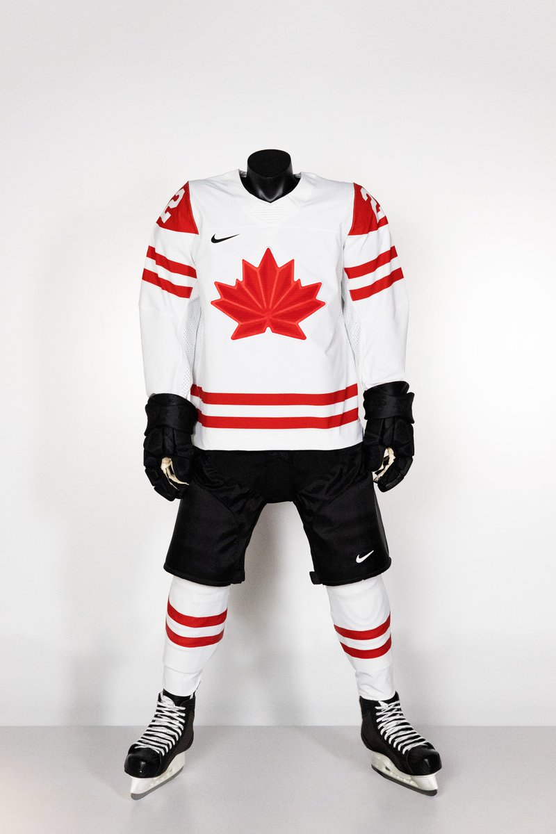
Hate the black, wish they were just red and white it is the color of Canada. I wonder when the last time Canada wore just red and white in the Olympics. Even in the Canada Cup the team wore blue pants, I believe.
|
|
|
|
|
11-24-2021, 03:41 PM
|
#125
|
|
Franchise Player
|
We never seem to rock red pants/gloves anymore.
We should.
The country’s colours are red and white.
Enough of this fascistic black.
__________________
All you have to decide is what to do with the time that is given to you.
Rowan Roy W-M - February 15, 2024
|
|
|
|
|
The Following 3 Users Say Thank You to GreenLantern2814 For This Useful Post:
|
|
|
The Following User Says Thank You to sleepingmoose For This Useful Post:
|
|
|
11-24-2021, 03:48 PM
|
#127
|
|
Franchise Player
Join Date: Feb 2006
Location: Calgary, AB
|
Quote:
Originally Posted by calgaryred
Hate the black, wish they were just red and white it is the color of Canada. I wonder when the last time Canada wore just red and white in the Olympics. Even in the Canada Cup the team wore blue pants, I believe.
|
Since Canada re-entered the Olympic hockey tournament in 1980, they've worn just red & white twice, 1980 and 1994.
In 1984, 1988, and 1992, they wore the same red & white with blue uniforms. Since 1998, they've worn some variation of the red & white with black uniforms.
__________________
Turn up the good, turn down the suck!
|
|
|
|
|
The Following User Says Thank You to getbak For This Useful Post:
|
|
|
11-24-2021, 03:48 PM
|
#128
|
|
Pent-up
Join Date: Mar 2018
Location: Plutanamo Bay.
|
Quote:
Originally Posted by GreenLantern2814
We never seem to rock red pants/gloves anymore.
We should.
The countrys colours are red and white.
Enough of this fascistic black.
|
While were at it they better not put gold on a jersey again. So dumb.
|

|
|
|
11-24-2021, 03:54 PM
|
#129
|
|
Franchise Player
|
Quote:
Originally Posted by Scroopy Noopers
While we’re at it they better not put gold on a jersey again. So dumb.
|
It’s so pretentious, and frankly un-Canadian.
We expect to kick your asses, world. We don’t need actual gold sewn into the sweaters.
It’s something a country with no chance of winning does.
__________________
All you have to decide is what to do with the time that is given to you.
Rowan Roy W-M - February 15, 2024
Last edited by GreenLantern2814; 11-24-2021 at 05:47 PM.
|
|
|
|
|
11-24-2021, 03:58 PM
|
#130
|
|
Franchise Player
Join Date: Mar 2009
Location: Calgary
|
Quote:
Originally Posted by Cecil Terwilliger
|
I love it! It emphatically sends the message:
"Marijuana is legal here; so come visit and remember to buy from our dispensaries. Also support (PRODUCT)RED just like you did back in 2007 with your KRZR"
On a side note I actually don't hate black on red or red on black, but that leaf is so obnoxious
__________________

"May those who accept their fate find happiness. May those who defy it find glory."
|
|
|
|
|
11-24-2021, 03:59 PM
|
#131
|
|
Pent-up
Join Date: Mar 2018
Location: Plutanamo Bay.
|
Quote:
Originally Posted by GreenLantern2814
Its so pretentious, and frankly un-Canadian.
We expect to kick your asses, world. We dont need actual gold sewn into the sweaters.
Its something a country with no change of winning does.
|
Its a total Edmonton move.
|
|
|
|
|
11-24-2021, 04:02 PM
|
#132
|
|
Lifetime Suspension
Join Date: Jan 2014
Location: victoria
|
So ugly. I hope they never end up wearing them (hoping that the games are canceled or at least the nhl pulls the plug)
Last edited by Moneyhands23; 11-24-2021 at 05:05 PM.
|
|
|
|
|
The Following User Says Thank You to Moneyhands23 For This Useful Post:
|
|
|
11-24-2021, 06:43 PM
|
#133
|
|
Franchise Player
|
Quote:
Originally Posted by Moneyhands23
So ugly. I hope they never end up wearing them (hoping that the games are canceled or at least the nhl pulls the plug)
|
If the games go forward, its incumbent on the rest of the world to go over there and punch the Chinese in the mouth.
They win 9-11 medals every Winter Olympics - make sure this is their least successful games ever.
|
|
|
|
|
The Following User Says Thank You to GreenLantern2814 For This Useful Post:
|
|
|
11-25-2021, 07:05 AM
|
#134
|
|
First Line Centre
Join Date: Jul 2013
Location: I will never cheer for losses
|
I actually like the white one, and the red has grown on me now. Still hate the black though, I think it would be better with a red maple leaf
__________________
Quote:
Originally Posted by Flash Walken
I am demolishing this bag of mini Mr. Big bars.
Halloween candy is horrifying.
|
Quote:
Originally Posted by Anduril
"Putting nets on puck."
- Ferland 2016
|
|
|
|
|
|
11-25-2021, 07:13 AM
|
#135
|
|
Franchise Player
|
Does the red one look orange to anyone else? Orange and black look like Halloween colours, or worse, Oilers.
|
|
|
|
|
11-25-2021, 07:59 AM
|
#136
|
|
First Line Centre
Join Date: Sep 2008
Location: Rocky Mt House
|
I agree with most that the leaf looks gimpy. It is a poor choice for red hue, and should have been closer to flag red. Not the worst - miles better than the yellow ones mention in op.
|
|
|
|
|
11-25-2021, 09:57 AM
|
#137
|
|
damn onions
|
Nike is not good at this.
|
|
|
|
|
The Following User Says Thank You to Mr.Coffee For This Useful Post:
|
|
|
11-25-2021, 10:25 AM
|
#138
|
|
Voted for Kodos
|
Quote:
Originally Posted by CroFlames
Does the red one look orange to anyone else? Orange and black look like Halloween colours, or worse, Oilers.
|
The black really tricks the eye in this way, yes.
Hockey Canada should tell Nike to start again from scratch, and perhaps look at our flag first.
|
|
|
|
|
11-25-2021, 01:17 PM
|
#139
|
|
Franchise Player
|
Quote:
Originally Posted by You Need a Thneed
The black really tricks the eye in this way, yes.
Hockey Canada should tell Nike to start again from scratch, and perhaps look at our flag first.
|
I donno. Flames jerseys with the black C never looked orange to me.
But no one else has commented so I guess it is just me.
|
|
|
|
|
11-25-2021, 01:18 PM
|
#140
|
|
Franchise Player
Join Date: Jan 2013
Location: Cape Breton Island
|
Absolute trash
__________________

|
|
|
|
 Posting Rules
|
You may not post new threads
You may not post replies
You may not post attachments
You may not edit your posts
HTML code is Off
|
|
|
All times are GMT -6. The time now is 11:39 AM.
|
|