Big meh from me. They took the jersey I hated from the Greg Gilbert era and gave it a couple tweaks. Considering what other teams did using their full range of template, logos, and colour, the Flames missed the mark.
I guess this placates the strange group of fans that actually like having a snot horse as a logo. I hope this only gets worn a couple times and is never seen again.
__________________
The masses of humanity have always had to surf.
The Following 2 Users Say Thank You to FireGilbert For This Useful Post:
Maybe I'm not as much of a jersey critic as some but the only ones I feel are really ugly are the Ducks and Canucks (I removed the Blues from that group as the more I see it the more I feel it's not bad as an occasional jersey for that fanbase). The rest range between okay to outstanding. I think Adidas did a pretty good job for the most part.
The Following User Says Thank You to Erick Estrada For This Useful Post:
Maybe I'm not as much of a jersey critic as some but the only ones I feel are really ugly are the Ducks and Canucks (I removed the Blues from that group as the more I see it the more I feel it's not bad as an occasional jersey for that fanbase). The rest range between okay to outstanding. I think Adidas did a pretty good job for the most part.
The Ducks jersey is amazing. Even the Canucks isnt bad - its just a recolouring of the old gradient jersey.
Honestly Adidas did a good job across the board here, and had done good since becoming the main Jersey provider. Much better than everything under Reebok IMO.
The jerseys are nice but the more I think about it the more I dislike the Avs and Hurricanes using the Nordiques and Whaler logos. Get your own identity.
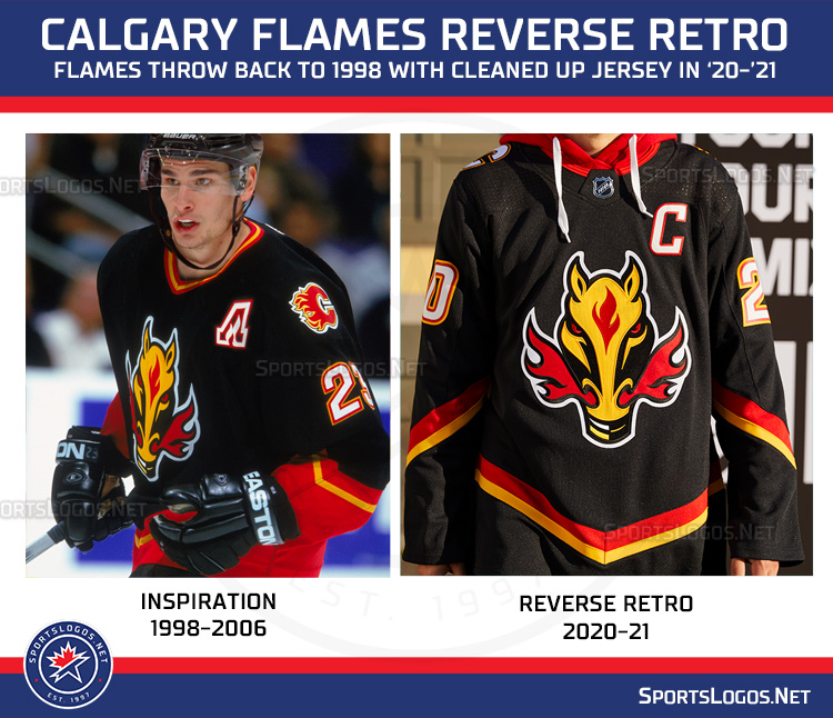
I'm still trying to understand what's reverse about it...
I bet the Flames logo on the pants is reversed to Red because the shoulder logos are reversed to white. Other than that, the red parts on the sleeve and waist are flipped to black.
There appears to be a wide range of opinions on these. My views:
Great: Buffalo (I can forgive the wordmark given how good the rest is), Minnesota, Colorado, Florida (love that logo), New Jersey (yes please Christmas jerseys), Vegas.
Awful: Arizona, Jets (looks like it was made in 5 minutes), Dallas, Los Angeles (that logo is so out of place on that jersey), Sens, Flyers, Sharks, Leafs... oh god that Leafs jersey is bad.
Boring: Boston, Detroit, Montreal, Islanders (is this actually a different jersey from the normal one?), Nashville, Pittsburgh
Not sure what I think about it:
Carolina: (love the Whalers but this isn't quite the Whalers)
Calgary: It's not quite boring because it's Blasty but it's as boring as you could make Blasty.
Tampa: Same thing. It's not quire boring, because it's a throwback, but they didn't do much with it.
Vancouver: (props for going for the flying V and the gradient at the same time and somehow making it not awful but it's not great either)
Washington: I really like the colour choice but I hate the lettering font they used back then and the wordmark is actually more annoying than on the sabres jersey.
__________________ "The great promise of the Internet was that more information would automatically yield better decisions. The great disappointment is that more information actually yields more possibilities to confirm what you already believed anyway." - Brian Eno
I'm still trying to understand what's reverse about it...
Maybe they are just trying to make you say retro backwards, and as you repeat and question it, it sounds enough like ‘order’ that you are subconsciously tempted to buy