[/LIST] This is because horse's eyes look dumb from the front with the way they bulge out the side. They aren't tucked in and facing forward like they do with tonal horse. It's also why you don't typically get many good views staring straight onto a horse, because horses turn their heads to see you better.
It's not a horse logo, it's a cartoon horse, a small but important difference. Cartoon's as logos are for minor leagues.
That's what it is! As a kid I never thought this looked like a horse. It's the eyes that are all wrong. It just doesn't look right. The combo of the weird eyes and the snot blasting out the sides made it more like a dilophosaurus about to spit in Nedry's eyes.
__________________
"If stupidity got us into this mess, then why can't it get us out?"
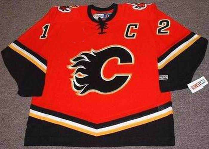
Interesting choice on the sleeves/waist, they brought back the Reebok edge Germany socks I see, in sleeve form.
Yeah I'm not digging that Blasty jersey at all...but I'm deff not the target age demographic for it. Hopefully all the 20 somethings that wanted it back so bad are happy with it!
I won't be getting one as I was never a blasty guy, but they are better than the old ones (if they get some of the stitching cleaned up).
My biggest fear is the fact that the team still has the ugly black pants with the unparallel stripes down the side for the black C third jersey. Praying they don't use those for the black jersey and go all black pants like they did in 1998.
The Following 2 Users Say Thank You to Bingo For This Useful Post:
I wish they would have "reversed" it by making it a red jersey. Sure it would have looked like the 2004 jersey with the logos swapped, but that would have been fine.
__________________
Turn up the good, turn down the suck!
The Following 3 Users Say Thank You to getbak For This Useful Post:
I won't be getting one as I was never a blasty guy, but they are better than the old ones (if they get some of the stitching cleaned up).
My biggest fear is the fact that the team still has the ugly black pants with the unparallel stripes down the side for the black C third jersey. Praying they don't use those for the black jersey and go all black pants like they did in 1998.
Those stripes on the pants have been the worst part of the uniform set for the last 13 years. I hope we burn the template and never see them again
I just feel if the Flames want to do a black jersey, a colour flip of the retros (or current set I guess) would have been the cleanest choice. The White Flaming C looks really cool on the shoulders of this new one.
Blasty would have been cool for a retro in its original form someday.
It looks like a large number of teams didn't really care to partake in this and just kind of half assed a design. I only really like the senators, jets and blackhawks jerseys.
Really like the wild, the caps, and the yotes.
I've always hated blasty, but it's not as bad as it could have been, so a big meh for us.
Vancouver's is so so so so bad. Like, truly awful design.
__________________
Quote:
Originally Posted by snipetype
k im just not going to respond to your #### anymore because i have better things to do like #### my model girlfriend rather then try to convince people like you of commonly held hockey knowledge.
We have the sacred retros as full time home and away jerseys. All Flames fans can agree this was the right move and we should be happy.
For limited one-off 3rds, they can go with anything and this time it's a reverse retro Blasty. There's obviously a segment of the fanbase that fell in love with them back in the day, and most of those people now have money. These will sell like mad.
I hope they continue to crank out modern/retro/mashup 3rds on a regular basis, and just leave the retros as they are, full time.
Agreed that there is obviously a segment of the fan base that were too young to fully appreciate the darkness of the original Blasty era, or who otherwise just like the logo and wanted to see it reanimated. I that sense, I'm okay with a return of the snot-horse for this limited engagement.
However, if they were going to bring it back, they should have done something special with it. There are so many examples in this thread of what they could have done. Instead it just looks like the 98 version with a bit less red, and that's pretty much it. Then the little inconsistencies just make it look like it was designed by committee, or in a rush, or just with a lack of care or attention to detail.
Hopefully the team performs well in these new uniforms. I think watching them lose in these threads will give me PTSD flashbacks.
I just feel if the Flames want to do a black jersey, a colour flip of the retros (or current set I guess) would have been the cleanest choice. The White Flaming C looks really cool on the shoulders of this new one.
Blasty would have been cool for a retro in its original form someday.
Honestly, if they had made it the 04 red with a blasty, or a white blasty, that would have been better. Even a pedestal blasty or original jersey one.
Or if they colour swapped it like the Sabres or Wild or Jets did.
Something.
__________________ Fireside Chat - The #1 Flames Fan Podcast - FiresideChat.ca
The Following User Says Thank You to Caged Great For This Useful Post: