|
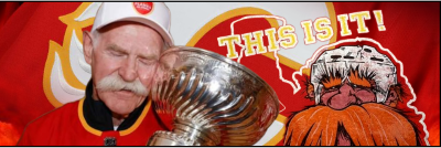
View Poll Results: Are you happy Blasty is back?
|
|
Yes
|
   
|
275 |
72.56% |
|
No
|
  
|
104 |
27.44% |
 11-12-2020, 08:02 PM
|
#561
|
|
First Line Centre
Join Date: Oct 2005
Location: Calgary
|
Quote:
Originally Posted by Cecil Terwilliger

Whats different about the shoulder patch?
|
Just the material, it's the same design and the Adidas logo is missing because it's likely a Fanattic version
|

|

|
|
11-12-2020, 08:32 PM
|
#562
|
|
Not a casual user
Join Date: Mar 2006
Location: A simple man leading a complicated life....
|
__________________
|
|
|
|
|
11-12-2020, 08:33 PM
|
#563
|
|
Not a casual user
Join Date: Mar 2006
Location: A simple man leading a complicated life....
|
__________________
|
|
|
|
|
11-12-2020, 08:35 PM
|
#564
|
|
Powerplay Quarterback
Join Date: Dec 2009
Location: Tokyo, Japan
|
That Canucks jersey is so ugly and it makes me happy.
|
|
|
|
|
The Following 7 Users Say Thank You to P-DAZZLE For This Useful Post:
|
|
|
11-12-2020, 08:41 PM
|
#565
|
|
Franchise Player
Join Date: Mar 2002
Location: Calgary
|
Quote:
Originally Posted by Dion
|
The original in 2001 would've looked just as bad, but the gradient they used made it work. The grey lines on the original were more subtle then there's white lines which standout more than they should. Mainly though, no gradient on this one is a fail, especially with a trimmer cut than they used to be.
Last edited by browna; 11-12-2020 at 08:45 PM.
|
|
|
|
|
11-12-2020, 08:44 PM
|
#566
|
|
Franchise Player
Join Date: Jun 2011
Location: Calgary
|
Should've been scorch shoulder patches. Ammirite or ammirite
|
|
|
|
|
The Following User Says Thank You to dammage79 For This Useful Post:
|
|
|
11-12-2020, 09:00 PM
|
#567
|
|
Franchise Player
Join Date: Feb 2006
Location: Calgary, AB
|
It will be interesting to see what the gradient looks like on the real Canucks' jersey. The preview image doesn't look like there's a gradient at all, but they may have cropped it just so any remnant of green is cut off.
__________________
Turn up the good, turn down the suck!
|
|
|
|
|
11-12-2020, 09:06 PM
|
#568
|
|
Franchise Player
Join Date: Apr 2013
Location: Cowtown
|
Looch sent out a tweet saying #Blasty, not sure if he's privy to the jerseys but he's excited too!
|

|
|
|
11-12-2020, 10:49 PM
|
#569
|
|
Franchise Player
Join Date: Feb 2007
Location: Calgary, AB
|
Quote:
Originally Posted by browna
The name font is fantastic.
Like the original 2004 Flames jerseys and the black name font, people will complain they can't read the names and it will get changed, and like the 2004 Flames jersey, throw off the entire planned esthetic.
|
People complained about large black block letters on a red background. Not enough contrast.
Shouldn’t be any issue with contrast of black letters on a white jersey. Many teams have black lettering on their white jerseys right now.
|
|
|
|
|
11-12-2020, 11:01 PM
|
#570
|
|
Franchise Player
Join Date: Jun 2006
Location: Calgary, Alberta
|
Quote:
Originally Posted by Jordan!
|
#### that's gorgeous.
|
|
|
|
|
The Following User Says Thank You to Joborule For This Useful Post:
|
|
|
11-12-2020, 11:08 PM
|
#571
|
|
Scoring Winger
|
Quote:
Originally Posted by Joborule
#### that's gorgeous.
|
Which one of us needs to see an optometrist?
That is the most gruesome, hideous thing I've seen to be put forth as a jersey.
|
|
|
|
|
The Following 15 Users Say Thank You to flizzenflozz For This Useful Post:
|
BeltlineFan,
BsFaninCGY,
Da_Chief,
FanIn80,
Fire,
FlamesNation23,
Funkhouser,
GreenLantern2814,
greyshep,
Johnny Makarov,
MrMike,
nixon45,
socalwingfan,
TheGingerbeardMan,
Vinny01
|
|
11-12-2020, 11:22 PM
|
#572
|
|
broke the first rule
|
Quote:
Originally Posted by Jordan!
|
This jersey should make every person who sees it want to go on a mythical quest to find their soulmate
|
|
|
|
|
The Following 31 Users Say Thank You to calf For This Useful Post:
|
3thirty,
Bill Bumface,
Bohica,
BsFaninCGY,
Cecil Terwilliger,
CrazyCaper,
devo22,
drewtastic,
FanIn80,
foofighter15,
GreenLantern2814,
jayswin,
Jetfire,
Joborule,
Jordan!,
kerriffic,
KevanGuy,
lambeburger,
Mango,
MrMike,
Nsd1,
Ragnar,
redflamesfan08,
REDVAN,
Sainters7,
Scroopy Noopers,
SuperMatt18,
Tabaracci_31,
TheGingerbeardMan,
TheScorpion,
Winsor_Pilates
|
|
11-12-2020, 11:24 PM
|
#573
|
|
That Crazy Guy at the Bus Stop
Join Date: Jun 2010
Location: Springfield Penitentiary
|
It pleases me that the Flames two biggest rivals have awful, awful jerseys and have for almost their entire existence.
The canucks skate jersey is beautiful and that’s why they promptly buried it and have largely ignored it ever since.
|
|
|
|
|
The Following User Says Thank You to Cecil Terwilliger For This Useful Post:
|
|
|
11-12-2020, 11:33 PM
|
#574
|
|
Lifetime Suspension
|
I can see why the Flames silks drew the biggest reaction.
So far an ant could crawl over the bar.
|
|
|
|
|
11-12-2020, 11:52 PM
|
#575
|
|
damn onions
|
The only good thing about that Canucks jersey is that they finally got with the program and outlined the orca logo in green. Looks cool. Shoulda done that a decade ago
I like the Coyotes jersey. Took a chance and I think it works but may have been a big better switching out the Coyote head for the full Kachina logo.
|
|
|
|
|
11-13-2020, 12:01 AM
|
#576
|
|
Scoring Winger
Join Date: Sep 2009
Location: Kelowna, BC
|
I am 100% ordering a Markstrom Reverse retro.
These are FUEGO.
|
|
|
|
|
11-13-2020, 07:31 AM
|
#577
|
|
Crash and Bang Winger
Join Date: Nov 2001
Location: Oakville, ON
|
Maybe I’m just getting old but to me these are all awful. I’m kinda dreading what the Flames do honestly. We finally got decent uniforms again and I don’t really want to relive the 98 Flames team again 
|
|
|
|
|
The Following 3 Users Say Thank You to Number 39 For This Useful Post:
|
|
|
11-13-2020, 07:56 AM
|
#578
|
|
Franchise Player
Join Date: Jul 2010
Location: Van Island
|
Quote:
Originally Posted by Number 39
Maybe Im just getting old but to me these are all awful. Im kinda dreading what the Flames do honestly. We finally got decent uniforms again and I dont really want to relive the 98 Flames team again |
It's just for fun, it's about time we got a bunch of new one off jerseys.
With having some of the worst jerseys for the past 12 or so years it's nice to have another option.
|
|
|
|
|
11-13-2020, 08:16 AM
|
#579
|
|
Crash and Bang Winger
Join Date: Nov 2001
Location: Oakville, ON
|
I get it and I know its all in fun. Having said that I'm a traditionalist and I accept it. I'd prefer the Flames treat their uniforms more like the Canadiens deal with theirs. The primary uniforms are the brand and basically never change. Play with a third jersey for marketing reasons that has historical significance. Honestly I've never been a Blasty fan. I associate that jersey and the pedestal abominations with the Young Guns era.....Nothing I really want to celebrate.
Last edited by Number 39; 11-13-2020 at 08:19 AM.
|
|
|
|
|
The Following 2 Users Say Thank You to Number 39 For This Useful Post:
|
|
|
11-13-2020, 08:28 AM
|
#580
|
|
Pent-up
Join Date: Mar 2018
Location: Plutanamo Bay.
|
Quote:
Originally Posted by Number 39
I get it and I know its all in fun. Having said that I'm a traditionalist and I accept it. I'd prefer the Flames treat their uniforms more like the Canadiens deal with theirs. The primary uniforms are the brand and basically never change. Play with a third jersey for marketing reasons that has historical significance. Honestly I've never been a Blasty fan. I associate that jersey and the pedestal abominations with the Young Guns era.....Nothing I really want to celebrate.
|
So... goofy jerseys are only permitted if you made a goofy jersey 80+ years ago? In which case you can release multiple ridiculous jerseys while remaining traditionalist?
http://hockeybydesign.com/2020/06/wo...eal-canadiens/

|
|
|
|
|
The Following 2 Users Say Thank You to Scroopy Noopers For This Useful Post:
|
|
 Posting Rules
|
You may not post new threads
You may not post replies
You may not post attachments
You may not edit your posts
HTML code is Off
|
|
|
All times are GMT -6. The time now is 07:22 PM.
|
|


