 12-17-2006, 03:39 PM
|
#21
|
|
The new goggles also do nothing.
Join Date: Oct 2001
Location: Calgary
|
Nice! PM that to Bingo, see what he says.
__________________
Uncertainty is an uncomfortable position.
But certainty is an absurd one.
|

|

|
|
12-17-2006, 07:24 PM
|
#22
|
|
Franchise Player
Join Date: Mar 2004
Location: in transit
|
Quote:
Originally Posted by photon

Is that the sound of you volunteering to do a new one?  |
Haha! Sure. I haven't got the best skills, however.
My last exam is tuesday. If you give me till Wednesday or Thursday, I could see what I can come up with.
Meantime, Jordan's looks pretty cool. Nice job!
__________________
|
|
|
|
|
12-18-2006, 09:59 AM
|
#23
|
|
It's not easy being green!
Join Date: Oct 2001
Location: In the tubes to Vancouver Island
|
Quote:
Originally Posted by SpitFire40
You've got really bad eyes...
|
It is a tad obscure.. I can tell it's the Calgary Tower, but it's really dark.
Nice new look though.
__________________
Who is in charge of this product and why haven't they been fired yet?
|
|
|
|
|
12-18-2006, 10:09 AM
|
#24
|
|
Franchise Player
Join Date: Sep 2002
Location: Estonia
|
Quote:
Originally Posted by kermitology
It is a tad obscure.. I can tell it's the Calgary Tower, but it's really dark.
Nice new look though.
|
Ohhh, its the tower. I wasnt sure what it was either.
|
|
|
|
|
12-18-2006, 12:26 PM
|
#25
|
Join Date: May 2004
Location: @robdashjamieson
|
Quote:
Originally Posted by fotze
I like it but what is that thing under .com? A curling rock?
|
Calgary Tower?
I'd like a go at this, if you guys don't mind. May have something by Wed/Thurs.
__________________

|
|
|
|
|
12-18-2006, 03:31 PM
|
#26
|
|
Lifetime Suspension
Join Date: Sep 2006
Location: Calgary
|
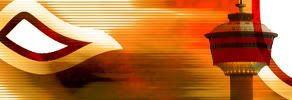
Here's a different one. With the Red jersey/striping, more clear Calgary tower @ Night with The Flame.

|
|
|
|
|
12-18-2006, 04:11 PM
|
#27
|
|
I believe in the Pony Power
|
I like that Jordan. Very nice work.
|
|
|
|
|
12-18-2006, 07:03 PM
|
#28
|
|
Lifetime Suspension
Join Date: Sep 2006
Location: Calgary
|
Thanks, I like the second one more. The Red colour plus the striping looks flag-like and the text is more readable. I guess I should PM that over to Bingo aswell for consideration.
Last edited by SpitFire40; 12-18-2006 at 07:05 PM.
|
|
|
|
|
12-19-2006, 12:02 AM
|
#29
|
|
Lifetime Suspension
Join Date: Sep 2006
Location: Calgary
|
The Big Man wanted it a little more brighter so I took out the night time Calgary tower to a better daytime pic and changed the "com" text to Gold.

|
|
|
|
|
12-19-2006, 12:05 AM
|
#30
|
|
Franchise Player
Join Date: Sep 2003
Location: Calgary, AB
|
Quote:
Originally Posted by SpitFire40
The Big Man wanted it a little more brighter so I took out the night time Calgary tower to a better daytime pic and changed the "com" text to Gold.
|
Your first couple didn't do much for me, but I like that one!
Only one small suggestion. Maybe fill the middle portion with the part of the Jersey with the flaming C?
|
|
|
|
|
12-19-2006, 12:07 AM
|
#31
|
|
Lifetime Suspension
Join Date: Sep 2006
Location: Calgary
|
Quote:
Originally Posted by Jiggy_12
Your first couple didn't do much for me, but I like that one!
Only one small suggestion. Maybe fill the middle portion with the part of the Jersey with the flaming C?
|
Nay, as an Unofficial Site that is CP. I don't think the full logo belongs. Plus if I did part of the logo as in the current one it'd look too cluttered IMO. We've got the team colours plus a local symbol in the Calgary Tower.
Last edited by SpitFire40; 12-19-2006 at 12:42 AM.
|
|
|
|
|
12-19-2006, 12:12 AM
|
#32
|
|
Franchise Player
Join Date: Sep 2002
Location: Estonia
|
Quote:
Originally Posted by SpitFire40
The Big Man wanted it a little more brighter so I took out the night time Calgary tower to a better daytime pic and changed the "com" text to Gold.
|
Looks good man.
|
|
|
|
|
12-19-2006, 12:13 AM
|
#33
|
|
I believe in the Pony Power
|
Yeah I like that a lot. Slick as warm owl ****.
|
|
|
|
|
12-19-2006, 12:15 AM
|
#34
|
|
Lifetime Suspension
Join Date: Sep 2006
Location: Calgary
|
My pleasure, and if Bingo wants to wait on more submissions he can feel free. I usually hate all the work I do, but I think it looks good. More sharp, more modern in style than the current.
|
|
|
|
|
12-19-2006, 12:41 AM
|
#35
|
|
It's not easy being green!
Join Date: Oct 2001
Location: In the tubes to Vancouver Island
|
Great work there Jordon.. I like the new design a lot.
__________________
Who is in charge of this product and why haven't they been fired yet?
|
|
|
|
|
12-19-2006, 01:02 PM
|
#36
|
|
Franchise Player
Join Date: Mar 2004
Location: in transit
|
Well, Jordon, looks like you're running away with this one. I like the look a lot; it definitely works. I'm not crazy about the font at the bottom, but other than that it's awesome.
I said I'd try to come up with something, although my photoshop skills are hack-ish. I did come up with this one, but I don't have any decent fonts that look good enough.
Maybe someone could add to this one? I like it.
Just noticing now that because of the lightness around the edges, it may need a border.
__________________
|
|
|
|
|
12-19-2006, 03:02 PM
|
#37
|
|
Lifetime Suspension
Join Date: Sep 2006
Location: Calgary
|
The reason I used that font at the bottom was to make it look bold, and I also didn't want one that was too sharp, I wanted one more round then the main font.
Almost like a stamp at the bottom
|
|
|
|
|
12-20-2006, 03:40 AM
|
#38
|
|
Franchise Player
Join Date: Feb 2002
Location: Silicon Valley
|
Quote:
Originally Posted by SpitFire40
Here's a different one. With the Red jersey/striping, more clear Calgary tower @ Night with The Flame.
|
I like this one except for the Calgary Tower; it makes it look a little busy.
__________________
"With a coach and a player, sometimes there's just so much respect there that it's boils over"
-Taylor Hall
|
|
|
|
|
12-20-2006, 04:01 AM
|
#39
|
|
Franchise Player
Join Date: Feb 2006
Location: Calgary, AB
|
I just noticed this, when you go to the main page of CalgaryPuck.com and roll over the logo, it changes to this:

It doesn't show up on the forums, just the main page.
Is that new or old? I don't mind it, except the image is flipped and Banker's Hall (only one tower too) and the Petro-Canada buildings are on the wrong side of the Tower. Plus, the Dome is oriented backwards.
Does the logo have to have those exact dimensions? I know there has to be room for the banner ads, but I'd to see something with a little more flow rather than a straight rectangle.
__________________
Turn up the good, turn down the suck!
|
|
|
|
|
12-20-2006, 09:15 AM
|
#40
|
|
The new goggles also do nothing.
Join Date: Oct 2001
Location: Calgary
|
Yeah that one's been around for a while I think.
I don't think it has to be a rectangle, just has to allow space for banner ads.
Doesn't have to just be a rectangle logo either, if someone wants to desgin a whole top of the page that would be nice too.
__________________
Uncertainty is an uncomfortable position.
But certainty is an absurd one.
|
|
|
|
 Posting Rules
|
You may not post new threads
You may not post replies
You may not post attachments
You may not edit your posts
HTML code is Off
|
|
|
All times are GMT -6. The time now is 05:05 AM.
|
|


