|
View Poll Results: Where would you like the Flames to go with their jerseys?
|
|
Keep with the existing set
|
   
|
9 |
2.34% |
|
go back to vintage home and away
|
  
|
229 |
59.48% |
|
go back to 2004 home and away
|
  
|
26 |
6.75% |
|
minor tweak to the existing set (piping, flags)
|
  
|
40 |
10.39% |
|
new design that adds black to the retro look
|
  
|
36 |
9.35% |
|
completely new design
|
  
|
39 |
10.13% |
|
other (elaborate)
|
|
6 |
1.56% |
 06-15-2017, 08:46 AM
|
#341
|
|
Franchise Player
Join Date: Aug 2007
Location: Ontario
|
It will be interesting to see what the replicas look like.
Those perforated numbers, for example, could be something that no replica has. Like the fight strap, it's a benefit to a game-worn jersey that doesn't get replicated.
|

|
|
|
06-15-2017, 08:59 AM
|
#342
|
|
Franchise Player
|
Quote:
Originally Posted by Split98

It will be interesting to see what the replicas look like.
Those perforated numbers, for example, could be something that no replica has. Like the fight strap, it's a benefit to a game-worn jersey that doesn't get replicated.
|
I'm guessing they'll use a "faux" mesh graphic like they introduced on NBA "Swingman" jerseys:

|
|
|
|
|
The Following User Says Thank You to tvp2003 For This Useful Post:
|
|
|
06-15-2017, 10:02 AM
|
#343
|
|
Some kinda newsbreaker!
Join Date: May 2004
Location: Learning Phaneufs skating style
|
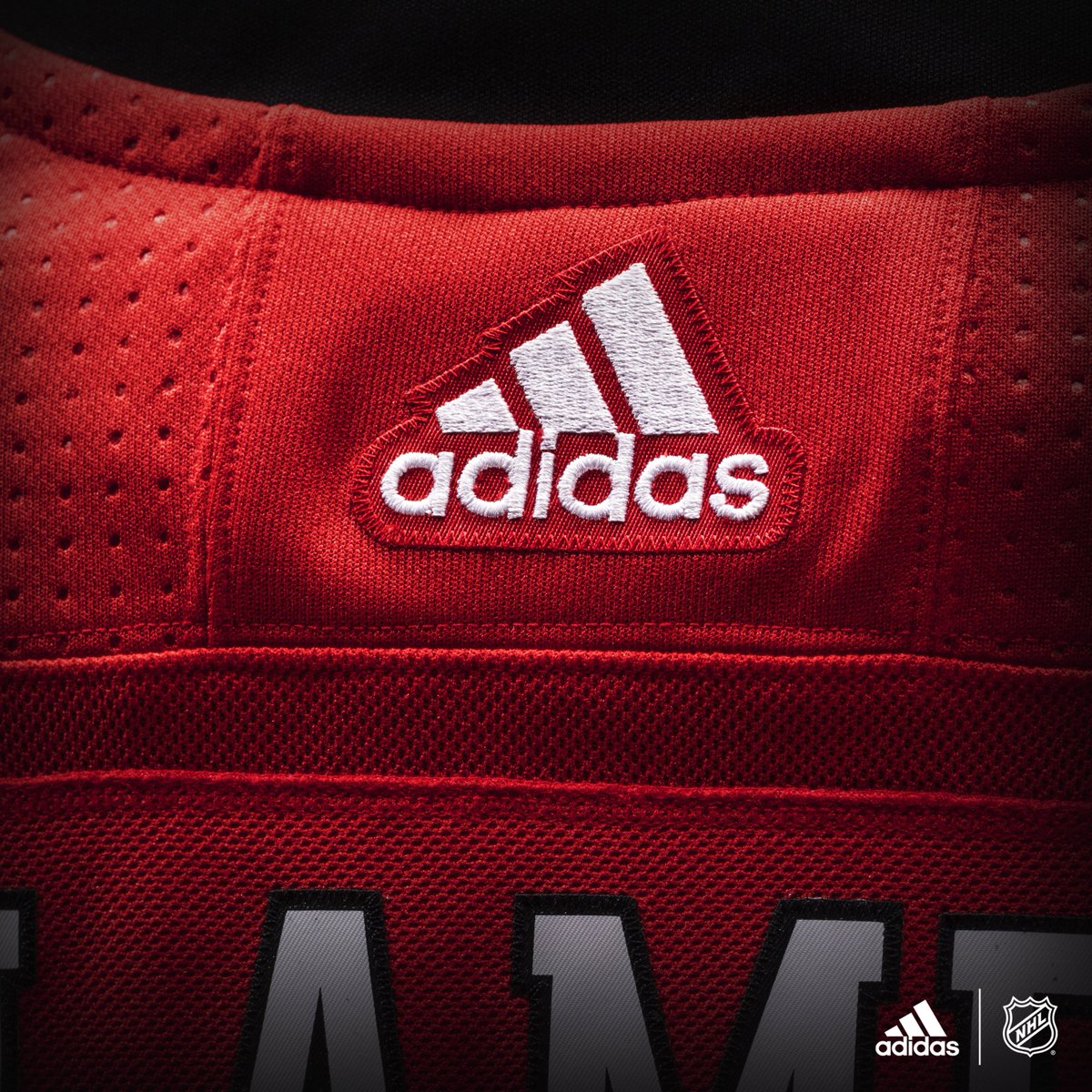
Another teaser pic from the Flames:
|
|
|
|
|
06-15-2017, 10:02 AM
|
#344
|
|
Franchise Player
|
Same font?
|
|
|
|
|
06-15-2017, 10:04 AM
|
#345
|
|
Franchise Player
|
No black around the collar?
|
|
|
|
|
06-15-2017, 10:05 AM
|
#346
|
|
Franchise Player
Join Date: Dec 2003
Location: Sector 7-G
|
Quote:
Originally Posted by Madman
Same font?
|
Looks like the same font as previous years 
|
|
|
|
|
06-15-2017, 10:07 AM
|
#347
|
|
Franchise Player
|
Quote:
Originally Posted by Otto-matic
Looks like the same font as previous years |
Actually, I think the font is slightly different -- the letters are not italicized like they currently are:

CHANGE!!!!!!
Last edited by tvp2003; 06-15-2017 at 10:11 AM.
|
|
|
|
|
The Following 6 Users Say Thank You to tvp2003 For This Useful Post:
|
|
|
06-15-2017, 10:11 AM
|
#348
|
|
Franchise Player
|
if I see a pipe I will die
|
|
|
|
|
The Following 2 Users Say Thank You to Ashasx For This Useful Post:
|
|
|
06-15-2017, 10:16 AM
|
#349
|
|
Franchise Player
Join Date: Feb 2007
Location: Calgary, AB
|
Quote:
Originally Posted by Hockeyguy15
No black around the collar?
|
Nah judging from the other team photos the top of the collar for us is still black, just hard to tell because of the contrast.
|
|
|
|
|
06-15-2017, 10:16 AM
|
#350
|
|
Powerplay Quarterback
|
Yes it's true...appears to be a more classical font. I like! I preferred the font on the wordmark alternates.
__________________
Is your cat doing singing?
|
|
|
|
|
06-15-2017, 10:26 AM
|
#351
|
|
Franchise Player
|
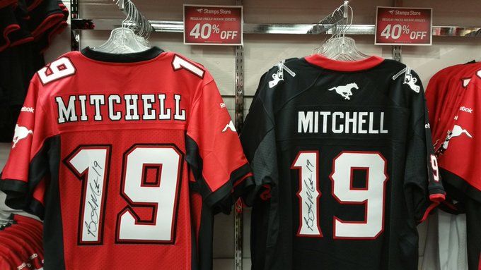
Possibly the same letter font as what the Stampeders used pre-Adidas (on the left) before switching to the "Outlaw" font (on the right)?
|
|
|
|
|
06-15-2017, 10:27 AM
|
#352
|
|
Franchise Player
Join Date: Aug 2005
Location: Violating Copyrights
|
Quote:
Originally Posted by SuperMatt18
Nah judging from the other team photos the top of the collar for us is still black, just hard to tell because of the contrast.
|
Yup, black collar.

|
|
|
|
|
06-15-2017, 10:27 AM
|
#353
|
|
something else haha
|
no black around the collar = more simple.
I have hope.
edit: Damnit
Last edited by Swayze11; 06-15-2017 at 10:30 AM.
|
|
|
|
|
06-15-2017, 10:29 AM
|
#354
|
|
Franchise Player
|
edit - Black collar? Nooooooooooo
Last edited by ComixZone; 06-15-2017 at 10:34 AM.
|
|
|
|
|
The Following User Says Thank You to ComixZone For This Useful Post:
|
|
|
06-15-2017, 10:30 AM
|
#355
|
|
Taking a while to get to 5000
|
Compare it to the back of a the World Cup jerseys and there is definitely a black collar there.
|
|
|
|
|
06-15-2017, 10:32 AM
|
#356
|
|
Franchise Player
Join Date: Oct 2014
Location: Springbank
|
Quote:
Originally Posted by ComixZone
There's no black collar there, or if there is - then it's poor design. You wouldn't stitch closed the top of the red, then bolt on a black collar. It's likely that there's no defined black collar that runs around the entire neck hole, but rather it follows the design of some of the world cup jerseys where you see some level of design on the front side.
(I love the lack of the black collar - it helps make red more dominant on the jersey, which is exactly what we need).
|
I guess the front laces would be red or white then? I don't want to lose the laces.
|
|
|
|
|
06-15-2017, 10:33 AM
|
#357
|
|
Franchise Player
Join Date: Feb 2007
Location: Calgary, AB
|
Barnes photo pretty clearly shows there is a black collar and it was just the contrast on the original photo.
|
|
|
|
|
06-15-2017, 10:34 AM
|
#358
|
|
Lifetime Suspension
Join Date: Jul 2003
Location: Calgary, Alberta
|
They didn't even fix the font?
I don't know what to say.
|
|
|
|
|
06-15-2017, 10:34 AM
|
#359
|
|
Some kinda newsbreaker!
Join Date: May 2004
Location: Learning Phaneufs skating style
|
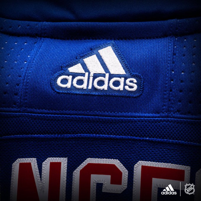
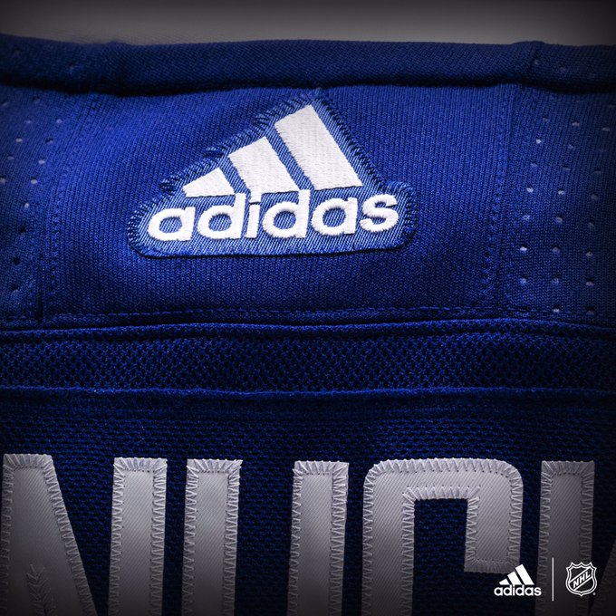
SuperMatt18 is correct it does look like there is a black collar based on the other teams teasers:
like the Rangers:
Canucks:
Wings:
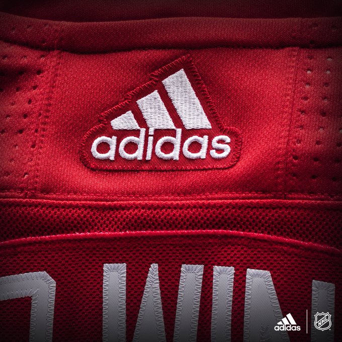
Preds:
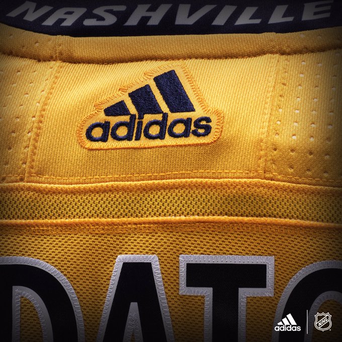
All the other teasers indicate there is fabric there. if the Flames don't have that collar, their jerseys would be different from the rest of the league
|
|
|
|
|
06-15-2017, 10:36 AM
|
#360
|
|
Scoring Winger
Join Date: Nov 2014
Location: Kelowna
|

Looks like the oilers are using white lettering now
|
|
|
|
 Posting Rules
|
You may not post new threads
You may not post replies
You may not post attachments
You may not edit your posts
HTML code is Off
|
|
|
All times are GMT -6. The time now is 05:12 AM.
|
|