|
View Poll Results: Where would you like the Flames to go with their jerseys?
|
|
Keep with the existing set
|
   
|
9 |
2.34% |
|
go back to vintage home and away
|
  
|
229 |
59.48% |
|
go back to 2004 home and away
|
  
|
26 |
6.75% |
|
minor tweak to the existing set (piping, flags)
|
  
|
40 |
10.39% |
|
new design that adds black to the retro look
|
  
|
36 |
9.35% |
|
completely new design
|
  
|
39 |
10.13% |
|
other (elaborate)
|
|
6 |
1.56% |
 06-12-2017, 10:48 AM
|
#141
|
|
First round-bust
Join Date: Feb 2015
Location: speculating about AHL players
|
Hey King, you're the worst.
__________________
Need a great deal on a new or pre-owned car? Come see me at Platinum Mitsubishi 2720 Barlow Trail NE
2026 World Junior Pool CHAMPION
|

|
|
|
The Following User Says Thank You to TheScorpion For This Useful Post:
|
|
|
06-12-2017, 10:49 AM
|
#142
|
|
Franchise Player
Join Date: Feb 2006
Location: Calgary, AB
|
Based on all the images that have been released so far, the only one that appears to have any significant changes from last season is Minnesota adding a centre stripe.
Rumours of Buffalo going back to royal blue; the Senators going to their retrOs full time; and the Devils going back to red and green appear to not be true. Although, I don't know how many of those were actual rumours and how many were just wishful thinking like the Flames going retro.
Of course, the only images that have been released so far only show the centre logo, so striping and piping are still unknown.
__________________
Turn up the good, turn down the suck!
|

|
|
|
06-12-2017, 10:49 AM
|
#143
|
|
First Line Centre
Join Date: Oct 2009
Location: Reppin' the C in BC
|
Please no flags, I would rather they have no shoulder patches at all.
|
|
|
|
|
06-12-2017, 10:50 AM
|
#144
|
|
Scoring Winger
|
Thanks for nothing K K
|
|
|
|
|
The Following User Says Thank You to Young_Guns For This Useful Post:
|
|
|
06-12-2017, 10:59 AM
|
#145
|
|
Retired
Join Date: Dec 2014
Location: Back in Guelph
|
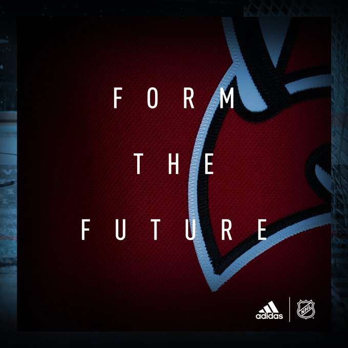
Form the future
From the present.
|
|
|
|
|
The Following 3 Users Say Thank You to TheFlamesVan For This Useful Post:
|
|
|
06-12-2017, 11:06 AM
|
#146
|
|
Franchise Player
Join Date: Sep 2008
Location: Calgary
|
Regardless of classic colours vs. status quo, if they don't use this as an opportunity to at least refresh the design, then they've really dropped the ball.
If we get the essentially the same flag jersey with three stripes sewn down the side, then I really have lost all faith in the organization's ability to design anything.
|
|
|
|
|
The Following User Says Thank You to Jimmy Stang For This Useful Post:
|
|
|
06-12-2017, 11:07 AM
|
#147
|
|
Franchise Player
|
Interesting (okay, maybe only to a few people) that the logo has a "semi-reverse kiss cut" twill crest, not the traditional layered crest.
Explanation: http://cdn.niketalk.com/b/b4/679x100...ckletwill.jpeg
|
|
|
|
|
The Following 9 Users Say Thank You to tvp2003 For This Useful Post:
|
|
|
06-12-2017, 11:07 AM
|
#148
|
|
First Line Centre
|
Well this is an organization that had a badass jersey for like 3 years, then switched to an ugly one and kept it for 10. Just no blue on it or somebody please shoot KK.
|
|
|
|
|
The Following 2 Users Say Thank You to Redrum For This Useful Post:
|
|
|
06-12-2017, 11:08 AM
|
#149
|
|
Franchise Player
Join Date: Oct 2014
Location: Springbank
|
I don't mind black, including on the C. The red in the teaser might be a darker shade which I will have to see in a whole jersey to make any kind of decision about.
But then, I've only ever disliked two jerseys - the pedestal and the last third jersey (the "Walmart"). I even have fondness for the horsehead.
|
|
|
|
|
06-12-2017, 11:10 AM
|
#150
|
|
#1 Goaltender
|
I'm sooooooo mad
|
|
|
|
|
06-12-2017, 11:14 AM
|
#151
|
|
Franchise Player
Join Date: Sep 2008
Location: Calgary
|
I've set the bar quite low, so I'm quite pleased that we've still got the flaming C on there and not some script or something. Small victories.
|
|
|
|
|
06-12-2017, 11:14 AM
|
#152
|
|
Scoring Winger
|
I'm a big fan of the White C. Always have been.
However I will give the Black C some credit, it does a much better job of disguising mustard stains.
|
|
|
|
|
06-12-2017, 11:17 AM
|
#153
|
|
Franchise Player
Join Date: Apr 2004
Location: I don't belong here
|
I don't mind the black in the jersesy, but I would have loved for them to go to retro as their primary home and away. Retro is my preference.
If they're sticking with black in the colour scheme then I hope they come up with a close copy of the 2004-2007 jerseys.
|
|
|
|
|
06-12-2017, 11:20 AM
|
#154
|
|
Franchise Player
Join Date: Feb 2006
Location: Calgary, AB
|
Quote:
Originally Posted by tvp2003

|
I noticed that too, but didn't realize it had a special name. That should reduce the weight of the logo because it won't be three full layers of heavy twill. The white layer will just be the outline.
Another thing I noticed is that for most of the teams, the largest coloured areas of the logo will be done in the jersey mesh material rather than the twill.
You can see it very well in the Devils' logo here...
That change should also reduce the overall weight of the jerseys. It's hard to tell on the Flames logo because it's black, but I believe the black C is in the jersey mesh material.
__________________
Turn up the good, turn down the suck!
|
|
|
|
|
The Following 2 Users Say Thank You to getbak For This Useful Post:
|
|
|
06-12-2017, 11:28 AM
|
#155
|
|
Lifetime Suspension
|
Quote:
Originally Posted by CroFlames
Maybe it's a switcharoo. Bait us with the black logo, unveil the retro logo. There's hope.
|
no way... at some point in the early 00's ken king went black.. and he has NOT gone back..
personally i dont mind if we're not retro full time.. as long as these jerseys are a nice clean simple design it's all good... but im leery of that. it just sucks not seeing the retros for anotehr couple years since no thirds for a while.
|
|
|
|
|
06-12-2017, 11:30 AM
|
#156
|
|
First Line Centre
|
Adidas did this with my teams soccer jersey (the dark teaser image). I think someone managed to lighten the image though and revealed the rest of the shirt.
I'm not disappointed exactly but I had hoped that ours was one of the redesigns. It may still be, I guess.
|
|
|
|
|
06-12-2017, 11:45 AM
|
#157
|
Participant  |
It'll be a great looking jersey if they use the new shoulder patch and clean up the piping. But I maintain my original position, and I'm sad for those who didn't embrace it:
Quote:
Originally Posted by PepsiFree
Hope and excitement are mistakes.
|
|
|
|
|
|
06-12-2017, 11:51 AM
|
#158
|
|
First Line Centre
|
Comes to Calgary Puck to see whats going on today.....Oh perfect everyone is angry about something again. I like our current jerseys and I actually like the shoulder patches....Shame on me for liking something
Last edited by colbym72; 06-12-2017 at 12:01 PM.
|
|
|
|
|
06-12-2017, 11:56 AM
|
#159
|
|
#1 Goaltender
Join Date: Jan 2009
Location: Calgary
|
Well.... I'm thoroughly disappointed
|
|
|
|
|
06-12-2017, 12:02 PM
|
#160
|
|
Unfrozen Caveman Lawyer
Join Date: Oct 2002
Location: Crowsnest Pass
|
Quote:
Originally Posted by Racki
It surprises me how often pro sports teams are out of touch or just don't care what their fan bases want to see as it relates to team jerseys.
I'm a lifetime San Diego Chargers fan and for years we've been begging for the old powder blues to come back as the primary jersey but ownership just will not do it.
Why not give your fans what they want and make them happy?
|
Your signature is the Black C. 
|
|
|
|
|
The Following User Says Thank You to troutman For This Useful Post:
|
|
 Posting Rules
|
You may not post new threads
You may not post replies
You may not post attachments
You may not edit your posts
HTML code is Off
|
|
|
All times are GMT -6. The time now is 08:08 PM.
|
|