08-16-2016, 01:42 PM
|
#1441
|
|
Franchise Player
Join Date: Oct 2006
Location: San Fernando Valley
|
Quote:
Originally Posted by the_only_turek_fan

You are basically looking at Team Canada jerseys if you drop the yellow:
 |
Looks good doesn't it? Obvously the Flaming C as well as black more prominent and a different design would differentiate. IMO yellow just doesn't work well with red as its two bright colours.
Last edited by Erick Estrada; 08-16-2016 at 01:45 PM.
|

|

|
|
The Following 3 Users Say Thank You to PepsiFree For This Useful Post:
|
|
|
The Following 7 Users Say Thank You to Scary Eloranta For This Useful Post:
|
|
|
10-01-2016, 12:26 AM
|
#1445
|
|
Franchise Player
|
Quote:
Originally Posted by Howie_16
I like this idea of incorporating the flame shape in the jersey design. Obviously the Flaming C swapped in for the Atlanta logo. Use the white Flaming C on the home jersey. The font doesn't have to stay the same as what is used in this concept, but it needs to be updated from the one currently being used on our main jerseys.
Red helmets & red pants with a white\black\yellow stripe to complete the look = win! 
 |
I'm in favor primarily because every woman wearing that in a youth L is going to look at least one number hotter.
__________________
All you have to decide is what to do with the time that is given to you.
Rowan Roy W-M - February 15, 2024
|

|
|
|
The Following User Says Thank You to GreenLantern2814 For This Useful Post:
|
|
|
10-01-2016, 10:42 AM
|
#1446
|
|
Scoring Winger
Join Date: Jul 2011
Location: at home
|

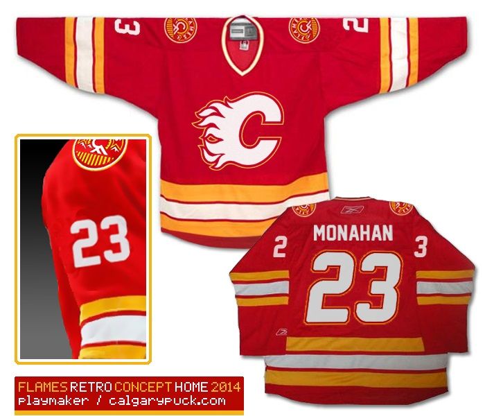
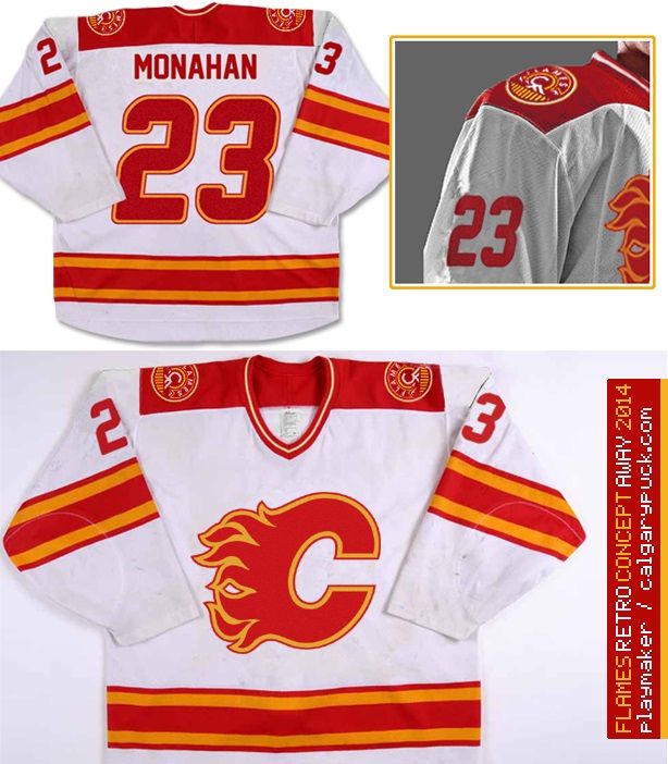
Here's my new contribution ... As you might remember, I generally prefer Flames to go full retro with some minor tweaks
(see my original retro concept in Spoiler tags)
But now when the Flames are ditching the 3rd word-mark jersey away, I've thought maybe the concept could be revised by using the white flaming C which would provide much needed contrast. Although I wasn't a big fan of new 3rds mainly due to lack of identity and contrast, I think after this small change it doesn't look that bad.
What do you think, is it time to get rid of that style forever or does it deserve another chance? Is there really something intriguing or is it just me drinking too much beer?


As for the photo-editing - it's not perfect though I did my best to simulate perspective or distortions of the logo during a game.
Other than replacing the word-mark I gently outlined numbering with gold so that they match the logo outline (see Mony and Johnny goal celebration). Also, the bottom composition is supposed to illustrate how identifiable the team remains with the white flaming C even in very small images (or when seen from a distance). The team logo, in my opinion, is something to stand out rather than just be there, blent together with the rest of the uniform.
Last edited by playmaker; 10-01-2016 at 10:45 AM.
|
|
|
|
|
The Following 6 Users Say Thank You to playmaker For This Useful Post:
|
|
|
10-01-2016, 10:47 AM
|
#1447
|
|
First round-bust
Join Date: Feb 2015
Location: speculating about AHL players
|
^ I feel like those jerseys would look way better without all the black, especially around the white C. I've always hated the white C with the black outline.
__________________
2026 World Junior Pool Champion
Need a deal on a new or pre-owned car? Come see me at Platinum Mitsubishi DM me to chat!
|
|
|
|
|
The Following User Says Thank You to TheScorpion For This Useful Post:
|
|
|
10-01-2016, 11:07 AM
|
#1448
|
|
Scoring Winger
Join Date: Mar 2012
Location: Halifax, NS
|
I know I'm in the minority, but I'm not a huge fan of the retro jerseys or anything that tries to bring them back. I like having black in the jerseys.
__________________
"Im on a mission to civilize." - Will McAvoy
|
|
|
|
|
The Following 4 Users Say Thank You to JerryUnderscore For This Useful Post:
|
|
|
10-01-2016, 02:00 PM
|
#1449
|
|
Powerplay Quarterback
|
The only thing I don't like about these jerseys is the stripes are different on the arms and lower part of the sweater
|
|
|
|
|
10-01-2016, 02:19 PM
|
#1450
|
|
Franchise Player
|
Quote:
Originally Posted by JerryUnderscore
I know I'm in the minority, but I'm not a huge fan of the retro jerseys or anything that tries to bring them back. I like having black in the jerseys.
|

__________________
Quote:
Originally Posted by CroFlames
Before you call me a pessimist or a downer, the Flames made me this way. Blame them.
|
|
|
|
|
|
The Following 10 Users Say Thank You to codynw For This Useful Post:
|
|
|
10-01-2016, 03:37 PM
|
#1451
|
|
Franchise Player
Join Date: Nov 2003
Location: Calgary, AB
|
Quote:
Originally Posted by playmaker
Here's my new contribution ... As you might remember, I generally prefer Flames to go full retro with some minor tweaks
(see my original retro concept in Spoiler tags)
But now when the Flames are ditching the 3rd word-mark jersey away, I've thought maybe the concept could be revised by using the white flaming C which would provide much needed contrast. Although I wasn't a big fan of new 3rds mainly due to lack of identity and contrast, I think after this small change it doesn't look that bad.
What do you think, is it time to get rid of that style forever or does it deserve another chance? Is there really something intriguing or is it just me drinking too much beer?
As for the photo-editing - it's not perfect though I did my best to simulate perspective or distortions of the logo during a game.
Other than replacing the word-mark I gently outlined numbering with gold so that they match the logo outline (see Mony and Johnny goal celebration). Also, the bottom composition is supposed to illustrate how identifiable the team remains with the white flaming C even in very small images (or when seen from a distance). The team logo, in my opinion, is something to stand out rather than just be there, blent together with the rest of the uniform. |
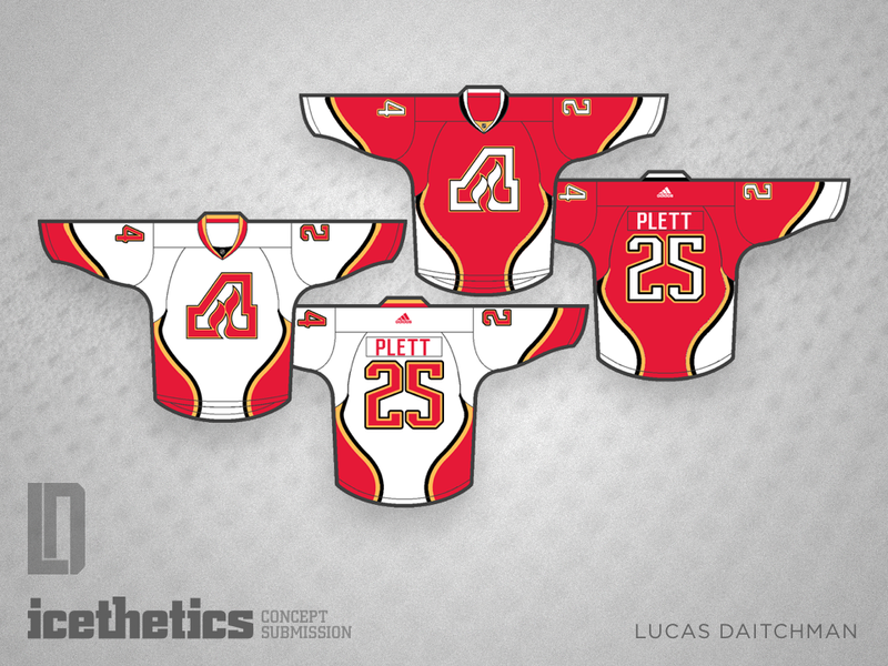
I thought this would look good too when I did a similar mock-up awhile ago (many pages back).
Couple things:
1) C has to be black
2) They need to modify the descending neck line, as it basically pushed the logo onto your gut
Here is my crappy Paint attemp:

Last edited by Tyler; 10-01-2016 at 03:43 PM.
|
|
|
|
|
The Following User Says Thank You to Tyler For This Useful Post:
|
|
|
10-02-2016, 10:53 AM
|
#1452
|
|
Threadkiller
Join Date: Oct 2003
Location: 51.0544° N, 114.0669° W
|
Quote:
Originally Posted by Howie_16
I like this idea of incorporating the flame shape in the jersey design. Obviously the Flaming C swapped in for the Atlanta logo. Use the white Flaming C on the home jersey. The font doesn't have to stay the same as what is used in this concept, but it needs to be updated from the one currently being used on our main jerseys.
Red helmets & red pants with a white\black\yellow stripe to complete the look = win!
|
I like these as a third
|
|
|
|
|
10-02-2016, 01:43 PM
|
#1453
|
|
#1 Goaltender
Join Date: Aug 2011
Location: Not cheering for losses
|
Quote:
Originally Posted by Howie_16
I like this idea of incorporating the flame shape in the jersey design. Obviously the Flaming C swapped in for the Atlanta logo. Use the white Flaming C on the home jersey. The font doesn't have to stay the same as what is used in this concept, but it needs to be updated from the one currently being used on our main jerseys.
Red helmets & red pants with a white\black\yellow stripe to complete the look = win!
|
Creates the silhouette of a woman wearing a one piece bathing suit.
|
|
|
|
|
The Following 2 Users Say Thank You to sun For This Useful Post:
|
|
|
12-01-2016, 04:38 PM
|
#1454
|
|
#1 Goaltender
|
NHL 2017 Redsign
Came across this website and this poster is redesigning every NHL team's jersey. I like a lot of his work and think he did great with Calgary. With Adidas being the sponsor next year, hopefully the Flames listen to the majority of their fan base and go with the retros full-time or at least a modernized look of the retros. It's classic, clean and just a beautiful looking jersey. I'm not sure how I feel on the black alternate jersey. If the Flames are adamant on keeping black in the color scheme, hopefully they bring back the 04 jersey.
Here are his notes:
Calgary might have the worst look the league. Blunt but honest. The random piping, the flags on the shoulders. Yeah it needs to go. I think the answer for them lies in the past.
- Dropped black from the home and away uniforms.
- Look reminiscent of the 80's, but made a new striping pattern.
- Dumped the name font and went to a block font, but kept the numbers
- Pants have a new stripe.
- I loved the logo from the now retired alternate jersey, so that gets used here
- Kept the pointy yoke but added stripes to it, and I'll explain why.
- The double stripes come from the old Calgary Stampeders (WHL, not CFL)
- And I then extended the design across the board.
 

|
|
|
|
|
The Following 18 Users Say Thank You to IceMan For This Useful Post:
|
AC,
anyonebutedmonton,
DaQwiz,
drewtastic,
DT77,
edn88,
FanIn80,
Flamesfan2010,
FleurysOTGoalCelebration,
foshizzle11,
Funkhouser,
GreenLantern2814,
Matty81,
Monahan For Mayor,
Mustache,
Rejean31,
TjRhythmic,
YYC in LAX
|
|
12-01-2016, 04:41 PM
|
#1455
|
|
#1 Goaltender
|
Jersey Ideas - Ken King please read
Quote:
Originally Posted by IceMan
NHL 2017 Redsign
Came across this website and this poster is redesigning every NHL team's jersey. I like a lot of his work and think he did great with Calgary. With Adidas being the sponsor next year, hopefully the Flames listen to the majority of their fan base and go with the retros full-time or at least a modernized look of the retros. It's classic, clean and just a beautiful looking jersey. I'm not sure how I feel on the black alternate jersey. If the Flames are adamant on keeping black in the color scheme, hopefully they bring back the 04 jersey.
Here are his notes:
Calgary might have the worst look the league. Blunt but honest. The random piping, the flags on the shoulders. Yeah it needs to go. I think the answer for them lies in the past.
- Dropped black from the home and away uniforms.
- Look reminiscent of the 80's, but made a new striping pattern.
- Dumped the name font and went to a block font, but kept the numbers
- Pants have a new stripe.
- I loved the logo from the now retired alternate jersey, so that gets used here
- Kept the pointy yoke but added stripes to it, and I'll explain why.
- The double stripes come from the old Calgary Stampeders (WHL, not CFL)
- And I then extended the design across the board.
|
Pretty good. Love the the home/away, except not sold on using that number font. The third is kind of gross, I despise that logo.
Last edited by bax; 12-02-2016 at 01:35 AM.
|
|
|
|
|
The Following 2 Users Say Thank You to bax For This Useful Post:
|
|
|
12-01-2016, 04:56 PM
|
#1456
|
|
That Crazy Guy at the Bus Stop
Join Date: Jun 2010
Location: Springfield Penitentiary
|
When will people learn that putting your city name on a home jersey is stupid.
That jersey should say Flames, not Calgary. If we were to have a wordmark third away jersey, then it can say Calgary.
Only Vancouver needs to put the city name because they change their jerseys and colors so often that it is the only way for casual fans to keep track of who to cheer for.
|
|
|
|
|
The Following 2 Users Say Thank You to Cecil Terwilliger For This Useful Post:
|
|
|
12-01-2016, 05:22 PM
|
#1457
|
|
Franchise Player
|
I like the striping pattern on that guys third (for a third)... Hate the wordmark logo but cool color scheme... Manages to look new compared to past flames designs without being cheesy.
Seems like 90% of the redesigns are retro variations... Crazy how long it is taking the team to get behind this despite what seems to be a majority fan decision.
Freshen retros, we're all (mostly) happy, and you sell a lot of jerseys because they are different from the original retros. Get on it
|
|
|
|
|
The Following 3 Users Say Thank You to Matty81 For This Useful Post:
|
|
|
12-01-2016, 09:37 PM
|
#1458
|
|
Powerplay Quarterback
Join Date: Dec 2009
Location: Tokyo, Japan
|
Quote:
Originally Posted by Matty81
Seems like 90% of the redesigns are retro variations... Crazy how long it is taking the team to get behind this despite what seems to be a majority fan decision.
Freshen retros, we're all (mostly) happy, and you sell a lot of jerseys because they are different from the original retros. Get on it
|
I think it's interesting how much of a trend and how accepted this is right now. I don't think there's any time before in sports where this has been routine. I know a lot of teams used to have designs for specific occasions but maintain the same uniform over time. For example, the Bruins thirds in the 90s while keeping the familiar staples for home and away. Now it seems like a lot of teams are going back to more original or historically notable designs. In hockey it's huge. In football I can think of the 49ers going back to more original striping on their jerseys. In basketball a lot of teams have gone back to original colours (76ers, Jazz). It's also definitely a NA thing. Football and rugby teams in Europe change their jerseys pretty much yearly.
It seems to me it's hard to change your design after going back to a previous one. It's kind of like saying you've decided you can't do better, so going forward you can't really try to innovate or improve other than perhaps with third designs.
|
|
|
|
|
12-01-2016, 10:34 PM
|
#1459
|
|
Franchise Player
|
Quote:
Originally Posted by P-DAZZLE
I think it's interesting how much of a trend and how accepted this is right now. I don't think there's any time before in sports where this has been routine. I know a lot of teams used to have designs for specific occasions but maintain the same uniform over time. For example, the Bruins thirds in the 90s while keeping the familiar staples for home and away. Now it seems like a lot of teams are going back to more original or historically notable designs. In hockey it's huge. In football I can think of the 49ers going back to more original striping on their jerseys. In basketball a lot of teams have gone back to original colours (76ers, Jazz). It's also definitely a NA thing. Football and rugby teams in Europe change their jerseys pretty much yearly.
It seems to me it's hard to change your design after going back to a previous one. It's kind of like saying you've decided you can't do better, so going forward you can't really try to innovate or improve other than perhaps with third designs.
|
Fair point but I could still see them changing again even if they go back to retros, very few teams have static jerseys and someone will come along in X years and try to improve it or generate more sales, or tastes will shift.
Fine with alterations to the original jerseys if desired but personally find it really lame when teams add or change primary colors or logos, thank god the Flames haven't done that at least. I think most teams that do it don't have much to be proud of in their history (like the Canucks for example).
For the Flames, original colors, we won the cup and had our best era by far in the "retros" so for me I have the best associations with that color scheme, I think it looks better (subjectively) and I wish they had never changed to begin with. Get that many grew up with the black so that's sacred for them but for me it was trying to be trendy in the 90s during an era where everyone was adding black or a black third jersey - thank god they didn't add teal at least I guess.
But regardless of your take on black in the color scheme, we can all agree that the current jerseys are brutal with all the piping and mismatched patches, let's get something new and fresh in here.
|
|
|
|
|
12-01-2016, 11:33 PM
|
#1460
|
|
Franchise Player
Join Date: Oct 2001
Location: Singapore
|
I wonder if the lack of CalgaryNext progress is due to Ken King spending all his time reading this thread...
Sent from my Nexus 6P using Tapatalk
__________________
Shot down in Flames!
|
|
|
|
|
The Following User Says Thank You to icarus For This Useful Post:
|
|
 Posting Rules
|
You may not post new threads
You may not post replies
You may not post attachments
You may not edit your posts
HTML code is Off
|
|
|
All times are GMT -6. The time now is 12:16 PM.
|
|