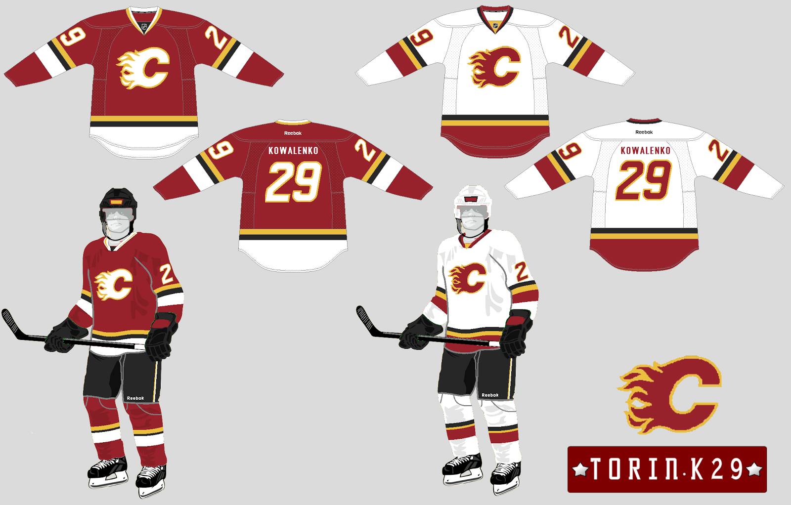
 09-22-2016, 07:52 AM
|
#81
|
|
Franchise Player
|
ya, get rid of the patches. Make the retro the official jersey, and i'd be interested in creating something more interesting with the 3rds. I just don't like the wordmark or simple letter jersey's we see as the 3rds around the league.
I wasn't a huge fan of the nose flaming horse jersey, but bringing back something based on a black jersey would be interesting.
|

|

|
 09-22-2016, 08:19 AM
|
#82
|
|
Franchise Player
Join Date: Nov 2003
Location: Calgary, AB
|
Quote:
Originally Posted by DeluxeMoustache

I don't get the obsession with Jerseys.
The on ice performance is what matters to me.
|
Thanks for coming in to a thread about the teams jerseys to tell everyone you don't care about the teams jerseys.
|

|

|
|
The Following 20 Users Say Thank You to Tyler For This Useful Post:
|
AC,
Ashasx,
codynw,
Cole436,
DaQwiz,
DeluxeMoustache,
hurtin_albertan,
jayswin,
Mony,
MrMastodonFarm,
N-E-B,
PepsiFree,
Reaper,
Regulator75,
socalwingfan,
TheScorpion,
Toonage,
Ullr,
Young_Guns,
zyzz
|
 09-22-2016, 08:22 AM
|
#83
|
|
Franchise Player
|
Quote:
Originally Posted by DeluxeMoustache

I don't get the obsession with Jerseys.
I don't mind the current jerseys, the piping is better than a weird stripe with untucked dress shirt nonsense dangling below. Some teams got away with this odd jersey shape by matching tails below stripe to pants, creating a non issue.
The thirds just retired I can admire as a departure and had some neat touches.
Either way, there is nothing crazy like the Coyotes checkerboard trim or other atrocities.
The on ice performance is what matters to me.
|
Well we've made the playoffs one year in the last seven.
So the on ice performance sucks as much as the jerseys.
__________________
All you have to decide is what to do with the time that is given to you.
Rowan Roy W-M - February 15, 2024
|

|

|
 09-22-2016, 08:36 AM
|
#84
|
|
Lifetime Suspension
Join Date: Jul 2003
Location: Calgary, Alberta
|

Quote:
Originally Posted by browna

The process for changing unis is almost a couple years to jump through league hoops, and that after a design is agreed on here. Then the league asks for changes, so not a rubber stamp.
Retros are easier because these have been worn over the past few years as an alternate and don't need re-approval. But if the Flames wanted to do a white retro, that would be just as long a process as would a whole new redesign, when it comes to the league and the jersey manufacturer.
Black unfortunately has been used since the desperate Bremner redesign in 1995 and can't really see it going away. Hopefully just used on a third new jersey I'm a few years, but guessing it will still be part of the primaries, to better allow for wider range of options (again, league mandated) in other merchandise like hats and t shirts etc to be in black or have black in it.
Just a guess, but likely the plan a bunch of years ago (ie 2011-ish)was likely to have the next round of regular jerseys intoruduced with the new building, which a bunch of years ago, would've been in the next year or two if all the factors didn't change. So now the uniform plan is likely in limbo with a new building still years out, and instead go the Retros as a temporary thing and figure out what to do with design of all sets in the next couple years.
|
Do you have any background on this? I am genuinely curious.
|

|

|
 09-22-2016, 08:37 AM
|
#85
|
|
Lifetime Suspension
Join Date: Jul 2003
Location: Calgary, Alberta
|

Here is an interesting idea.
He keeps the black pants and has some black trim on the jerseys but leaves the logo alone.
I would clean up the lettering and numbering, but I like it. It is a good compromise.
|

|

|
|
The Following User Says Thank You to the_only_turek_fan For This Useful Post:
|
|
 09-22-2016, 09:05 AM
|
#87
|
|
Franchise Player
Join Date: Dec 2005
Location: back in the 403
|
I don't get how people would prefer plain, generic "any team" black gloves to red/yellow gloves, I just don't. They're so boring.
It's not even like it's mostly black with a little bit of red in there to make it Flames, but just plain black. You could grab a guy from a random beer hockey league and put him on the Flames and he wouldn't even have to change his mitts. How is that better than slick, red/yellow?
Last edited by Sainters7; 09-22-2016 at 09:07 AM.
|

|

|
|
The Following User Says Thank You to Sainters7 For This Useful Post:
|
|
 09-22-2016, 09:21 AM
|
#88
|
|
Franchise Player
|
I don't get why people hate the flags so much. I think it's a great touch.
|

|

|
 09-22-2016, 09:47 AM
|
#90
|
|
Could Care Less
|
Make the main jerseys the retros and bring back the black flaming snot horse for the thirds.
|

|

|
 09-22-2016, 10:05 AM
|
#91
|
|
First Line Centre
Join Date: Oct 2005
Location: Calgary
|
Quote:
Originally Posted by the_only_turek_fan


Here is an interesting idea.
He keeps the black pants and has some black trim on the jerseys but leaves the logo alone.
I would clean up the lettering and numbering, but I like it. It is a good compromise. |
I do like these but the shade of red should be what the Flames use and the C does need a black trim in it. I think it would be better with a red kit as well (helmet, pants and gloves)
|

|

|
 09-22-2016, 10:14 AM
|
#92
|
|
In the Sin Bin
|
Personally, I loved the '04 jerseys. When they showed them on Global news for the first time they were the talk of my school (I was in grade 9). I started watching hockey because of the hype at school that day and haven't stopped since. It'll always hold a place in my Flames heart!
|

|

|
|
The Following 2 Users Say Thank You to polak For This Useful Post:
|
|
 09-22-2016, 10:27 AM
|
#93
|
|
Franchise Player
Join Date: Dec 2003
Location: Sector 7-G
|
Quote:
Originally Posted by polak

Personally, I loved the '04 jerseys. When they showed them on Global news for the first time they were the talk of my school (I was in grade 9). I started watching hockey because of the hype at school that day and haven't stopped since. It'll always hold a place in my Flames heart!
|
I remember the day they released them, I was downtown with my Aunt after school and walked by the Flames Fanattic they used to have at TD. Before internet was readily available in my pocket it was the first time I saw/heard about the new uniforms. The black C was sharp. My old man took a while to like the uniforms but he eventually loved them too.
I really hope they use the 04 template as either the base again or at least as a third.
|

|

|
 09-22-2016, 11:44 AM
|
#94
|
|
Scoring Winger
|
Retro 80's red - Home
Retro 80's white - Away
94/95 red - Alternate
The 94/95 (young guns era) is actually a design I very much liked. The black on the jersey itself is minimal, but they do wear black pants and helmet. The only thing they would need to fix is maybe the striping which was an odd "diagonal pedestal" or whatever they were trying. This being an alternate works as they likely still want a red for home jerseys ("C of Red").
The white 04 jersey is still fairly nice and the horsehead on the shoulders was far superior to the flags. I am just not a fan of the Black C but I doubt they go white for an alternate.
Lol anybody remember the 94/95 jerseys when they had the Captain C as the Flaming C (I think my Fleury jersey was bought with it)? Never were many fans of that, but the Atlanta A is awesome.
|

|

|
 09-22-2016, 11:47 AM
|
#95
|
|
Franchise Player
Join Date: Dec 2005
Location: back in the 403
|
I weirdly remember the day they released them too - I went to the Stamps game that night and some dude at McMahon was wearing it. I remember my initial gut reaction to it being "No" -It took me the playoff run to fully warm up to those.
FF for the next 5 years I liked them, even considered them to be one of the nicer unis in the league at the time. Then in 09 I think it was when they brought back the retro unis as a third, I felt like Milhouse when their school uniforms get wet and go all psychadelic, it was like getting over amnesia and suddenly remembering how much better our unis used to be; "I'm freakin out!!" Been pining to ditch the black ever since.
Last edited by Sainters7; 09-22-2016 at 11:59 AM.
|

|

|
 09-22-2016, 01:12 PM
|
#96
|
|
First Line Centre
Join Date: Oct 2009
Location: Calgary
|
Quote:
Originally Posted by Funkhouser

|
The white one for sure
|

|

|
|
The Following User Says Thank You to RM14 For This Useful Post:
|
|
 09-22-2016, 01:34 PM
|
#97
|
|
Franchise Player
Join Date: May 2009
Location: Glastonbury
|
Quote:
Originally Posted by nik-

My ideal scenario is Retro home and away and the '04 homes as the third.
|
Change the third to the 'horsehead' jersey and sold!
not kidding, I love that jersey.
__________________
TC

|

|

|
|
The Following 2 Users Say Thank You to -TC- For This Useful Post:
|
|
 09-22-2016, 06:08 PM
|
#98
|
|
Franchise Player
|
Does anyone have BC Chris' custom jersey. I went that without the reebok word mark on front.
__________________

|

|

|
 09-22-2016, 06:17 PM
|
#99
|
|
Not a casual user
Join Date: Mar 2006
Location: A simple man leading a complicated life....
|
Quote:
Originally Posted by corporatejay

Does anyone have BC Chris' custom jersey. I went that without the reebok word mark on front.
|

__________________

|

|

|
|
The Following User Says Thank You to Dion For This Useful Post:
|
|
 09-23-2016, 02:39 AM
|
#100
|
|
Franchise Player
|

Quote:
Originally Posted by CroFlames

I don't get why people hate the flags so much. I think it's a great touch.
|
The Alberta flag patch breaks one of the fundamental rules of design: You never put two bright solid colours next to each other; you put in a relatively neutral colour to modulate between them. (Yellow counts as neutral for this purpose.) This rule has been well understood since the Middle Ages, when it was one of the laws of heraldry. To this day, if you look at national flags, very few of them have colour next to colour. Most of those that do are among the ugliest flags around.
On sports uniforms, if you put red and blue on the same design, it's customary to separate them with a white stripe (yellow is acceptable but rare). The bright blue of the Alberta flag against a field of red is, to put it bluntly, an eyesore. Believe it or not, that combination is physiologically fatiguing to the eye. (I won't go into the reasons in this post; I don't want to write an encyclopaedia.)
So if the Flames want to have the Alberta flag patch on their red uniforms, they really ought to put a bit of white piping around the flag to separate the blue from the red. What I think would work much better is to get rid of the blue field altogether, and just use the shield from the centre of the flag, with a thin white border around it. You could make the shield larger than the one on the flag patch, so that the overall area of the patch would remain about the same.
What we have now:

What I suggest:

Easier on the eyes, easier to make out the elements of the shield, and in my opinion, much better looking altogether.
__________________
WARNING: The preceding message may not have been processed in a sarcasm-free facility.
You see in Calgary, [Ryan] Huska is no joke. Its good. Hes really set on a specific model defensively. If you can be reliable, you have the freedom to play offence.
Ethan Wyttenbach
|

|

|
|
The Following 23 Users Say Thank You to Jay Random For This Useful Post:
|
bax,
btimbit,
Cali Panthers Fan,
corporatejay,
CroFlames,
D-Red,
DaQwiz,
Dion,
erikk3,
EVERLAST,
FBI,
Ironhorse,
Isikiz,
KevanGuy,
kkaleR,
Mightyfire89,
Mony,
normtwofinger,
Regulator75,
Sainters7,
Table 5,
TheScorpion,
Zarley
|
 Posting Rules
|
You may not post new threads
You may not post replies
You may not post attachments
You may not edit your posts
HTML code is Off
|
|
|
All times are GMT -6. The time now is 08:15 PM.
|
|

