07-10-2016, 12:44 AM
|
#1421
|
|
Franchise Player
|
Quote:
Originally Posted by Howie_16

I'm not a fan of these. If we ever drop black completely from our colour scheme, then I think we should bring back the original design as closely as possible.
|
I think that mock looks great, but I agree about keeping black. Maybe something like that, but with the logo and striping all outlined in black? As long as it isn't a major colour, I think black works well
|

|

|
|
The Following User Says Thank You to btimbit For This Useful Post:
|
|
|
07-10-2016, 03:58 AM
|
#1422
|
|
Franchise Player
Join Date: Sep 2013
Location: Brisbane
|
I love most of these mock ups. So disappointing the Flames have one of the best logos in the league but one of the worst jerseys. I hope they go full retro but at the very least get rid of the vertical stripes and the shoulder flags.
|
|
|
|
|
07-10-2016, 04:56 AM
|
#1424
|
|
Franchise Player
Join Date: Oct 2006
Location: Calgary
|
Quote:
Originally Posted by LanceUppercut
**** no to those.
Though, I do kind of like the C and mountain outline on the black pants.
|
Hate the logo on the top two, but that black and red jersey looks interesting.
If you got rid of the white points, lowered the chest strip down to it's normal position and put a black c on that, it would be a great looking jersey.
__________________
Fireside Chat - The #1 Flames Fan Podcast - FiresideChat.ca
|
|
|
|
|
The Following User Says Thank You to Caged Great For This Useful Post:
|
|
|
07-10-2016, 06:04 AM
|
#1425
|
|
Franchise Player
Join Date: Jul 2005
Location: SW Ontario
|
Quote:
Originally Posted by Money Baer
Perfect! These two would be amazing!
|
Ya, amazingly boring. Those are terrible.
|
|
|
|
|
07-10-2016, 06:10 AM
|
#1426
|
|
Franchise Player
Join Date: Jul 2005
Location: SW Ontario
|
Quote:
Originally Posted by Otto-matic
|
These would be perfect if ads on jerseys come into effect and our main sponsor is McDonalds. Barf.
|
|
|
|
|
07-10-2016, 06:13 AM
|
#1427
|
|
First Line Centre
Join Date: Jan 2011
Location: Fort St. John, BC
|
Quote:
Originally Posted by Dion
|

|
|
|
|
|
The Following 4 Users Say Thank You to doctajones428 For This Useful Post:
|
|
|
07-10-2016, 07:19 AM
|
#1428
|
|
Franchise Player
Join Date: Sep 2013
Location: Brisbane
|
Quote:
Originally Posted by dissentowner
These would be perfect if ads on jerseys come into effect and our main sponsor is McDonalds. Barf.
|
Not sure if serious. You are happy with the current Lego colour scheme but have a problem with McDonalds? You are going to have a tough time finding any colour scheme that isn't also used by a corporation.
What about the Maple Leafs and HP? Panthers and Burger King? Red Wings and Coke? Rangers and Pepsi? Wild and Mountain Dew? Lightning and BMW? Would you be happy if every NHL team changed their colours to Pink and Green so they didn't match a corporate logo?
When I think Red and Yellow the first thing that comes to mind is the Calgary Flames. Number 2 is the KC Chiefs.
|
|
|
|
|
The Following 3 Users Say Thank You to FireGilbert For This Useful Post:
|
|
|
07-10-2016, 08:24 AM
|
#1429
|
|
First round-bust
Join Date: Feb 2015
Location: speculating about AHL players
|
Quote:
Originally Posted by Dion
|
Those are positively hideous. No!
__________________
Need a great deal on a new or pre-owned car? Come see me at Platinum Mitsubishi 2720 Barlow Trail NE
2026 World Junior Pool CHAMPION
|
|
|
|
|
07-10-2016, 08:43 AM
|
#1430
|
|
Franchise Player
|
Quote:
Originally Posted by FireGilbert
Not sure if serious. You are happy with the current Lego colour scheme but have a problem with McDonalds? You are going to have a tough time finding any colour scheme that isn't also used by a corporation.
What about the Maple Leafs and HP? Panthers and Burger King? Red Wings and Coke? Rangers and Pepsi? Wild and Mountain Dew? Lightning and BMW? Would you be happy if every NHL team changed their colours to Pink and Green so they didn't match a corporate logo?
When I think Red and Yellow the first thing that comes to mind is the Calgary Flames. Number 2 is the KC Chiefs.
|


|
|
|
|
|
The Following User Says Thank You to Alberta_Beef For This Useful Post:
|
|
|
07-10-2016, 09:42 AM
|
#1431
|
|
Franchise Player
|
Alright, I think enough folks have quoted and called Din's last idea terrible.
|
|
|
|
|
07-10-2016, 10:12 AM
|
#1432
|
|
Powerplay Quarterback
Join Date: Apr 2014
Location: Calgary, AB
|
Quote:
Originally Posted by Scary Eloranta
I was thinking the same thing but now that I see the full unis I'm not liking it as much. What do you guys think?
 |
For me, I like your previous version of this rendering but maybe with the black accent on that.
That and the alternate jersey having the flaming C on it as well would be a big W in my books.
Love the work you've done, great job and thank you!
|
|
|
|
|
07-10-2016, 10:41 AM
|
#1433
|
|
Franchise Player
|
Quote:
Originally Posted by Da_Chief
Alright, I think enough folks have quoted and called Din's last idea terrible.
|
To be fair to Dion I don't think it was him that designed that monstrosity. He just found it and was kind enough to share the torture with us.
|
|
|
|
|
The Following 4 Users Say Thank You to Alberta_Beef For This Useful Post:
|
|
|
07-10-2016, 07:13 PM
|
#1434
|
|
Franchise Player
Join Date: Sep 2013
Location: Brisbane
|
That horse logo would actually be okay for the Stampeders.
|
|
|
|
|
07-10-2016, 08:15 PM
|
#1435
|
|
Franchise Player
Join Date: Aug 2007
Location: Vancouver
|
Quote:
Originally Posted by Scary Eloranta
I was thinking the same thing but now that I see the full unis I'm not liking it as much. What do you guys think?
|
I really dig this. I think it's the perfect blend of the retro with a little black for those who like it. A black version with similar colors to the Horsehead uni would be a great third.
Different logo though. To be honest I'm not a huge fan of the shoulderpatch as a crest.
__________________

|
|
|
|
|
07-10-2016, 08:34 PM
|
#1436
|
|
Lifetime Suspension
Join Date: Jul 2012
Location: North America
|
Quote:
Originally Posted by Scary Eloranta
I was thinking the same thing but now that I see the full unis I'm not liking it as much. What do you guys think?
|
Looks like a Charles Schultz design.
|
|
|
|
|
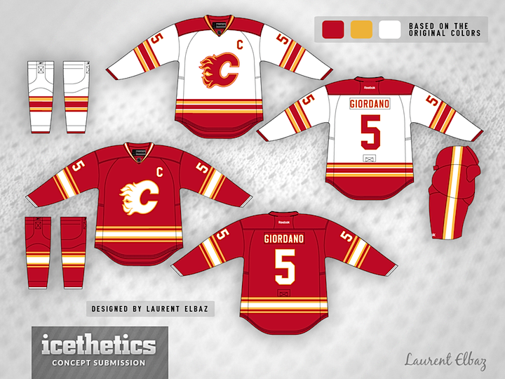
08-16-2016, 10:08 AM
|
#1437
|
|
Lifetime Suspension
Join Date: Jul 2003
Location: Calgary, Alberta
|

New concept up on icethetics.
Can't say I hate it.
|
|
|
|
|
The Following User Says Thank You to the_only_turek_fan For This Useful Post:
|
|
|
08-16-2016, 10:25 AM
|
#1438
|
|
Franchise Player
Join Date: Oct 2006
Location: San Fernando Valley
|
Quote:
Originally Posted by JerryUnderscore
While I understand some people love the retro jerseys, I've never been that fond of them. They're very "McDonalds" feeling. At the same time, I agree that too much black feels very 90s.
Black works best as a trim colour, not a primary colour.
|
If I get this right you don't like the original red/yellow/white nor red/yellow/black/white? Some of you must realize that blue and green are the only remaining spectrum colours available and they won't work for the Flames. IMO they should scrap yellow and go with the same colours as the Stampeders which is red/black/white. Or scrap red and go yellow/black/white. Red and yellow simply don't make for an overly attractive scheme.
As far as the actual colours of a flame go black and yellow are the associated colours so red isn't necessarily required although I'm not sure about leaving the sea of red behind.
Last edited by Erick Estrada; 08-16-2016 at 10:31 AM.
|
|
|
|
|
08-16-2016, 10:38 AM
|
#1439
|
|
That Crazy Guy at the Bus Stop
Join Date: Jun 2010
Location: Springfield Penitentiary
|
Quote:
Originally Posted by the_only_turek_fan
New concept up on icethetics.
Can't say I hate it.
|
The away is good, but people need to stop making the bottom of the home jersey white. That would look so bad in person. Especially with the stupid little extra hang that these jerseys have.
|
|
|
|
|
08-16-2016, 10:40 AM
|
#1440
|
|
Lifetime Suspension
Join Date: Jul 2003
Location: Calgary, Alberta
|
Quote:
Originally Posted by Erick Estrada
If I get this right you don't like the original red/yellow/white nor red/yellow/black/white? Some of you must realize that blue and green are the only remaining spectrum colours available and they won't work for the Flames. IMO they should scrap yellow and go with the same colours as the Stampeders which is red/black/white. Or scrap red and go yellow/black/white. Red and yellow simply don't make for an overly attractive scheme.
As far as the actual colours of a flame go black and yellow are the associated colours so red isn't necessarily required although I'm not sure about leaving the sea of red behind.
|
You are basically looking at Team Canada jerseys if you drop the yellow:

|
|
|
|
 Posting Rules
|
You may not post new threads
You may not post replies
You may not post attachments
You may not edit your posts
HTML code is Off
|
|
|
All times are GMT -6. The time now is 07:59 AM.
|
|