The team confirmed on their website that the new logo will be unveiled Tuesday at 9:30 p.m. on The Leaf: Blueprint, a Leafs TV television show produced by Maple Leaf Sports and Entertainment. The organization also released a video teaser on YouTube, which you can watch below.
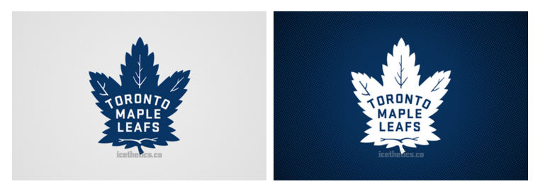
I recently got a chance to see the new logo for myself and can share my thoughts. It's a new design but heavily inspired by the past. That's the hallmark of hockey design in the last decade — and not at all surprising from one of the league's oldest clubs.
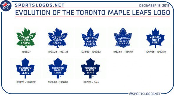
It's modeled on the leaf that was introduced in 1938 minus the double outline that was added in the the 1960s — the logo we all know well from the third jersey the Leafs wore from 2000 to 2011.
The new design features updates to the veins and the typeface as seen in the sneak peek from the Leafs' tweet today. In fact, I can confirm that the type seen in that image (top) is indeed from the new logo.
I've created a mock-up based on what I saw to give you an idea of what we'll be seeing Tuesday. To demonstrate, I started with the logo from the aforementioned third jersey, therefore the outline is not exact.
The new design features a new leaf shape. And the type style is not completely accurate here either, but you can see the new type in today's official teaser.
Again, this is a mock-up, so don't be surprised when you start spotting the differences from the real thing on Tuesday. But it is in the neighborhood.
Essentially, the team has taken the old logo from 1938 and modernized it.
The Marlies classic 70's jerseys is what they should be going back to.
But yeah, Shanahan is just using common sense (and unlimited funds) with things like Babcock, Lou, Dave Keon and new logo, but the Leafs and their fans are lapping it up as something more than it is, just because they've been a disorganized mess on and off the ice for decades.
The Following User Says Thank You to browna For This Useful Post: