 08-14-2015, 06:06 PM
|
#21
|
|
Not a casual user
Join Date: Mar 2006
Location: A simple man leading a complicated life....
|
The Canucks have always had the reputation of having the ugliest jersies in the league.
__________________
|

|

|
 08-14-2015, 07:25 PM
|
#22
|
|
First Line Centre
|
well good for you vancouver

__________________
is your cat doing singing?
|

|

|
 08-14-2015, 08:09 PM
|
#23
|
|
All I can get
|
Quote:
Originally Posted by Hemi-Cuda

You could have an entire playoffs of teams wearing different Canuck jerseys and never have to worry about confusing who's on which team
|
A mass epidemic of burned retinas would surely result.
__________________
Edmonton is No Good.
|

|

|
 08-14-2015, 09:37 PM
|
#24
|
|
Franchise Player
Join Date: Sep 2013
Location: Brisbane
|
For a team that has had a history of bad jerseys this is their worst non-3rd. The logo is one of the worst sights ever created by man and it doesn't have the "so bad it is amazingly good" quality of the V jersey.
Also, with the Canucks' history of jersey changes I wouldn't be surprised if they go back to these permanently in a few years.
|

|

|
|
The Following 2 Users Say Thank You to FireGilbert For This Useful Post:
|
|
 08-14-2015, 10:01 PM
|
#25
|
|
Powerplay Quarterback
Join Date: Dec 2006
Location: Canada
|
Canucks can't skate, those jerseys are false advertisement. Only a team with P.Bure should be allowed to wear those jerseys.
__________________

|

|

|
 08-14-2015, 10:23 PM
|
#26
|
|
Franchise Player
|
Quote:
Originally Posted by FireGilbert

and it doesn't have the "so bad it is amazingly good" quality of the V jersey.
|
AKA orange pajamas, not good.
|

|

|
 08-14-2015, 11:19 PM
|
#27
|
|
A Fiddler Crab
Join Date: Jan 2007
Location: Chicago
|
It's a shame they have to wear the black one at home. I always thought the white Vancouver skate jersey was one of the better looking jerseys in the league.
|

|

|
 08-15-2015, 02:11 AM
|
#28
|
|
Franchise Player
Join Date: Feb 2004
Location: Maple Ridge, BC
|
Quote:
Originally Posted by browna

Part of the 20th anniversary of GM Place/Rogers Arena festivities.....of course they never worse those jerseys in GM Place, switching to the Orca C, while also bringing Messier and Keenan in tow that inaugural season
|
They wore those jerseys for a couple years at GM place.
|

|

|
 08-16-2015, 12:50 PM
|
#29
|
|
Lifetime Suspension
|
Quote:
Originally Posted by Hemi-Cuda

You could have an entire playoffs of teams wearing different Canuck jerseys and never have to worry about confusing who's on which team
|
And somehow, not one of the teams would win the Stanley Cup that year.
|

|

|
|
The Following User Says Thank You to pylon For This Useful Post:
|
|
|
The Following 2 Users Say Thank You to jayswin For This Useful Post:
|
|
 08-16-2015, 01:32 PM
|
#31
|
|
Celebrated Square Root Day
|
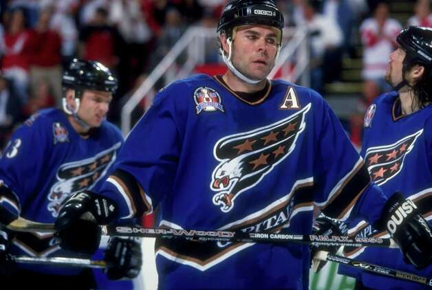
I'm also in the minority in thinking those blue Capitals jerseys were just excellent. The worst thing is, the blues were way better than the whites in this case, but the blue jerseys were a victim of the NHL's lame trend of every team making a black jersey. So the white's got a nice long run while the blues were kicked out really quickly.
There's something about that shade of blue mixed with black and gold that just looked great. The jersey design itself would be a little goofy, present day, but if a team came up with a nice design and used that blue, black and goldcombo it would be incredible, imo.
|

|

|
|
The Following User Says Thank You to jayswin For This Useful Post:
|
|
 08-16-2015, 11:41 PM
|
#32
|
|
#1 Goaltender
|
Quote:
Originally Posted by browna

Part of the 20th anniversary of GM Place/Rogers Arena festivities.....of course they never worse those jerseys in GM Place, switching to the Orca C, while also bringing Messier and Keenan in tow that inaugural season
|
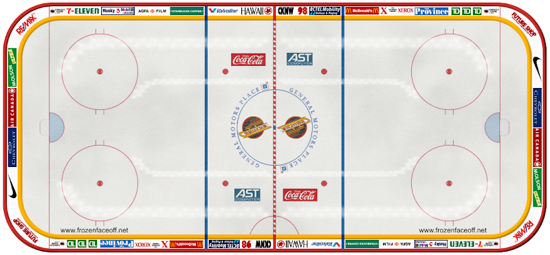 this website rocks.
__________________
Quote:
Originally Posted by Street Pharmacist

If ever there was an oilering
|
Connor Zary will win the Hart Trophy in 2027.
|

|

|
|
The Following User Says Thank You to saskflames69 For This Useful Post:
|
|
 08-17-2015, 04:23 AM
|
#33
|
|
Powerplay Quarterback
|

Quote:
Originally Posted by MrMastodonFarm

Biggest identity crisis team in the NHL?
Nothing like seeing a game in Vancouver filled with Canuck fans and seeing a handful of different jerseys with a handful of different designs.
Staggering how many they have and how many they've reused recently.
|
Arizona (and soon Vegas) say hi
It is insane the number of changes the Canucks have made .. The weirdest part is they all seem to have come at a time when the team was enjoying a window of success, and had picked up a bunch of bandwagon fans.
Wouldn't they want to keep the same jersey so the fair weather fans could recognize them from the other team?
I actually have a funny pic of 4 of my nuck *scribble*friends *scribble* wearing newish jerseys and they're all different, but not really by a lot. Efen they laughed at the obvious attempt to get it while the gettin's good from a group of fans who would way rather get a new design when they buy their second jersey since becoming a fan and then diehard fan in the span of 9 weeks, thus giving the impression of sticking around through different eras
__________________
Long time listener, first time caller.
|

|

|
 08-17-2015, 08:40 AM
|
#34
|
|
Franchise Player
Join Date: Aug 2007
Location: Ontario
|

Best way to celebrate the 20th? Actually establish an identity. Those above? Done. Just make it happen.
There's the logo and there's your colours. Tweak the jersey over the years, but don't CELEBRATE your identity crisis!
|

|

|
 08-17-2015, 10:46 AM
|
#35
|
|
Franchise Player
|
Ugh the hockey stick and rink logo is simply horrible. Like even as a neutral party, you have to admit those suck.
As bad as the Saturn-looking skate is, it's the best one.
At the very least, make the V with Johnny Canuck your primary logo. At least it makes sense.
|

|

|
 08-18-2015, 12:34 AM
|
#36
|
|
Scoring Winger
|
Quote:
Originally Posted by flameswin

I'm also in the minority in thinking those blue Capitals jerseys were just excellent. The worst thing is, the blues were way better than the whites in this case, but the blue jerseys were a victim of the NHL's lame trend of every team making a black jersey. So the white's got a nice long run while the blues were kicked out really quickly.
There's something about that shade of blue mixed with black and gold that just looked great. The jersey design itself would be a little goofy, present day, but if a team came up with a nice design and used that blue, black and goldcombo it would be incredible, imo.
 |
I like those too. What do you mean and why didn't they stick around long?
|

|

|
 08-18-2015, 07:58 AM
|
#37
|
|
Franchise Player
Join Date: Aug 2007
Location: Ontario
|
Quote:
Originally Posted by CroFlames

Ugh the hockey stick and rink logo is simply horrible. Like even as a neutral party, you have to admit those suck.
As bad as the Saturn-looking skate is, it's the best one.
At the very least, make the V with Johnny Canuck your primary logo. At least it makes sense.
|
I didn't think I was, but I guess I'm the minority! I always thought the rink was the 2nd best logo they had, and the best one that has any kind of primary use.
Haven't seen a Johnny Canuck (and can't be bothered to design one. It's the Canucks...) jersey I thought looked like a pro sports team. But there is definitely potential there.
I'd just like to watch games and not be distracted by their terrible.
|

|

|
 08-18-2015, 10:48 AM
|
#38
|
|
Celebrated Square Root Day
|
Quote:
Originally Posted by Your Calgary Flames!

I like those too. What do you mean and why didn't they stick around long?
|
They created a black third jersey when they were all the rage, and the response was so positive that they ditched their away blues and just went with white and black home and aways.

|

|

|
|
The Following User Says Thank You to jayswin For This Useful Post:
|
|
 08-19-2015, 06:21 PM
|
#39
|
|
Franchise Player
|
Even Canucks fans hate the orca logo. That said, I've never thought any of the primary jerseys (outside of the V) were particularly good or particularly terrible. They're just "that's okay, whatever".
They really just need to stick to either the stick in rink with the blue / green colouring or the red / yellow / black skate logo. Just pick one.
__________________
"The great promise of the Internet was that more information would automatically yield better decisions. The great disappointment is that more information actually yields more possibilities to confirm what you already believed anyway." - Brian Eno
|

|

|
|
The Following User Says Thank You to CorsiHockeyLeague For This Useful Post:
|
|
 08-20-2015, 10:01 AM
|
#40
|
|
Franchise Player
Join Date: Mar 2007
Location: Calgary
|
When I was a kid I thought the canucks logo was a planet disintegrating, at least that's what it looked like.
|

|

|
 Posting Rules
|
You may not post new threads
You may not post replies
You may not post attachments
You may not edit your posts
HTML code is Off
|
|
|
All times are GMT -6. The time now is 04:30 AM.
|
|

