 02-14-2015, 12:55 PM
|
#61
|
|
Scoring Winger
|
At least leave black as an accent colour. I think the black 'C' screams Flames to me. Buffalo added silver and have a darker blue than original. At least use black as an outline colour and I think most would be happy. A mix of classic outlined with black would be epic. The Oilers live in the past and wear straight retro uniforms. Hasn't worked well for them.
|

|

|
|
The Following User Says Thank You to Playfair For This Useful Post:
|
|
 02-14-2015, 12:58 PM
|
#62
|
|
Franchise Player
|
The future is Split98
Quote:
Originally Posted by Split98

|
|

|

|
|
The Following 7 Users Say Thank You to Ashasx For This Useful Post:
|
|
 02-14-2015, 04:42 PM
|
#63
|
|
Powerplay Quarterback
Join Date: Dec 2009
Location: Tokyo, Japan
|

Quote:
Originally Posted by _Q_

See I don't think anyone hates the colour black because it's black. One of the basic principles of good colour design is you need a primary colour and at most two accents. Once you start adding a fourth or fifth colour, the colour scheme loses focus and becomes unattractive. This works for not only sports uniforms, but fashion design, interior decorating, company logos, website design, etc.
For example, go to any half decent store in Chinook and pick out a dress shirt. It will generally have two colours and at most 3. Let's say you like a red shirt with a blue and white pattern, the sales rep there will probably tell you to match it with blue pants, since black, grey or brown would make your outfit look too busy. Same goes for furniture stores. Go into a furniture store and you'll probably see all the living room displays have 3 colours at most.
Back to the Flames uniform, using these principles, if red is going to be the team's primary colour and white is pretty much required to be on all NHL uniforms, the remaining accent colour should be either black or yellow. While a red white and black uniform looks good, it's far too common, so replacing that with yellow gives the team a unique identity.
It's not about reliving the glory years of the 80's, it's about good colour design.
|
There's also colour theory about using black in a sparing way to anchor things. Like having a couple black pieces in a room or an outfit. I think this works well in some uniforms. The BFBS overkill is real, but I think with the Flames colours it works well and on the whites (striping and flag arguments aside) the minimal black does a lot for the jersey. When you add the black in the pants and helmets it obviously makes it a much more influential colour in the scheme.
I like the way you're thinking but you can make arguments about using colours that sit opposite each other on the colour wheel for pairing as well as many other arguments. More colours is not always a bad thing, it's all about how it's done.
|

|

|
|
The Following User Says Thank You to P-DAZZLE For This Useful Post:
|
|
 02-14-2015, 04:56 PM
|
#64
|
|
Scoring Winger
Join Date: Jul 2011
Location: at home
|
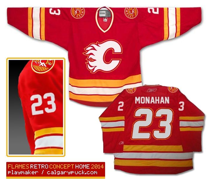
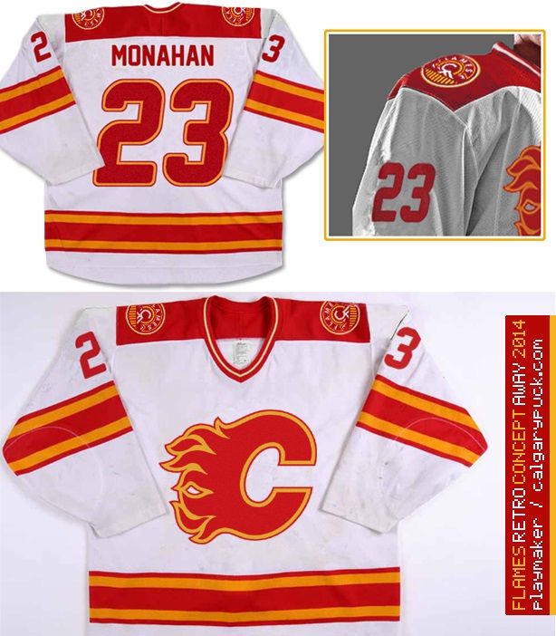
I've made hundreds of comments and proposals in the KK please read! thread
http://forum.calgarypuck.com/showthr...117010&page=48
so here's the reminder of my final concept:


IMHO the most important things...
Bring the white flaming C back.
Don't put white and yellow together - they'll blend into one 'yellowish white' when in small scales or seen from distance.
It's all about contrast.
|

|

|
|
The Following 8 Users Say Thank You to playmaker For This Useful Post:
|
|
 02-14-2015, 05:01 PM
|
#65
|
|
Lifetime Suspension
Join Date: Nov 2014
Location: NB
|
I'm of the mindset that I don't love the 04 jerseys, and I don't love the 80s jerseys. Something like Split98's jerseys would be fantastic IMO.
|

|

|
 02-14-2015, 05:02 PM
|
#66
|
|
Franchise Player
|
If they're gonna stick with black, they at least need to clean up the current set. Basically what St. Louis did. Get rid of the flags too.
2013-14 Blues
2014-15 Blues
__________________
Quote:
Originally Posted by CroFlames

Before you call me a pessimist or a downer, the Flames made me this way. Blame them.
|
|

|

|
 02-14-2015, 06:36 PM
|
#67
|
|
Franchise Player
Join Date: Nov 2003
Location: Calgary, AB
|
Quote:
Originally Posted by N-E-B

Take our current thirds, remove the black shoulder patch, replace wordmark with regular flaming C, and remove dumb stripes from pants and bang, beautiful jersey.
|
Sort of like this?

|

|

|
|
The Following 9 Users Say Thank You to Tyler For This Useful Post:
|
|
 02-14-2015, 07:00 PM
|
#68
|
|
Lifetime Suspension
Join Date: Sep 2007
Location: blow me
|
nm
Last edited by RedMileDJ; 08-31-2015 at 02:34 AM.
|

|

|
|
The Following 3 Users Say Thank You to RedMileDJ For This Useful Post:
|
|
 02-14-2015, 07:05 PM
|
#69
|
|
Self-Retirement
|
Straighten the shoulder yoke and that's awesome.
Why are we doing this thread again?
|

|

|
 02-14-2015, 07:10 PM
|
#70
|
|
First Line Centre
Join Date: Oct 2009
Location: Calgary
|
Why do the Reebok premier jerseys have the size tags on the bottom front? Looks stupid.
|

|

|
|
The Following User Says Thank You to RM14 For This Useful Post:
|
|
 02-14-2015, 07:12 PM
|
#71
|
|
Franchise Player
Join Date: Nov 2003
Location: Calgary, AB
|
Quote:
Originally Posted by RM14

Why do the Reebok premier jerseys have the size tags on the bottom front? Looks stupid.
|
So that the Reebok logo is on the front and back and for brand awareness?
|

|

|
 02-14-2015, 07:23 PM
|
#72
|
|
Farm Team Player
Join Date: Apr 2006
Exp: 
|
Quote:
Originally Posted by Tyler

Sort of like this?
 |
Friggen' perfection.
__________________
Ole Yeller
|

|

|
|
The Following User Says Thank You to S. Yelle For This Useful Post:
|
|
 02-14-2015, 07:56 PM
|
#73
|
|
Franchise Player
|
Quote:
Originally Posted by Tyler

Sort of like this?
 |
Done. Make it happen, Murray.
__________________
All you have to decide is what to do with the time that is given to you.
Rowan Roy W-M - February 15, 2024
|

|

|
 02-14-2015, 10:20 PM
|
#74
|
|
Franchise Player
Join Date: Mar 2002
Location: Calgary
|
Quote:
Originally Posted by Tyler

Sort of like this?
 |
Looks good. For a third jersey, what above reversing the colors (black jersey, red shoulders) and then either a white C, or the CF logo, on the front?
|

|

|
 02-14-2015, 10:26 PM
|
#75
|
|
Franchise Player
|
Quote:
Originally Posted by browna

Looks good. For a third jersey, what above reversing the colors (black jersey, red shoulders) and then either a white C, or the CF logo, on the front?
|
I honestly have been thinking about an orange (like Philly orange) third lately. Not sure if they could pull it off, but it would be nice to see something completely new for the third jersey.
Thoughts?
__________________
Quote:
Originally Posted by CroFlames

Before you call me a pessimist or a downer, the Flames made me this way. Blame them.
|
|

|

|
|
The Following 2 Users Say Thank You to codynw For This Useful Post:
|
|
 02-15-2015, 12:00 AM
|
#76
|
|
Lives In Fear Of Labelling
|
Quote:
Originally Posted by browna

Looks good. For a third jersey, what above reversing the colors (black jersey, red shoulders) and then either a white C, or the CF logo, on the front?
|

|

|

|
|
The Following User Says Thank You to underGRADFlame For This Useful Post:
|
|
 02-15-2015, 12:05 AM
|
#77
|
|
All I can get
|
The western-style front yoke on the third is growing on me. I think the back of the jersey should be flared instead of square to continue the motif.
|

|

|
 02-15-2015, 02:30 AM
|
#78
|
|
Franchise Player
Join Date: Dec 2011
Location: Calgary
|
Quote:
Originally Posted by codynw

I honestly have been thinking about an orange (like Philly orange) third lately. Not sure if they could pull it off, but it would be nice to see something completely new for the third jersey.
Thoughts?
|
Would have to be done with extreme perfection IMO. Adding a new colour to a teams colour scheme rarely works, like the red in Dallas or Black and Grey for the Isles.
|

|

|
 02-15-2015, 05:35 AM
|
#79
|
|
Powerplay Quarterback
|
I want new thirds with something crazy and fresh. Bright orange.
__________________
Long time listener, first time caller.
|

|

|
|
The Following User Says Thank You to Hugh Jahrmes For This Useful Post:
|
|
 02-15-2015, 05:39 AM
|
#80
|
|
Powerplay Quarterback
|
Quote:
Originally Posted by codynw

I honestly have been thinking about an orange (like Philly orange) third lately. Not sure if they could pull it off, but it would be nice to see something completely new for the third jersey.
Thoughts?
|
Yeah buddy!
__________________
Long time listener, first time caller.
|

|

|
|
The Following User Says Thank You to Hugh Jahrmes For This Useful Post:
|
|
 Posting Rules
|
You may not post new threads
You may not post replies
You may not post attachments
You may not edit your posts
HTML code is Off
|
|
|
All times are GMT -6. The time now is 01:44 AM.
|
|

