 08-03-2014, 07:23 PM
|
#121
|
|
Franchise Player
|
Quote:
Originally Posted by flameswin

You know for sure? Now you've got me curious. It doesn't look like the blade of a stick at all, to me. It looks like some graphic lines were put behind the puck to make it stand out more.
|
I thought it was to symbolize movement.
|

|

|
|
08-03-2014, 07:26 PM
|
#122
|
|
Celebrated Square Root Day
|
Quote:
Originally Posted by To Be Quite Honest
I thought it was to symbolize movement.
|
That was my first thought, too, but the fact that the lines go in front of the puck as well, led m to believe it was more of just a generic background graphic thingy.
Chingas seems pretty confident it's a stick blade though, so I was wondering if maybe the guy who made it explained that it was a blade and I missed it.
|
|
|
|
|
08-03-2014, 07:45 PM
|
#123
|
|
First Line Centre
Join Date: Sep 2008
Location: Rocky Mt House
|
[IMG]  [/IMG]
My humble attempt.
|
|
|
|
|
The Following 3 Users Say Thank You to Yrebmi For This Useful Post:
|
|
|
08-03-2014, 07:51 PM
|
#124
|
|
Franchise Player
Join Date: Oct 2001
Location: Flames fan in Seattle
|
Between this thread and the prospect voting threads, we should be able to survive the long summer.
__________________
|

|
|
|
The Following User Says Thank You to FBI For This Useful Post:
|
|
|
08-03-2014, 08:28 PM
|
#125
|
|
The new goggles also do nothing.
Join Date: Oct 2001
Location: Calgary
|
Quote:
Originally Posted by alltherage
|
I like! Has a modern feel to it and as pointed out the speech bubble thing is exactly the kind of meaning that logos should have.
__________________
Uncertainty is an uncomfortable position.
But certainty is an absurd one.
|
|
|
|
|
The Following 4 Users Say Thank You to photon For This Useful Post:
|
|
|
08-03-2014, 08:37 PM
|
#126
|
|
Franchise Player
|
I still think the original logo is the front runner. No offense to any contributors since I couldn't do any better myself but so far I haven't seen anything that really stands on top of it.
|
|
|
|
|
08-03-2014, 08:41 PM
|
#127
|
|
Franchise Player
Join Date: Jun 2003
Location: N/A
|
Quote:
Originally Posted by flameswin
That was my first thought, too, but the fact that the lines go in front of the puck as well, led m to believe it was more of just a generic background graphic thingy.
Chingas seems pretty confident it's a stick blade though, so I was wondering if maybe the guy who made it explained that it was a blade and I missed it.
|
It's a puck on the tip of a stick! The fact several CP members can't see this tells me it is time for a new, fresh logo!
|
|
|
|
|
08-03-2014, 08:46 PM
|
#128
|
|
Powerplay Quarterback
|
I updated mine to see how it will look on the site.
__________________
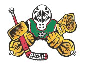 CPHL Dallas Stars
|
|
|
|
|
08-03-2014, 09:47 PM
|
#129
|
|
Franchise Player
|
Quote:
Originally Posted by Hackey
I still think the original logo is the front runner. No offense to any contributors since I couldn't do any better myself but so far I haven't seen anything that really stands on top of it.
|
To be fair, we haven't seen Dion's offering yet. If the license plate thread is any indication, we're in for some real doozies.
|
|
|
|
|
The Following 2 Users Say Thank You to V For This Useful Post:
|
|
|
08-03-2014, 09:57 PM
|
#130
|
|
Franchise Player
Join Date: Dec 2010
Location: Calgary
|
I think post # 78 is the winner so far, but will throw one into the ring anyway.

|
|
|
|
|
08-03-2014, 10:03 PM
|
#131
|
|
Lifetime Suspension
|
Quote:
Originally Posted by Split98
Same idea, but keeping with the heritage of CP:

Always loved the interlocking 'CP' of the logo. |
I like this one the best.
|
|
|
|
|
The Following User Says Thank You to SHOGUN For This Useful Post:
|
|
|
08-03-2014, 10:05 PM
|
#132
|
|
Ass Handler
Join Date: Feb 2011
Location: Okotoks, AB
|
Quote:
Originally Posted by Split98
Honestly, I'm a little embarrassed I missed this
 |
This with the black inner circle please.
|
|
|
|
|
08-03-2014, 10:10 PM
|
#133
|
|
Franchise Player
Join Date: Mar 2009
Location: The Bay Area
|
Quote:
Originally Posted by flameswin
To those that thanked this, is it an inside joke I'm missing? Or you just liked the design?
|
I like it a lot.
|
|
|
|
|
08-03-2014, 10:11 PM
|
#134
|
|
#1 Goaltender
Join Date: Mar 2006
Location: Underground
|
Quote:
Originally Posted by Split98
Good idea
 |
I like it, but I think I'm in the minority as I think the stick going into the lettering is distracting and breaks the lines. Felt the same way about the skate but you moved that away already.
|
|
|
|
|
08-03-2014, 10:12 PM
|
#135
|
|
Powerplay Quarterback
|
I remember the previous old CP logo that looks like the Ottawa 67's logo, where abouts is that nowadays? theres should be a timeline of each logo that has made it as it unoffical logo of CP.
__________________
CPHL Dallas Stars
|
|
|
|
|
08-03-2014, 10:19 PM
|
#136
|
|
Lives In Fear Of Labelling
|
Quote:
Originally Posted by alltherage
|
My favorite so far... Love the simplicity of it. Wouldn't mid seeing a few color variations, as I'm not 100% on the bluish grey.
I really like split98's logo too. Would rather have it say calgarypuck.com across the top though.
|
|
|
|
|
08-03-2014, 10:31 PM
|
#137
|
|
#1 Goaltender
Join Date: Mar 2006
Location: Underground
|
Quote:
Originally Posted by alltherage
|
Nice job.
Although it does make me feel like Bingo should close on some Series A financing for his new start-up 
|
|
|
|
|
08-03-2014, 10:46 PM
|
#138
|
|
Resident Videologist
Join Date: Mar 2002
Location: Calgary
|
Quote:
Originally Posted by alltherage
|
What if you changed the blue/grey to a darker red and extended the speech point more? It might emphasize the puck aspect a bit more that way.
Just a rough mockup, but something like this:

All credit to alltherage obviously.
|
|
|
|
|
The Following 7 Users Say Thank You to AC For This Useful Post:
|
|
|
08-03-2014, 10:48 PM
|
#139
|
|
Franchise Player
|
Quote:
Originally Posted by fotze
All these designs insist upon themselves.
|
what? .... what does that even mean?!
__________________
Quote:
Originally Posted by MisterJoji
Johnny eats garbage and isnt 100% committed.
|
|
|
|
|
|
08-03-2014, 10:53 PM
|
#140
|
|
GOAT!
|
Quote:
Originally Posted by Split98
Good idea
|
I love this, but can can I suggest two things?
1. Slide the stick down through his hand so that it stays at the exact angle it's at, but there's some separation between the blade and the Y. I thought about rotating him a touch, but I love the angle the way it is.
2. Make the red background transparent, so it meshes with the gradient at the top of the website better.
Even if you don't go with my suggestions, I still think this one is easily the best one of the bunch so far.
|
|
|
|
 Posting Rules
|
You may not post new threads
You may not post replies
You may not post attachments
You may not edit your posts
HTML code is Off
|
|
|
All times are GMT -6. The time now is 07:11 PM.
|
|


