Quote:
Originally Posted by pylon

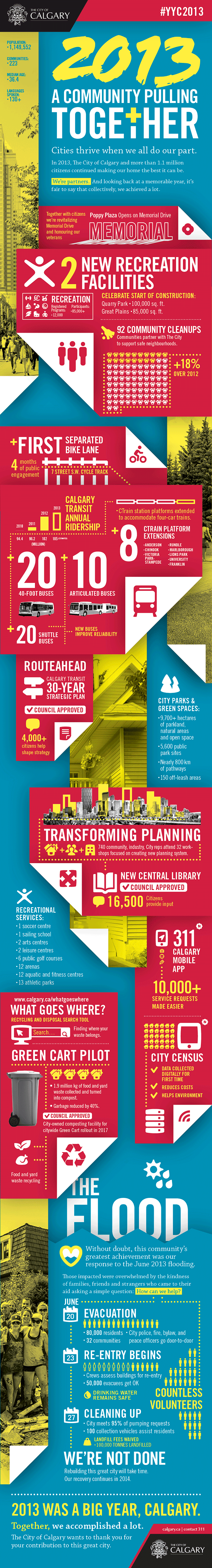
Infographics.
"Making an itemized list more complicated and confusing since 2008."
|
Infographics and data-visualization are a big part of what I do (shameless plug: one of the charts I did a few weeks ago was quoted by Bill Gates as his favorite of 2013), and I teach a class at ACAD in it as well, so I like to think I know what I'm talking about. So when I hear people say things like this, I....tend to agree! Well, mostly.
I think sometimes us designers forget that the main goal of an infographic is to communicate information. However information on it's own, especially when it deals with a lot of numbers and datasets, can be pretty stale and intimidating (especially when you get it in an Excel chart). The truth is that people wouldn't read a lot of this stuff if it wasn't interesting to look at. Obviously the goal is to make something engaging AND be easier to understand, but sometimes us designers go too far in the visual direction and just complicate the issue.
Btw...here's an infographic fun fact (hey, it's fun to me)...one of the pioneers of graphic charts was Florence Nightingale! During her time as a field-nurse in the Crimean War, she developed charts and stats to show to her superiors about how their soldiers were dying not because of wounds, but because of poor medical and hygene practices in the field.
Here's the chart. You can see here the difference between preventable deaths (blue) and deaths from wounds (red) over the months of the war.
This little chart did a lot for changing field practices during war, and saved a lot of lives as a result. Not bad for a little infographic!