|
View Poll Results: Hiow do you like the leaked jersey?
|
|
Like
|
   
|
185 |
24.03% |
|
Dislike
|
  
|
585 |
75.97% |
 10-12-2013, 08:43 PM
|
#441
|
|
First Line Centre
|
At this point I don't care what they look like.... I just want a damn Monahan jersey and I don't want one of the current (terrible) home/away alberta jerseys.
|

|

|
|
10-12-2013, 09:13 PM
|
#442
|
|
Franchise Player
Join Date: Dec 2005
Location: back in the 403
|
Quote:
|
Originally Posted by rohara66
At this point I don't care what they look like.... I just want a damn Monahan jersey and I don't want one of the current (terrible) home/away alberta jerseys.
|
That's what I especially hate about the switch...wanna get Monahan on my new Flames retro jersey, but my jersey snobness would never allow it.
Posted from Calgarypuck.com App for Android
|
|
|
|
|
The Following 3 Users Say Thank You to Sainters7 For This Useful Post:
|
|
|
10-13-2013, 04:11 AM
|
#443
|
|
Franchise Player
Join Date: Aug 2007
Location: Ontario
|
Quote:
Originally Posted by browna

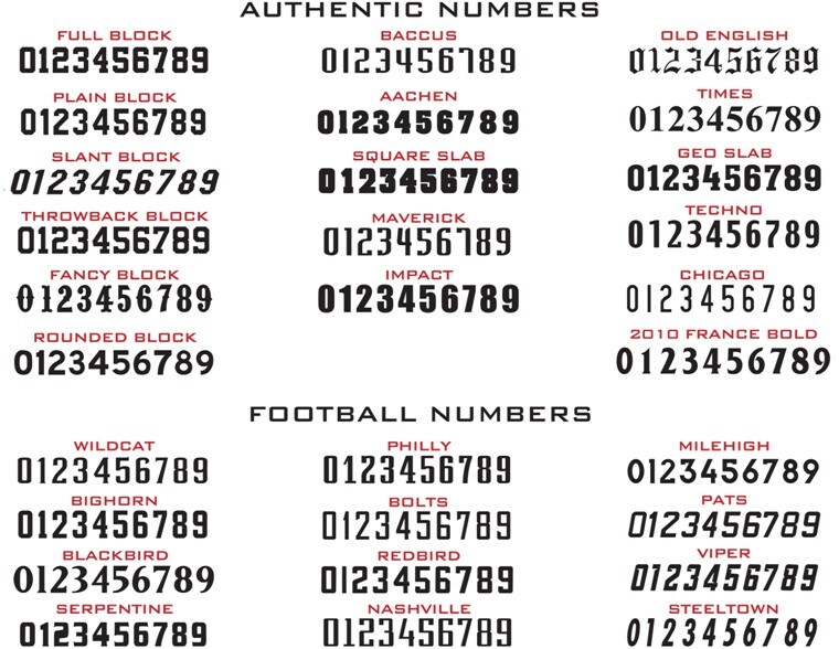
Been looking for that number font around the net. I don't think its an non italicized current font, looks brand new. Closest I found is the "Redbird" font here:
On the 2,, there is squared off hook on the top, the bottom 2/3 of the number starts with a sharper slant than the current set. Then at the bottom 1/3 point, there is a vertical line before it goes to the horizontal base. On the base there is a tail, pointing up it appears, on the 2.The current set, a curved hook at the top of the 2, the slant is more gradual and basically goes to the horizontal base and, no tail.
Same with the G not C (good catch). That G is nowhere near what the current G looks like.
Glad to see they're refreshing up the name and number fonts...been far too long with the current set. |
You're damn close, and I like it:
%203.jpg)
|
|
|
|
|
The Following 6 Users Say Thank You to Split98 For This Useful Post:
|
|
|
10-13-2013, 12:28 PM
|
#444
|
|
#1 Goaltender
|
The lettering looks a little small or the numbers too big but another good mock up.
|
|
|
|
|
10-13-2013, 04:09 PM
|
#445
|
|
Crash and Bang Winger
Join Date: Aug 2007
Location: Calgary, AB
|
Thought I'd contribute an EA style mock-up. I like these for mock-ups because they give a sense of realism to the sweater. Thanks (I believe) to Spit98 for the shoulder logo. I made up the front script crest based on the most similar font I could find. I think it's pretty close. This, based on the leaked graphics and the teasers on the jumbotron the last couple of games, is exactly what I think we're getting.
There are plenty of things I like about the look, but many that I don't. All-in-all, this isn't a bad sweater at all. The kicker is that many of the concepts we've all seen in the last few months have been better. I think that's what's most frustrating.

I'll try and post some screenshots or some pics with numbers sometime this evening so the full look can be seen.
|
|
|
|
|
The Following 12 Users Say Thank You to DT77 For This Useful Post:
|
CaptainSunshin3,
chalms04,
DaQwiz,
Domoic,
EYE_Overstand,
Freeway,
GreenHardHat,
Mango,
MisterJoji,
Otto-matic,
Resolute 14,
roberts10
|
|
10-13-2013, 04:18 PM
|
#446
|
|
Crash and Bang Winger
Join Date: Jan 2011
Location: Calgary, AB
|
Curse you for making it look decent.. my mind was set on "it's crap" but that mock up isn't too bad.
|
|
|
|
|
The Following User Says Thank You to Flamescat For This Useful Post:
|
|
|
10-13-2013, 04:25 PM
|
#447
|
|
Franchise Player
Join Date: Feb 2013
Location: Boca Raton, FL
|
I have to be 100% honest, this thread depresses the crap out of me. If that really is the jersey it is truly terrible.
__________________
"You know, that's kinda why I came here, to show that I don't suck that much" ~ Devin Cooley, Professional Goaltender
|
|
|
|
|
The Following User Says Thank You to Cali Panthers Fan For This Useful Post:
|
|
|
10-13-2013, 05:44 PM
|
#448
|
|
Franchise Player
Join Date: Jun 2011
Location: Austria, NOT Australia
|
the more I see it, the less I mind. It could have been a lot better, sure, but when I watched a match of the Austrian league on Friday, I realized just how neat NHL jerseys are. The visiting team sported these "beauties" (bonus points to the hockey nuts among you who know the player  ):

Advertisements everywhere ... a newspaper, an insurance company, a bank, a travel agency, a brewery and some others. Sadly, this is how 99 % of European hockey jerseys look.
So keep in mind: it could be a lot worse.
|
|
|
|
|
10-13-2013, 11:42 PM
|
#449
|
|
Franchise Player
Join Date: Aug 2007
Location: Ontario
|
Quote:
Originally Posted by DT77
Thought I'd contribute an EA style mock-up. I like these for mock-ups because they give a sense of realism to the sweater. Thanks (I believe) to Spit98 for the shoulder logo. I made up the front script crest based on the most similar font I could find. I think it's pretty close. This, based on the leaked graphics and the teasers on the jumbotron the last couple of games, is exactly what I think we're getting.
There are plenty of things I like about the look, but many that I don't. All-in-all, this isn't a bad sweater at all. The kicker is that many of the concepts we've all seen in the last few months have been better. I think that's what's most frustrating.
I'll try and post some screenshots or some pics with numbers sometime this evening so the full look can be seen. |
Nicely done! Your font is impressively close too eh. Which font is this?
|
|
|
|
|
10-13-2013, 11:58 PM
|
#450
|
|
Franchise Player
|
Quote:
Originally Posted by devo22
Advertisements everywhere ... a newspaper, an insurance company, a bank, a travel agency, a brewery and some others. Sadly, this is how 99 % of European hockey jerseys look.
|
Given the increase in advertising in the last 30 years already, I honestly don't think we're that far off from following suit...
|
|
|
|
|
10-14-2013, 01:17 AM
|
#451
|
|
Scoring Winger
Join Date: Jul 2011
Location: at home
|
The wordmark and the logo will certainly blend together and in my opinion the whole thing will look like a splash of black paint when seen from a distance.
Perhaps the white flaming C would make it slightly better, but I'm still disappointed with NJD look (broad black stripes and squared off yokes, with yellow reduced to minimum)

|
|
|
|
|
10-14-2013, 12:33 PM
|
#452
|
|
Crash and Bang Winger
Join Date: Aug 2007
Location: Calgary, AB
|
As promised:


Quote:
Originally Posted by Split98
Nicely done! Your font is impressively close too eh. Which font is this?
|
It's called "Script MS" which I believe is a default Windows font. I found a similar one online as well named something else, but it was virtually identical.
|
|
|
|
|
10-14-2013, 01:18 PM
|
#453
|
|
Powerplay Quarterback
|
Quote:
Originally Posted by playmaker
The wordmark and the logo will certainly blend together and in my opinion the whole thing will look like a splash of black paint when seen from a distance.
Perhaps the white flaming C would make it slightly better, but I'm still disappointed with NJD look (broad black stripes and squared off yokes, with yellow reduced to minimum)
|
I think I'd go with a red flaming C on the front. Perhaps even switch out one of the secondary patches with a red flaming C on one shoulder.
If we are going to look like another NHL team, the New Jersey Devils are not a bad uniform to be compared to.
|
|
|
|
|
10-14-2013, 01:21 PM
|
#454
|
|
Franchise Player
Join Date: Aug 2007
Location: Ontario
|
Quote:
Originally Posted by DT77
It's called "Script MS" which I believe is a default Windows font. I found a similar one online as well named something else, but it was virtually identical.
|
That's hilarious. I searched high and low for a close font and a closer font is default MS.
Well done with the game jerseys bud. Good to see a better rep of what they may look like.
|
|
|
|
|
10-14-2013, 01:26 PM
|
#455
|
|
Lifetime Suspension
|
They actually look better in those screenshots than they do in the EA ones, so that's hopeful.
|
|
|
|
|
10-14-2013, 01:50 PM
|
#456
|
|
Franchise Player
Join Date: Sep 2002
Location: I'm right behind you
|
Quote:
Originally Posted by DT77
As promised:
It's called "Script MS" which I believe is a default Windows font. I found a similar one online as well named something else, but it was virtually identical. |
If that is from NHL 14 then someone needs to be fired. Incorrect stick wrap (the CCM U+) is upside down and TPS hasn't been manufactured for 2 years.
__________________
Don't fear me. Trust me.
|
|
|
|
|
10-14-2013, 01:51 PM
|
#457
|
|
Lifetime Suspension
|
Quote:
Originally Posted by Reaper
If that is from NHL 14 then someone needs to be fired. Incorrect stick wrap (the CCM U+) is upside down and TPS hasn't been manufactured for 2 years.
|
Clearly, for better or worse, you've never played NHL 14.
|
|
|
|
|
10-14-2013, 01:53 PM
|
#458
|
|
Franchise Player
Join Date: Sep 2002
Location: I'm right behind you
|
Quote:
Originally Posted by strombad
Clearly, for better or worse, you've never played NHL 14.
|
No, I don't play video games.
__________________
Don't fear me. Trust me.
|
|
|
|
|
10-14-2013, 01:57 PM
|
#459
|
|
Lifetime Suspension
|
Quote:
Originally Posted by Reaper
No, I don't play video games.
|
Excellent story.
|
|
|
|
|
10-14-2013, 01:59 PM
|
#460
|
|
Franchise Player
Join Date: Sep 2002
Location: I'm right behind you
|
Quote:
Originally Posted by strombad
Excellent story.
|
Thanks Tips. Now go back to eating paint chips.
__________________
Don't fear me. Trust me.
|
|
|
|
 Posting Rules
|
You may not post new threads
You may not post replies
You may not post attachments
You may not edit your posts
HTML code is Off
|
|
|
All times are GMT -6. The time now is 11:06 PM.
|
|