 10-08-2013, 09:12 AM
|
#141
|
|
Franchise Player
|
They'll look better with a gold medal
|

|

|
 10-08-2013, 09:14 AM
|
#142
|
|
Franchise Player
Join Date: Feb 2007
Location: Calgary, AB
|
Actually look much better with the entire uniform (except for the black which needs red pants). Still not great, but better. Don't think I will be buying one until the post-olympic clearance sales though.
 http://globalnews.ca/news/888793/tea...nveiled-today/
Last edited by SuperMatt18; 10-08-2013 at 09:26 AM.
|

|

|
|
The Following 2 Users Say Thank You to SuperMatt18 For This Useful Post:
|
|
 10-08-2013, 09:18 AM
|
#143
|
|
Lifetime Suspension
|
Quote:
Originally Posted by SuperMatt18

|
Uh, really? They look as terrible as ever, and black pants and gloves with the white and red jerseys just look ridiculous. Where is the black even coming from?
|

|

|
|
The Following 9 Users Say Thank You to 19Yzerman19 For This Useful Post:
|
|
 10-08-2013, 09:34 AM
|
#144
|
|
Lifetime Suspension
|
Quote:
Originally Posted by 19Yzerman19

Uh, really? They look as terrible as ever, and black pants and gloves with the white and red jerseys just look ridiculous. Where is the black even coming from?
|
I'd guess Nazi Germany from the look.
|

|

|
 10-08-2013, 09:36 AM
|
#145
|
|
Lifetime Suspension
|
Quote:
Originally Posted by SuperMatt18

Actually look much better with the entire uniform (except for the black which needs red pants). Still not great, but better. Don't think I will be buying one until the post-olympic clearance sales though.
|
I completely agree. They look much better as a complete uniform. If the black jerseys had red pants then you'd have something really bold and a little more interesting.
Quote:
Originally Posted by 19Yzerman19

Uh, really? They look as terrible as ever, and black pants and gloves with the white and red jerseys just look ridiculous. Where is the black even coming from?
|
Is the "I don't like black!" sentiment some disease that floats around CP? How do I avoid getting it? It's an official team colour, has been for YEARS.
You.... HAVE watched the Olympics before right?
For heaven's sake, we used to wear blue pants, surely this is a less offensive alternative that actually adds to the red and white instead of being a glaring eyesore.
|

|

|
|
The Following User Says Thank You to strombad For This Useful Post:
|
|
 10-08-2013, 09:39 AM
|
#146
|
|
Franchise Player
|
unfortunately, Canada has worn black pants for at least 15 years; Hockey Canada has black in its logo
still better than the blue pants they wore prior to that

Last edited by Canada 02; 10-08-2013 at 09:42 AM.
|

|

|
 10-08-2013, 09:44 AM
|
#147
|
|
Lifetime Suspension
|
Quote:
Originally Posted by Canada 02

unfortunately, Canada has worn black pants for at least 15 years; Hockey Canada has black in its logo
still better than the blue pants they wore prior to that
|
But red pants would be a huge improvement on two of the three designs and not significantly worse for the other one.
You want to fix the design. Do this...
Arm bands on both arms.
Red pants
Red gloves
Red helmets
Give the white and red uniforms the same sock design as the black uniforms.
Oh, and obviously lose the silly fake neck design.
|

|

|
 10-08-2013, 09:44 AM
|
#148
|
|
In the Sin Bin
|

Quote:
Originally Posted by strombad

I completely agree. They look much better as a complete uniform. If the black jerseys had red pants then you'd have something really bold and a little more interesting.
|
They do look better. In much the same way that week old crap smells better than fresh crap.
Quote:
Is the "I don't like black!" sentiment some disease that floats around CP? How do I avoid getting it? It's an official team colour, has been for YEARS.
You.... HAVE watched the Olympics before right?
For heaven's sake, we used to wear blue pants, surely this is a less offensive alternative that actually adds to the red and white instead of being a glaring eyesore.
|
Black has always been an accent colour, not the dominating theme. There was no reason to design a third jersey - Canada is the lone country with a third uniform, and that is exclusively due to crass commericalism.
Literally the only positive thing I can say about these uniforms is that they are better than those green monstrosities from the Saskatchewan world juniors.
The Reds and Whites make me think of Petro Canada, the blacks of Nazi Germany, and the gold embroidered maple leaves represent a game of Galaxian. Just a sorry, sad and pitiful attempt at a hockey uniform.
|

|

|
|
The Following User Says Thank You to Resolute 14 For This Useful Post:
|
|
 10-08-2013, 09:44 AM
|
#149
|
|
#1 Goaltender
Join Date: Jan 2009
Location: Calgary
|
Those red and white socks are weird.
The entire set looks decent though.
|

|

|
 10-08-2013, 09:45 AM
|
#150
|
|
Powerplay Quarterback
Join Date: Feb 2011
Location: AB
|
Quote:
Originally Posted by SuperMatt18

Don't think I will be buying one until the post-olympic clearance sales though.
|
Why wait until then, just order one from me at a good CP discount
|

|

|
 10-08-2013, 09:46 AM
|
#151
|
|
Franchise Player
|
Quote:
Originally Posted by Canada 02

unfortunately, Canada has worn black pants for at least 15 years; Hockey Canada has black in its logo
still better than the blue pants they wore prior to that
 |
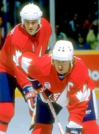
Come on. If they showed up in those kits, it'd be the most awesome thing hockey'd seen in 25 years.
__________________
All you have to decide is what to do with the time that is given to you.
Rowan Roy W-M - February 15, 2024
|

|

|
 10-08-2013, 09:48 AM
|
#152
|
|
Lifetime Suspension
|
Quote:
Originally Posted by SuperMatt18

|
Why would they pick a model who can't even stand on her skates?
|

|

|
|
The Following 3 Users Say Thank You to WilderPegasus For This Useful Post:
|
|
 10-08-2013, 09:53 AM
|
#153
|
|
Lifetime Suspension
|
Quote:
Originally Posted by strombad

Is the "I don't like black!" sentiment some disease that floats around CP? How do I avoid getting it? It's an official team colour, has been for YEARS.
You.... HAVE watched the Olympics before right?
|
I'm fine with black when it's a part of the jersey. When the colours are predominantly white and red with no black elsewhere, and you just stick black pants and gloves on there, it looks awkward. Would red pants and gloves really have been that hard? We could just borrow the Red Wings' gear. Someone photoshop it.
As far as the 3rds, the black isn't my problem, it's the general uniform design and the Nazi-esque red armband, which comparison is exacerbated by the uni being black. It's not the presence of black itself I object to.
Last edited by 19Yzerman19; 10-08-2013 at 09:55 AM.
|

|

|
|
The Following 2 Users Say Thank You to 19Yzerman19 For This Useful Post:
|
|
 10-08-2013, 09:53 AM
|
#154
|
|
Franchise Player
Join Date: Dec 2011
Location: Calgary
|
Can they please ditch the black? It looks HORRIBLE. Red and white looks awesome, like Detroit.
|

|

|
 10-08-2013, 10:00 AM
|
#155
|
|
Franchise Player
Join Date: Dec 2005
Location: back in the 403
|
Quote:
Originally Posted by GreenLantern2814

Come on. If they showed up in those kits, it'd be the most awesome thing hockey'd seen in 25 years.
|
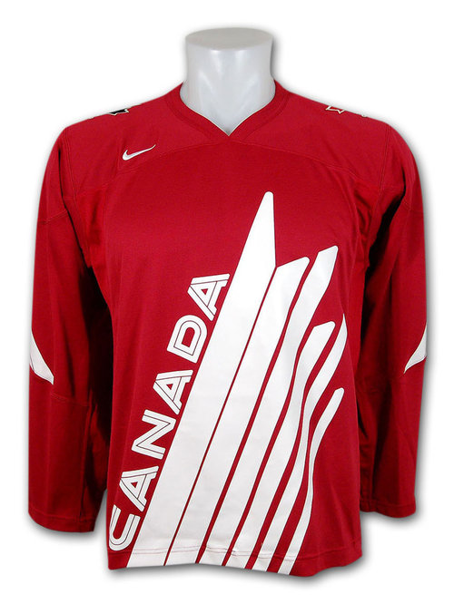
In the 2009 WJC, they kinda did, with this homage to those ones. Looked great with the black pants, but I guess you'll have to take my word for it, since this waist up shot is the only pic I can find of em. I think those '09 versions are the nicest ones they've worn in a long time...and I'll never know why they chose to wear blue pants way back then. So random.

Last edited by Sainters7; 10-08-2013 at 10:11 AM.
|

|

|
 10-08-2013, 10:14 AM
|
#156
|
|
Franchise Player
Join Date: Feb 2007
Location: Calgary, AB
|
Quote:
Originally Posted by Sainters7

In the 2009 WJC, they kinda did, with this homage to those ones. Looked great with the black pants, but I guess you'll have to take my word for it, since this waist up shot is the only pic I can find of em. I think those '09 versions are the nicest ones they've worn in a long time...and I'll never know why they chose to wear blue pants way back then. So random.
|

Best Canada jersey since 2002.
|

|

|
|
The Following User Says Thank You to SuperMatt18 For This Useful Post:
|
|
 10-08-2013, 10:15 AM
|
#157
|
|
Franchise Player
Join Date: Nov 2008
Location: the dark side of Sesame Street
|
From Hockey Canada's page:
Quote:
|
Taking inspiration from the iconic designs of vintage Canadian jerseys, the 2014 jersey is also 15 per cent lighter than the 2010 Nike hockey jersey, with a modern neckline incorporating Nike flywire and lightweight graphic badges.
|
http://www.hockeycanada.ca/en-ca/new...c-Winter-Games
why not just eliminate any weight from the jersey and spray-paint a logo and number on the players?
...and hey - they're Earth-friendly!
Quote:
The jersey and socks are made from 73 per cent recycled polyester as part of Nike’s commitment to produce performance apparel with reduced environmental impact.
Each jersey is made from up to 17 recycled plastic water bottles, and the sock uses an average of five plastic bottles.
|
__________________
"If Javex is your muse
then dive in buddy"
- Surferguy
|

|

|
 10-08-2013, 10:15 AM
|
#158
|
|
Franchise Player
Join Date: Aug 2007
Location: Vancouver
|
Quote:
Originally Posted by Sainters7

In the 2009 WJC, they kinda did, with this homage to those ones. Looked great with the black pants, but I guess you'll have to take my word for it, since this waist up shot is the only pic I can find of em. I think those '09 versions are the nicest ones they've worn in a long time...and I'll never know why they chose to wear blue pants way back then. So random.
|
It's really no more random than black. It's not like our flag has any black on it.
__________________

|

|

|
 10-08-2013, 10:24 AM
|
#159
|
|
Franchise Player
Join Date: Dec 2005
Location: back in the 403
|
True...though I guess to me anyway, red / black is unique in international hockey, whereas red / blue could just as easily be USA / Russia / Czech Rep, etc. Just seems like an odd choice to make when so many other countries wear those colours.
EDIT: Actually one of my favourites was in '98 Nagano, when gray instead of black was our random colour of choice. Thought it looked great with the red...on that note, the Stamps need to break out their old, 70's red / gray unis too. Apparently I really like that colour combo..
Last edited by Sainters7; 10-08-2013 at 10:26 AM.
|

|

|
 10-08-2013, 10:45 AM
|
#160
|
|
Franchise Player
Join Date: Nov 2008
Location: the dark side of Sesame Street
|
Quote:
Originally Posted by WilderPegasus

I'd guess Nazi Germany from the look.
|
The gold leaf in the red armband really doesn't help, either.

__________________
"If Javex is your muse
then dive in buddy"
- Surferguy
|

|

|
 Posting Rules
|
You may not post new threads
You may not post replies
You may not post attachments
You may not edit your posts
HTML code is Off
|
|
|
All times are GMT -6. The time now is 04:19 AM.
|
|

