 08-26-2013, 10:42 AM
|
#661
|
|
Lifetime Suspension
|

Quote:
Originally Posted by Split98

So I think I'm finally pretty happy with the concept. After playing around with the nameplate font, I found that I really did just love the clean (though Coyote's-esque) simple sans font. I also still never dug adding the extra band to the waist and included here is the neck-placement alternate logo that would be a great place if Reebok does end up allowing their branding relocation. I also retained the tie-ups, but decided on a jersey coloured thread to blend while keeping the (IMO) great look of a tie-up. Blends, avoids the clutter that bothered some people and adds that classic tie-up touch.
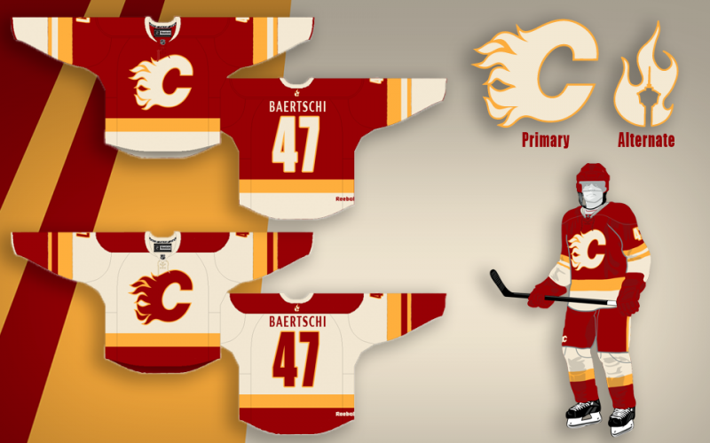
Thanks a lot for the positive response guys, this was definitely something I've had a ton of fun working on. |
I really don't get why everyone is so in love with these jerseys. There is too much white on the homes and the font looks terrible. I like the general design of the road jersey (save for the font) but I think people are getting a little TOO excited over this design. I don't know, it's kind of cheesy. Reminds me of the Dallas jerseys in the way that they're just kind of kid friendly, a little bit bubblegum, not classic enough to represent our history, and not stylish enough to be current. Not a lot of well thought out style, just a lot of "well look at THIS cool thing". Honestly, reminds me of the jerseys from the 90's. These are just a cheesy take on retro. Either go retro and tweak it, or do something different. This is somewhere kind of awkwardly in the middle.
|

|

|
|
The Following 15 Users Say Thank You to strombad For This Useful Post:
|
CMPunk,
Dr. Pepper,
Ducay,
FlamesKickAss,
jayswin,
Magnum PEI,
Mitch,
MPE907,
redforever,
RM14,
t0rrent98,
the-rasta-masta,
You Need a Thneed,
zztim81,
_Q_
|
|
08-26-2013, 10:49 AM
|
#662
|
|
#1 Goaltender
|
Considering there is no jersey out there that will please everyone I think this is pretty damn close to be honest. It is not only the jersey that I like, it is the entire uniform that looks sharp. Sure, I suppose the font could be a bit different but it does the trick. The off white is different but it looks good.
|
|
|
|
|
The Following User Says Thank You to red sky For This Useful Post:
|
|
|
08-26-2013, 11:22 AM
|
#663
|
|
Franchise Player
|
Quote:
Originally Posted by MisterJoji
No doubt. Since Split probably got most or all of the tweaking suggestions from here, who on CP is going to be THAT guy? I'd like to think none us are a dickhead of that proportion.
|
As one of the posters who's suggestion was used in a tweak, I would just be happy with the bragging rights. I would buy a jersey and tell everyone the alternate logo over the name bar was my idea (which rbk wouldn't allow anyway IMO)
|
|
|
|
|
08-26-2013, 12:08 PM
|
#664
|
|
First Line Centre
Join Date: Oct 2011
Location: The Armpit of BC: Trail
|
Quote:
Originally Posted by Alberta_Beef
As one of the posters who's suggestion was used in a tweak, I would just be happy with the bragging rights. I would buy a jersey and tell everyone the alternate logo over the name bar was my idea (which rbk wouldn't allow anyway IMO)
|
Same. I would tell people the rough idea for the alternate logo was drawn up one night by me, sitting alone in a guard shack at work. I definitely wouldn't sue or persue any form of compensation. My name is Trailer Fire and you can take that to court.
__________________
Disregard any and all THANKS I give. I'm a dirty, dirty thanks-whore.
|
|
|
|
|
08-26-2013, 01:14 PM
|
#665
|
|
Crash and Bang Winger
Join Date: May 2009
Location: Calgary
|
Quote:
Originally Posted by strombad
I really don't get why everyone is so in love with these jerseys. There is too much white on the homes and the font looks terrible. I like the general design of the road jersey (save for the font) but I think people are getting a little TOO excited over this design. I don't know, it's kind of cheesy. Reminds me of the Dallas jerseys in the way that they're just kind of kid friendly, a little bit bubblegum, not classic enough to represent our history, and not stylish enough to be current. Not a lot of well thought out style, just a lot of "well look at THIS cool thing". Honestly, reminds me of the jerseys from the 90's. These are just a cheesy take on retro. Either go retro and tweak it, or do something different. This is somewhere kind of awkwardly in the middle.
|
My thoughts as well - very nice effort however.
__________________
The Doctor is in
|
|
|
|
|
08-26-2013, 02:01 PM
|
#666
|
|
Franchise Player
Join Date: Nov 2003
Location: Calgary, AB
|
Regardless of what new jersey we select, I think it's important for the organization to visually differentiate this new era as the 'post-Iginla' era. A new set of kits will help reinforce that.
|
|
|
|
|
08-26-2013, 02:18 PM
|
#667
|
|
First Line Centre
Join Date: Oct 2002
Location: Turner Valley
|
Quote:
Originally Posted by strombad
I really don't get why everyone is so in love with these jerseys. There is too much white on the homes and the font looks terrible. I like the general design of the road jersey (save for the font) but I think people are getting a little TOO excited over this design. I don't know, it's kind of cheesy. Reminds me of the Dallas jerseys in the way that they're just kind of kid friendly, a little bit bubblegum, not classic enough to represent our history, and not stylish enough to be current. Not a lot of well thought out style, just a lot of "well look at THIS cool thing". Honestly, reminds me of the jerseys from the 90's. These are just a cheesy take on retro. Either go retro and tweak it, or do something different. This is somewhere kind of awkwardly in the middle.
|
Agreed. The white on the bottom of the jersey and arms, along with the socks, kills the jersey for me.
|
|
|
|
|
The Following User Says Thank You to the-rasta-masta For This Useful Post:
|
|
|
08-26-2013, 02:21 PM
|
#668
|
|
Lifetime Suspension
Join Date: Oct 2012
Location: Halifax
|
Quote:
Originally Posted by strombad
I really don't get why everyone is so in love with these jerseys. There is too much white on the homes and the font looks terrible. I like the general design of the road jersey (save for the font) but I think people are getting a little TOO excited over this design. I don't know, it's kind of cheesy. Reminds me of the Dallas jerseys in the way that they're just kind of kid friendly, a little bit bubblegum, not classic enough to represent our history, and not stylish enough to be current. Not a lot of well thought out style, just a lot of "well look at THIS cool thing". Honestly, reminds me of the jerseys from the 90's. These are just a cheesy take on retro. Either go retro and tweak it, or do something different. This is somewhere kind of awkwardly in the middle.
|
you're crazy.
|
|
|
|
|
The Following 2 Users Say Thank You to $ven27 For This Useful Post:
|
|
|
08-26-2013, 02:28 PM
|
#669
|
|
Scoring Winger
Join Date: Feb 2011
Location: 780
|
I'd like to see these...
Quote:
Originally Posted by Split98
|
With this as the third

|

|
|
|
The Following 2 Users Say Thank You to Plett25 For This Useful Post:
|
|
|
08-26-2013, 02:55 PM
|
#670
|
|
Lifetime Suspension
|
Quote:
Originally Posted by $ven27
you're crazy.
|
the MOST crazy
|
|
|
|
|
08-26-2013, 08:11 PM
|
#671
|
|
Franchise Player
|
I think the concept for the jersey is nearly perfect. The only thing I might change is the font to make it more readable.
They would be the best jerseys in the league. No piping, no nonsense shoulder patches. Simple and clean.
|
|
|
|
|
08-26-2013, 08:19 PM
|
#672
|
|
Franchise Player
|
I still like the graphite-coloured ones.
__________________
KNOWLEDGE IS POWER. I love power.
|
|
|
|
|
The Following User Says Thank You to Machiavelli For This Useful Post:
|
|
|
08-26-2013, 09:29 PM
|
#673
|
|
Franchise Player
Join Date: Oct 2006
Location: Calgary
|
I did a quick edit showing the white version of that jersey

__________________
Fireside Chat - The #1 Flames Fan Podcast - FiresideChat.ca
|
|
|
|
|
The Following 2 Users Say Thank You to Caged Great For This Useful Post:
|
|
|
08-26-2013, 09:32 PM
|
#674
|
|
#1 Goaltender
Join Date: Jan 2010
Location: Calgary
|
I know people have said they don't like black, but I could see a little bit of black piping somewhere on this jersey would help it pop. I do like it. I think it is a more modern version of the retros but modern and streamline enough to seem like new era style.
Pretty good design for a random concept.
|
|
|
|
|
08-27-2013, 12:07 AM
|
#675
|
|
#1 Goaltender
|
I love the cream jerseys- easily one of the best concepts I've seen, but I still feel we need to go full retro (home and away) and then a red alternate with a black C. My okay issue with the cream jersey is abandoning our bright red.
|
|
|
|
|
08-30-2013, 12:35 PM
|
#676
|
|
First Line Centre
Join Date: Jul 2013
Location: I will never cheer for losses
|
[QUOTE..
With this as the third
[/QUOTE]
that looks cool
|
|
|
|
|
08-30-2013, 02:43 PM
|
#677
|
|
Franchise Player
Join Date: Nov 2009
Location: Kelowna, BC
|
i absolutely LOVE Split98's jerseys. the only change i would make is to the name font - just so it's not a copy of phoenix's font
i found this while searching for something else (not sure if it was posted in this thread yet or not) ...i don't feel like going back thru 600+ posts
and my initial, and continued response to this jersey is ... NO... burn it with fire. don't really like anything about this jersey.... except that it's red/white/yellow
__________________
"...and there goes Finger up the middle on Luongo!" - Jim Hughson, Av's vs. 'Nucks
|
|
|
|
|
08-30-2013, 02:58 PM
|
#678
|
|
Crash and Bang Winger
Join Date: Jul 2010
Location: Victoria, BC
|
Quote:
Originally Posted by Split98
|
I Like the layout of everything, piping etc. The only things I can't stand with this design is the "Vintage White" and the font for the Nameplate.
Vintage white should really only be used on "Winter Classic" type special jerseys, not on the normal home/road uni. If it was changed to white I think you'd have a very legitimate NHL ready set.
The font just doesn't work for me, not with our logos. Works for a team like the Coyotes that have a more detailed logo. Just a solid letterman font or just a simple san-serif would work well IMO.
|
|
|
|
|
08-30-2013, 04:45 PM
|
#679
|
|
Scoring Winger
Join Date: Aug 2009
Location: Calgary, Alberta, Canada
|
Quote:
Originally Posted by Split98
Thanks a lot for the positive response guys, this was definitely something I've had a ton of fun working on.
|
I too feel these jerseys would be great to have but only with the many suggestions that the off-white or "cream" as my wife calls it, be changed to a regular white. Then my small contribution would be to swap the very bottoms of the Home jersey with the very bottoms of the Away jerseys giving each set a more blended and cleaner look to them. If possible, i also think it would be pretty neat to have white gloves for the Home set while sticking with the red for the Away.
|
|
|
|
|
08-30-2013, 05:25 PM
|
#680
|
|
#1 Goaltender
Join Date: Aug 2011
Location: Not cheering for losses
|
Quote:
Originally Posted by Split98
So I think I'm finally pretty happy with the concept. After playing around with the nameplate font, I found that I really did just love the clean (though Coyote's-esque) simple sans font. I also still never dug adding the extra band to the waist and included here is the neck-placement alternate logo that would be a great place if Reebok does end up allowing their branding relocation. I also retained the tie-ups, but decided on a jersey coloured thread to blend while keeping the (IMO) great look of a tie-up. Blends, avoids the clutter that bothered some people and adds that classic tie-up touch.
Thanks a lot for the positive response guys, this was definitely something I've had a ton of fun working on. |

Mocked up in optical white instead of off-white. All credit to Split98 of course who created the original. Hope it's okay that I edited it.
Last edited by sun; 08-30-2013 at 05:29 PM.
|
|
|
|
|
The Following 4 Users Say Thank You to sun For This Useful Post:
|
|
 Posting Rules
|
You may not post new threads
You may not post replies
You may not post attachments
You may not edit your posts
HTML code is Off
|
|
|
All times are GMT -6. The time now is 01:17 PM.
|
|


