04-25-2013, 11:30 AM
|
#601
|
|
First Line Centre
Join Date: Aug 2003
Location: Toronto, ON
|
The white diaper look is putting me a bit off...
|

|

|
|
04-25-2013, 12:18 PM
|
#602
|
|
First Line Centre
Join Date: Oct 2011
Location: The Armpit of BC: Trail
|
Quote:
Originally Posted by Split98

So I think I'm finally pretty happy with the concept. After playing around with the nameplate font, I found that I really did just love the clean (though Coyote's-esque) simple sans font. I also still never dug adding the extra band to the waist and included here is the neck-placement alternate logo that would be a great place if Reebok does end up allowing their branding relocation. I also retained the tie-ups, but decided on a jersey coloured thread to blend while keeping the (IMO) great look of a tie-up. Blends, avoids the clutter that bothered some people and adds that classic tie-up touch.
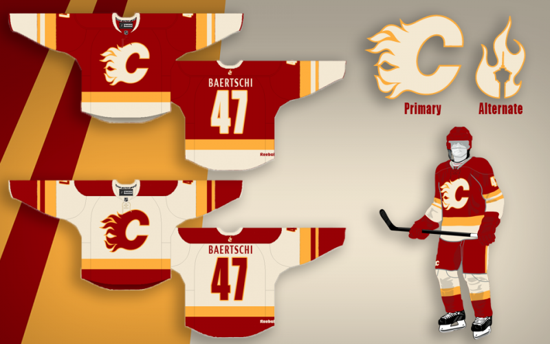
Thanks a lot for the positive response guys, this was definitely something I've had a ton of fun working on. |
Lord Jesus that is a thing of beauty. The cream/off white is amazing and ties in beautifully with the other colours. It loses all the McDonalds connotations. I also love the alternate logo and its placement. Cheers man. Love it.
__________________
Disregard any and all THANKS I give. I'm a dirty, dirty thanks-whore.
|
|
|
|
|
04-25-2013, 12:28 PM
|
#603
|
|
Powerplay Quarterback
|
Quote:
Originally Posted by Flames89
The white diaper look is putting me a bit off...
|
Agreed. I'm not sure if it would look better with the yellow/white bands reversed on the red jersey or if the bottom stripes need to be curved like the current jerseys to eliminate that.
|
|
|
|
|
04-25-2013, 12:37 PM
|
#604
|
|
Powerplay Quarterback
|
Love the cream over white - I think that is what makes the SF Giants' home uniforms one of the best in the MLB.
|
|
|
|
|
04-25-2013, 12:39 PM
|
#605
|
|
Scoring Winger
Join Date: Feb 2013
Location: Lethbridge
|
That jersey combines everything I've ever hate in Flames jerseys into one.
It is, quite possibly, the worst thing I have ever seen.
Quote:
Originally Posted by Dr. Pepper
|
|
|
|
|
|
The Following User Says Thank You to ToraToraTora For This Useful Post:
|
|
|
08-22-2013, 09:59 PM
|
#606
|
|
Crash and Bang Winger
Join Date: May 2009
Location: Calgary
|
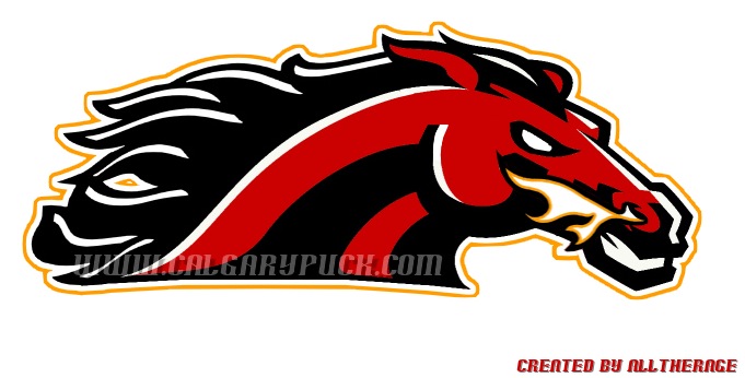
Here's another that someone posted on another thread - thought I'd put it here so we've got all these in one thread:

Don't much care for the horsehead jersey, but the white one is spot on with the updated striping. The red one is nice too - only thing I'd add is a white shoulder yoke. Pretty nice overall concept though. Different from anything I've seen posted - so kudos to whoever came up with this.
__________________
The Doctor is in
|
|
|
|
|
The Following 5 Users Say Thank You to Dr. Pepper For This Useful Post:
|
|
|
08-22-2013, 11:36 PM
|
#607
|
|
Franchise Player
Join Date: Aug 2007
Location: Vancouver
|
Quote:
Originally Posted by Split98
Thanks a lot for the positive response guys, this was definitely something I've had a ton of fun working on.
|
Please. Oh come on please. They would be stupid not to make the jerseys look like this or something close. Every time I open this thread I see that and want one so bad.
That new ones not bad though. Can't say I love the horsehead. Not because it has the horsehead, I just don't think it looks good in that color scheme. I think it would have to be on a darker jersey.
__________________

|
|
|
|
|
The Following User Says Thank You to Coach For This Useful Post:
|
|
|
08-22-2013, 11:36 PM
|
#608
|
|
First Line Centre
Join Date: Jul 2013
Location: I will never cheer for losses
|
Quote:
Originally Posted by Dr. Pepper
|
that looks to much like it should be a football logo
|
|
|
|
|
08-22-2013, 11:40 PM
|
#609
|
|
Franchise Player
Join Date: Oct 2006
Location: Calgary
|
Quote:
Originally Posted by Split98
So I think I'm finally pretty happy with the concept. After playing around with the nameplate font, I found that I really did just love the clean (though Coyote's-esque) simple sans font. I also still never dug adding the extra band to the waist and included here is the neck-placement alternate logo that would be a great place if Reebok does end up allowing their branding relocation. I also retained the tie-ups, but decided on a jersey coloured thread to blend while keeping the (IMO) great look of a tie-up. Blends, avoids the clutter that bothered some people and adds that classic tie-up touch.
Thanks a lot for the positive response guys, this was definitely something I've had a ton of fun working on. |
Anyone know where to get a concept Jersey made? I'd take a one of the away
__________________
Fireside Chat - The #1 Flames Fan Podcast - FiresideChat.ca
|
|
|
|
|
08-22-2013, 11:56 PM
|
#610
|
|
Crash and Bang Winger
Join Date: Mar 2010
Location: Calgary
|
^^I really hope they make new jerseys like these. The away jersey is just awesome.
|
|
|
|
|
08-23-2013, 12:04 AM
|
#611
|
|
Franchise Player
Join Date: Sep 2011
Location: The toilet of Alberta : Edmonton
|
Quote:
Originally Posted by Split98
So I think I'm finally pretty happy with the concept. After playing around with the nameplate font, I found that I really did just love the clean (though Coyote's-esque) simple sans font. I also still never dug adding the extra band to the waist and included here is the neck-placement alternate logo that would be a great place if Reebok does end up allowing their branding relocation. I also retained the tie-ups, but decided on a jersey coloured thread to blend while keeping the (IMO) great look of a tie-up. Blends, avoids the clutter that bothered some people and adds that classic tie-up touch.
Thanks a lot for the positive response guys, this was definitely something I've had a ton of fun working on. |
Looks great. I'd love to see how the alternate logo looks as the main crest on the jersey. I'm not one that despises the horse head but I'd love to see some other options too.
__________________
"Illusions Michael, tricks are something a wh*re does for money ....... or cocaine"
|
|
|
|
|
08-23-2013, 12:41 AM
|
#612
|
|
Franchise Player
Join Date: Aug 2007
Location: Vancouver
|
Quote:
Originally Posted by MisterJoji
Looks great. I'd love to see how the alternate logo looks as the main crest on the jersey. I'm not one that despises the horse head but I'd love to see some other options too.
|
if you look close, its above the name bars.
__________________
|
|
|
|
|
The Following User Says Thank You to Coach For This Useful Post:
|
|
|
08-23-2013, 01:52 AM
|
#613
|
|
Franchise Player
|
Quote:
Originally Posted by MattyC
if you look close, its above the name bars.
|
I think he means as the large logo on the front as apart of a 3rd jersey
|
|
|
|
|
The Following User Says Thank You to Alberta_Beef For This Useful Post:
|
|
|
08-23-2013, 01:58 AM
|
#614
|
|
#1 Goaltender
Join Date: Aug 2011
Location: Not cheering for losses
|
Flames have one of the best logos out there. Doesn't need to be effed with.
|
|
|
|
|
The Following 3 Users Say Thank You to sun For This Useful Post:
|
|
|
08-23-2013, 02:16 AM
|
#615
|
|
Franchise Player
Join Date: Nov 2009
Location: Kelowna, BC
|
Quote:
Originally Posted by Caged Great
Anyone know where to get a concept Jersey made? I'd take a one of the away
|
you can get any concept jersey made up, you just need $$
i know these guys do custom jerseys: http://www.spapparel.com/
i know that many other companies would also do totally custom jerseys... like athletic knit and even rbk
it would be a custom order so i would imagine the minimum number to order would be 6 jerseys (maybe more, depends on the company).
on top of the cost of the jerseys would be an initial art charge and i doubt they'd put the logo on the front due to copyright restrictions
let me know if you go for it.... i'd take one in a heart beat!
__________________
"...and there goes Finger up the middle on Luongo!" - Jim Hughson, Av's vs. 'Nucks
|
|
|
|
|
08-23-2013, 12:54 PM
|
#616
|
|
First Line Centre
Join Date: Jul 2013
Location: I will never cheer for losses
|
that is definitley my favourite concept,i would love to see the flames wearing that this season
Last edited by flamesfan1297; 08-23-2013 at 02:47 PM.
|
|
|
|
|
08-23-2013, 01:07 PM
|
#617
|
|
Franchise Player
Join Date: Aug 2007
Location: Vancouver
|
Ken King. If you are here (we all know you lurk sometimes), please take heed to Split98's design. Don't pander to people who think we need something different with different logos and crazy color schemes. This is what the Flames should look like. Pay Split a few bucks for the rights and throw in a free jersey. I'm sure he wouldn't mind.
Please!!!!
__________________
|
|
|
|
|
08-23-2013, 01:14 PM
|
#618
|
|
Backup Goalie
Join Date: Sep 2006
Location: Whitefish, MT & Marysville B.C.
Exp: 
|
Creme- Sweet looking jersey, agree I like this concept the best, Worth emailing to KK.....
|
|
|
|
|
08-23-2013, 01:32 PM
|
#619
|
|
Powerplay Quarterback
Join Date: May 2010
Location: Deep South
|
I concur. That is a nice looking Jersey. I like the alternate logo too, had to enlarge to appreciate how the tower was placed within the flame.
So wish to select goal song granted. Now how about the jersey?
|
|
|
|
|
08-23-2013, 01:59 PM
|
#620
|
|
Franchise Player
Join Date: Oct 2003
Location: Vancouver
|
Great looking jersey concept. It never ceases to amaze me what some talented and passioniate fans can come up with...only to have the actual team contract a professional to come out with something far, far worse.
__________________
A few weeks after crashing head-first into the boards (denting his helmet and being unable to move for a little while) following a hit from behind by Bob Errey, the Calgary Flames player explains:
"I was like Christ, lying on my back, with my arms outstretched, crucified"
-- Frank Musil - Early January 1994
|
|
|
|
 Posting Rules
|
You may not post new threads
You may not post replies
You may not post attachments
You may not edit your posts
HTML code is Off
|
|
|
All times are GMT -6. The time now is 08:07 AM.
|
|