03-04-2013, 10:25 PM
|
#561
|
|
#1 Goaltender
|
Quote:
Originally Posted by t0rrent98

Finally, somebody had the balls to try something like this, IMO, the logo needs a bit of a tweaking along with maybe the color scheme but overall I definitely would buy the jersey.
|
I don't know, I'm not big on this and I certianly don't get the 'somebody had the balls to try something like this' comment. It seems to me looking around the league everybody has the balls to try something like this.
Isn't every single third jersey made now have this circle with the team logo inside it? St Louis, Columbus, Florida, Minnesota, Pittsburgh.
That Jones one a few posts earlier is the best tweak of a Flames jersey I have ever seen.
|

|

|
|
The Following 2 Users Say Thank You to Flames in 07 For This Useful Post:
|
|
|
03-04-2013, 11:30 PM
|
#562
|
|
Powerplay Quarterback
|
Quote:
Originally Posted by Flames in 07
I don't know, I'm not big on this and I certianly don't get the 'somebody had the balls to try something like this' comment. It seems to me looking around the league everybody has the balls to try something like this.
Isn't every single third jersey made now have this circle with the team logo inside it? St Louis, Columbus, Florida, Minnesota, Pittsburgh.
That Jones one a few posts earlier is the best tweak of a Flames jersey I have ever seen.
|
True that, most teams now have the circle logo as their 3rd alternate but I'd like to see how it would like in a Flames Uniform.
Last edited by t0rrent98; 03-04-2013 at 11:33 PM.
|
|
|
|
|
03-06-2013, 04:35 AM
|
#563
|
|
Franchise Player
Join Date: Nov 2009
Location: Kelowna, BC
|
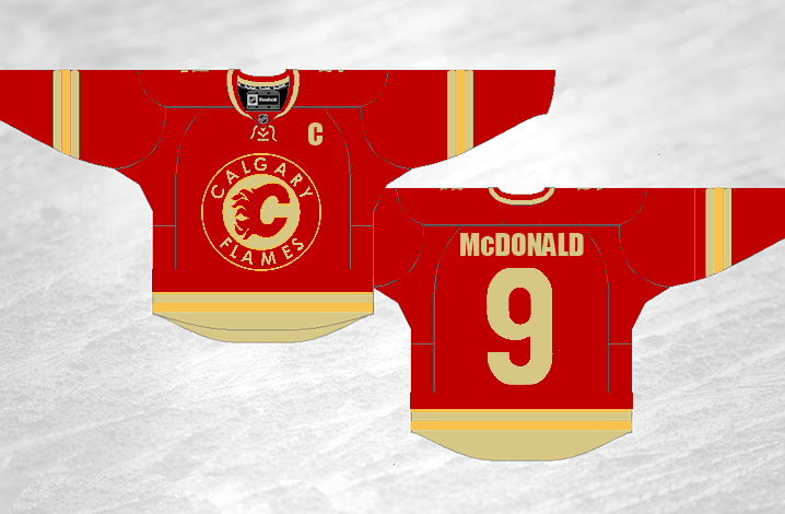
ok - so tonight i was working on a couple of baby blankets (my wife is preggers with our first child!!). i decided that on the red side of the blanket i wanted to do a 3-colour flaming c... white inside, then red, then yellow.
i made up the patch and thought, 'man... that looks really sweet.... i wonder what it would look like on the retro jerseys?!?!?' so i grabbed a jersey and i think i actually squealed with delight! this pic has the logo on the back of the jersey since the patch i made for the blanket is smaller than the patch on the front of the jersey - but you'll get the idea....
personally, i love it - i think it looks sweet. i should just make my version of the logo bigger and replace the front patch on my jersey..... hmmmm 
__________________
"...and there goes Finger up the middle on Luongo!" - Jim Hughson, Av's vs. 'Nucks
Last edited by bc-chris; 08-23-2013 at 01:45 PM.
|

|
|
|
The Following 8 Users Say Thank You to bc-chris For This Useful Post:
|
|
|
03-13-2013, 10:51 PM
|
#564
|
|
First Line Centre
Join Date: Feb 2010
Location: Calgary
|
|
|
|
|
|
The Following 3 Users Say Thank You to Regular_John For This Useful Post:
|
|
|
03-14-2013, 04:00 AM
|
#565
|
|
Crash and Bang Winger
Join Date: May 2009
Location: Calgary
|
Quote:
Originally Posted by t0rrent98
Probably posted some where in this thread but I think the Flames should do this. |
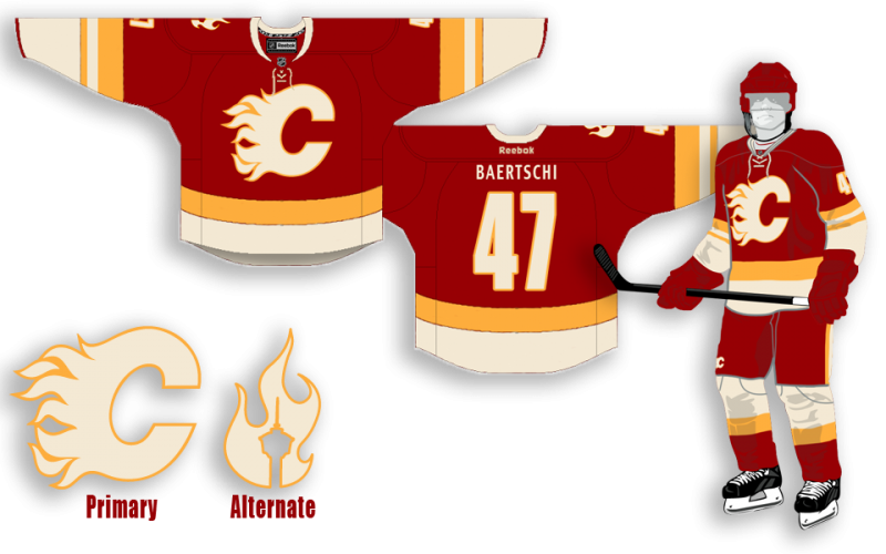
The front crest flaming "C" needs to be slightly bigger, and lose the stripe on all the pants, and those are pretty fantastic. Thanks for sharing!
|
|
|
|
|
03-22-2013, 01:11 AM
|
#566
|
|
Franchise Player
Join Date: Aug 2007
Location: Ontario
|
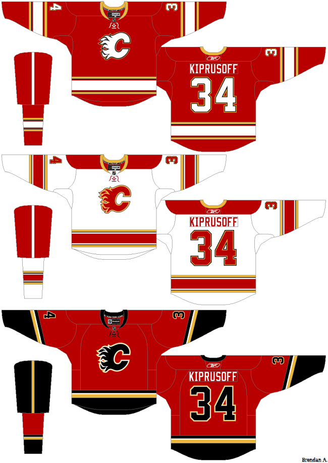
Not close to finished, but just thought I'd post up something I've been toying around with (while avoiding any kind of real work...)
Last edited by Split98; 03-22-2013 at 02:34 AM.
|
|
|
|
|
The Following 3 Users Say Thank You to Split98 For This Useful Post:
|
|
|
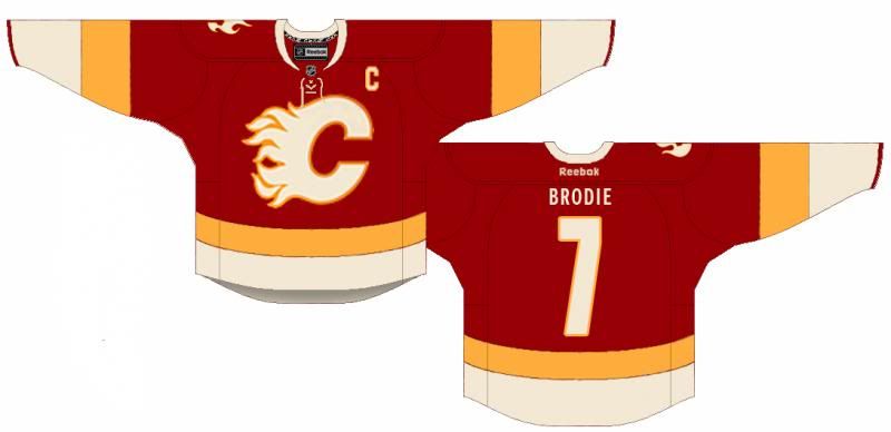
03-22-2013, 08:53 AM
|
#567
|
|
Franchise Player
Join Date: Aug 2007
Location: Ontario
|
|
|
|
|
|
The Following 18 Users Say Thank You to Split98 For This Useful Post:
|
Alberta_Beef,
bax,
Caged Great,
calgaryred,
chalms04,
davidus_49,
Joborule,
klikitiklik,
mac_82,
mattyk19,
mdubz,
miraisoup,
red sky,
RedMileDJ,
roberts10,
Trailer Fire,
Tyler,
Zarley
|
|
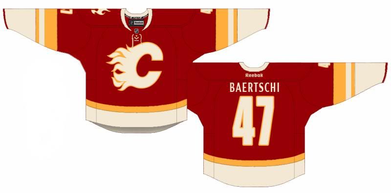
03-22-2013, 09:11 AM
|
#568
|
|
#1 Goaltender
|
The font is too small for the names but other than that, I like it a lot (the second one better)
Edit: I also would like to see how it looks with a smaller yellow horizontal strip on the bottom instead of the larger one that you currently have. Perhaps the same size as the smaller strip on the sleeve, if that makes sense.
Last edited by red sky; 03-22-2013 at 09:14 AM.
|
|
|
|
|
03-22-2013, 09:32 AM
|
#569
|
|
Franchise Player
Join Date: Aug 2007
Location: Ontario
|
Quote:
Originally Posted by red sky
The font is too small for the names but other than that, I like it a lot (the second one better)
Edit: I also would like to see how it looks with a smaller yellow horizontal strip on the bottom instead of the larger one that you currently have. Perhaps the same size as the smaller strip on the sleeve, if that makes sense.
|
Thanks bud, and good call on the font.
Here it is with a thinner belt line. Personally, I dig the waist high yellow, but this also looks damn clean:
|
|
|
|
|
The Following 2 Users Say Thank You to Split98 For This Useful Post:
|
|
|
03-22-2013, 09:46 AM
|
#570
|
|
Lifetime Suspension
|
Why do we use the laces, we were not part of that era of hockey?
|
|
|
|
|
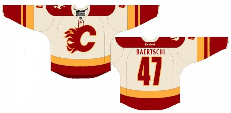
03-22-2013, 09:51 AM
|
#571
|
|
Franchise Player
Join Date: Aug 2007
Location: Ontario
|
And to finish off the concept, the away threads:
|
|
|
|
|
The Following 11 Users Say Thank You to Split98 For This Useful Post:
|
$ven27,
Alberta_Beef,
bax,
calgaryred,
FakenHaken,
mattyk19,
red sky,
roberts10,
sec304,
tomo,
Tyler
|
|
03-22-2013, 09:53 AM
|
#572
|
|
Powerplay Quarterback
|
Like both but prefer the larger yellow stripe at bottom as you had mentioned. Also the aways look great as well. Love the off white not the super bleached whites we have now.
|
|
|
|
|
03-22-2013, 10:10 AM
|
#574
|
|
Powerplay Quarterback
Join Date: Aug 2007
Location: 403
|
Quote:
Originally Posted by Split98
|
Looks good. Only thing I would change is to add a small yellow stripe at the bottom of the jersey, so the striping matches the yellow-white-yellow of the sleeve. Nice one.
|
|
|
|
|
03-22-2013, 10:27 AM
|
#575
|
|
Franchise Player
Join Date: Jun 2006
Location: Calgary, Alberta
|
Quote:
Originally Posted by mac_82
Looks good. Only thing I would change is to add a small yellow stripe at the bottom of the jersey, so the striping matches the yellow-white-yellow of the sleeve. Nice one.
|
This.
Damn solid concept. Good job. Would love to see the Flames in those.
|
|
|
|
|
03-22-2013, 12:00 PM
|
#576
|
|
Backup Goalie
Join Date: Mar 2010
Location: Seattle
Exp: 
|
Love this concept.
I would make a couple edits.
1. The name on the back needs a subtle change. Right now it is a similar typeface as what Phoenix uses, it's nice but not with the minimal design of this jersey.
2. Would love to see the alternate logo taken off the shoulder and a smaller version where the Reebok logo is. Reebok logo moved to the bottom center, maybe in the yellow stripe.
3. The laced neck makes the front a bit busy. Might look cleaner without them. Less is more...
But sweet design. This would be nice to combine it with my graphite concept as well for a 3rd... 
Quote:
Originally Posted by Split98
And to finish off the concept, the away threads:
|
|
|
|
|
|
03-22-2013, 12:02 PM
|
#577
|
|
First Line Centre
Join Date: Oct 2002
Location: Turner Valley
|
Quote:
Originally Posted by Split98
|
I hate those socks.What would it look like with red socks and white and yellow stripes instead?
|
|
|
|
|
03-22-2013, 12:22 PM
|
#578
|
|
Franchise Player
Join Date: Aug 2007
Location: Vancouver
|
Those are a great concept. I think its pretty obvious the vast majority of people (at least those on here) like the retro look or some variation of those colors with a simple template. They can go nuts on a 3rd. Make it baby blue for all I care, but please, please, please keep the regulars with these concepts.
__________________

|
|
|
|
|
03-22-2013, 12:59 PM
|
#579
|
|
Powerplay Quarterback
|
I really like that sleeve. Agree that the bottom needs a little work but that is a damn fine jersey.
__________________
"Somebody may beat me, but they are going to have to bleed to do it."
-Steve Prefontaine
|
|
|
|
|
03-22-2013, 01:17 PM
|
#580
|
|
Crash and Bang Winger
Join Date: Mar 2010
Location: Calgary
|
Quote:
Originally Posted by Split98
|
By far my favorite jersey. I would love it, if the flames chose this.
|
|
|
|
|
The Following User Says Thank You to davidus_49 For This Useful Post:
|
|
 Posting Rules
|
You may not post new threads
You may not post replies
You may not post attachments
You may not edit your posts
HTML code is Off
|
|
|
All times are GMT -6. The time now is 10:56 PM.
|
|