09-09-2012, 09:43 PM
|
#321
|
|
Powerplay Quarterback
Join Date: Aug 2007
Location: 403
|
Quote:
Originally Posted by flameswin

Not even close. It's the asthetics that draw people back to them. The only comments I've ever heard about them, is related to how they look so good compared to what we have now. Nobody ever says it reminds them of our best years. They are damn fine looking jerseys.
|
Yes! They are simple, classic, and clean. Adding black was such a fad of the 90s. You didn't see the Wings, Leafs or Habs adding black and messing with logos. Keep it simple, make small tweaks, and don't buy in to design and marketing trends (ie - black is meaner!, everyone needs a 'classic' jersey like the blue Pens jersey) If you consistently change the colours and logo you turn into the Islanders or Canucks.
|

|

|
|
The Following User Says Thank You to mac_82 For This Useful Post:
|
|
|
09-10-2012, 03:50 PM
|
#322
|
|
Farm Team Player
Join Date: Aug 2012
Location: Calgary
Exp: 
|
Quote:
Originally Posted by Dr. Pepper
|
ooo, I really like this one actually.
|
|
|
|
|
09-10-2012, 04:01 PM
|
#323
|
|
Franchise Player
Join Date: Dec 2005
Location: back in the 403
|
Quote:
Originally Posted by drPepper1

This with a little more red. Maybe like a deep blood red color. |
I'm always harping on getting rid of the black and going back full time to the retros, but I'm fine with (and actually hope) they do a little slight tweaking to modernize it. If they wanted to darken the red I'd be fine with it. Not as dark as you're saying, but if they kept the colour of red from the current home unis and incorporate it into the retro design, I'd be all for it as long as it looked good.
Though I sincerely doubt it, I really hope KK reads these. All N.A. pro sports teams seem to be going back to their retros, our retros our awesome, lets make the switch. May as well allow us to enjoy the team aesthetically while we're forced to watch them sludge their way through mediocrity the next few years..
Last edited by Sainters7; 09-10-2012 at 04:03 PM.
|
|
|
|
|
The Following User Says Thank You to Sainters7 For This Useful Post:
|
|
|
09-10-2012, 04:06 PM
|
#324
|
|
#1 Goaltender
Join Date: Jan 2009
Location: Calgary
|
Guys it's been said before and I'll say it again. The current home jersey and the retro third have the exact same colour of red. It's just the black accents makes the current home look darker overall. Don't believe me? Just put the two side by side and compare. So Ken King, don't darken the red. Maroon might be the ugliest colour known to mankind.
|
|
|
|
|
09-10-2012, 04:12 PM
|
#325
|
|
Farm Team Player
Join Date: Aug 2012
Location: Calgary
Exp:
|
Quote:
Originally Posted by tomo
|
SOLD! I love this design so much, well done sir!
|
|
|
|
|
09-10-2012, 04:14 PM
|
#326
|
|
Franchise Player
Join Date: Dec 2005
Location: back in the 403
|
Fair enough, actually now that I think of it, the Stamps home jerseys seem a bit darker when they wear their black pants compared to their whites, so maybe you're right.
I guess my point is, if they want to tweak the retros a little I'm all for it. A little.
|
|
|
|
|
09-10-2012, 10:05 PM
|
#327
|
|
Farm Team Player
Join Date: Aug 2011
Exp:
|
You know, I was just browsing this thread and realized I don't like the retro jerseys at all anymore.
Its already seems tired and we didnt even wear them that much last year...
|
|
|
|
|
09-10-2012, 11:53 PM
|
#328
|
|
Franchise Player
Join Date: Aug 2007
Location: Ontario
|
Quote:
Originally Posted by Capitano
You know, I was just browsing this thread and realized I don't like the retro jerseys at all anymore.
Its already seems tired and we didnt even wear them that much last year...
|
*readying pitchfork*
Your opinions intrigue me
|
|
|
|
|
09-11-2012, 12:20 AM
|
#329
|
|
damn onions
|
Quote:
Originally Posted by Dr. Pepper
OK gotcha - no black. What's your ideal Flames jersey look like? Do you own one? If so, which one? Why do you like it? Do you like the current ones?
|
Quote:
Originally Posted by bax
|
there we go. Found them, perfect.
Also the Stamps should ditch black too and just go straight red and white, but I realize that's off topic.
|
|
|
|
|
09-11-2012, 12:32 AM
|
#330
|
|
NOT breaking news
Join Date: Jan 2007
Location: Calgary
|
__________________
Watching the Oilers defend is like watching fire engines frantically rushing to the wrong fire

|
|
|
|
|
09-11-2012, 12:34 AM
|
#331
|
|
NOT breaking news
Join Date: Jan 2007
Location: Calgary
|
can someone make a yellow jersey with red trim and a red flaming C? I think that would look nice 
__________________
Watching the Oilers defend is like watching fire engines frantically rushing to the wrong fire
|
|
|
|
|
09-11-2012, 12:40 AM
|
#333
|
|
NOT breaking news
Join Date: Jan 2007
Location: Calgary
|
Quote:
Originally Posted by kyuss275
|
I don't know, here's a start.

__________________
Watching the Oilers defend is like watching fire engines frantically rushing to the wrong fire
|
|
|
|
|
09-11-2012, 12:42 AM
|
#334
|
|
Franchise Player
Join Date: Aug 2007
Location: Ontario
|
Has this been posted yet?
Quite a beauty:

|
|
|
|
|
09-11-2012, 01:36 AM
|
#335
|
|
Franchise Player
|
Quote:
Originally Posted by Split98
Has this been posted yet?
Quite a beauty:
|
I like the overall design, just not the colours
|
|
|
|
|
09-11-2012, 02:47 AM
|
#336
|
|
First Line Centre
Join Date: Oct 2011
Location: The Armpit of BC: Trail
|
Quote:
Originally Posted by Split98
Has this been posted yet?
Quite a beauty:
|
Make the beige more yellow/gold and make the burgundy more red I'd buy it then.
__________________
Disregard any and all THANKS I give. I'm a dirty, dirty thanks-whore.
|
|
|
|
|
09-11-2012, 01:17 PM
|
#337
|
|
Backup Goalie
Join Date: Aug 2005
Exp:
|
This entire thread should be blown up... back to go... do not collect $200
nothing to see here Ken.
|
|
|
|
|
The Following 3 Users Say Thank You to To_be_Quite_Honest For This Useful Post:
|
|
|
09-11-2012, 06:25 PM
|
#338
|
|
Crash and Bang Winger
Join Date: May 2009
Location: Calgary
|
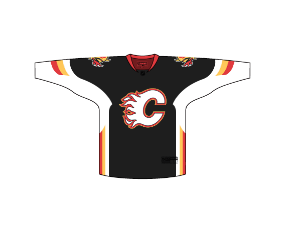
 Updated retro
As the OP - I have to say I've really enjoyed the thread thus far. I very much agree with the general tone of getting to a design that is classic and doesn't need to be messed with too badly over the years. Thinking Red Wings / Blackhawks / Flyers / etc. I think the basics are there to do it.
And thanks to everyone who either made up designs or had a constructive thought to add to the thread.
So alright - just a quick look through the recent posts, and it seems like the majority would favor an updated retro for home/away at least. 3rd I don't care much about as it's the one that should change every once in awhile, so there are going to be some winners/losers on that.
So - how about a contest. I'm calling on the artists out there to design some updated homes/aways... Remember - small tweaks good (stripe width, logo size, alternate shoulder crests, updated numbers, etc. = good. Big tweaks bad (change of primary color scheme of classic Flames Red/Yellow, too much black - or black at all, etc.)
GO!
|
|
|
|
|
09-13-2012, 06:29 PM
|
#339
|
|
Franchise Player
|
Quote:
Originally Posted by Split98
Has this been posted yet?
Quite a beauty:
|
-1 for the pedestal striping on the shoulders. Reminds me of a pilot's uniform. Also not a fan of the color -- beige and brown?
|
|
|
|
|
09-13-2012, 06:34 PM
|
#340
|
|
Franchise Player
Join Date: Jul 2005
Location: SW Ontario
|
The jerseys we had in 2004 are the best we ever had. I like the retros for their time but they are too plain for today. The black C kicks ass, don't ever get away from it.
|
|
|
|
|
The Following 2 Users Say Thank You to dissentowner For This Useful Post:
|
|
 Posting Rules
|
You may not post new threads
You may not post replies
You may not post attachments
You may not edit your posts
HTML code is Off
|
|
|
All times are GMT -6. The time now is 04:07 AM.
|
|