 06-06-2008, 12:08 PM
|
#41
|
|
Dances with Wolves
Join Date: Jun 2006
Location: Section 304
|
Quote:
Originally Posted by moncton golden flames

/\ /\ /\ This, from the guy who thinks 'Hookers and Blow' is original enough for a personal signature. Can't beat copy + paste!
|
It's called branding ... ass
I should still have all the original raster files for that logo, so if you folks need changes just let me know.
|

|

|
|
06-06-2008, 12:32 PM
|
#42
|
|
Franchise Player
Join Date: Feb 2006
Location: Section 222
|
Oh yeah, I guess I should have mentioned that Russic graciously put this file together for our team. Looks great on the shirts!
__________________
Go Flames Go!!
|
|
|
|
|
06-06-2008, 01:59 PM
|
#43
|
|
Not a casual user
Join Date: Mar 2006
Location: A simple man leading a complicated life....
|
Quote:
Originally Posted by flameswin
Hey Dion, do you think you could try that logo (with the yellow) on the new Flames jerseys, with the CP logo as the shoulder patch?
|

__________________

Last edited by Dion; 06-06-2008 at 02:05 PM.
|
|
|
|
|
06-06-2008, 04:02 PM
|
#44
|
|
Celebrated Square Root Day
|
This is my clearcut personal favorite so far for sure.
|
|
|
|
|
06-06-2008, 05:19 PM
|
#45
|
|
Franchise Player
|
What's the deadline?
|
|
|
|
|
06-06-2008, 05:22 PM
|
#46
|
|
Powerplay Quarterback
Join Date: Feb 2007
Location: Cowtown
|
Here are basically the same ones Dion posted, just more polished looking of a picture. That and only the grey part, not black, was changed to yellow.
Enjoy.
|
|
|
|
|
06-06-2008, 05:24 PM
|
#47
|
|
Franchise Player
Join Date: Sep 2002
Location: Stern Nation
|
/\/\/\ that looks great.
|
|
|
|
|
06-06-2008, 05:58 PM
|
#49
|
|
aka Spike
Join Date: Sep 2004
Location: The Darkest Corners of My Mind
|
Quote:
Originally Posted by Madman
I like your original idea - how's this?
 |
I think he was looking for more Flame like letters. Kinda like the Quad Cities logo
|

|
|
|
06-06-2008, 07:20 PM
|
#50
|
|
Franchise Player
Join Date: Feb 2006
Location: Section 222
|
Quote:
Originally Posted by IgnitedSoul
Here are basically the same ones Dion posted, just more polished looking of a picture. That and only the grey part, not black, was changed to yellow.
Enjoy.
|
That looks really good. Only change I would make would be to add another border color to seperate the red on red, besides the black lines. Or just something to help the red in the logo stand out against the red jerseys. Another idea would be to have the "Calgary Puckers" part of the logo be red letters on white color for the home jersey and keep it white letters on red color for the away.
__________________
Go Flames Go!!
|
|
|
|
|
06-06-2008, 10:12 PM
|
#51
|
|
Franchise Player
Join Date: Mar 2006
Location: Shanghai
|
Damn, CP could actually start selling those. I'm sure there are a few who would be willing to buy a CP jersey like that if the prices weren't exhorbitant. Could be interesting to see folks wearing those around at the dome.
__________________
"If stupidity got us into this mess, then why can't it get us out?"
|
|
|
|
|
06-06-2008, 10:57 PM
|
#52
|
|
Powerplay Quarterback
Join Date: Feb 2007
Location: Cowtown
|
Quote:
Originally Posted by Rhettzky
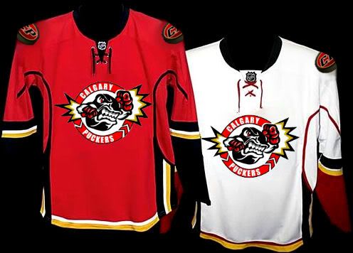
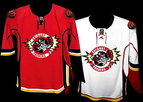
That looks really good. Only change I would make would be to add another border color to seperate the red on red, besides the black lines. Or just something to help the red in the logo stand out against the red jerseys. Another idea would be to have the "Calgary Puckers" part of the logo be red letters on white color for the home jersey and keep it white letters on red color for the away.
|
Thanks guys! And here you are, two more variations of that idea 
(I like the 2nd better)

|
|
|
|
|
06-06-2008, 11:19 PM
|
#53
|
|
Scoring Winger
Join Date: Sep 2007
Location: Northern AB, in "oil country" >:p----@
|
Quote:
Originally Posted by flameswin
Also, bonus points to whoever can make my microsoft paint travesty into a nice looking logo.
|
something quick for you. tried a couple different looks

__________________
Nothing like rediscovering one of the greatest bands ever!

|
|
|
|
|
06-06-2008, 11:22 PM
|
#54
|
|
Not a casual user
Join Date: Mar 2006
Location: A simple man leading a complicated life....
|
Egads i've created a monster 
Seriuosly, nice work Ignited Soul on the touch ups. And thanks to everyone else for the compliments
__________________
|
|
|
|
|
06-06-2008, 11:53 PM
|
#55
|
|
Celebrated Square Root Day
|
Quote:
Originally Posted by JohnnyB
Damn, CP could actually start selling those. I'm sure there are a few who would be willing to buy a CP jersey like that if the prices weren't exhorbitant. Could be interesting to see folks wearing those around at the dome.
|
I believe they would be cheaper than real Flames jerseys. I haven't been quoted on the price with a logo yet, but without I think it was like $70 a jersey, and she said it would likely be another $20 per jersey with the logo. So CP'ers should be able to purchase those jerseys for under $100 each.
Also, the cool thing about cal-crests (unless they've changed this) is once the jerseys have been designed, anyone on here can just walk in off the street and order the Calgarypuck jersey.
|
|
|
|
|
06-07-2008, 12:00 AM
|
#56
|
|
Celebrated Square Root Day
|
Quote:
Originally Posted by Madman
What's the deadline?
|
I don't think there's really a deadline per say, as we don't hit the ice until september, however calcrests get's overloaded with orders around mid-summer every year, and in past years on other teams they've been so backed up that we've had to scramble and order practice jerseys to wear for the first 3 or 4 games. So definitly the sooner the better.
Although, after browsing this thread and seeing some of the ideas, i want my jerseys right now! 
|
|
|
|
|
06-07-2008, 12:02 AM
|
#57
|
|
Celebrated Square Root Day
|
...and also if there's anyone from the CP softball team or any CP'ers that are kind of thiking this would be a cool idea, let me know, cause we still have the chance to make it an all Calgarypuck team.
|
|
|
|
|
06-07-2008, 12:09 AM
|
#58
|
|
Franchise Player
Join Date: Aug 2005
Location: Calgary
|
Hey, you should also check with the league that they'll accept the name "Calgary Puckers" if we decided to go with that. I'm sure it would be fine, but since there could be a connotation there that could be... well... I'd hate to buy the jersey to find we couldn't use them.
|
|
|
|
|
06-07-2008, 12:11 AM
|
#59
|
|
Celebrated Square Root Day
|

What I'd love to see photoshopped is something like this, only with a C and P, and with the P in front of the C, and only have the C flaming. The calcrest rep said they only have to make a VERY minor change to the Flames coming off the C to avoid copyright problems. I would kind of like to see it on the '89 jersey and the new one.
The quod city logo looks a little goofy imo, but I think it's mostly because
a) The letters Q and C are too similar looking and
b)They made both letters flaming.
I think a C and P would compliment eachother nicely, and plus only the C would have Flames, which would also look better imo.
|
|
|
|
|
06-07-2008, 12:13 AM
|
#60
|
|
Celebrated Square Root Day
|
Quote:
Originally Posted by Jayems
Hey, you should also check with the league that they'll accept the name "Calgary Puckers" if we decided to go with that. I'm sure it would be fine, but since there could be a connotation there that could be... well... I'd hate to buy the jersey to find we couldn't use them.
|
They allowed the "circle of jerks" . But yeah, i'll definitly check with league about that.
|
|
|
|
 Posting Rules
|
You may not post new threads
You may not post replies
You may not post attachments
You may not edit your posts
HTML code is Off
|
|
|
All times are GMT -6. The time now is 08:22 PM.
|
|


