Cool link, thanks for that. Here are Ro's top 10 NCAA Div. I helmets:
10:
 Boston College
. Who needs a logo. But at least they had the foresight to add a second color for effect, ahem, Notre Dame.
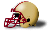
9:
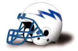 Air Force
 - Chargers redux. With better colors.
8:
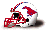 Southern Methodist
. Interestingly, they first used this logo in 1968, the same year the Stamps did. Wonder who stole it. Have to admit it looks sharp in this color scheme though.
7:
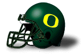 Oregon
. I'm a Ducks fan, so this is another impartial pick, but the shape of the "O" has a dual significance for Ducks fans, and it's simple and classic and they wear the green and yellow so much better than the Eskies.
6:
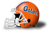 Florida
. Kind of like the Houston Oilers one from the original list- throwback feel, old school cursive, bright colors. One of those lids that makes me think of college football for whatever reason.
5:
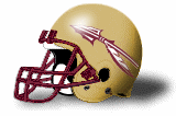 Florida State
. A clear ripoff of the old 'Skins helmets, but with better results.
4:
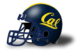 California
. I've always loved this one, don't know why really. It's like I can picture Jerry Rice running a perfect flag pattern and catching a clean pass in the corner of the endzone with delicacy and grace, just past the outstretched defenders, all because he's wearing this helmet. Then he does a little post-TD dance, but not as flamboyant as to embarrass the other team. Classy, smooth...looks like an "athlete's helmet" to me. I dunno.
3:
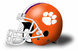 Clemson
. More Bronco orange. One of the best logos in football also.
2:
 Texas
Texas. What says "southern US college football" better than this helmet? Simplicity always wins out in the end. Another great logo also.
1:
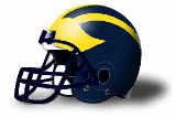 Michigan
. Might not even make some people's lists, similar to the Bengals helmet in the original list, but I think it's fantastic. Like this cool link says (
http://bentley.umich.edu/athdept/foo...et/mhelmet.htm), the instantly recognizable wings are symbolic with college ball.
-------------
CIS Bonus pick:
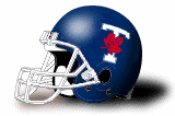 Toronto
. Hadn't seen this one before I checked out the CIS school's pages, but wow, what a great looking helmet. Must be the hue of the blue. It's like the Maple Leafs decided to add red to their logo, and I didn't hate them for it.