 02-02-2022, 10:33 AM
|
#1
|
|
Powerplay Quarterback
Join Date: Aug 2005
Location: N/A
|
 New Jersey Devils release Ein Flagge
Hmm.
https://twitter.com/LWaler/status/14...FTsIMPYzxzEJZA
Perhaps the designer has been watching a lot of documentaries lately and subconsciously drew inspiration.
Evidently it's a jersey, just folded up into a nice tidy flag-like rectangle rather than hung on a hangar the way jerseys normally are.
Last edited by RoadGame; 02-02-2022 at 12:16 PM.
|

|

|
|
02-02-2022, 10:42 AM
|
#2
|
|
Crash and Bang Winger
|
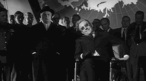
TIL many people don’t actually know what the Nazi flags looked like.
|
|
|
|
|
The Following 3 Users Say Thank You to Passe La Puck For This Useful Post:
|
|
|
02-02-2022, 10:43 AM
|
#3
|
|
Franchise Player
Join Date: Jun 2011
Location: Austria, NOT Australia
|
* eine Flagge 
|
|
|
|
|
The Following User Says Thank You to devo22 For This Useful Post:
|
|
|
02-02-2022, 10:45 AM
|
#4
|
|
Franchise Player
Join Date: Oct 2001
Location: Vancouver
|
Quote:
Originally Posted by Passe La Puck

TIL many people dont actually know what the Nazi flags looked like.
|
To too many people these days, it's a freedom flag. Just ask the people at the "freedom convoy".
The NJ flag looks suspicious. What's the inspiration for it? It looks like some pagan or wiccan thing going on.
__________________
"A pessimist thinks things can't get any worse. An optimist knows they can."
|

|
|
|
02-02-2022, 10:52 AM
|
#5
|
|
Franchise Player
|
it for Chinese/Lunar New Year. The New Jersey logo is in Chinese calligraphy-like script
|
|
|
|
|
The Following 5 Users Say Thank You to Canada 02 For This Useful Post:
|
|
|
02-02-2022, 10:53 AM
|
#6
|
|
Franchise Player
Join Date: Aug 2007
Location: Vancouver
|
Quote:
Originally Posted by FlamesAddiction
To too many people these days, it's a freedom flag. Just ask the people at the "freedom convoy".
The NJ flag looks suspicious. What's the inspiration for it? It looks like some pagan or wiccan thing going on.
|
Its a Chinese New Year flag. Year of the tiger.
Its just a weird combo of the colours, symbol and way its folded that is accidentally evoking some Nazi trigger. Nothing purposeful at all.
__________________

|
|
|
|
|
02-02-2022, 10:55 AM
|
#7
|
|
Franchise Player
|
A guy lost his job because those jersey's look like nazi flags?
I'm confused.
Who is Ein Flagg? The equipment guy?
|
|
|
|
|
The Following User Says Thank You to CroFlames For This Useful Post:
|
|
|
02-02-2022, 10:55 AM
|
#8
|
|
Franchise Player
|
Quote:
Originally Posted by Canada 02
it for Chinese/Lunar New Year. The New Jersey logo is in Chinese calligraphy-like script
|
Thank you. Between the thread title and the Twitter link I had no idea what I was looking at.
|
|
|
|
|
02-02-2022, 10:56 AM
|
#10
|
|
Franchise Player
Join Date: Oct 2001
Location: Vancouver
|
Quote:
Originally Posted by Canada 02
it for Chinese/Lunar New Year. The New Jersey logo is in Chinese calligraphy-like script
|
Lol... now I feel dumb.
__________________
"A pessimist thinks things can't get any worse. An optimist knows they can."
|
|
|
|
|
02-02-2022, 11:00 AM
|
#11
|
|
Powerplay Quarterback
Join Date: Aug 2005
Location: N/A
|
Why not use yellow in place of the white at least? The Red/yellow pairing having a strong tradition in that part of the world. Angular symbols, black on white circle on a red field is strongly evocative too - but from a different hemisphere.
I'm not saying the designer's a Nazi or that NJD sympathizes, but maybe do a little more field testing before releasing it on the world?
I once came upon a belt company in the US that was using as their corporate logo an identical copy of the logo of a Luftwaffe fighter squadron (Jagdgeschwader 3). Probably some freelance designer was asked to come up with a graphic-style bird-like logo, did a bit of googling and appropriated it, but one reverse image search and two minutes on wikipedia could have saved some headaches. I dunno, I just SMH sometimes.
|
|
|
|
|
The Following User Says Thank You to RoadGame For This Useful Post:
|
|
|
The Following 2 Users Say Thank You to Canada 02 For This Useful Post:
|
|
|
02-02-2022, 11:07 AM
|
#13
|
|
First Line Centre
|
Quote:
Originally Posted by RoadGame
Why not use yellow in place of the white at least? The Red/yellow pairing having a strong tradition in that part of the world. Angular symbols, black on white circle on a red field is strongly evocative too - but from a different hemisphere.
I'm not saying the designer's a Nazi or that NJD sympathizes, but maybe do a little more field testing before releasing it on the world?
I once came upon a belt company in the US that was using as their corporate logo an identical copy of the logo of a Luftwaffe fighter squadron (Jagdgeschwader 3). Probably some freelance designer was asked to come up with a graphic-style bird-like logo, did a bit of googling and appropriated it, but one reverse image search and two minutes on wikipedia could have saved some headaches. I dunno, I just SMH sometimes.
|
I think you are looking for something that just isn't there. I saw the jerseys and thought it was an interesting design to bring in the lunar new year with. Not once did I think "Nazi flag".
|
|
|
|
|
The Following 5 Users Say Thank You to Since1984 For This Useful Post:
|
|
|
02-02-2022, 11:08 AM
|
#14
|
|
Scoring Winger
Join Date: Dec 2010
Location: Cowtown
|
Hahahaha that's awesome! I thought the jersey looked great until the comparison.
Someone dropped the ball. Their Quality control guy was the same one the Flames used for their Portpass app!
__________________

|
|
|
|
|
The Following User Says Thank You to klikitiklik For This Useful Post:
|
|
|
02-02-2022, 11:13 AM
|
#15
|
|
Acerbic Cyberbully
Join Date: Aug 2003
Location: back in Chilliwack
|
What? Someone is going to have to explain to me how the hell anyone saw this and thought "NAZIS!"
Sent from my SM-G960W using Tapatalk
|
|
|
|
|
The Following 17 Users Say Thank You to Textcritic For This Useful Post:
|
Beatle17,
Canada 02,
D as in David,
dissentowner,
DoubleK,
Enoch Root,
Flaming Choy,
JMN,
kkaleR,
midniteowl,
monkeyman,
Scroopy Noopers,
Since1984,
SnipeShow,
SuperMatt18,
The Yen Man,
tknez16
|
|
02-02-2022, 11:14 AM
|
#16
|
|
Franchise Player
Join Date: Mar 2007
Location: Income Tax Central
|
I must be missing it. I didnt get any impression like that upon looking at them.
I think people are really reaching hard here.
Yes. They are red and black. Most similarity ends there.
__________________
The Beatings Shall Continue Until Morale Improves!
This Post Has Been Distilled for the Eradication of Seemingly Incurable Sadness.
The World Ends when you're dead. Until then, you've got more punishment in store. - Flames Fans
If you thought this season would have a happy ending, you haven't been paying attention.
|
|
|
|
|
02-02-2022, 11:18 AM
|
#17
|
|
Franchise Player
|
Quote:
Originally Posted by Canada 02
|
Those actually look pretty awesome IMO the gold pops better in the light, and the Chinese writing on the back is a nice touch.
|
|
|
|
|
02-02-2022, 11:21 AM
|
#18
|
|
Franchise Player
Join Date: Oct 2001
Location: Vancouver
|
Quote:
Originally Posted by Locke
I must be missing it. I didnt get any impression like that upon looking at them.
I think people are really reaching hard here.
Yes. They are red and black. Most similarity ends there.
|
I don't think I would have thought Nazi if I saw it before someone else made the comparison. The similarities are pretty vague.
It's a great idea for the Devils to do this and pretty obvious that they wouldn't make a racist flag.
There is a flagging company here in the LML, maybe in Alberta too, called Universal Flagging. Every time I see their trucks, I can't help but think Nazi flag.
__________________
"A pessimist thinks things can't get any worse. An optimist knows they can."
|
|
|
|
|
02-02-2022, 11:22 AM
|
#19
|
|
First Line Centre
Join Date: Nov 2010
Location: Sunnyvale
|
Went to Hockeydb, couldn't find Ein Flagge's stats anywhere, no wonder he got released.
__________________
The only thing better then a glass of beer is tea with Ms McGill
|
|
|
|
|
The Following 4 Users Say Thank You to Derek Sutton For This Useful Post:
|
|
|
02-02-2022, 11:52 AM
|
#20
|
|
Powerplay Quarterback
Join Date: Aug 2005
Location: N/A
|
Fair enough that many won't see a likeness, but generally speaking an angular black symbol on a white circle on a red field runs the risk of drawing the comparison. A scroll through the twitter replies includes a picture of the Brandenburg Gate with banners hanging that is what came to mind for me when I saw the jerseys folded into rectangles and hung in the locker room (why not just put the damn things on hangars so they look like shirts? Odd.)
At the risk of straying too far from hockey into graphic design, for those who remember the old cylindrical Heritage Fund grain hoppers some at the time thought they evoked the swastika as well:
http://tracksidetreasure.blogspot.co...rain-cars.html

Last edited by RoadGame; 02-02-2022 at 12:00 PM.
|
|
|
|
 Posting Rules
|
You may not post new threads
You may not post replies
You may not post attachments
You may not edit your posts
HTML code is Off
|
|
|
All times are GMT -6. The time now is 08:19 PM.
|
|


